Ahh digital. How I love thee. Though you don’t have the tactile feel of real paint, your forgiving un-do and layered personality make me feel warm and fuzzy inside.
Now I know at times I chastise you because there are much fewer originals with my signature on them than before we met. But I also know you’ve made me a better person… er.. I mean artist.
Beyond the ginormous time saver you have been since day one, you also allowed me to take MASSIVE risks with my work. You made me feel safe and secure and convinced me that I could leap off cliffs and land safely. (Except for those few times you blacked out on me… Grrr…) The truth is, you’ve made me a much better traditional painter. Cause I took that bravery you instilled, back into the real world. You’ve help me build solid foundation beneath almost every traditional painting I do to this day.
I am liberated with you by my side. And because of that stability, I can cut loose and just have fun when it is time to pick up a real brush. Knowing I did the homework first.
Truth be told, my traditional technique is very much a mirror of our time together. Cause I now think in layers even when you are asleep in the corner and I have a real brush in hand. Whether it is on paper, copper or on Dura-lar, which I even refer to as the ‘Analog Photoshop’.
So to celebrate our love, how about I take the good folks through a digital piece step-by-step.
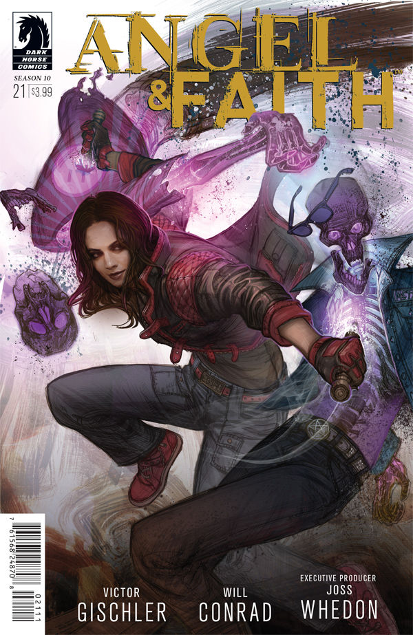
Process: Angel and Faith season 10 issue 21 (Dark Horse Comics.)
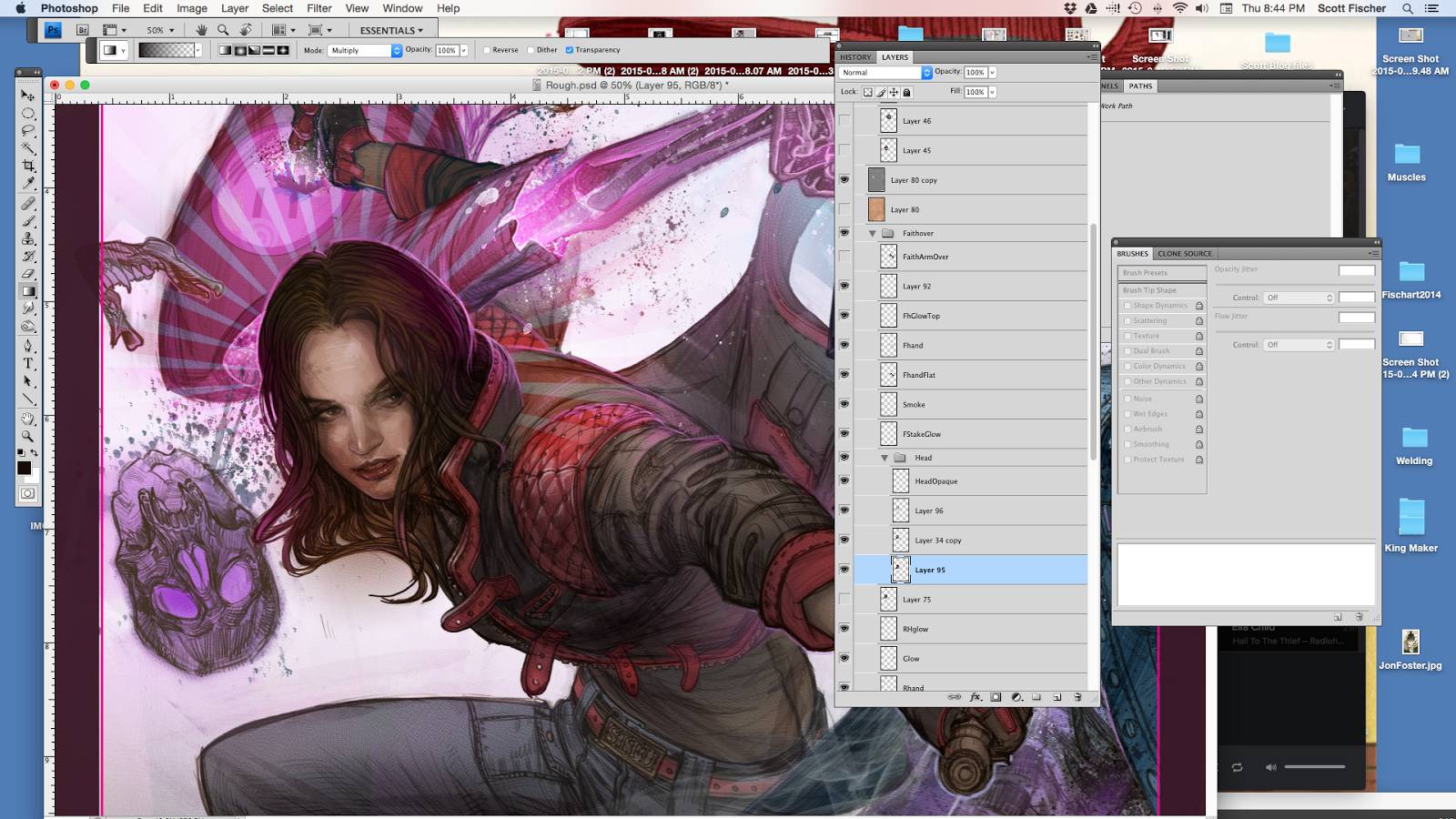
Note this entire piece is done in Adobe Photoshop.
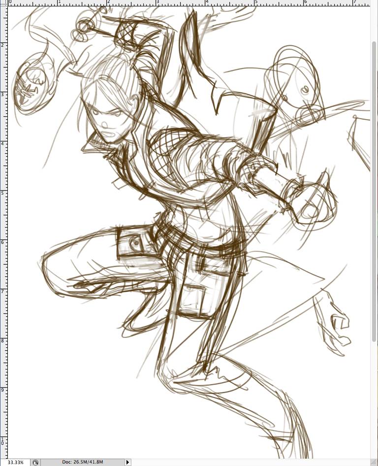
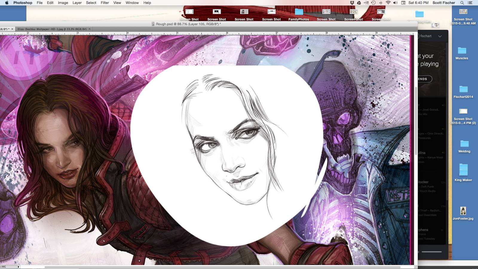
We start out how most things do, with a crappy thumbnail drawing. Mind you I am not putting myself down. I think all paintings should start off with bad drawings, or I should say dumb drawings. It is WAY too soon to start falling in love with anything. Take the part of your brain that is a slave to proportions and aesthetic beauty out of this stage of the conversation. For I believe if you make your drawing too pretty too soon, you are likely doing yourself a disservice. As chicken-scratch as this mess is, it is the heart of everything. And arguably more important than the pretty face or well drawn hands to come.
Lets throw that into a framework that my hard working editor understands.

Up to this point everything has been out of my head. Now that we have a solid foundation to build on (And approval from the client!) lets start ironing out the chicken-scratch.
I track down reference that is close to my thumbnail. That which I can’t find I shoot myself. Often with nothing but the photobooth app and Imac camera. I ghost out my thumbnail drawing with a quick gradient, make a new layer on top of that, and start drawing. I will repeat this process many times, slowly refining the drawing with each new layer. I usually establish the faces early. I can relax more once they are in.
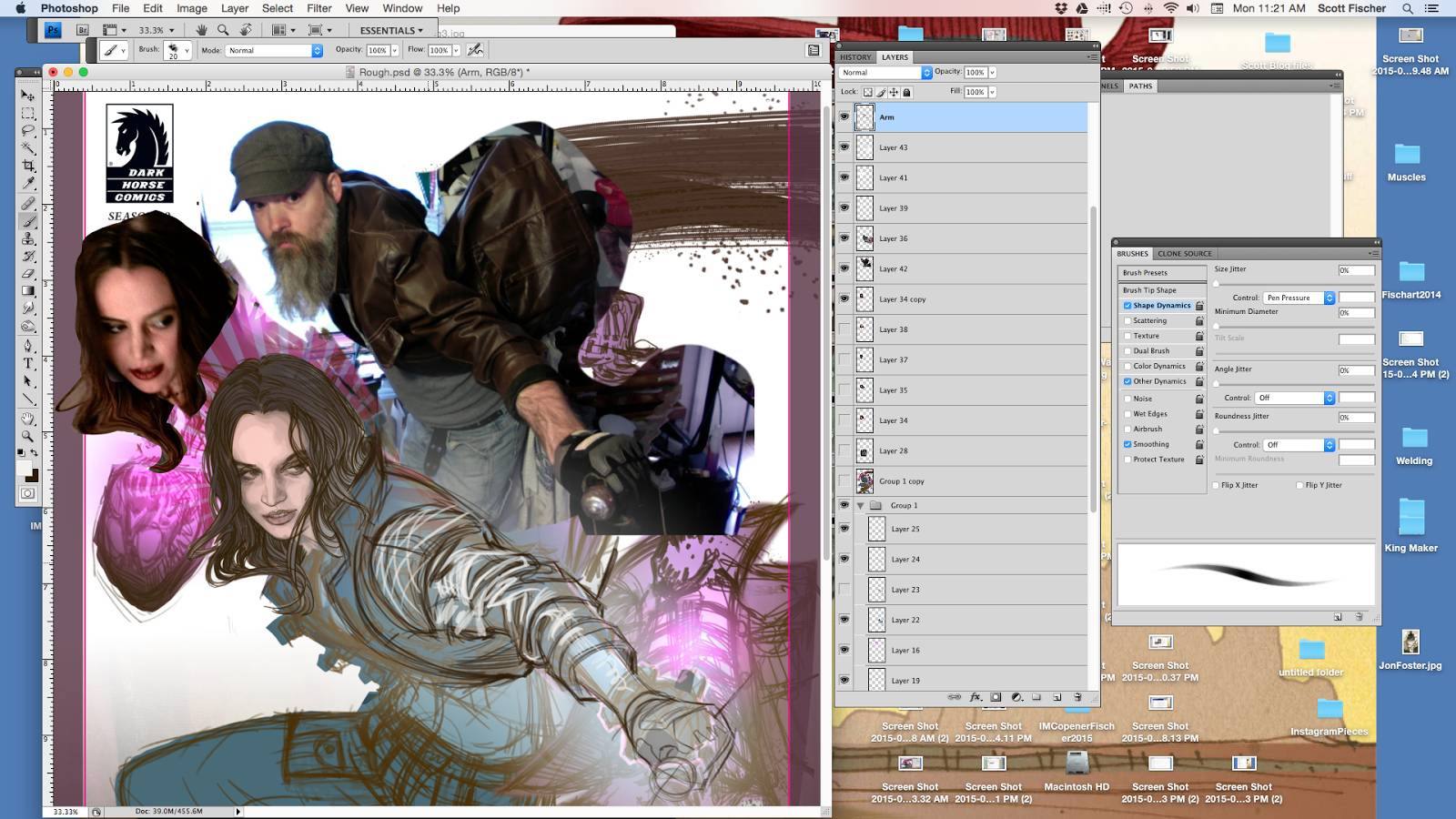
I put my ref right on my surface as close to what I am drawing as possible. My eyes dart between the ref and the drawing like a million times a second. Constantly doublechecking. Note that the jacket ref isn’t perfect for me. I needed way more foreshortening on those wrinkles. So first I drew them like the ref, pretty crudely, getting in the wrinkle stacks. Then I use ‘liquify’ or ‘Transform/warp” to bend them to the proper elipse.

I ghost out the rougher drawing of the sleeves and, yup, you guessed it, drew them again, a little tighter. I actually enjoy a bit of that ghosted out underdrawing showing beneath. It helps keeps some of the spontaneous feel.
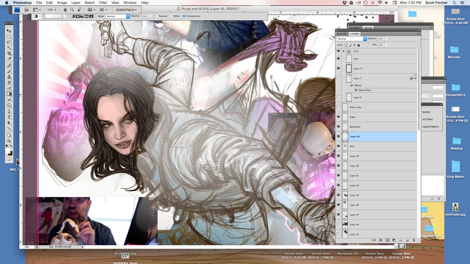
I throw a layer of white under there so I can really see what is happening. I will turn this off and on when I need clarity.
Time for middle values. When I say ‘middle’ I don’t mean it is a 50% value in the traditional sense. It can be much lighter or darker, but it is a middle value relative to itself. The brown of the jacket, for instance, is the middle value for that jacket, and I can go a few steps lighter or darker in rendering within its borders. The red padding or the skin have their own middle range and won’t have to go anywhere near as dark as the jacket.
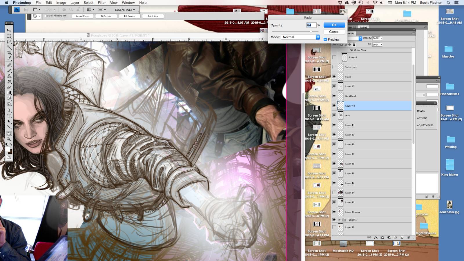
Tracking down more ref, and using it to inform the drawing but there is a fine line to walk where I don’t want to lose touch with the gesture that is underneath. So I try to balance accuracy with energy. In the end things will stiffen up a bit as you refine, so it is important to retain what you can.


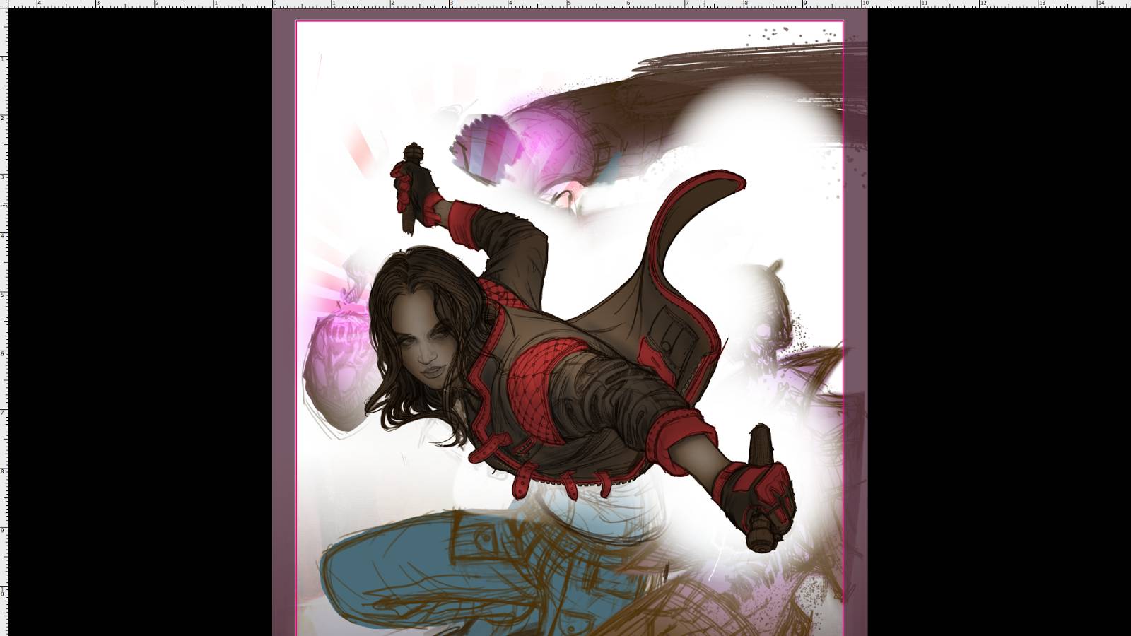
With the figure drawing nearing finish, I reestablish some of the values.
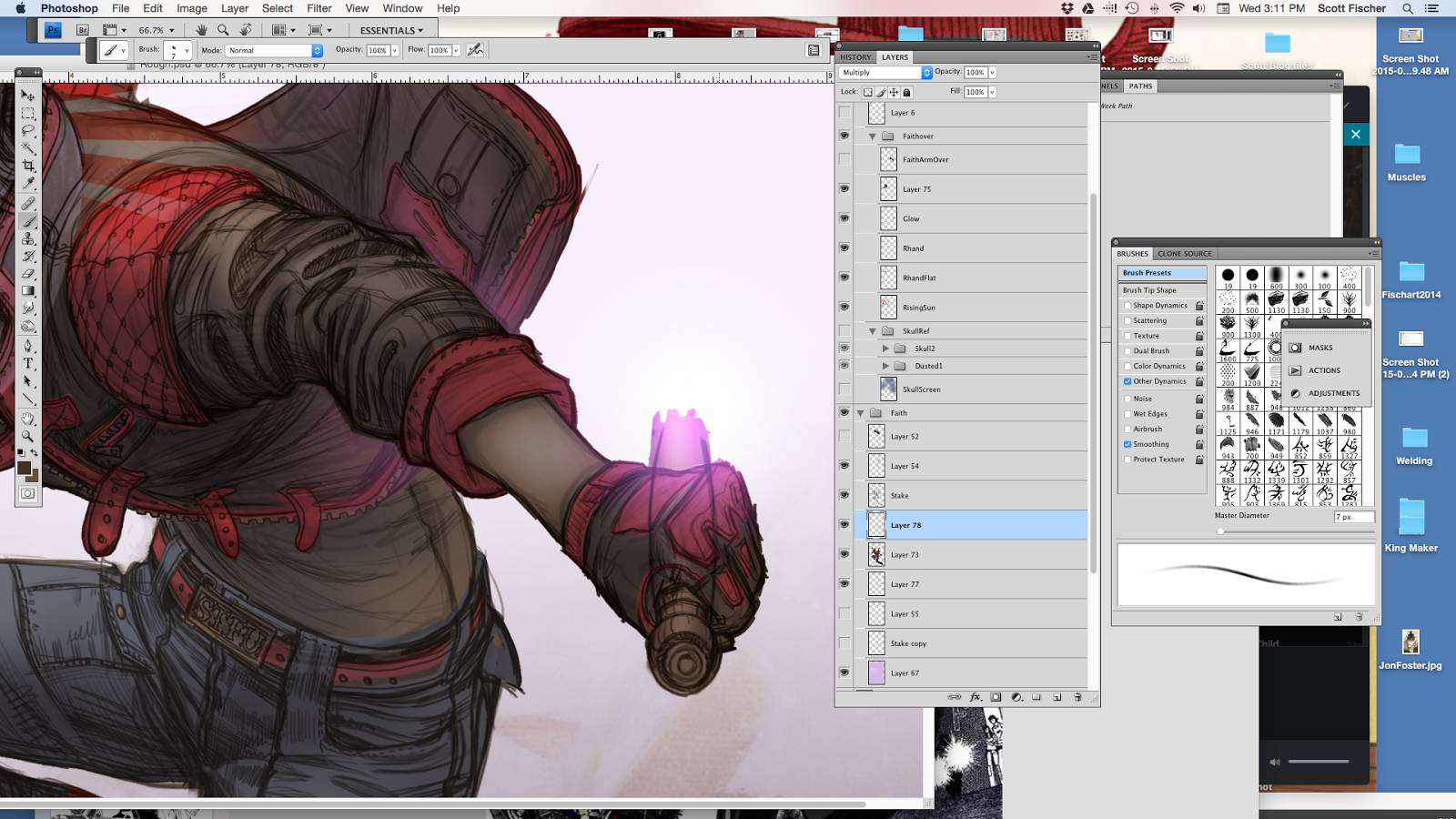
Special FX are something the computer excels at. I am using a combo of pink gradients, spatter brushes and even a ‘rising sun’ symbol- set to hardlight, dodge, or some combo of- till it starts to feel like an exploding vamp. Part of what keeps me engaged in making a piece is puzzling out how to pull something off. If I was rendering from first stroke to last, it would be more fatiguing. Things like this break up the adventure for me. I can catch my breath before diving back into rendering.

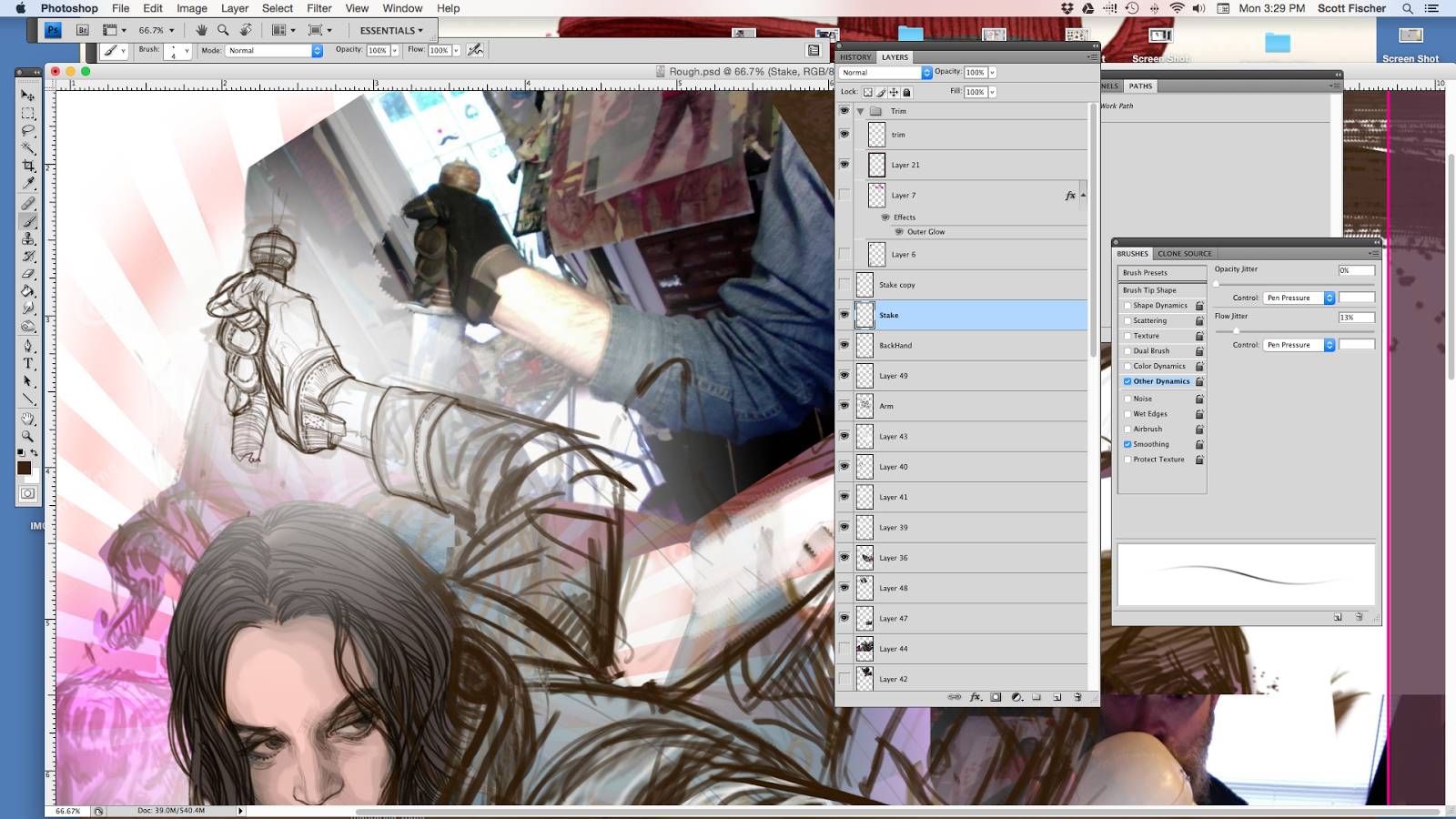
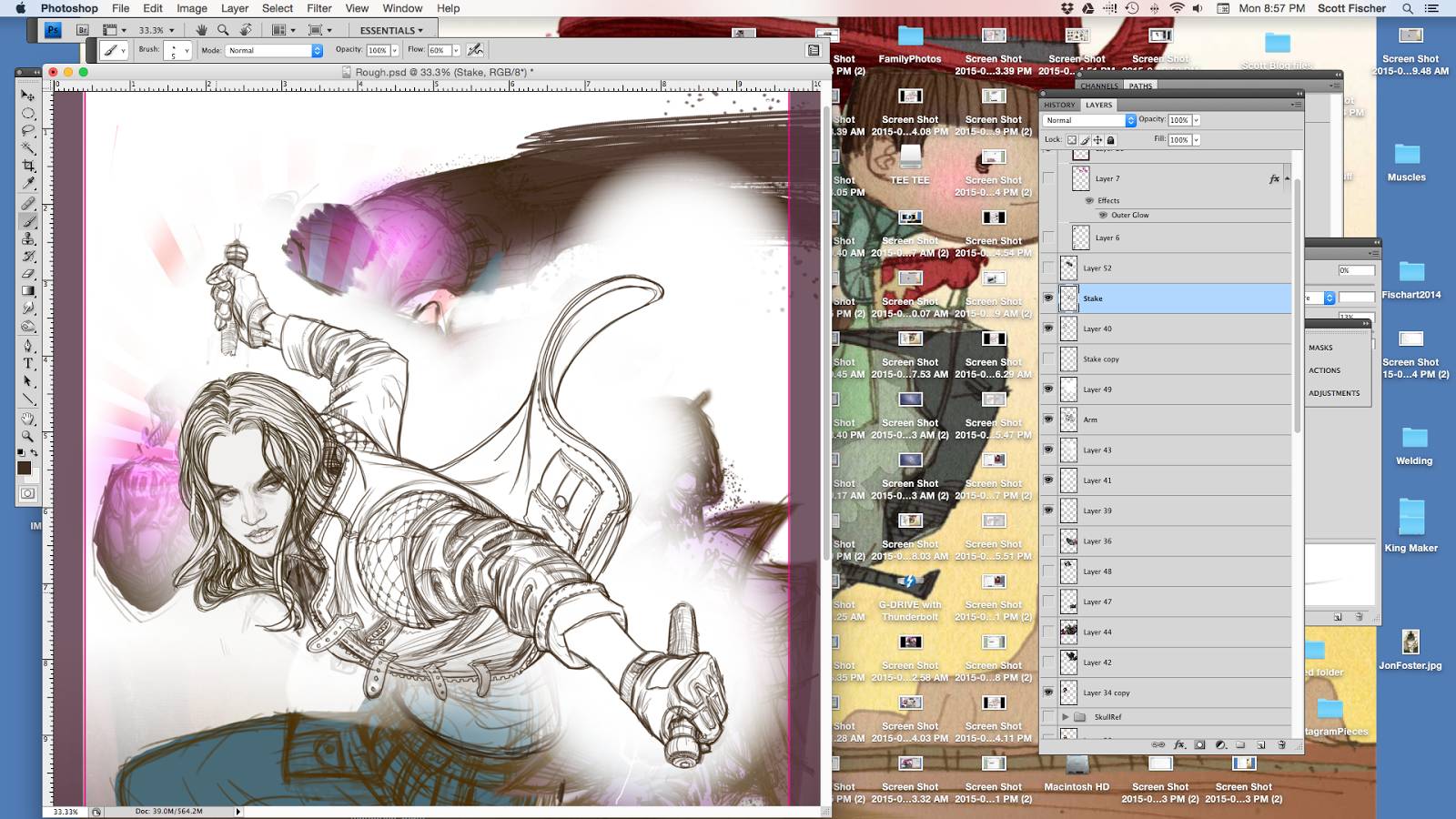
Correcting elipse on stake. Nothing is done til it is done, and I will redraw something already finished if it will serve the piece better. Note I created a new layer for the stake so that I could ‘draw through’ the hand without messing up the glove. Always remember to draw through if you are trying to figure something out.
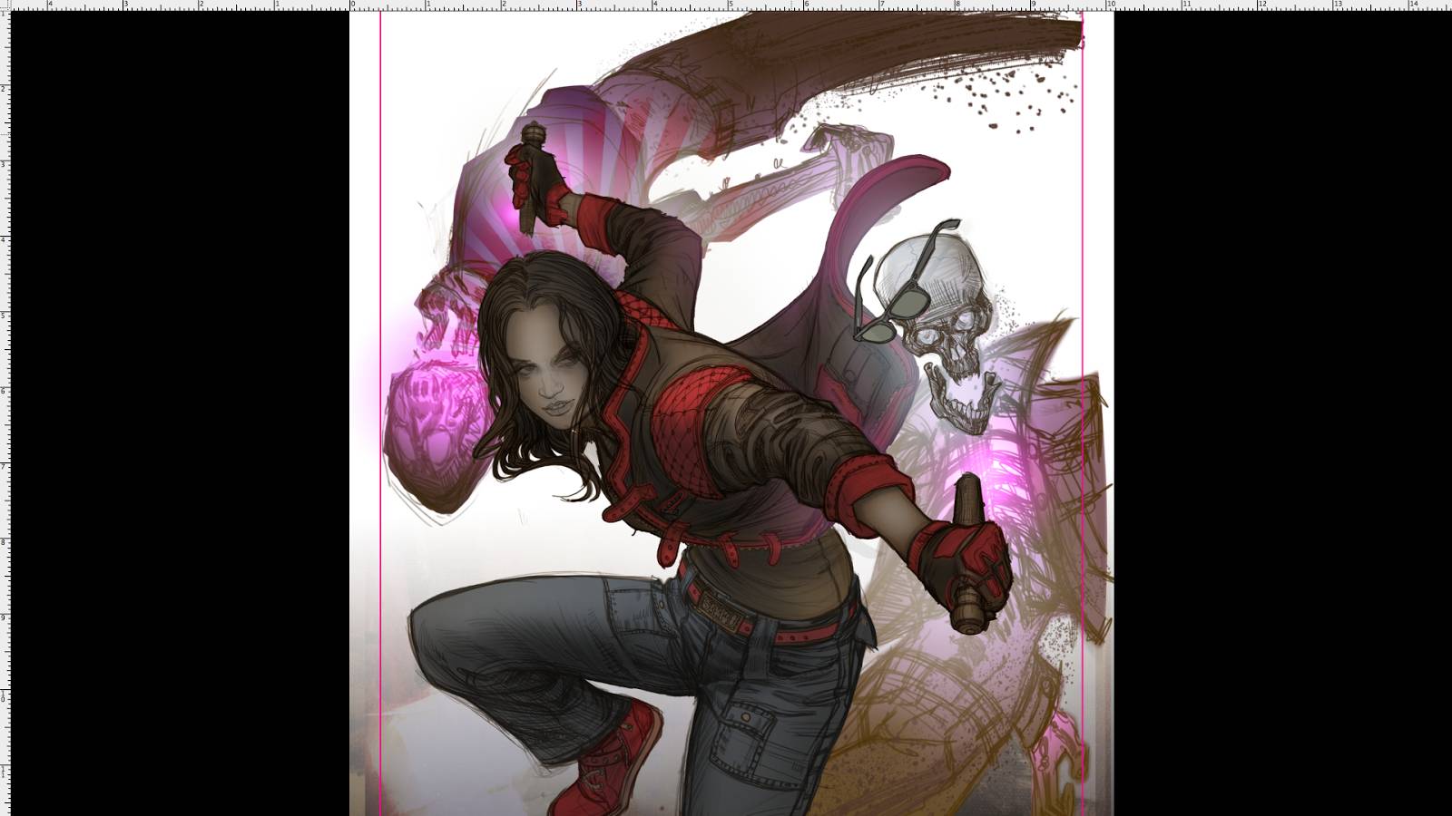
Skull Party! A prime example of not being a slave to ref. I knew I wanted to stretch these skulls. Had I simply lightboxed them I would have lost some of that elastic energy they have.
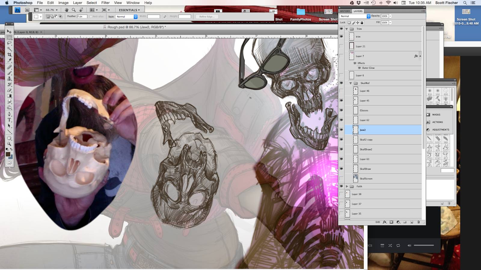
I put the skulls in place and refine their clothes from my imagination. Being a life long metal head it wasn’t too tough to do, I’ve owned a few jean jackets lol! (Horns up!) The tough thing here was how to do a reverse x-ray effect on the skeleton, but also have that ribcage transition to light pink where the stab happens. I just kept working those values back and forth till the balance felt right and it wasn’t too jarring.
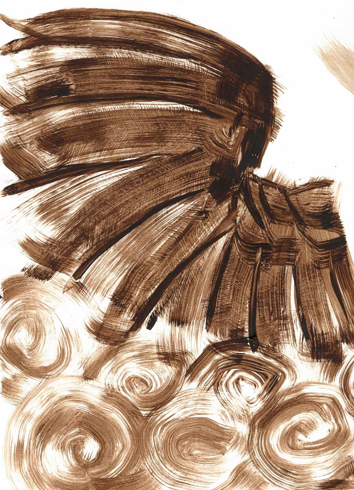
I have these go-to textures I use time and time again. This one was a prepped oil panel my lovely wife Teresa had prepared, and I said, “HOLD IT! I gotta scan that!”
I am using it as an all over texture to add a bit of noise to the surface. Sometimes gentle use of textures can get rid of that Photoshop smell, because it activates otherwise smooth or flat ‘computer-feeling’ areas.
Here is a cool trick. What you see below in grey is the same texture as above, however I have run a ‘High Pass Filter’ on it. ( Find it- Filters/Other/Highpass ) This makes a sort of texture map of it. I set it pretty low. 2 pixel radius or less.
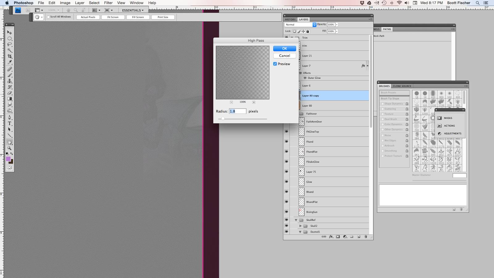
Then all you have is set that layer to ‘overlay’, and you get some yummy subtle texture. I will often erase it a bit over faces if it is too strong.

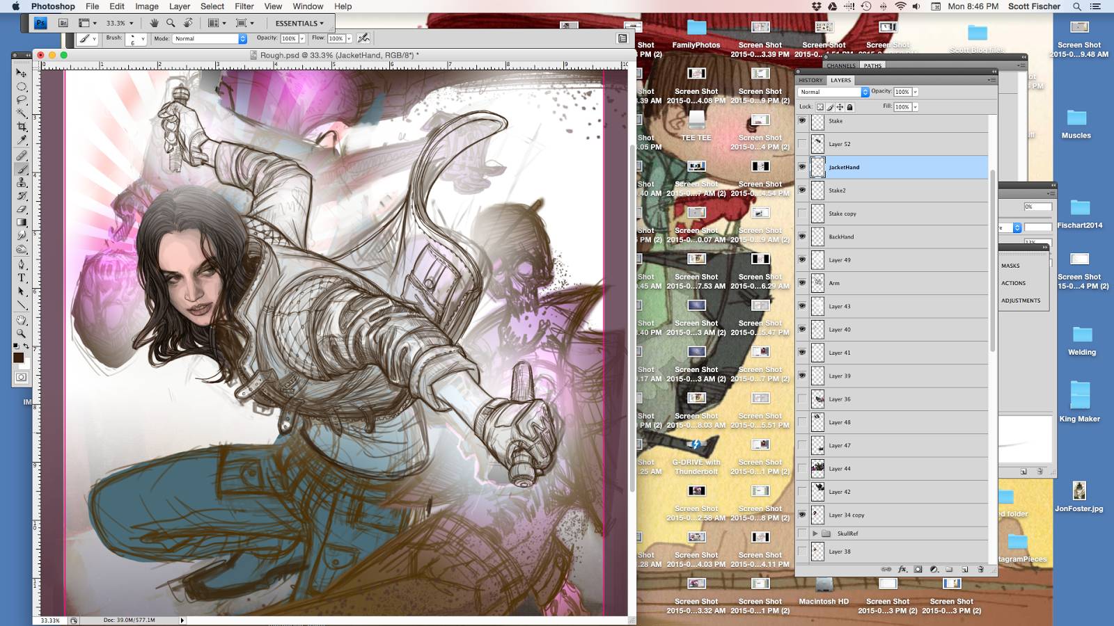
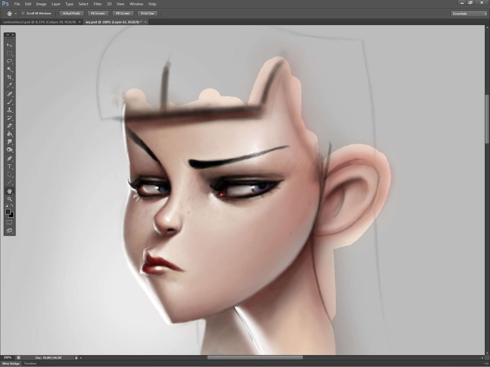
Firming up face now.
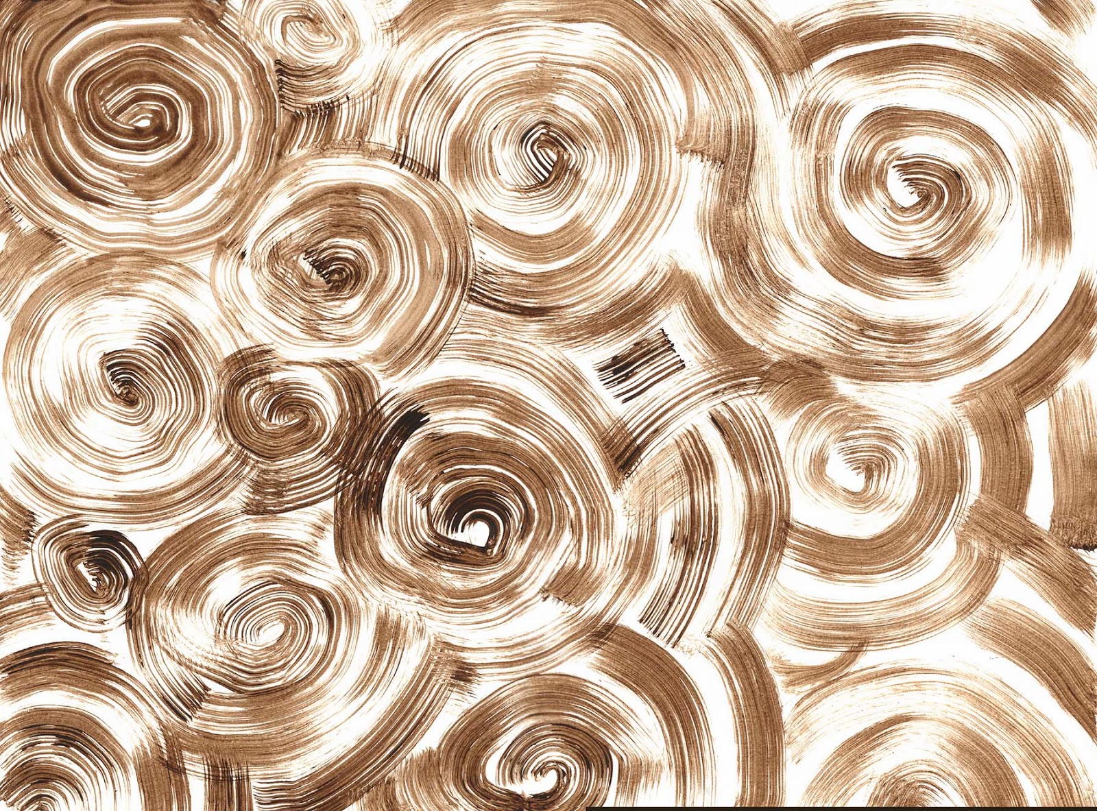
More textures from my vault. Get some pallet paper and some acrylic paint and nasty brushes. Spend a few hours making cool textures and scanning them. Both of these have been applied to the piece to capitalize and enhance the swirling energy. Using combos of softlight and overlay layer settings. It is a shotgun effect where I pretty much try every layer setting taking bits and pieces that I liked from them. I also warp and distort the textures till they do what I want them too. My general rule with tricks: use them, but beat them up once they are on the image.
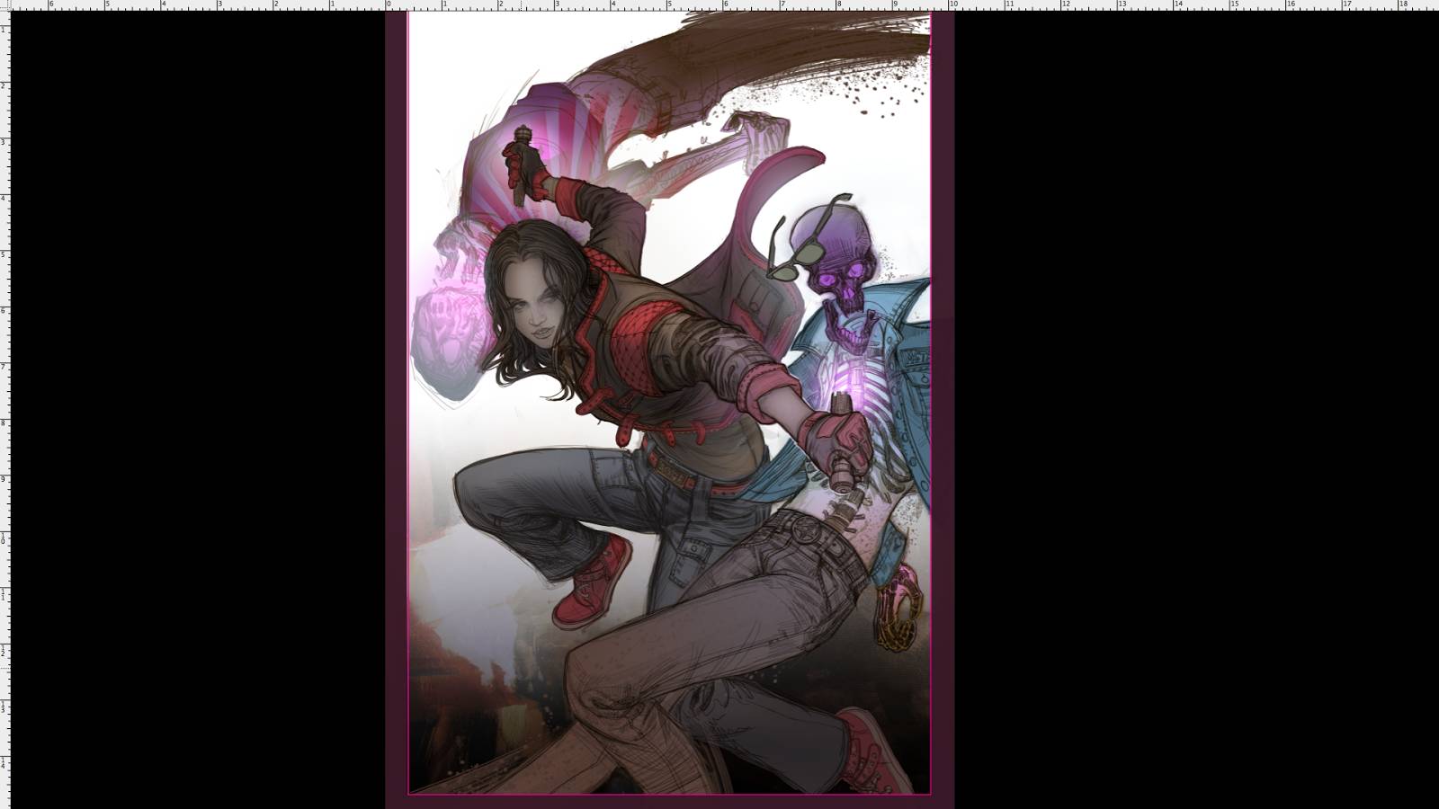
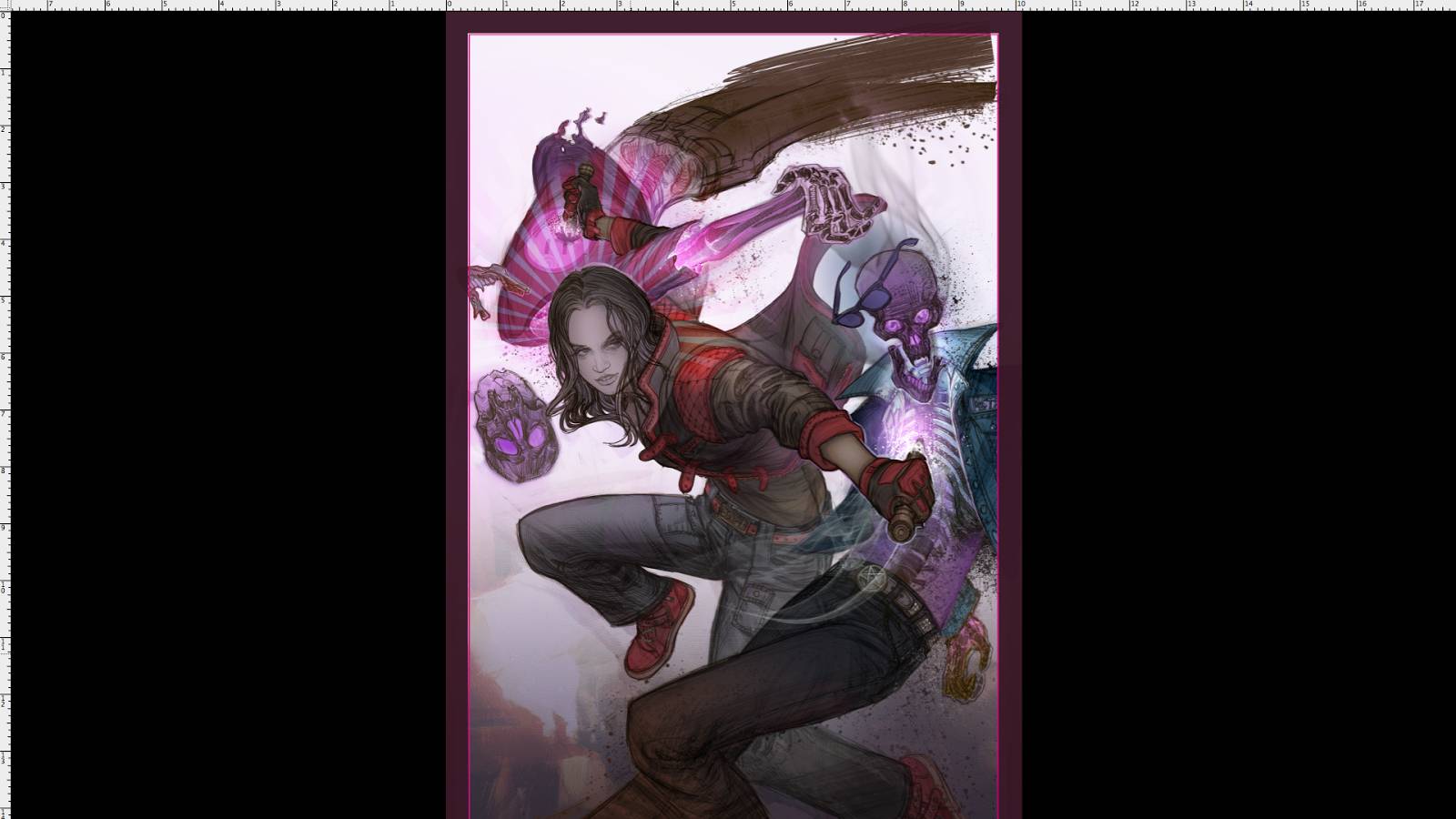
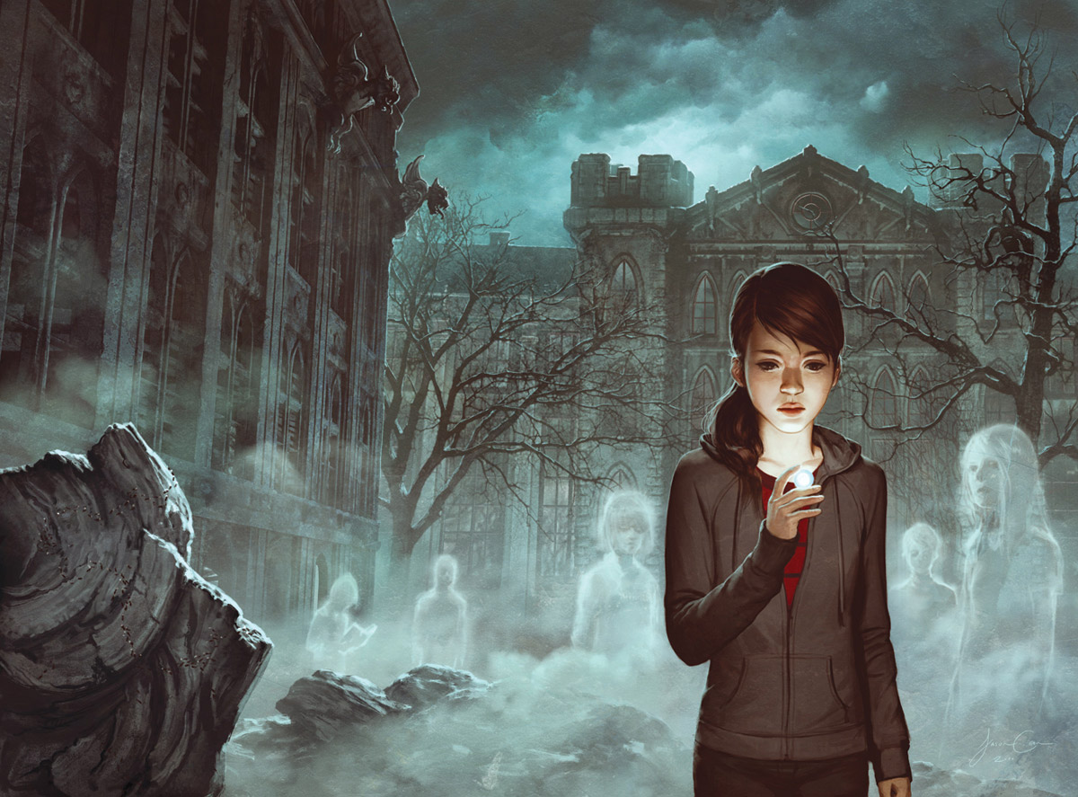
Here is the final. You can see the tight drawing+ loose drawing+ textural smorgasbord coming together. I love that Dark Horse Comics embraces the sketchy energetic side of me. There is a rawness that I love, and I am thankful they don’t make me polish it out too much. This was the approved final art.
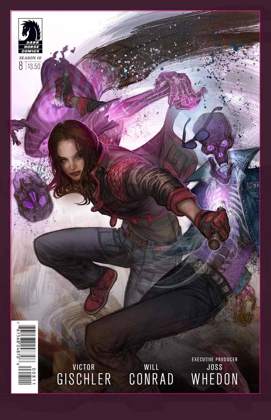
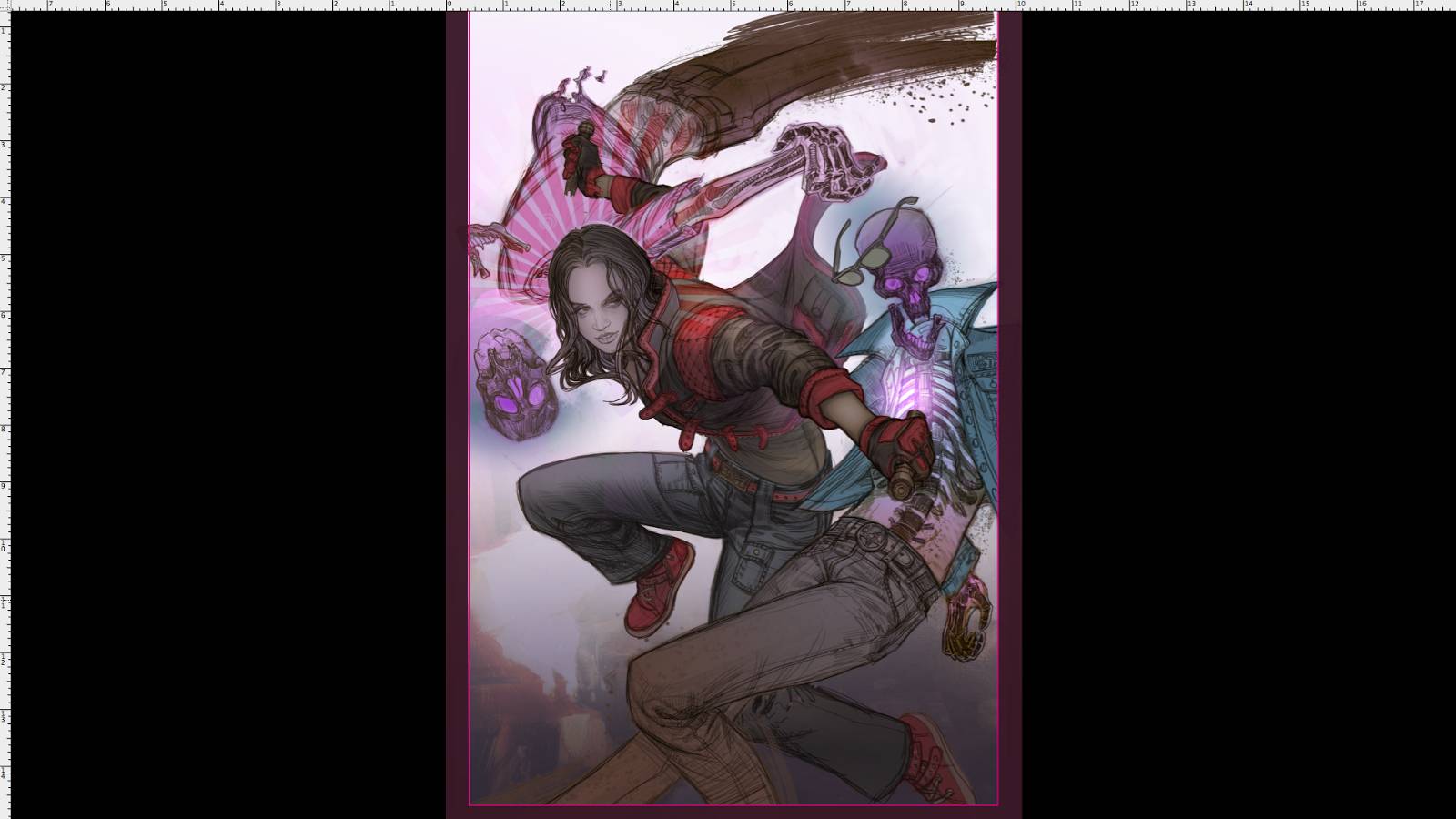
However…. as often happens with me, I was not happy with her face in the final. And even though the piece was finished, approved and invoiced for, I redid it. Cause in the end friends we have to please the client, AND ourselves.
Here is the real final/final. (Unless I mess with it more, lol.)
Thanks for coming on this journey through my digital workflow!

Thank you for sharing! Really enjoyed getting a walk through of your process. You outlined the steps in a very tangible way.
This is so great! I love seeing how you use/adapt the reference and tools to best suit the idea.
Thanks for sharing! This was really informative
Indeed, and the adaptation changes with every new piece. That is part of what makes art fun. If I just did the same steps every painting, it would be much less interesting for me. Every one is a new puzzle!
Glad you got something out of it!
I especially like the “High Pass Filter” tip! I’ve been looking for a simple and quick way to add textures to digital paintings, and this is great! Thanks!
Really nice process post…great skill shown with your capabilities…now for you to hate me if you so desire…the final face is beautiful and well rendered – but for me the expression lacks grit and doesn’t seem to match the action, if that makes sense…looks like she’s peeking around a corner or just caught the punchline to a subtle, slightly sarcastic joke.