Hey hey hey my muddy colorers! Hope you all had a happy 4th of july and celebrated America with minimal powder burns.
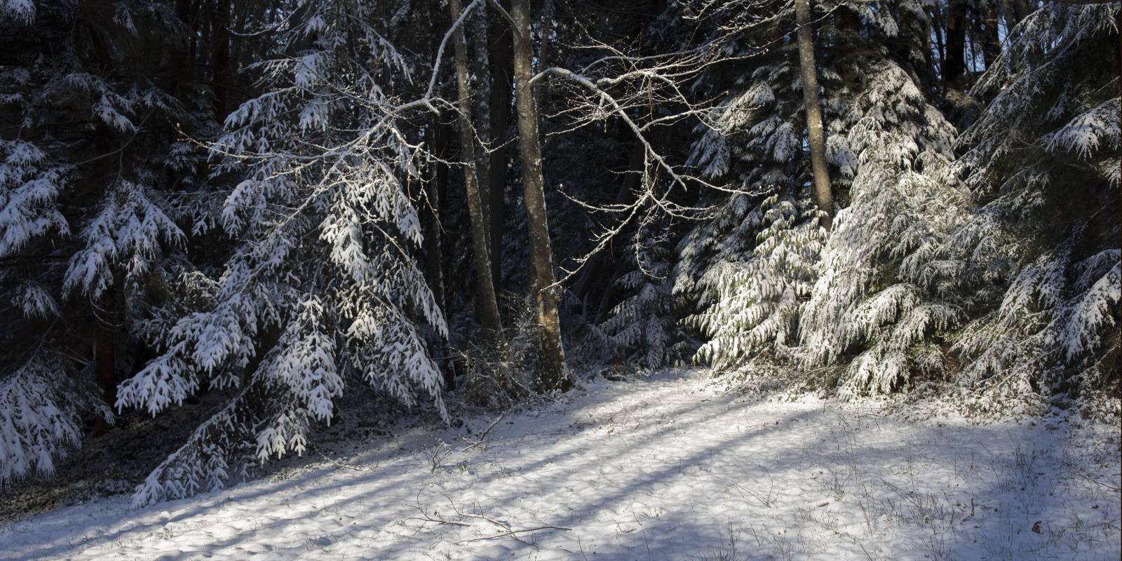
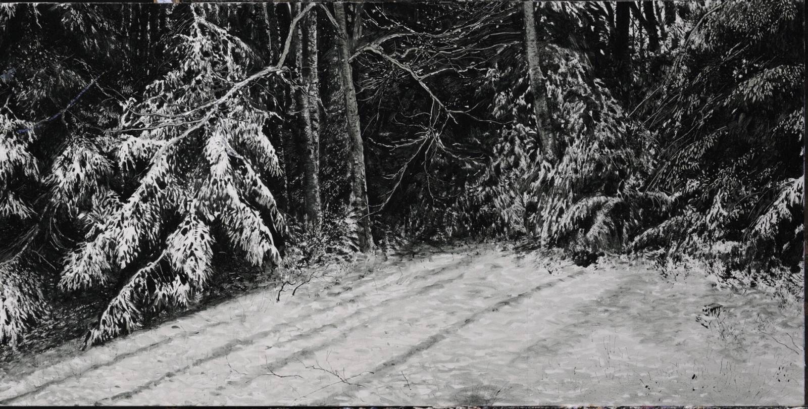
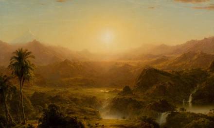
Now that summer is here, and everything is in full bloom, I figured there’d be no better time to sit down and paint a cold ass winter scene. I took this in our backyard last winter. We’re situated close to the water here, but still get snow at least once a year usually. Couldn’t remember the last time I tried to paint snow, and this shot stuck out to me because I liked the composition and it had a few elements that I thought would be fun to tackle.
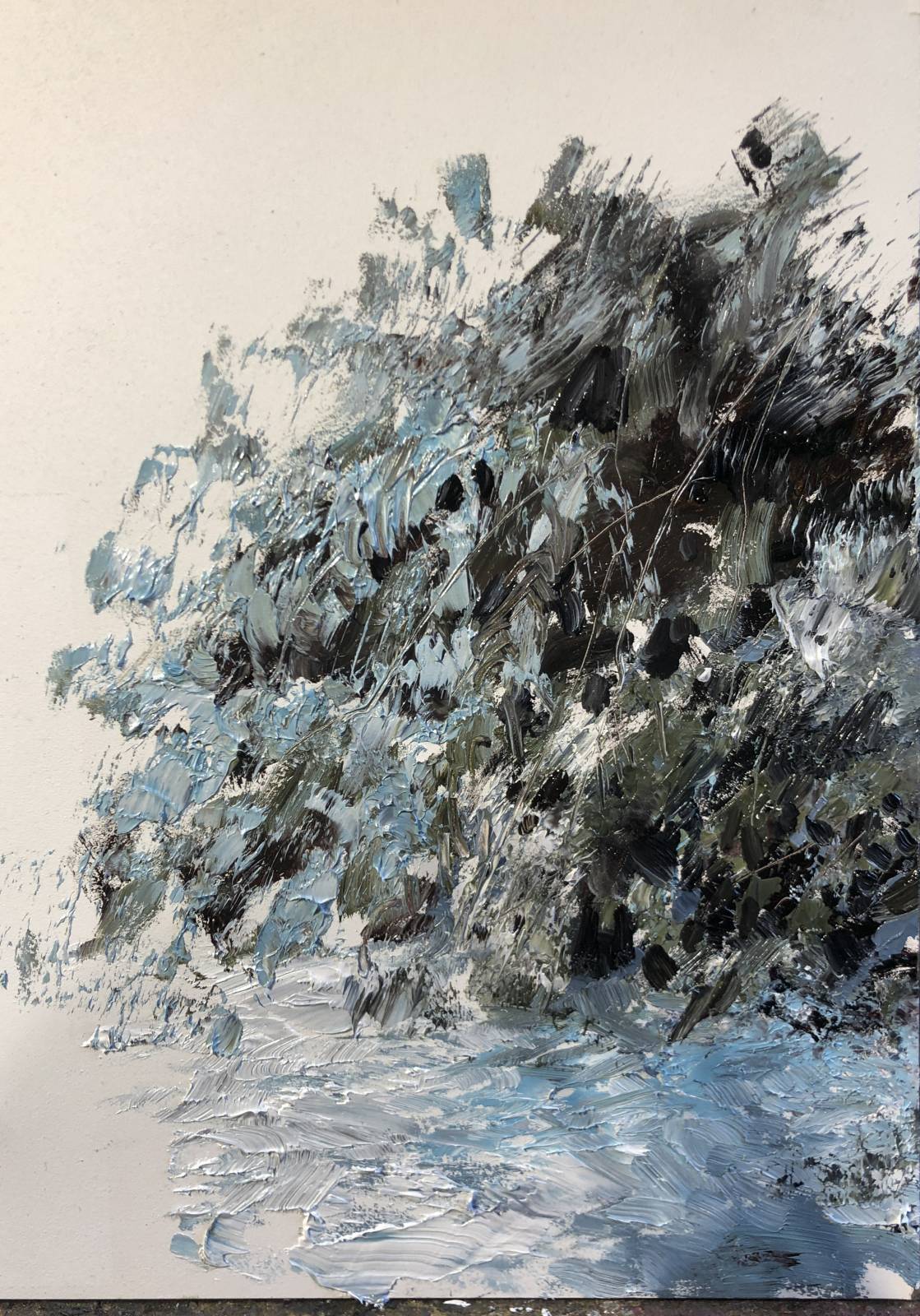
Before starting, I did a quick rough exploring palette and general mark making strategy. This was all wet in wet and done quite quickly, but I wanted to at least test out my color formulas and a basic approach to painting snowy trees. This was a really helpful exercise that gave me the confidence to move forward on the actual scene.
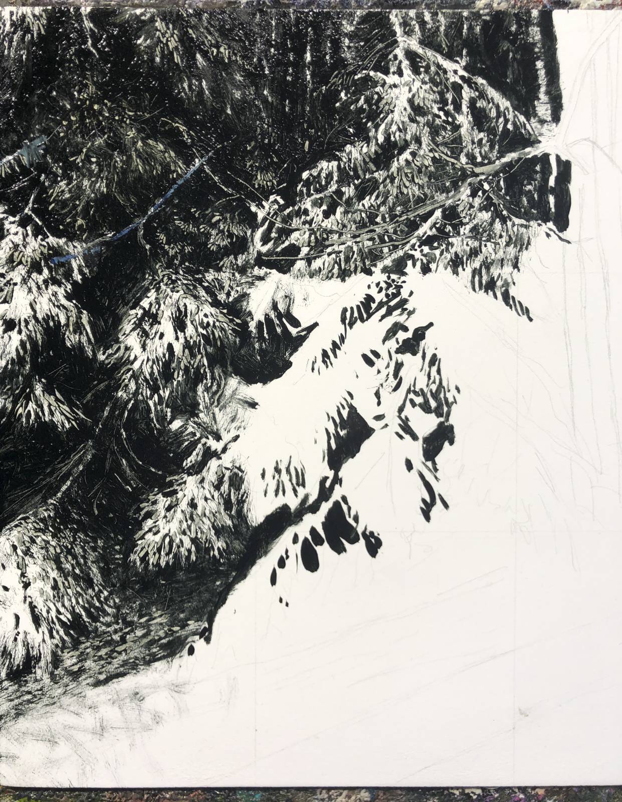
I start these pretty simply, loosely sketching the main shapes onto the panel with a 4h pencil. I use a large grid to keep me centered and things proportional. I’m not slavish about it but just kind of aim for the big stuff, since im just gonna cover it with paint anyway.

I used a mix of payne’s gray and olive green for my underpainting. I usually just use olive green, but wanted to cool it off some for this one. it usually takes weeks for once of these today, but for some reason, mixing payne’s gray into it, it only took like 3 days this time. Super unusual, but hey I’m not complaining. part of that weird paint alchemy thing thats really cool when it works in your favor.
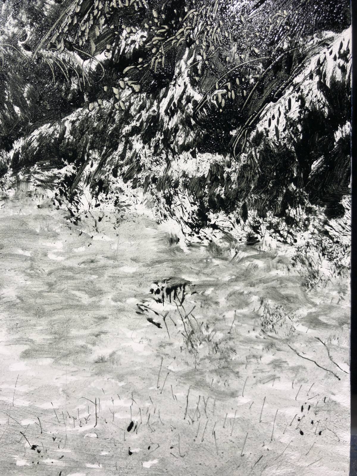
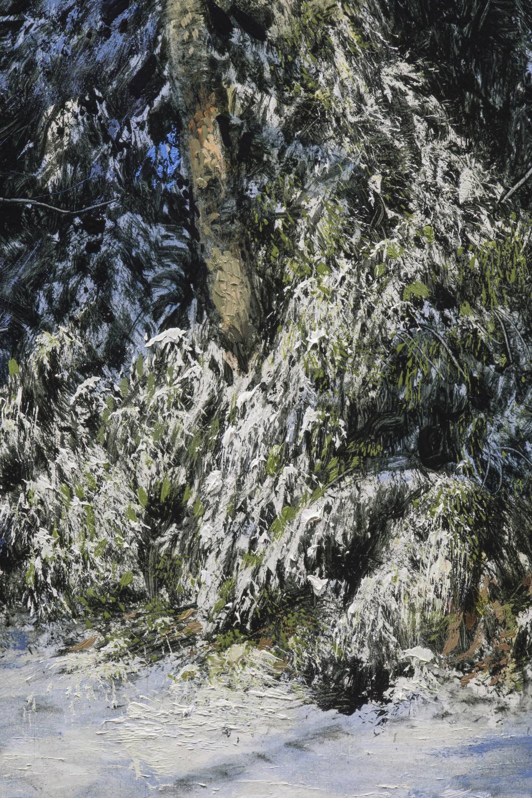
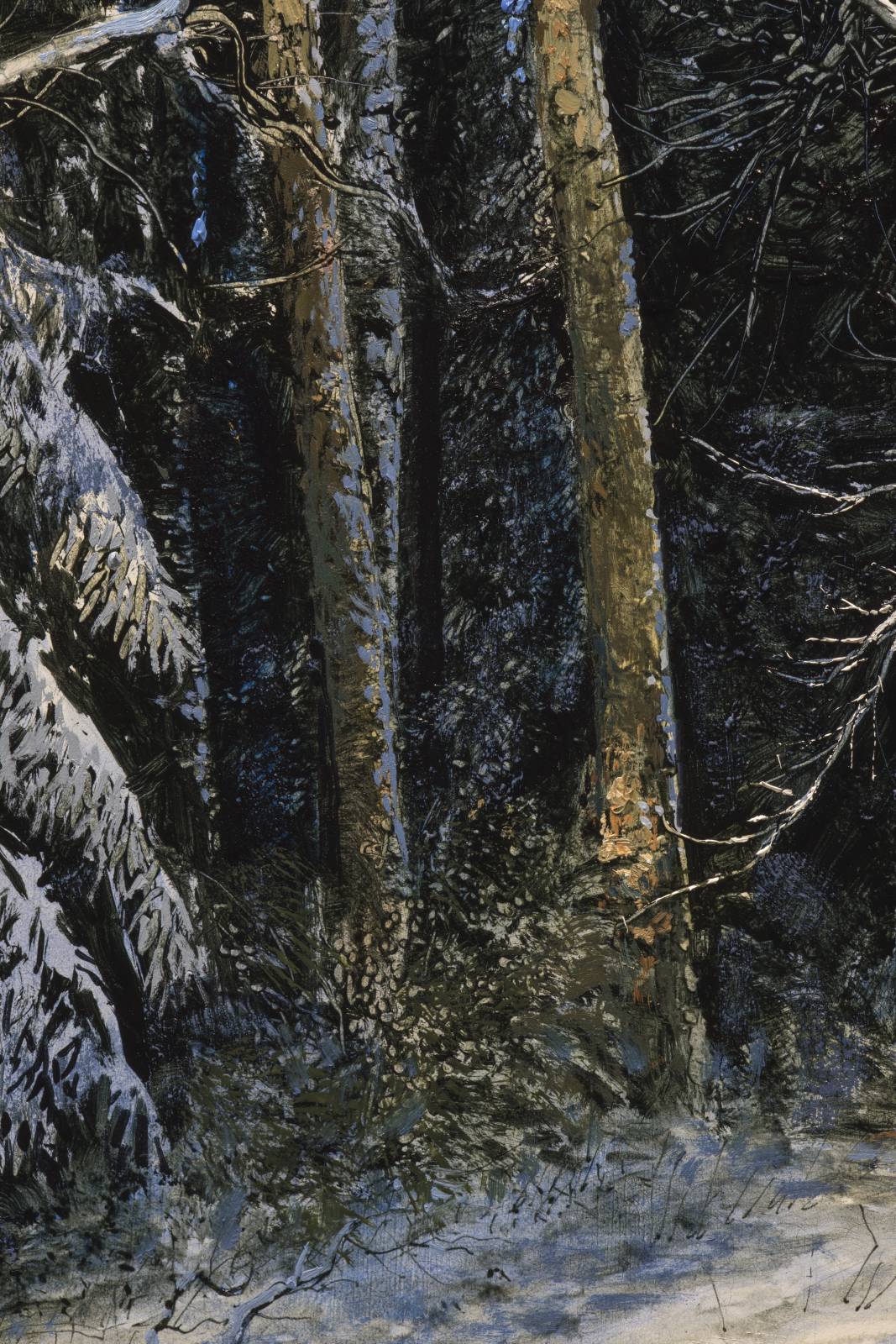
I use hog’s hair bristle brushes to push and scratch into the paint quite a bit. It’s all about mark making at this stage, and my aim is to simplify and find fun ways to interpret the reference. I’ll use lots of beat up old brushes, rollers, scrapers, brush handles, anything to get effects that can best help describe the source imagery. I was using a dip pen to scratch twigs back into the shadows, and ended up loading it with diluted paint to draw a lot of the small blades of grass penetrating the surface of the snow in the foreground. I hadn’t ever used oil paint as ink. It worked really well! And in fact, I’m gonna try it again when I revisit that area.
I try to approach these nature scenes similarly to how I’d approach painting a portrait from reference, where I’m shooting for likeness, but will take liberties and abbreviate where I think it helps to make a better picture. This underpainting step is totally the most important part of the process, as it locks everything in for all subsequent layers, and I also let a lot of it show through in the final…wherever I can get away with it.
Once it’s dry to the touch, it’s time to go in and glaze some color into it. Here’s a video I took of the glazing process. I use a mixture of alkyd, odorless spirits and a touch fo linseed oil and apply it thinly with soft brushes. This is a very satisfying step where it really starts to come together. I try not to get too detailed rather just aim for local colors. Less is more. Also, it’s better to apply three thin coats with very little paint than one heavy coat that smothers the details. I got this one pretty close with one pass, but sometimes I’ll do two sittings. whatever works :D…
The glaze dries usually in about 24 hours, and once it’s at least tacky I start in with opaque paint. Adjusting, embellishing, and redrawing, I’ll really start laying thicker impasto style paint in this stage, always paying close attention to the values. Colors can skew and drift a little, but the values need to be as close as possible to help sell the illusion of realism. Here’s where it’s currently at:
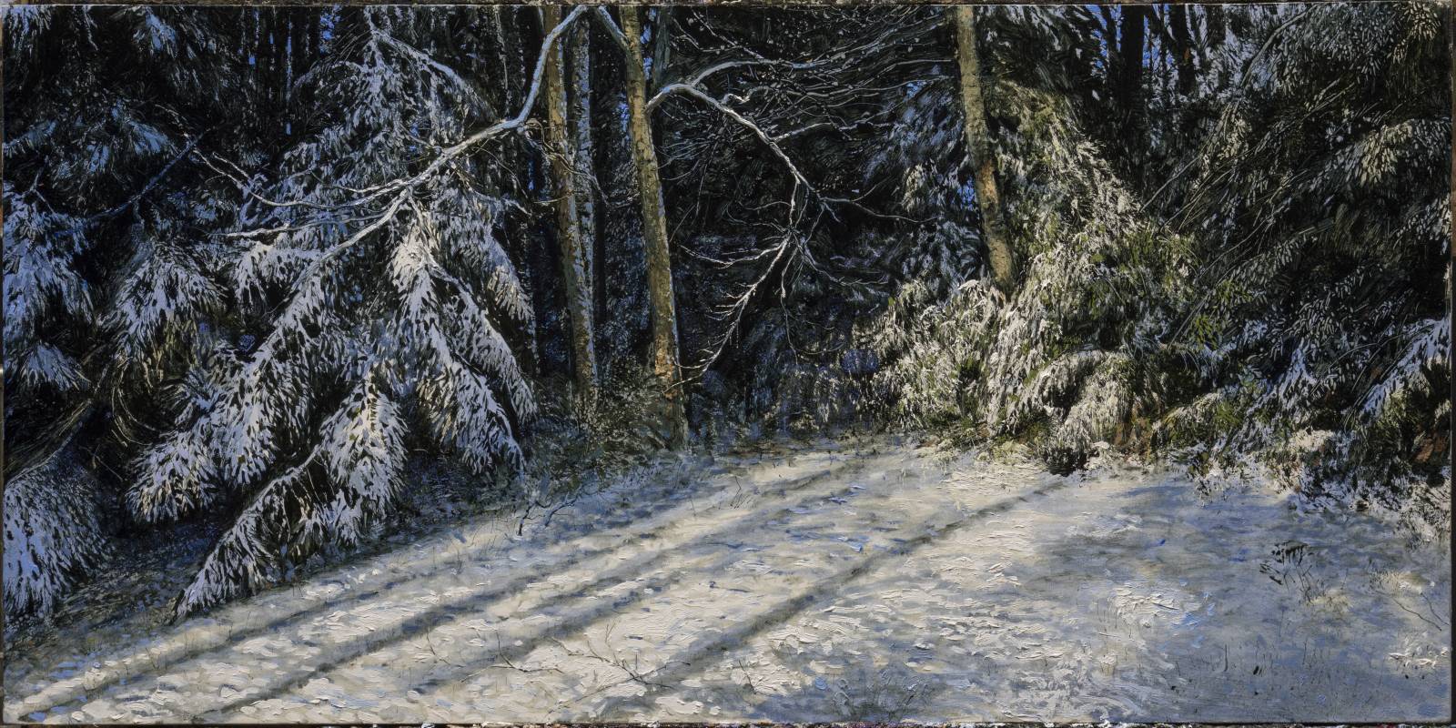
I feel like I always have a painting at around 75% when its my time to do one of these posts. I should plan better. I’ll post the final next month (hopefully :))
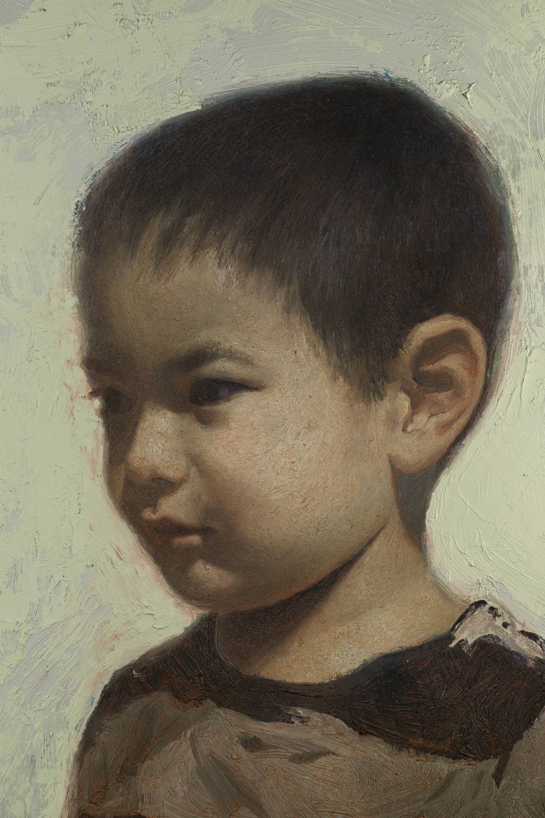
Also painted this portrait of my younger son, Milton a couple weeks ago. Started it pretty directly, painting it wet in wet over the course of a couple of days. Tried to be a bit more intentional in terms of my stroke direction to help describe volumes, and also because I planned to do a bunch of glazing and didn’t want to have to fight with weird brush marks down the road.
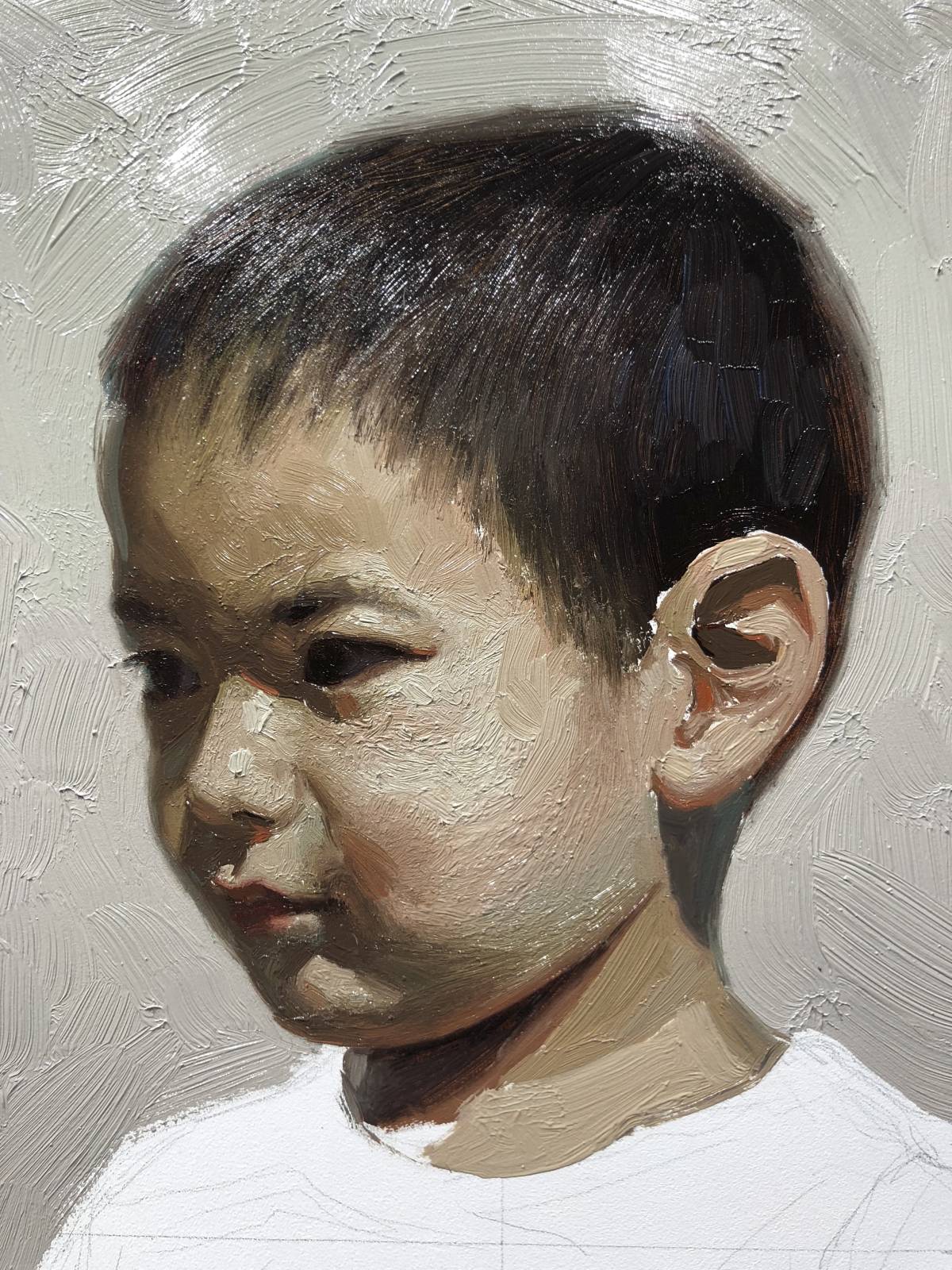
Once dry, I applied a light wash of unbleached titanium white across the whole thing to even the values out a bit more. Kind of scary, but ended up being happy with the result. It put some “air” in those shadows and brought out a bunch of detail on the hair.
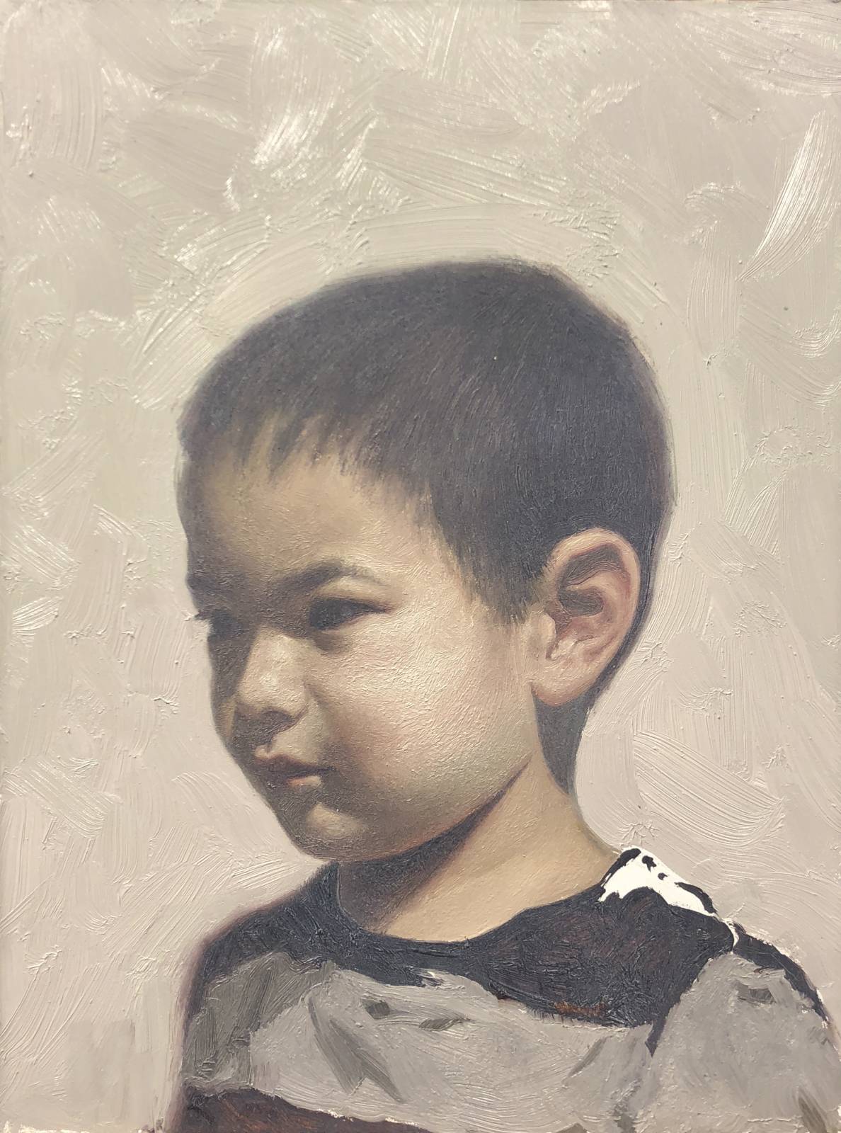
Once dry, and After some further opaque repainting and adjusting here and there, I applied a thin glaze of olive green mixed with a touch of payne’s gray to harmonize things a bit more. It can look kind of crazy when you first lay a glaze on, but don’t freak out! It will thin out and soften some as it sets.
This glaze left it a bit dark and dead looking,

so I washed the whole thing with s very light wash of cadmium red scarlet. This helped a ton to breathe some life back into him.
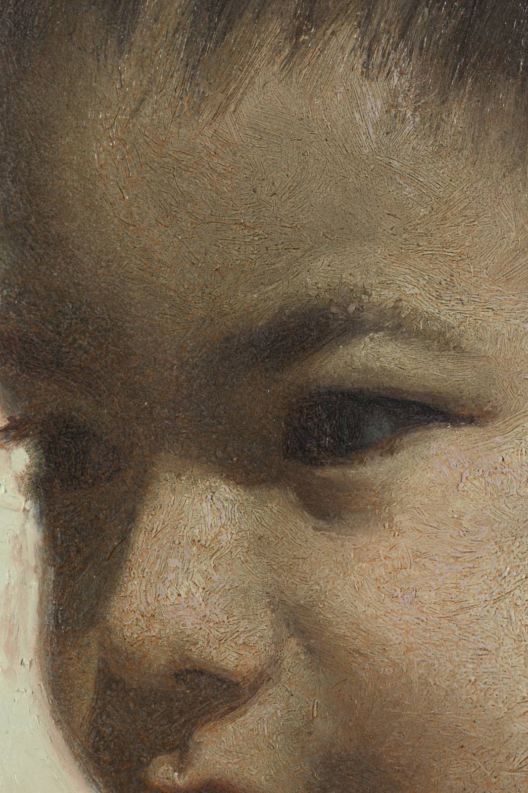
After a bit more adjusting and detailing, I called it done. This was a fun one and the approach gave me some new ideas I want to attempt on more ambitious future efforts.

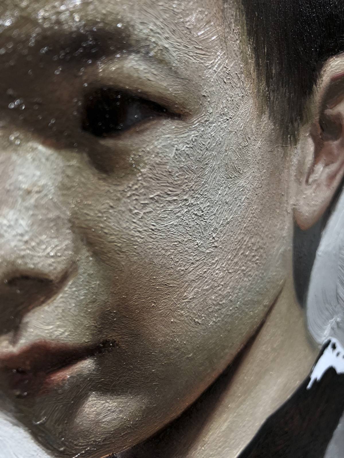
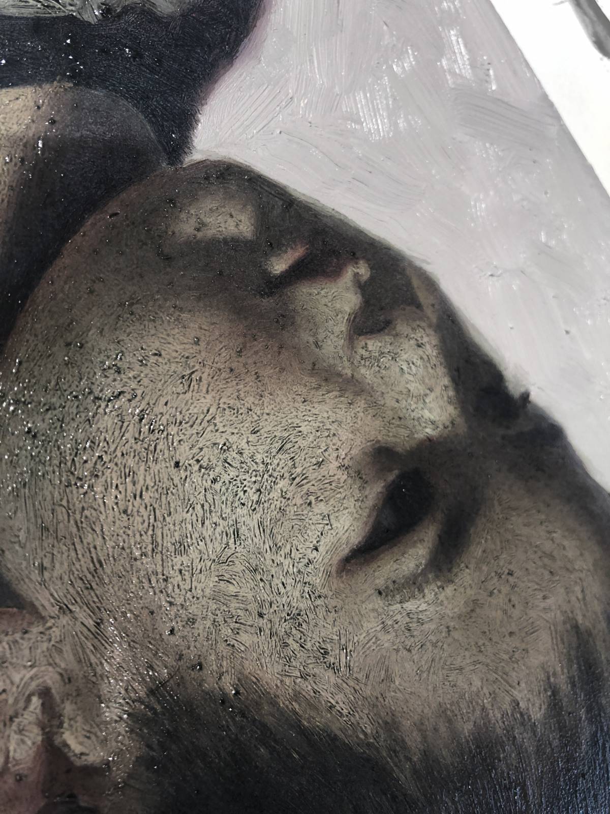
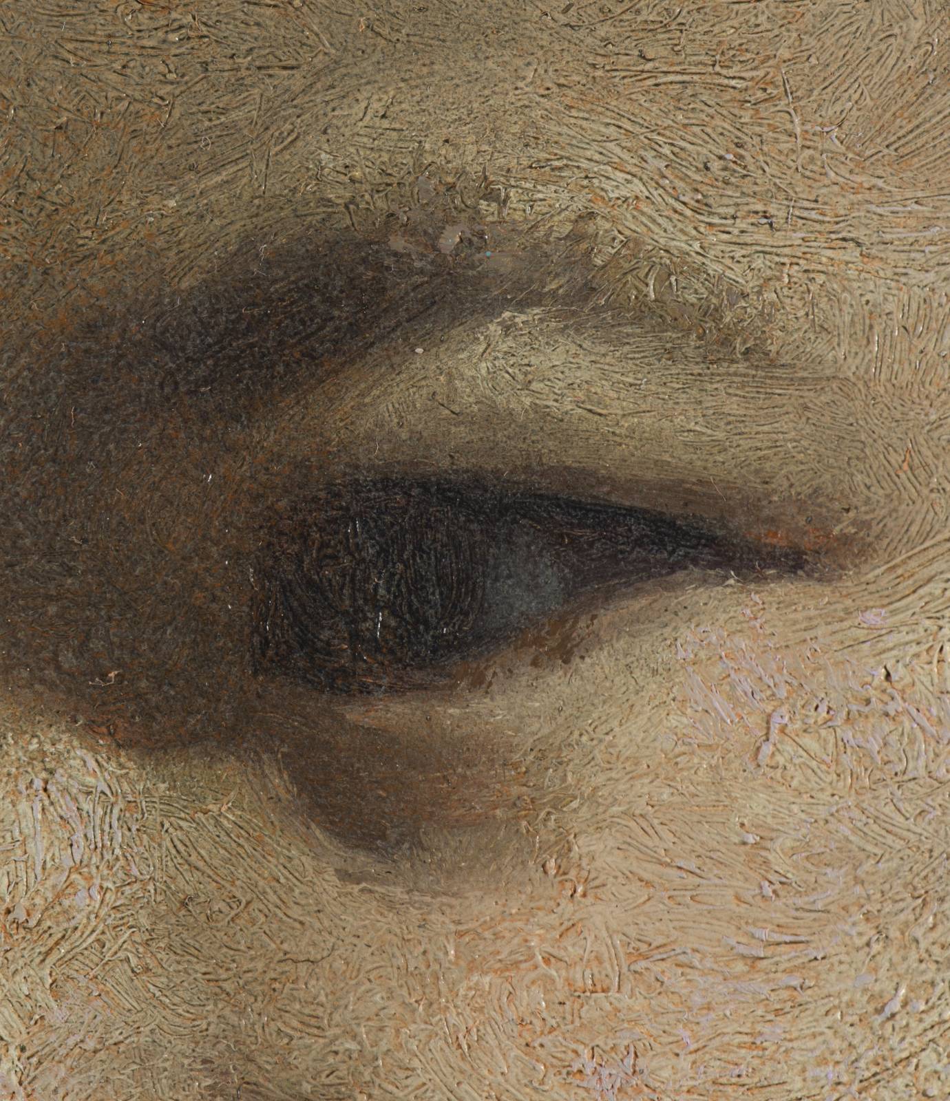
Even though I’ve never worked in oils, you’re one of my favorite contributors here at MC! I love the attention to markmaking and subtle color effects. The super close-ups of your brushwork are delicious – and informative.
thanks so much! Oil painting is without a doubt my favorite medium. its depth is just endless. 20 years in and I feel like ive barely scratched the surface of whats possible with it. Glad you like these posts.
Thank you for sharing! I hope you didn’t mention in the video…I couldn’t watch it where I am at reading the post now… How large was the canvas that you did the winter scene on? What medium are you using to glaze?
Thanks!
hey! its painted on a 12×24 inch birch panel, primed and sanded with gesso. the medium i use is about 60% galkyd, 30%odorless spirits, and 10% refined linseed oil.
Hello Justin,
Great work, loved to see the process! After working digitally for quite some years now, I recently discovered oils. Loving it!
Do you always put the oils that thick? For texture purposes?
Thank you,
Lino