-By Dan dos Santos
A little while ago I was commissioned to do the cover to an Urban Fantasy anthology called ‘The Wild Side’. One of the great things about anthologies is that you tend to have a lot more freedom with the subject matter, since you need to capture the flavor of multiple stories. In this case, the Art Director gave me an unprecedented amount freedom, and let me do whatever I wanted, provided that the image screamed of ‘urban fantasy’ and had a strong sex appeal.
I actually struggled with the concept way more than I thought I would, most likely because I had TOO much freedom… I just didn’t know where to start. I am definitely one of those people that comes up with more creative solutions when I have a few restrictions to push against. Eventually I just started drawing every UF cliche I could think of; tattoos, guns, breasts, vampires, alleyways, etc. Before I knew it, this was what came of it.

At the time, I was drooling over Petar Meseldzija’s colors, and thought I would try out his process on this piece. He had mentioned to me at IlluXcon that he starts his pieces with a reddish-umber underpainting. Since this was before he had started his blog, I had no idea what color he really meant, so I guessed… It turns out I was WAY off. My underpainting was really saturated, and caused a lot of problems for me, but it also provided me with some unpredictable (and pretty cool) results.

I was able to throw absolute mud on top of the orange underpainting, and it created a very weird sense of depth. The cool/warm contrast made the upper layer absolutely vibrate off the surface. It doesn’t come through very well in this photo, but in real life, it almost hurt my eyes.

It took a few coats to finally cool down the faces to where they needed to be. But ultimately, the orange underpainting served me well. I managed to get a really intense sense of light by just letting the underpainting show through.
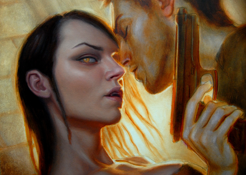
I knew my composition was going to require some unusual type placement, so I included some sample type in my sketch. The client actually liked it enough, that they decided to let me do the final type as well. That gave me the opportunity to really cater the image to the suit the design, like leaving the forearm area really simple and dropped into shadow so that the type would pop more. It is really rare that I am given this much freedom for a commercial commission.


That is quite an excellent amount of boobage! I like the very orange plane under their jaws. What colours did you use in the cold parts of the skin?
God damn, Dan! This is an awesome post. I love the heat radiating off of this one 😉 Thanks for sharing the progress shots.
Ah, the glory of a really bitchin' underpainting. Great piece Dan.
Hold it…I had to peel my eyes away from the lady's bust. Anyway, the dark figures and the lighter foreground does work. Plus I noticed you rimmed the characters with a warm color (the light from the background). That can he a handy trick to stop a work from looking monochromatic.
A real intensity to the colors, and I love, LOVE the design feel this has 🙂
Artist and graphic designer in one, pretty rare to have such a strong feel for both equally.
Wow! Beautiful from conception to completion! Having seen the richness of color in your paintings firsthand I can only imagine how vibrant and crisp the original is. Gorgeous work Dan!
I would say…Espectacular!
awesomesauce!
love it.
That post is great, really. Not only because of the tutorial, but because for me that is one of your best covers.
Is hard to get a cool illustration using a few colors on the palette, and you did it.
I bought your DVD tutorial, and I learn so much, I wish I could have access to these information way before, I will be cover artist right now if I had it.
Hey, but never is too late to start isin´t?
Thanks for the post and for the Blog, is a great place for artist learn.
And congrats for the cover.
That looks awesome, you always create amazing light in your pieces. I learned much from your dvd and the progress shots are very helpful in painting in a different direction.
I saw this post this morning and my brain broke a little at how amazing it is and how long i have until i get anywhere CLOSE to the magnificence of this piece. It is totally awe inspiring and lovely.
Thank you so much for sharing this with us.
Really interesting process, and a great result – thanks for sharing this, Dan.
Great piece. I was glad to hear about the problem of too much freedom of subject. I thought that was just me. Thanks for sharing.
Fred
Wow, amazing art, thank you for sharing! I still can't believe you work traditionally.
I just had to comment. I was looking through the images on your portfolio site, and this one really grabbed me. Man, this illustration/painting really sizzles!!! Amazing work.
You created some amazing constrast between warn and cool. I wish I could see this artwork in person. Thanks for sharing and for the steps pictures. You are a very talented artist.