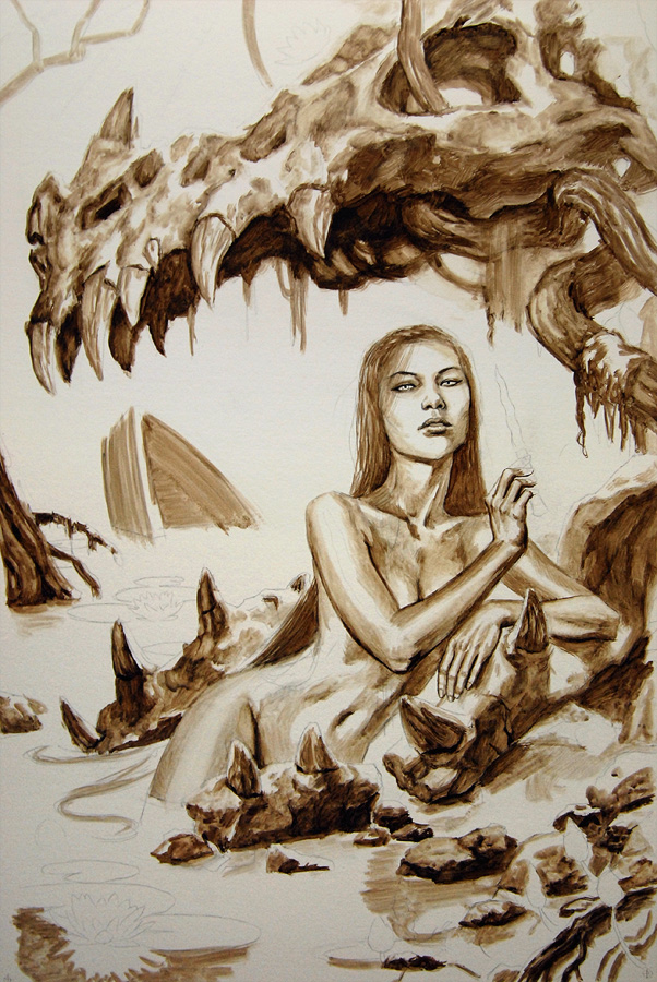
Here’s a new cover of mine that just went public. Aside from the glint on the switchblade and a few color adjustments, it’s all oil paint. The original measures roughly 20×30 inches on illustration board.

This was a really fun job (for somewhat obvious reasons), but was also one of those assignments that took far longer than expected. In fact, I’m still feeling the repercussions of having gone well over my deadline. Unfortunately, I had to cut things short, so there are still quite a few areas I am unhappy with. I expect I will revisit the piece soon to fix some of those errors.
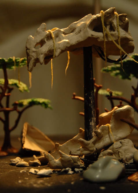
I was uncertain of some of the lighting I had in my sketch, so I decided to make a quick maquette of the dragon skull to aid me.
Here’s a few progress pics of the acrylic lay-in, and a quick scrub of oils over said lay-in. The lay-in was more detailed than usual, but it’s texture really showed through the oils and did a lot of the work for me.

And lastly, the final image with type treatment.


Awesome stuff as always Dan 🙂 Congrats on the Hugo nomination as well!
-J
Cool! Really like the texture on the dragon skull. And love the Maquette setup. I need to get into sculpting out my scenes more. Thanks for posting this.
Very cool looking, what did you use to make the maquette?
Cool painting and nice maquette:) Really unifies the whole piece.
Beautiful work. Thanks for posting.
Just out of curiosity and if you can/will tell us, why did the painting go over the deadline.
PS nice, kinda cute for a nekid goddess in a skull in a swamp 😉
Damn fine work! I am amazed by the job you did blending the water into the sky, it looks like two separate entities and still flows naturally together. I am also very fond of the skin tones in her stomach, but hey, can you blame me?
@ Felipe:
I used WED clay. It's what we used in Jordu's sculpture workshop and I had some left over. It's stay wet and pliable for a very long time.
@BadDaddy:
I don't really know why. I guess it was a combination of underestimating the amount of details I had to paint (my backgrounds aren't usually that important), and struggling with the colors a bit. My original sketch looked pretty scary, and the AD didn't like it. It needed a supernatural vibe, but not 'horror'. I did a lot of different color studies until I stumbled onto this one, which seemed to strike a nice balance of eeriness and femininity. Before I knew it, days had gone by and I'd fallen behind!
When you paint oil over acrylic on illustration board, do you seal the board in any way? And do you use glazes or lay it on thick? A combination perhaps?
That maquette is ADORABLE.
@Akeley:
I usually seal the pencils prior to the acrylic lay-in. No need to do it twice. As for the oils, it's right in between. I keep the paint pretty lean at first, but scrub it pretty thin, creating a semi-transparent coat. I then add opacity gradually. Afterwards, I will adjust with glazes.
As a follow on from my first question and your answer how did the AD react to missing the deadline since everyone is always going on about NEVER MISS A DEADLINE 😉
Thanks
Another beautiful painting Dan! This is another one of those novel series that I started reading specifically because you had done the cover art. I enjoy the series on its own, but awesome cover art always helps! There was something bugging me with the actual cover with typeface on it, which took me a few looks to figure out. The “ch” covers her stomach/belly button! I like it much better with that part visible…super sexy! 🙂
@Baddaddy:
Most of my deadlines are -MY- deadlines. I schedule myself a certain amount of time for each job. So even though I was late for the date I had specified, it didn't really affect the AD. He didn't need the art until much later.
@Erik:
I agree. The drop shadow from the type also does some weird things to her hip. I can't complain though. They were likely trying to play it safe and cover as much of her body as possible.
I sure wish you'd publish an art book of your work…
Re, Dropshadows:
I think they should have left them off too. With the way the ones for the “W” the “I” and the “T” merge, it looks like she's got a badly done tattoo of something there.
It's a fabulous cover, and I'm proud to have it on my book … would love to see the more horrific version you initially submitted.
I really love this cover! Great job!
Awesome! Love the maquette.