I am rummaging around the studio searching for sketches and colour comps to put into my upcoming artbook, when I discovered these…
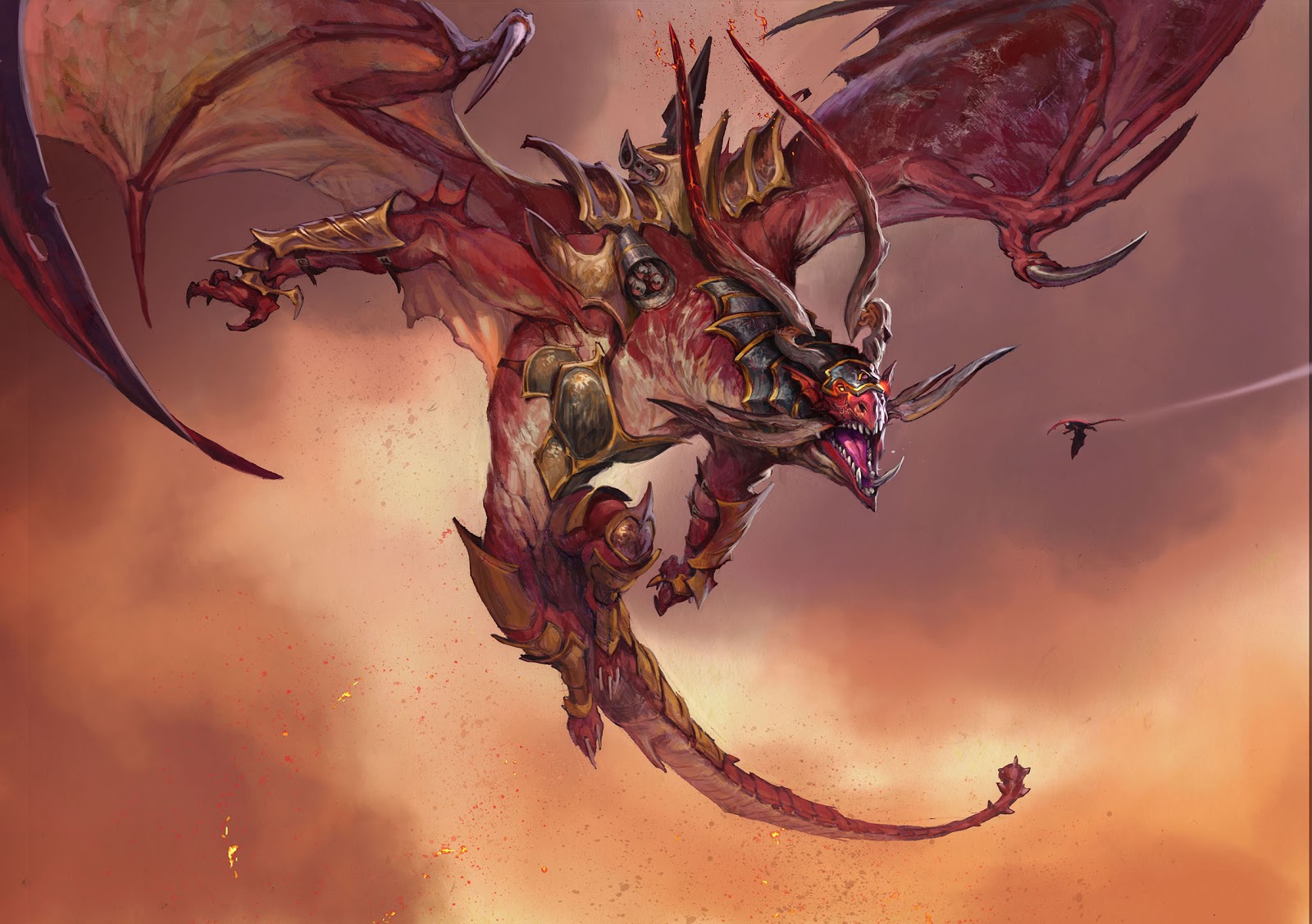
The Goblin Tunneler is a magic card illustration from a while ago, but it is still one of my favourite illustrations. One of the reasons is, that it is pretty simple and straight forward in the design and composition. The description was short: A goblin with a hacking tool who has dug himself out of a tunnel. But what I really like about this specific work is that the brushstrokes are very loose and chunky but still precise and accurate. the care-free randomness of dots and the simplicity of the rendering of details makes this stand out. When I was finished I took this piece and put it up on my board in front of my desk. “This is what you are steering at from now on, Jesper”, I said to myself. “Simplicity and effortless-ness”( is that even a word?). Well 2 paintings later I was back at rendering too many details and adding way too busy backgrounds. But as an artistic steering point, he is still up there on the wall looking down at me with the mattock.
It is always hard to achieve that easiness while painting, since there is so many balls to juggle in a painting. When you have to clean up composition, create color themes, paint a perfect hand gesture and solve light issues, the mind easily panics and gets frustrated. When it succeed and I enters that stage of careless painting that allows me to act and paint without thinking, it is not until afterwards that I realize that it went well. While in it, it just flows without thinking. I wish there was a way of automatically enter that stage. Until science figures that out, I have invented a system to grease myself into that feeling more often. It is called: Hard Work.
When you have a tight drawing with nothing insecure to fix, when you have a solid colour rough, you have already cleared the way for easy painting. The less you have to worry about, the more focus left for painting.
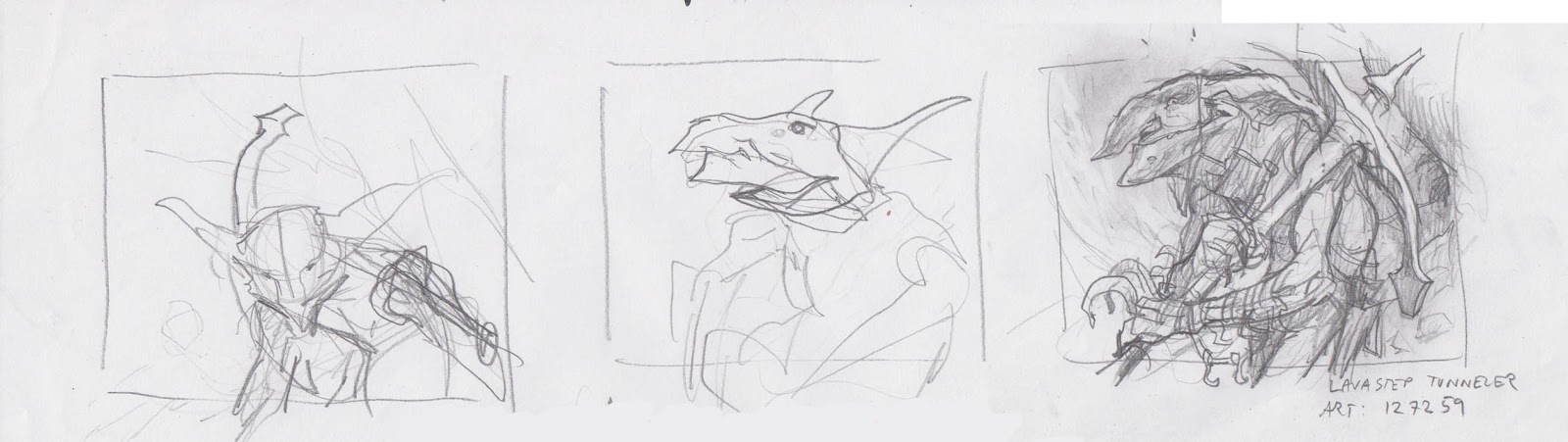
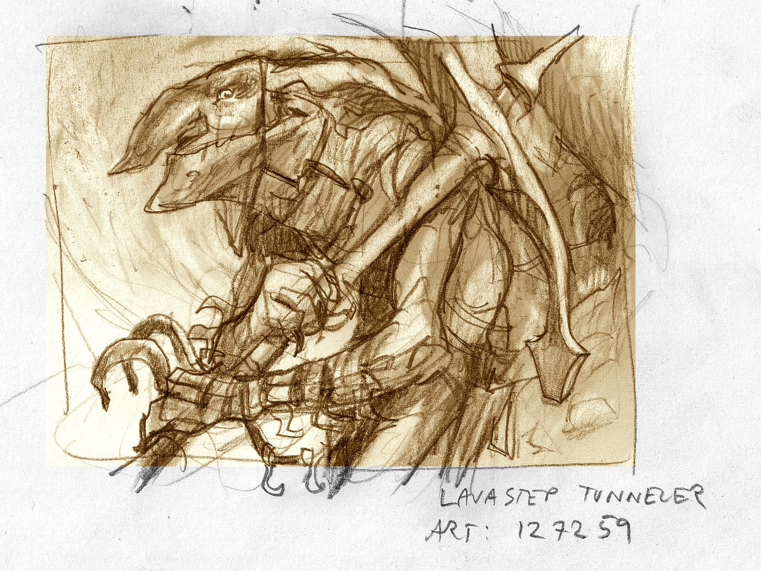
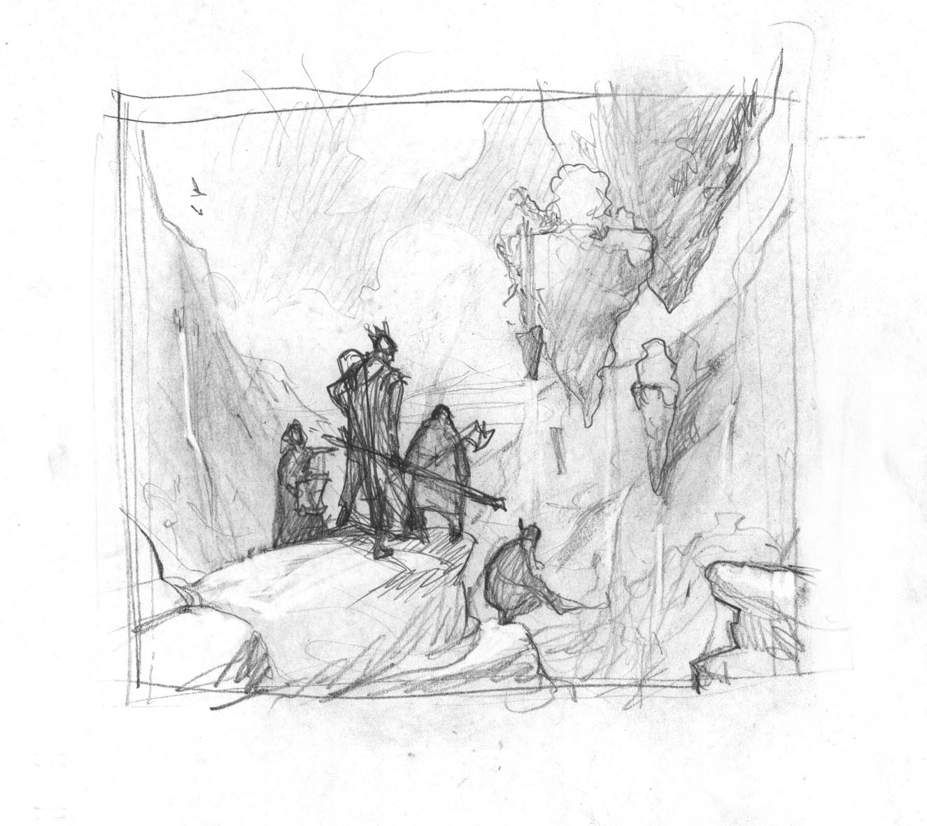
With this goblin I quickly abandoned boring ideas and as soon as I hit something usable, I put in some values to establish depth. I am not the kind of artist who enjoys sketching. I stop as soon as I am almost able to see what I am doing and then I would rather do the rest in transferring or in the final drawing than having to draw things twice. So this thumb I sent for approval and transferred it as soon as I got a “Go”, from the art director.
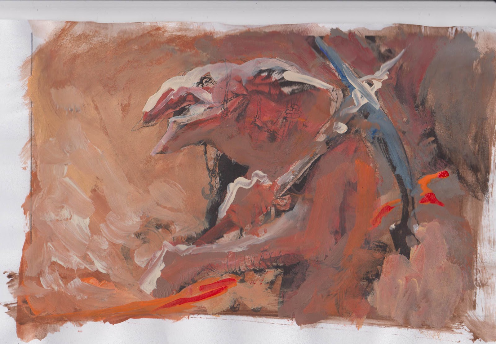
The colour rough does one thing. It secures me in my thoughts that these colours in my head will work together. The grey/brown to the right is added to have a easy area to soak up some of the intense warm colours and acts as a temperature contrast to the yellow and orange. Without any cold colour or neutral grey the image would seem flat.
The background I painted while the figure was masked out, using frisket film. I used a very broad flat brush size 16 to keep myself away from doing too many details.
While painting I realized that the very red cliffs from my colour test would be too heavy and would collide with the figure, so I changed it to greyish orange. at some point I could no longer keep myself from peeling away the film, because I wanted desperately to paint the figure. I promised myself to go back and clean up and render the rocks in the background, but for now I just needed to do some of the focal points.
I never got back. When the figure was done the simplicity of the background and the rough – almost out of focus – of the rocks in the left side and the bottom works perfectly.
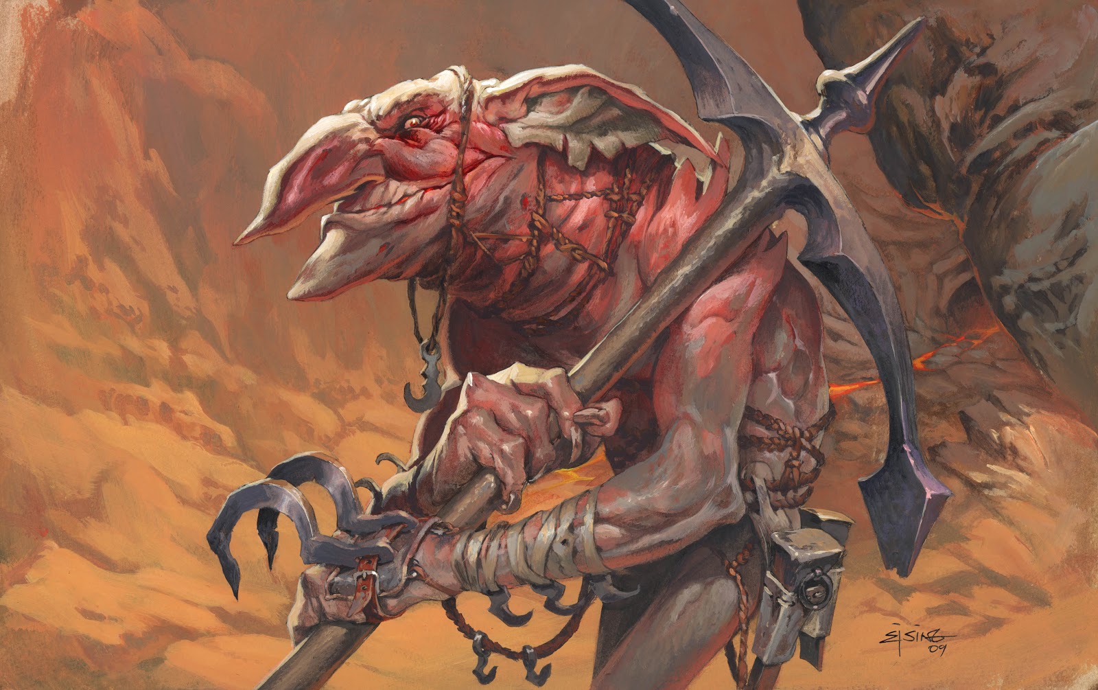
If you look at the cross hatchings in his ear, you can actually see how thin I apply most of the paint – or how slobby I actually am, depending on how you see it.
I got that one, signed and framed on my mantle piece.
Excellent use of gray to intensify the colors!
i love looking at your colour roughs because it makes me realise how little i know about making a colour pallete but also makes me realise how the use of neutral colours can be just as effective as saturated colour, and how powerful a hint of warm and cool colours work,
BRING OUT THAT DAMN ARTBOOK! im waiting for you to take my money in exchange for your wisdom
Yess, the long awaited artbook, I'll have one for me and one for Joyce my good sir.
This goblin is one of my favorite paintings ever, it's nice to see the process and your thoughts on it too.
We miss you here in Chile! we had an awesome time.
Yeah Felipe!
I wish we could do that again some time. I will do a little drawing in your book commenting on the perversety if Chilian teenagers high on corn spider poison all day messing around the F…castle