 |
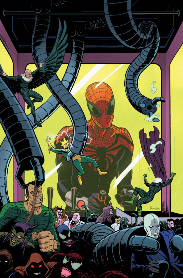
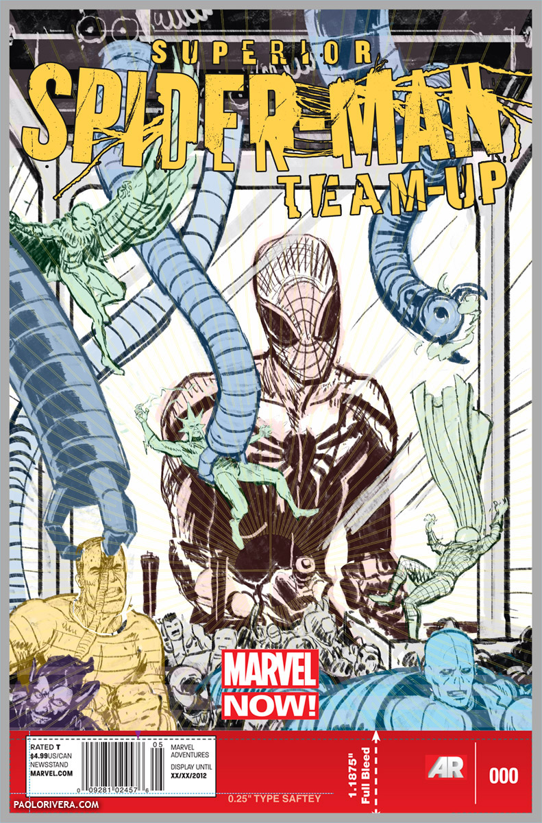
| Superior Spider-Man Team-Up #5 Cover. 2013. Ink(ed by Joe Rivera) on bristol board with digital color, 11 × 17″. |
Before I get into the nitty-gritty of how to ink a page, I want to cover a bit of the why. I’m hardly qualified to give a history lesson on the practice, but I can say with (moderate) confidence that it was always a necessary part of comic book publication. Early printing methods simply weren’t capable of reproducing the subtle grays of pencil — but even though technology has improved, the practice remains solidly in place.
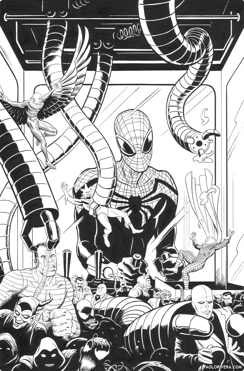 |
| inks by Joe Rivera over cyan print |
If we think back even further, it becomes apparent that “inking” has existed since the first printed art objects. From woodcuts to engraving, printmaking is a relatively new technology that has only flourished over the last 600 years. The techniques originally created to cope with the limitations of the medium eventually grew into a style unto themselves.
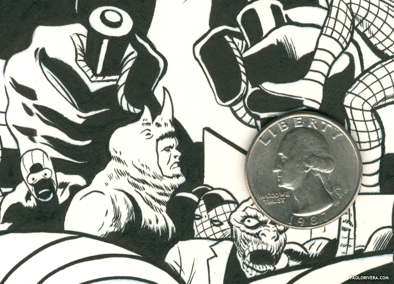 |
| my Dad’s inks at full resolution (with George for relative size) |
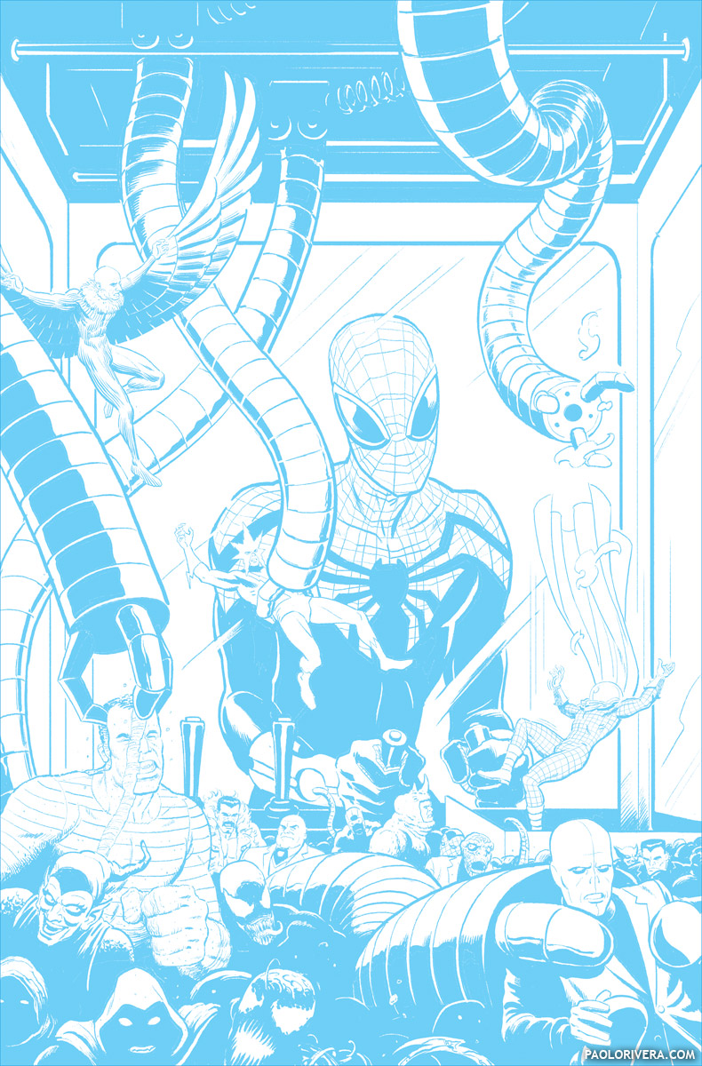 |
| cyan print of my digital “pencils” |
So what is that style? It’s any distillation of the experience of seeing, rather than a rote copy of nature. It’s an approach that isolates what’s important about a scene by exploiting the differences between objects. There’s a reason that we can watch an animated film — 2D or 3D — and still get caught up in the story. What matters to us is the characters, not their visual proximity to nature. Even the most fully-rendered print by Durer, with it’s many subtle values, is a kind of hyper-reality — it’s a cartoon in the sense of being a type of exaggeration. That’s what inking’s all about: selecting what’s most important about an illustration and leaving out everything else.
 |
| my digital “pencils” at full resolution |
The time lapse video at the end of the post is more about the thought process behind inking, rather than the physical act. (I’ll cover more of that next time.) In it, I’m digitally inking over a fairly refined sketch (with a Cintiq 13HD in Photoshop). While it won’t show you which brush to use on what paper, I hope it can reveal some of the decisions I make when going from a sketch to a finished piece. In most cases, it’s all about clarity — making sure that what the viewer sees is what I want them too. You could, of course, be as loose or rough as you like with your inks, but having only two value options can really focus the mind on composition.
 |
| digital sketch, color-coded by layer |
I made the transition from rendered paintings to line work in 2008, but I like to think that the switch reaped unexpected rewards when I eventually returned to painting. Having fewer value options has a way of imposing good composition practices. You can almost always save a bad composition with fancy lighting (this was actually a game students played at the Brandywine School) but any sketch with a strong start has a much better chance of a strong finish.
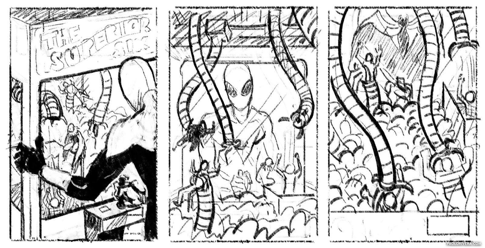 |
| digital layouts for editor approval |
Just a quick note about this cover: I don’t normally pencil digitally, but I was between studios at the time and this method was easier. To be completely honest, we could’ve used my “pencils” for the final art, but I had my Dad go ahead and ink it because it’s a cleaner style (and we like having original art to sell). My total time for the piece was 18 hours (not counting my Dad’s inks). Here’s the hourly breakdown.
layout: 2.5
digital sketch: 6.5
digital pencils: 6.5
digital colors: 2.5
I plan on writing 2 more posts on the subject, so if you have any questions or topics that you’d like covered for next time, don’t hesitate to ask.
GreatWork! Question, at what DPI are your working at? Do you use stock brushes?
I absolutely love your posts… partly because comic books have always been a huge influence in my own art and style, and partly because I appreciate your approach and “teaching” style. Mostly, I just want more. Your work is amazing and I think it's the coolest thing that you get to work with your dad.
If I had to ask for something specifically, though, I would love to hear more about composition. You touch on it only briefly enough to say it's important, but I want to know what you think about and how you generate your ideas. How do you define a good composition for ink/line work? How do you know what should be important and how to make it stand out to the viewer? How much of your inking is done with lighting-by-color in mind? (I mean, how much do you rely on the final colors to “balance” the composition?)
One last thought: for a beginner who has only done digital inking… what tools would you suggest he start with if he were ever to try his hand at the traditional medium?
Thanks! The digital inks are done 2750 x 4175 pixels, which is the final resolution. However, when I'm scanning in inks, the art is 4125 x 6262 pixels. This is because the inks are turned to bitmaps with only black or white pixels. While this saves quite a bit on memory, it means images must be much larger to compensate for the inherent pixelation. This is the size I also color at, though the final is output back to 2750 x 4175.
As for brushes, I usually start with stock brushes and modify them to my liking. My “inking” brush has both “Texture” and “Noise” turned on. I could probably do a whole post on brush customization.
Thanks! Composition is a subject all to itself, so I hope to someday write a series of posts dedicated to just that. However, I do plan on addressing a related topic: spotting blacks. I'll cover what that means and why it's important next time. I try not to think too much about the color until the inks are done, but I usually have a rough sense of the kind of lighting I'm going to use, i.e. the amount of light and the direction.
If you're looking to get into traditional inking for the first time, I suggest Holbein Special Black Ink or Pelikan Drawing Ink A. I prefer the Winsor & Newton Series 7 #6 brush, but many find that too large. I'll go into more detail in the next post about why large brushes are important and why they shouldn't be as intimidating as they are.
I'm looking forward to the rest of this series of posts 🙂
What you're saying about inking and stylization acting as a distilled form of reality reminds me of an issue I encountered transitioning from painting from life to imagination. The first representational painting teacher whose method really resonated with me pushed the idea of empiricism above all else. The concept was to essentially throw out all of your preconceived notions about how things appear, and just try to break down and understand what you see in front of you. My paintings improved drastically by approaching them this way, focusing on observation over representation. When I started trying to create compositions and scenes from imagination I realized I didn't actually have much idea about how things fit together or how even really how light behaves. I also found that a painterly notation of something I saw didn't necessarily translate to what a viewer would later see when looking at the finished piece.
Representation really is the “Re-Presentation” of reality, and its subtly distinct from Observation.
ps- love the scour mark going through the sandman's face
I couldn't agree more. It's a tough line and something that I often talk about with a colleague (and former classmate) of mine. We spent most of art school learning how to see what was actually in front of us, then spent the next 10 years trying to unlearn that. It's not that one's better than the other, it's that knowing the ins and outs of both approaches enriches your work in ways they can't on their own. I consider myself a representational artist, but certainly not a “realist.” Those can be loaded terms, anyway. What I do care about is communication, and I'm willing to try anything that gets the job done.
And thanks (with regard to Sandman)! I realized I didn't really explain what's going on in the cover. Regular Spidey readers know that his arch-nemesis, Doc Ock, has taken over his body, but the casual viewer wouldn't necessarily know that. In this cover, he's picking out his on super-team from Spidey's classic rogues gallery.
Paolo, Paolo, Paolo….radically good, as always! You amaze me no end with the amount of mad drawing skills you've developed. This kind of drawing, I feel, is a must-have understanding of form, shape, light, etc. To use line indication to explain face shapes and expression like this…well…I'm jealous really.
Yes….that is a great topic about observation vs representation. Which should come first, or which is better, will likely be argued about into the future. Somehow, I think computer work is allowing us to see what methods of learning may present themselves as the best 'way to go.' Not many teachers make the distinction. I will have to use this in my teaching. There's something here that's important.
I did much observation with my own training, and I'm still going back to study practical methods.
Anyway….this was great. Would love to talk more about this sometime. And you have mad painting skills, too! Grrrrr….
Best,
Greg
Grrrrrreg! You have no idea what your opinion means to me. I thank you for the kind words. As for process, the computer has always been an integral part of my process. I learned Photoshop and Illustrator in high school so I never thought twice about their legitimacy as a tool. That being said, I think the best understanding comes from knowing both methods. With all the advances that have been made technologically, the same rules still apply.