 |
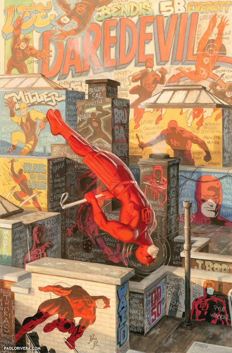
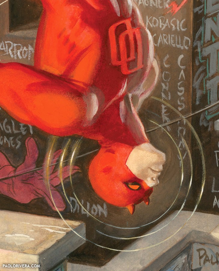
| DAREDEVIL 1.5 COVER. 2014. Gouache, watercolor, and acrylic on bristol board, 13 × 19″. |
Sometimes things don’t work out as planned. Case in point: today’s post was supposed to be part 2 of my “Let’s Get Organized” post. But with back to back comic conventions, I’m having a tough time adhering to my own calendar.
Instead, I thought I’d show my most recent cover for Daredevil, which proved to be almost more painting than I could handle. Marvel wanted art to commemorate the 50th anniversary of the character, so I decided to pay homage to the many creators who have contributed to the title.
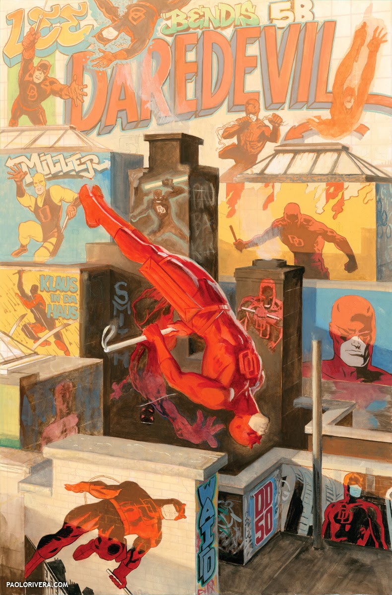 |
| I liked it more before I added all the names. Oh, well. |
The basic idea was fairly simple: Daredevil flipping across the gritty New York rooftops, backed by graffiti representing creators through the ages. Picking the representative art was an easy process — I just selected my favorites — but when I got to the names, I was overwhelmed by the sheer volume. As I attempted to record every penciler and writer, I realized that I wouldn’t have room for colorists, editors, or inkers (my Dad among them). If you’re feeling brave, you can check out the formidable list. Apologies to those I missed!
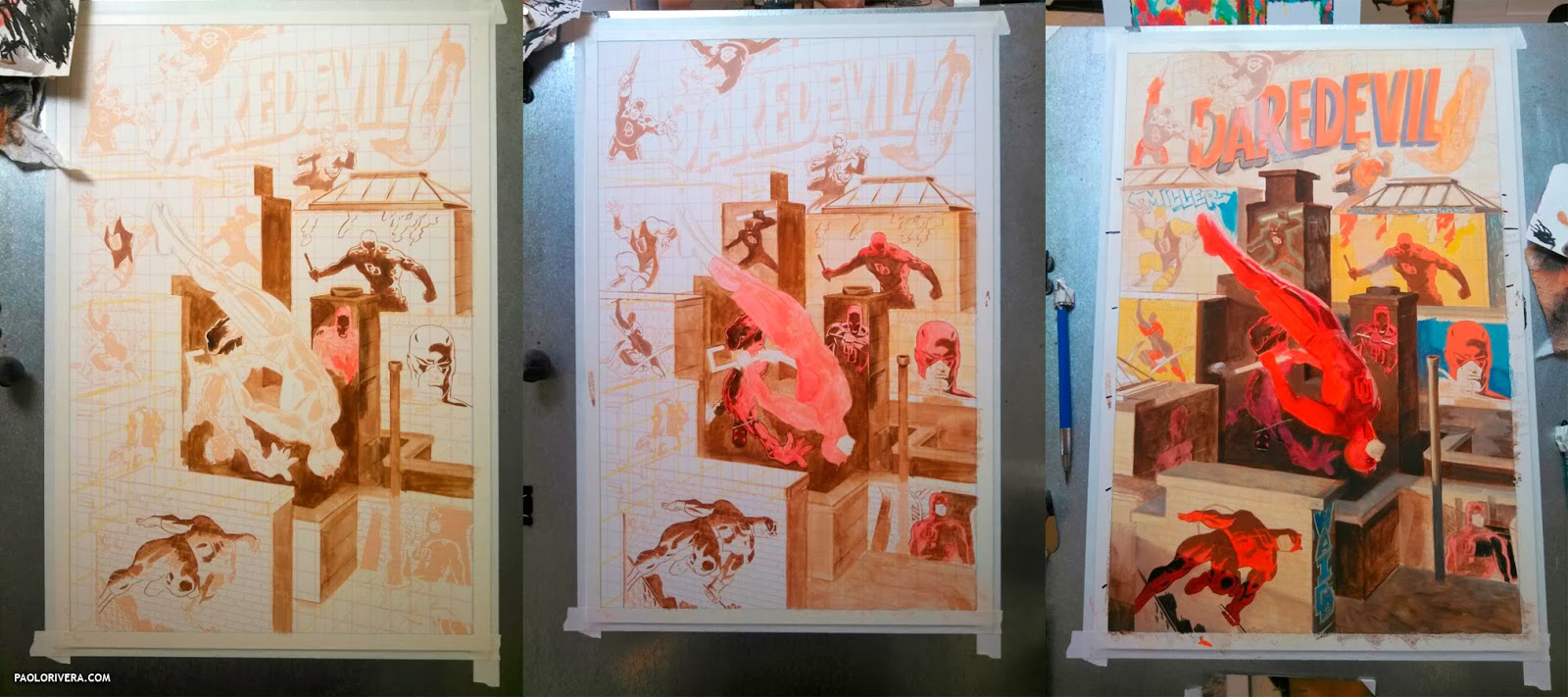 |
| burnt umber washes and slowly building up to color |
The art is painted in gouache with touches of acrylic for things like highlights. The 13 × 19″ bristol board (Strathmore 500 Series 3-ply vellum surface) is taped down to a steel drawing board (so I can use magnets to keep tools and reference in place). I paint thinly at first, almost like watercolor, and save the opaque passes for the final stages when I’m more confident in the composition. Certain colors, like the bright red on Daredevil, lose their brilliance if applied too thickly. But when I couldn’t avoid opaque strokes, I actually used a bright orange to achieve the same effect.
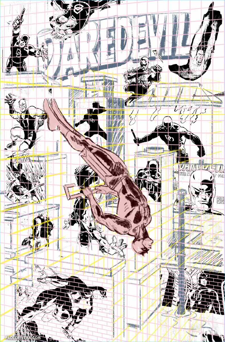 |
| digital sketch |
The perspective grid was laid out in Photoshop using Smart Objects, which acts as a file within a file. By nesting layers within those files, I can switch out a grid for bricks. I also imported the art from various artists to expedite the process. The perspective guidelines were color-coded using Layer Properties, which keeps things organized according to vanishing point. Finally, the digital image was printed in a light orange to mimic an underpainting of burnt sienna.
As is often the case, simple ideas can be very complex when it comes to execution. I spent 72 hours from initial sketch to final scan over the course of several months. (hourly breakdown — layout: 2.5, digital sketch: 7.5, paint: 61.25, post-production: 0.75) The scene itself was pretty simple to render, but as you can imagine, the graffiti added an extra layer of work to every square inch. Maybe I’ll have a better plan next time. Maybe not.
(I should be returning from the convention tonight. I’ll be happy to reply to comments and questions upon my return.)
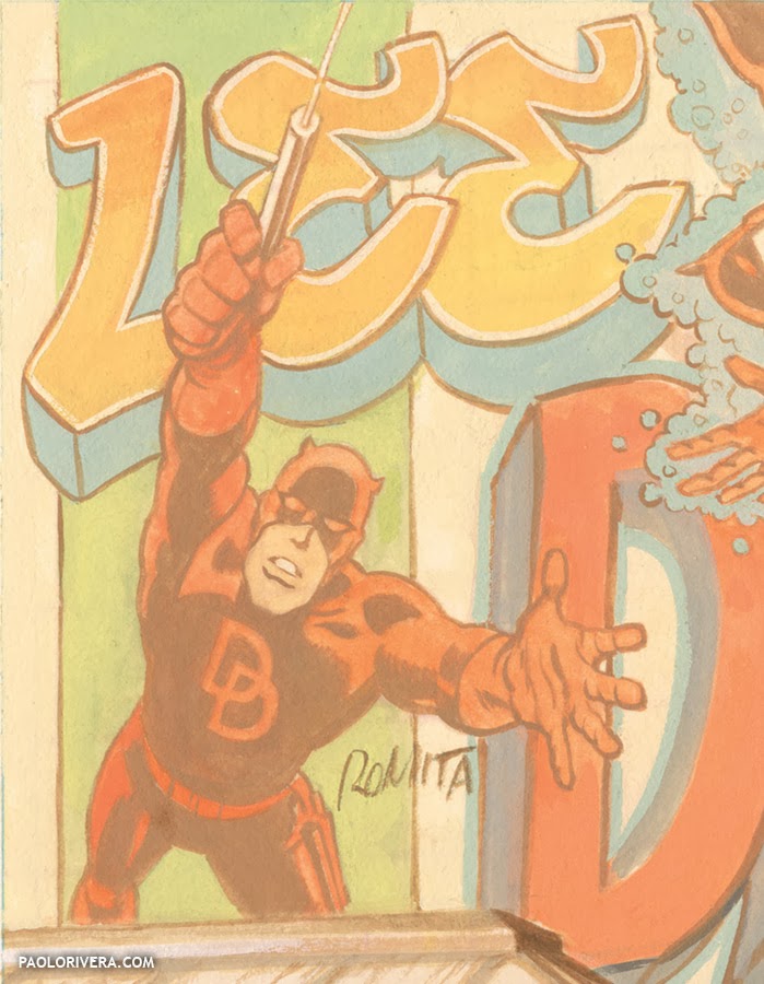 |
| Stan Lee and John Romita, Sr. make an appearance |
 |
| digital color study |


Beautiful tribute! If you're looking for a subject to cover, it would be nice to expand on your method on using smart objects for perspective grids. Thanks!
Oh man, nice.
This is by far one of my favourite covers. One of those that make you say “Damn, I wish I could have come up with something like that”. And the render is gorgeous!
Amazing work! The time and effort show in the final!
I LOVE that time break down because it feels very realistic amount of hours spent painting. I'm often intimidated and discouraged by illustrators that say they've finished complex paintings in a short amount of time. 61 painting hours is “comforting.”
Thanks, guys!
Emmanuel: the perspective post is something I've been picking away at for a while. Still need to produce an involved video, so i can't say when it'll be done. Hopefully, some day…
It'll definitely be a while before I get to the rather complicated topic, but here's a nice tutorial that a blog reader was kind enough to assemble: http://www.andrecastelo.com/2013/02/tutorial-using-smart-objects-to-help-with-perspective/
Paolo Rivera todo bien quitando eso de “Con suerte, algún día…
Me gustó una imagen y quise conocer autor e insertar en mis mensajes valor autoría
Not sure if I caught that… and Google translate isn't helping.