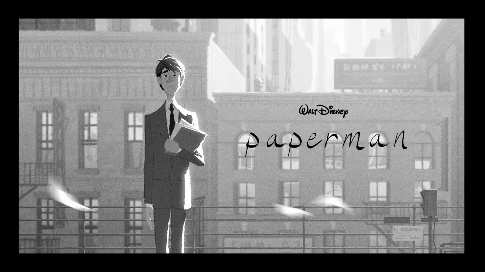
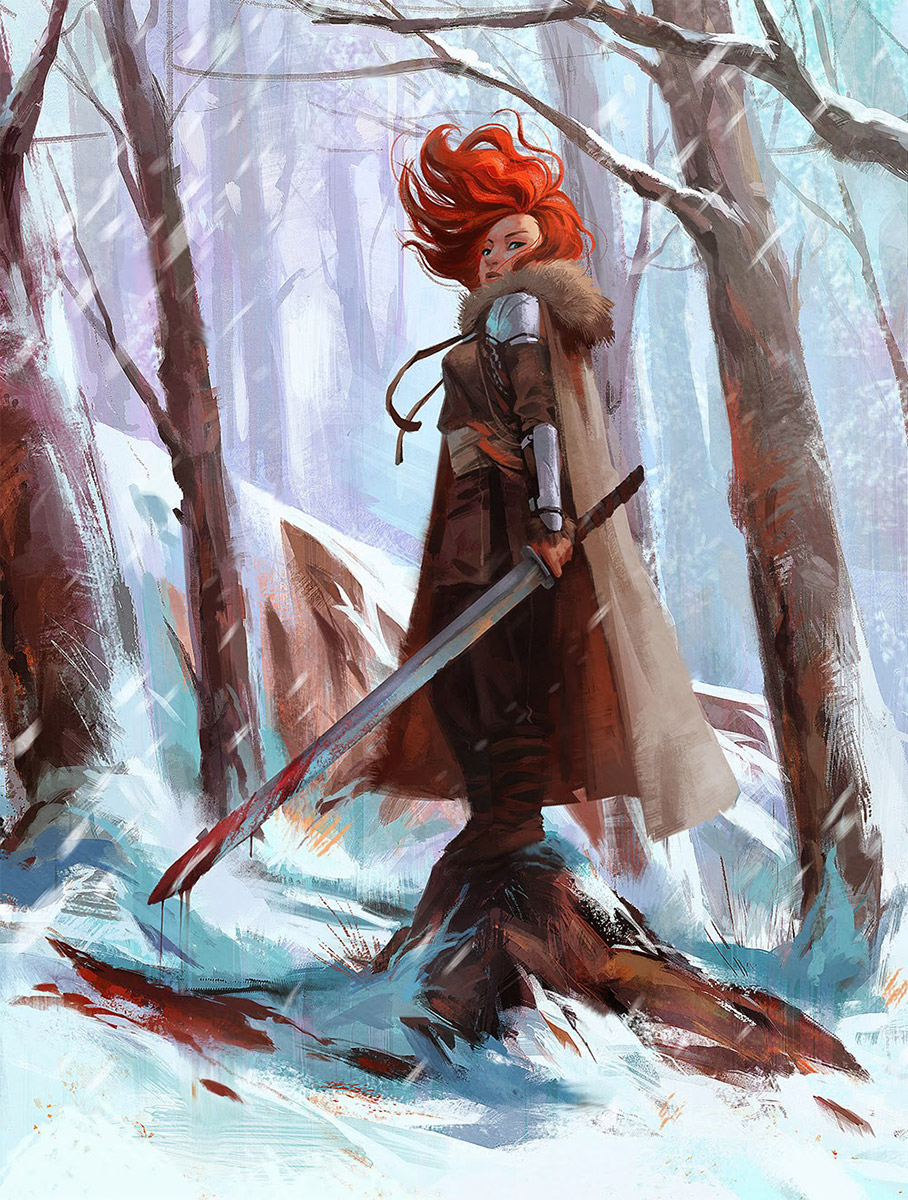
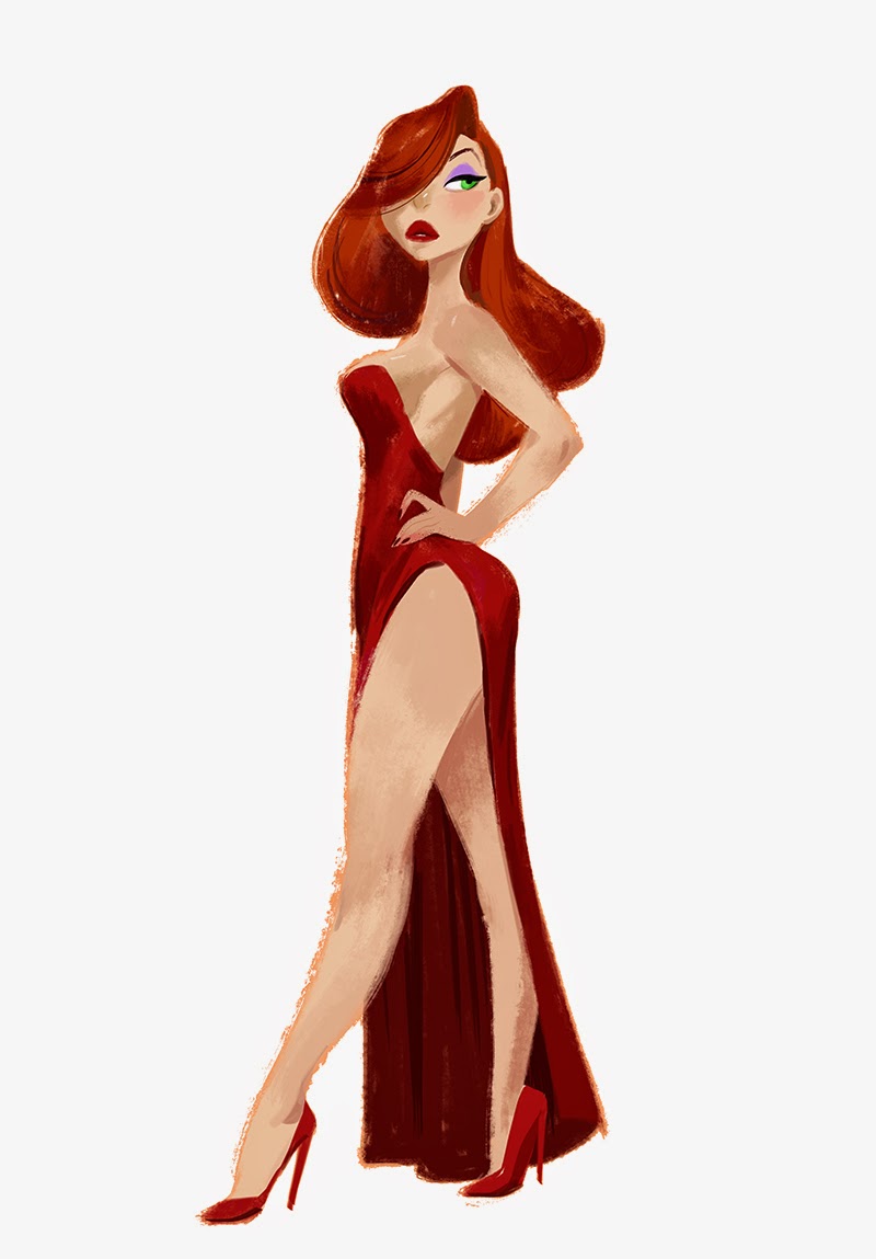
I was skipping through Facebook updates one day, when an image by MingJue Helen Chen immediately caught my eye. It was a simple little illustration of a girl in sneakers with a backpack and a sad expression. There was nothing “special” about this drawing, no bright colors or digital color dodge effects, no sparkle and crazy angles or anything; but the specialty of it was that it was an incredible solid drawing filled to the brim of the outline with craftsmanship. I joyed over the small tilt to the foot, that allowed me to see the bottom of the shoe, the believable way the hair fell over the forehead and around the ears, and then I clapped my hands at the dryness of the colored strokes, that made it look like an almost flat gouache illustration. So I immediately clicked the link to the artists blog, and got blown away by the rest of her artwork. Damn; it turned out she had a thing for drawing girls with swords! ( And she worked for Disney; turned out I had already seen her work before in “Paperman” a small animation film) I asked her to be my best (Facebook) friend and the second she accepted I asked her if she wanted to write a piece on Muddycolors. Egotistically, I asked mostly because I was really interested in knowing all about how she worked for myself. Now you can see as well. Here is what she wrote me…
For the last 5 years I’ve been working in the field of feature animation, working on projects like Frankenweenie, Wreck-it Ralph, and Paperman. Most recently I’ve finished working on Disney’s Big Hero 6 and moved on to Paramount Animation as an Art director for an as yet unannounced feature animation film.
This post will focus on my process, in my personal work as well as work my professional work. I’ve always felt that art intended for film is a little different than art intended to be presented as a standalone illustration. For example, at work I will rarely present paintings that are formatted outside a widescreen format, because that will most likely be the format the audience will receive it. Another key difference in art for film is time. When an audience is watching the film, every composition happens within a very short time, so the visual storytelling aspect of the film has to be clear and precise.
This is the process of a quick 4 hour demo I did for an online class I taught. There are some issues I still have with the overall piece in terms of value and color, but it does show how I normally start a piece.
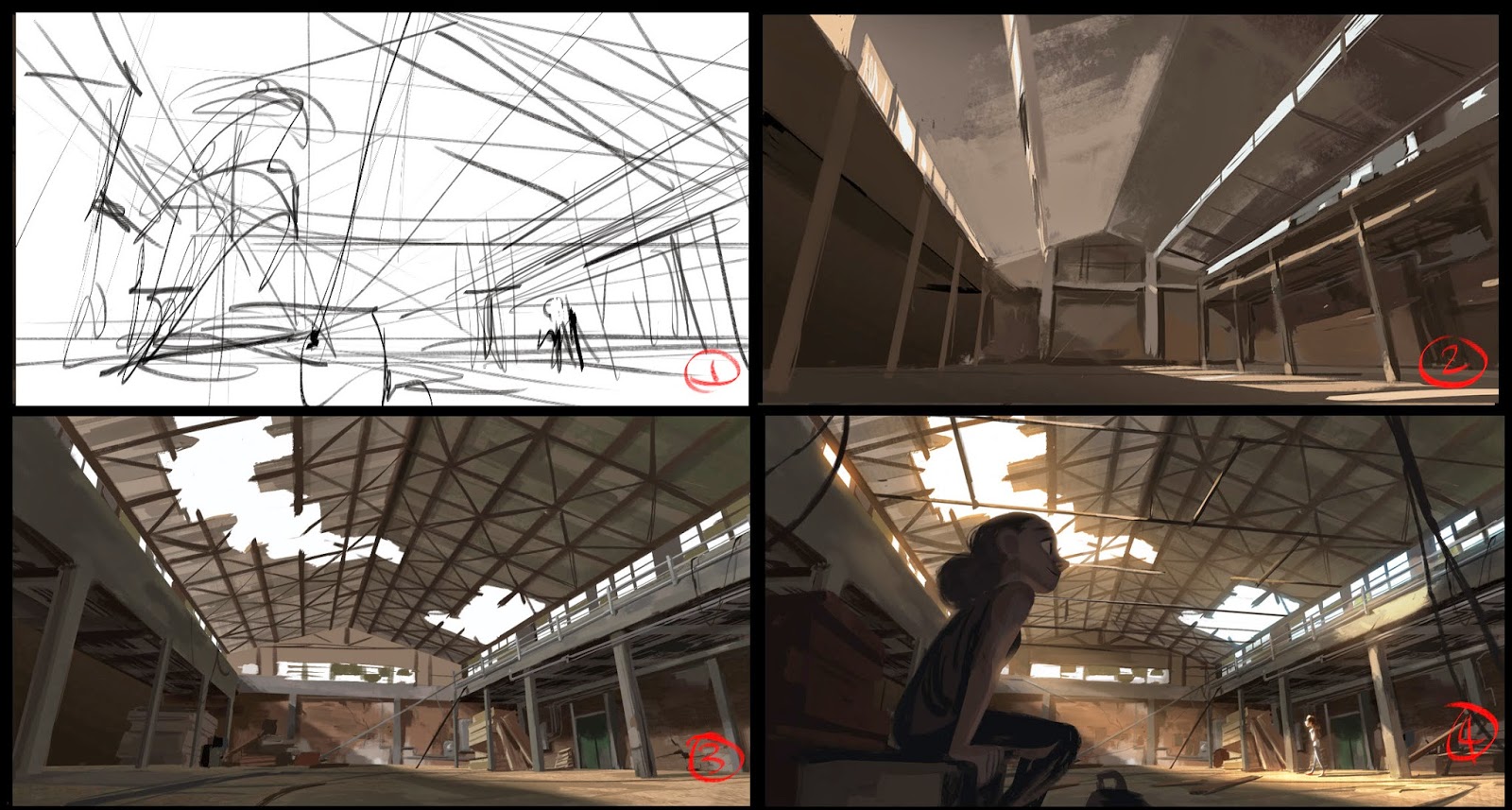
1. Even though the initial sketch does not address value, I’ve already tried to plan out in my head how I want the values to work in my head, and the direction of the light.
2. This is the stage where I lay in as much of the canvas as possible, any color is better than no color. I usually work back to front.
3. This is where I normally redraw my perspective grids so I can focus on the structure and design of the space. There is quite a bit of lighting backed into the painting itself, but I also know there will be more on top of it. As a one off piece, this painting could have benefitted from more reference and forward planning.
4. The last half hour or so I add some lighting effects to bring everything together. I use it as a way to get rid of unwanted detail and bring the focal point forward.
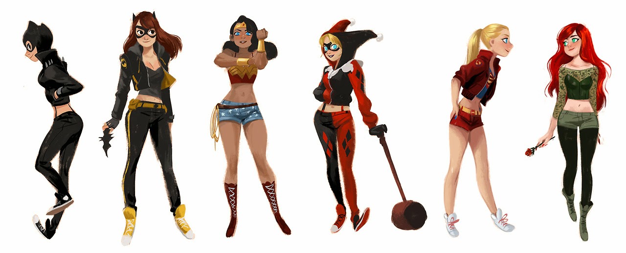
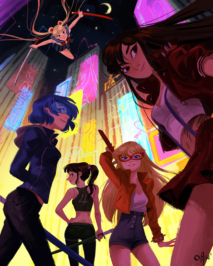
In my free time, I do a lot of character paintings as a way to wind down from my normal workday, which includes very little characters and a lot of sets and painting. It really helps as a way to keep me motivated to practice drawing characters as well, because even though I focus on environments at work, I try to place figures in every painting.
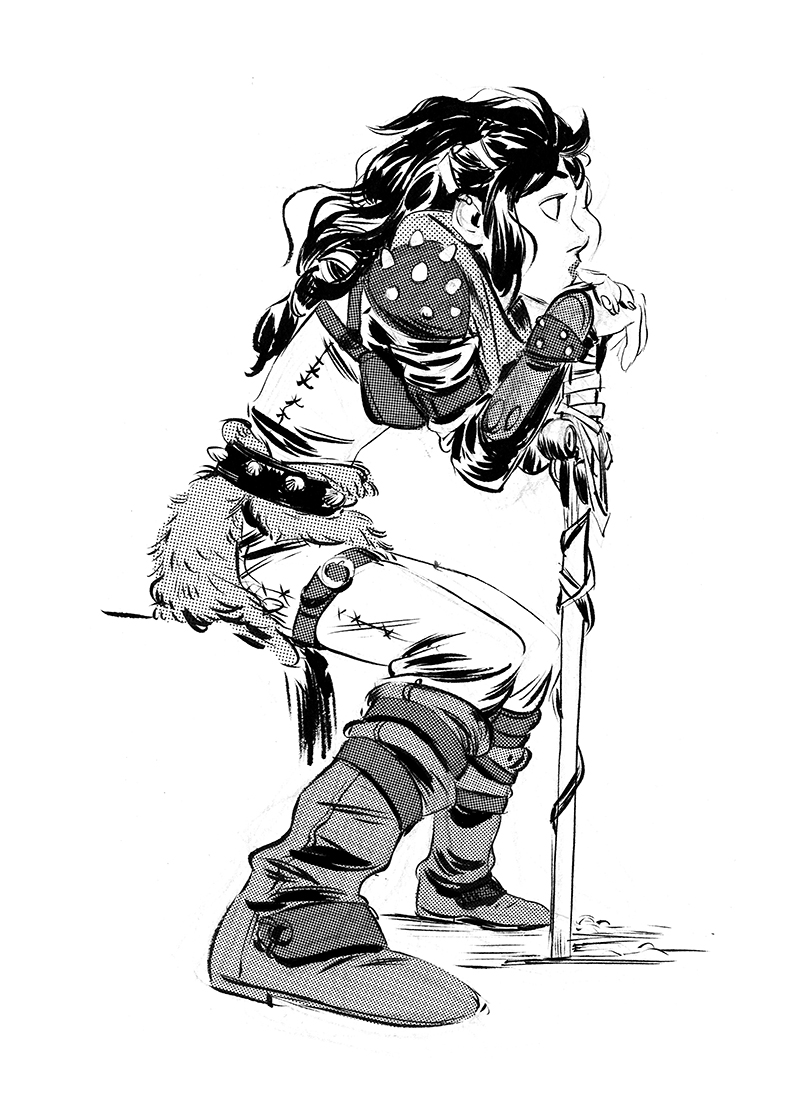
I start very much like how I would a normal environment painting, with scribbles. It helps me feel out the forms and plan the drawing even before I add any color. I fill in the line with a base layer, because I am not a great designer. If I fill in just one color it highlights the shapes for me, and I can focus more on the graphic design of the figure just for this one step. It unifies the design for me, and prevents me from adding tiny details that break the silhouette for no reason.
After that I lay in the local color, and add simple line detail and basic shading to sell the simplified form. Not that I would compare myself to him in any way, but Robert Mcginnis is an illustrator that I look up to for his strong use of value and shape. Values are contained within strict hierarchies, and composed in a really graphic way. All of that without sacrificing form and function, its really genius.
MingJue was even nice enough to put together a process video for us!
You can see more of MingJue Helen Chen’s work on her Tumblr: http://jigokuen.tumblr.com/
Oh my gosh, I wanted this to happen for a long time, MingJue Helen Chen is one of my favorite current artists. This was very insightful MingJue,
Thank you sincerely.
Love it, love it, love it! Great post!
Great!
Thank you!
Big fan of of your work. Come back to Muddy Colors anytime!
Wow! Thank you for all of that information. I hadn't heard of Robert Mcginnis, will have to really check his stuff out.
Great article, thank you! I am such a massive fan of MingJue Chen's work and follow her pretty much everywhere (Twitter, Instagram, Tumblr, you name it). I'm obsessed with her style and have learned so much from her work.
Everyone should also check out her book 'Spam Volume 1.5' which you can buy online for a tiny price, it has 84 pages of her work and also 3 process videos! Well worth the download. I am so psyched for the new 'Lovely: Ladies of Animation' book coming out too, featuring work from Mingjue, Lorelay Bove, Brittney Lee, Claire Keane, Lisa Keene and Victoria Ying! All super talented ladies.
I didn´t know you Helen
Such a wonderful work!!…
Thank you very much for sharing!!!!
It always so cool to see an artists process of working! Really useful to see the break down of creating the background and what to keep in mind as you do so! Thank you so much for sharing! 🙂
Fabulous….Always!!
I couldn’t agree more, Dan. I am yet even more encouraged and proud to be a digital artist after seeing your work! And it’s REAL too, like mine! Not painted over a photo! I think it is people who cheat and paint over photos who give digital artists like us a bad rap. Like you, I too started from scratch so to speak and honed my craft slowly as a practiced every day. I look back on my dig paintings from 2014 and compare them to now and I can really see growth! Thank you for posting your experience. Your work is brilliant!