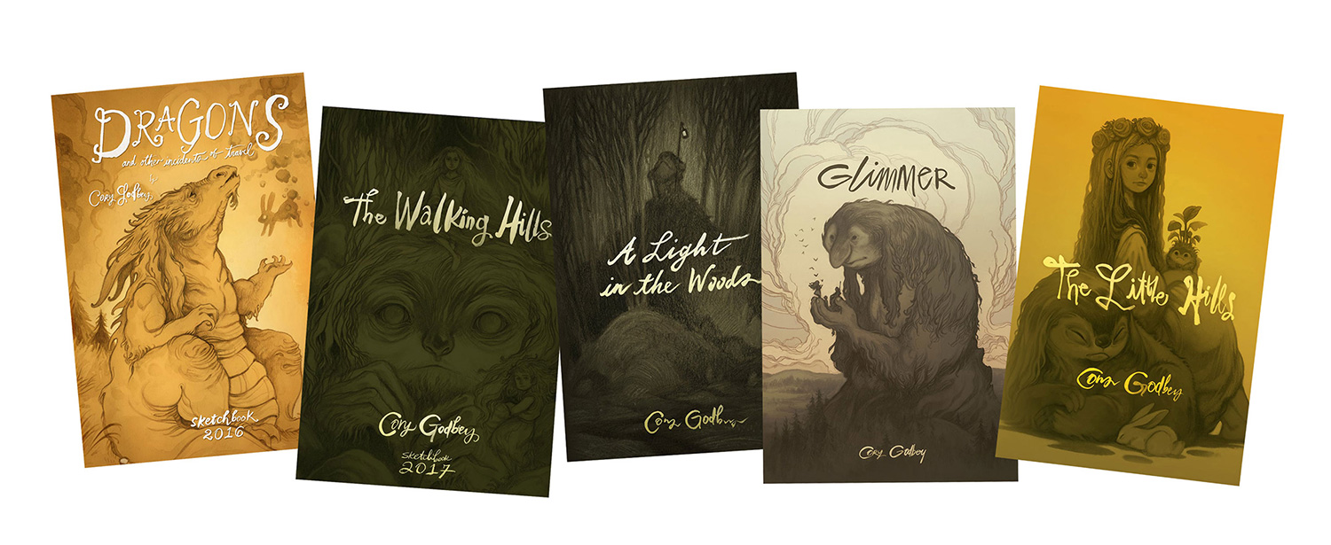
by Cory Godbey
_______________________________________________
Over the years I’ve had the opportunity to work with a wide variety of projects and clients. Among my most favorite is the time I’ve been able to spend with Henson properties.
In my experience, working with the Jim Henson Co. along with Archaia / BOOM! is that their approach to art direction is unique. They are very much interested in the artist’s thumbprint on work that is (technically) licensing. Put another way, even though you’re working with existing IPs and characters, they are genuinely interested in the artist’s interpretation of the characters, open to artistic license, and not strictly following some kind of style guide. I’ve always felt like I’ve been given room to explore.
Here is a look at one such project for a past Free Comic Book Day.

_______________________________________________
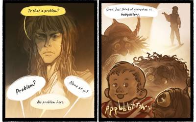
This particular story I had the opportunity to write as well. It was pretty short; four pages. Even so, that’s probably just as well. My writing method is, in a word, messy. Below is a picture of only one of several pages worth of notes. Drawing feels as natural as breathing to me but I have to marshal my thoughts for writing in a different, shall we say, convoluted, way.
I’ll put down notes, circle them, draw arrows, rearrange, redirect, criss-cross lines back and forth… tends naturally towards confusion and scribbles. It’s almost labyrinthine.
 |
| Bonus: I spilled coffee on this sketchbook and then very nearly set it on fire by leaving on the hearth to dry. |
Once I hit on the idea and got it approved, I scrawled out some thumbnails and planned the layout.
 |
| Behold! Slightly refined thumbnails. |
Next, I moved on to the drawings. For these I ended up scanning them still in progress and arranging them in a kind of half-step between thumbnail and rough. My initial thumbnails were so loose I wanted the editor to be able to see more clearly where I was headed.


 |
| Rough pencils! Not pictured, an oubliette. |
Now, you’ve no doubt been able to gather from how scattered I write, how scribbled out and nearly useless my thumbnails are, all of that — my comics process is a little fragmented. Alright, fine, guess what, it’s literally fragmented. I tend to draw everything separate and figure out panels later. I don’t like drawing small. Or in panels. That’s absurd, you might say, it’s comics. And you’d be right. But I fell into comics on accident. And I’m obliged to make it up as I go. (How I started doing any comics at all might worth a post of it’s own in the future.)
What it amounts to is drawing each panel individually. It’s not much more effort or time and it feels more natural to me.
Here’s a look at some of the original scans of these “panel” pages.


 |
| This is exactly what it looks like. Goblins overwhelming multiple sheets of paper. |
Once finished with the drawings I scanned them and began to prep them for the final work, flatting shapes to block out the figures and elements.


 |
| Dance, magic. |
After this pass at flatting is done, I go back and begin to work on the actual characters themselves. This means making sure base colors are correct and that things are mostly in place. A lot of this initial color work takes place underneath the drawing.


 |
| Tally-ho! in progress. |
_______________________________________________
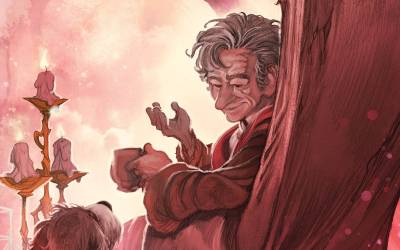
And now for the real goblin magic! Getting those above images to final. I’m always kind of amazed when it happens. It does feel like magic sometimes. Here’s a look at a few finished pieces.


So that does it! I also lettered the story, laying out the all the type.


I had such a good time with every part of this project. My editors were great, always helpful. This was also the first time I had the chance to write something Henson as well as illustrate.
I’m not going to lie, I felt like I’d been given a challenge by the Goblin King himself. Not quite as challenging as solving the Labyrinth and rescuing a lost sibling but still, a little challenge from Jareth.
_______________________________________________
And you know what, speaking of that guy:
[youtube https://www.youtube.com/watch?v=ViftZTfRSt8]
Look, everything I’ve done, I’ve done for you. I’m just saving you the trouble of looking up that song later.
Great to see you in such esteemed and hallowed company Cory. Your work certainly justifies your inclusion. Lovely stuff!
Thanks so much, Paul!
These are beautiful pages.
Nice work Cory! Your style fits in with the Labyrinth world very cohesively. In your gnarled tree i see a hint of Charles Vess, was he an influence on you?
These are seriously fantastic! And I agree with Michael, your style is perfect for the movie style. Great job. Do you have prints available from the set?
Great post Cory! :}
Thanks, Lou! And congratulations on the well deserved acclaim “Frostborn” is receiving! I've got it on my list.
It's true!
Thanks, Adam! No, I don't sell prints of commissioned work.
Thanks dude!
So great to see where you're going Cory. What a great project.
Awesome job Cory 🙂 Such nostalgia. It's like reliving childhood
Beautiful pages, Cory! Lovelly. Congratulation!