Paintings affect each of us differently and for different reasons. This is a series of posts that point to choice passages in favorite paintings as seen from a painter’s eye.
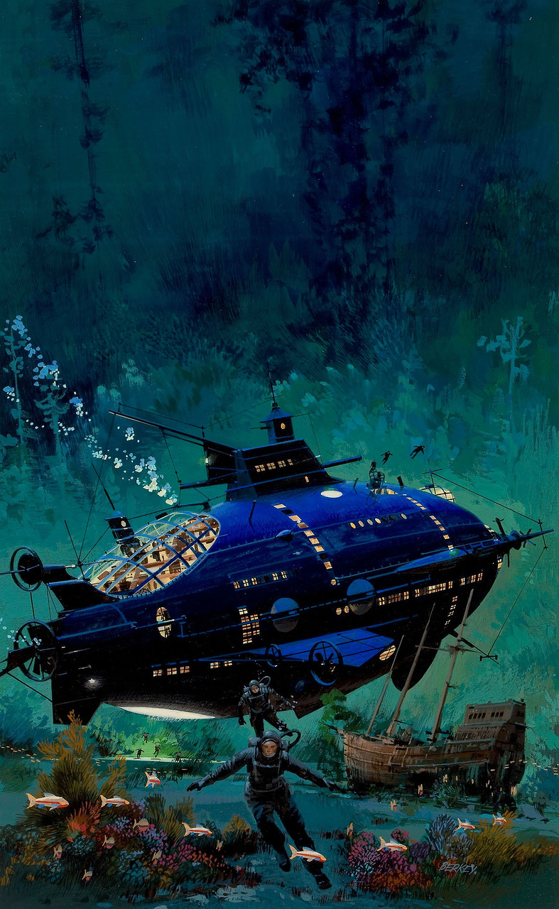
John Berkey’s 20,000 Leagues Under the Sea cover is one of the best renditions of Verne’s world, capturing the feel of the book’s undersea atmosphere. His rendition of the Nautilus is quite different from so many iterations of the famous submarine. It’s quite huge in comparison and actually feels like the right amount of space that Verne writes about in the story.
So many nice parts to this piece, like the many divers involved on a diving run, the bright sea life, and the sunken wooden ship in the landscape.
But the use of light is what grabs the viewer and directs the focus.
The perfect passage here is the glow under the sub, gently lighting the activity at the stern of the massive shape. A bit of information that adds a little bright green to the whole piece.
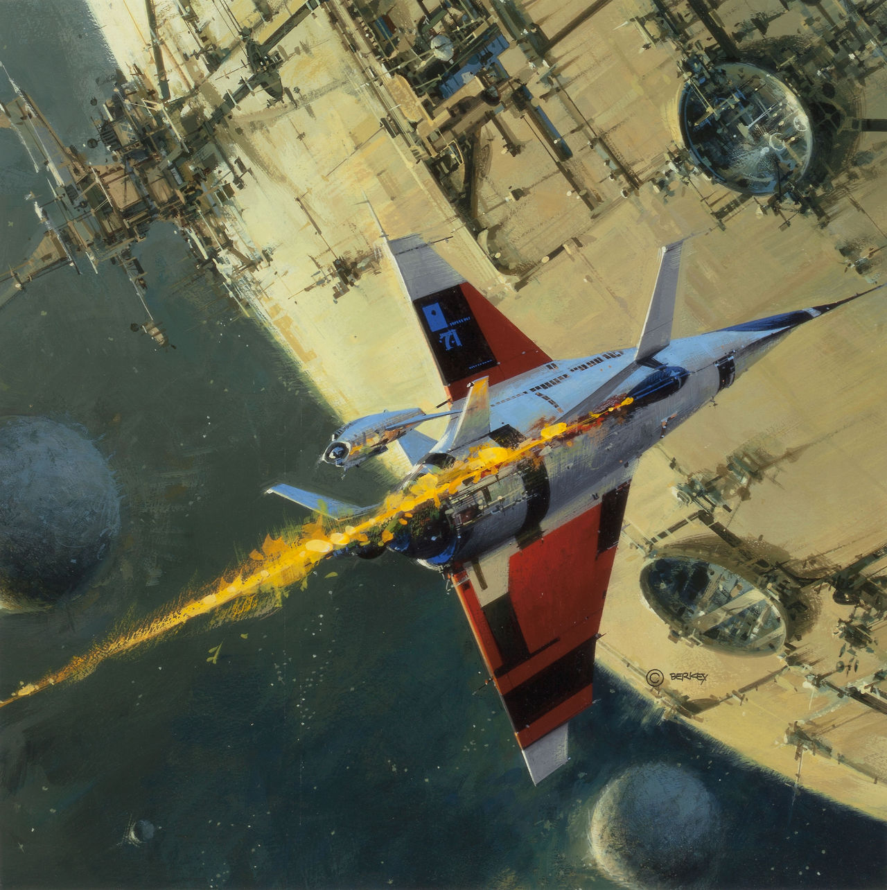
In Berkey’s cover painting for Star 4, I’m drawn to the viewing portals of the metal moon that the ship is about to crash into.
But the loose quality of the paint he uses to indicate the streak of burning damage coming off the fuselage is a perfect mixture of bright oranges and cadmium yellows to show intermittent flames without over-rendering, and all on a nice beeline straight-away that captures the speed.


I love how Berkey (and John Harris, whose style is similar) can say so much in one piece without it looking belabored. The sense of scale in their work is awesome.
That burning streak in the second piece, wow. The contrast between that bold, energetic use of paint and the smooth precision of the ship's tail fins… so beautiful.
You know it, Indigo!
This is a beautiful painting, too.
Illustration Magazine #36 (I believe) had a great article with lots of art by Berkey. I did not realize how diverse he was beyond his space paintings until I saw that article.
The Article had a dark image of Star 4 with it shown in a 90 degree clock wise angle instead of the angle shown here. Editors discretion trumped Berkley's I guess…
It is great how Berkey makes my mind want to explore so many parts of these paintings.
Thanks for the post Greg, [it was nice to see you at the Froud workshop while you visited.
I didn't finish my sculpture, but working it slowly after work and family time and hope to have it completed soon.]
Mike