Hello everyone, I hope everything is going well for all of you.
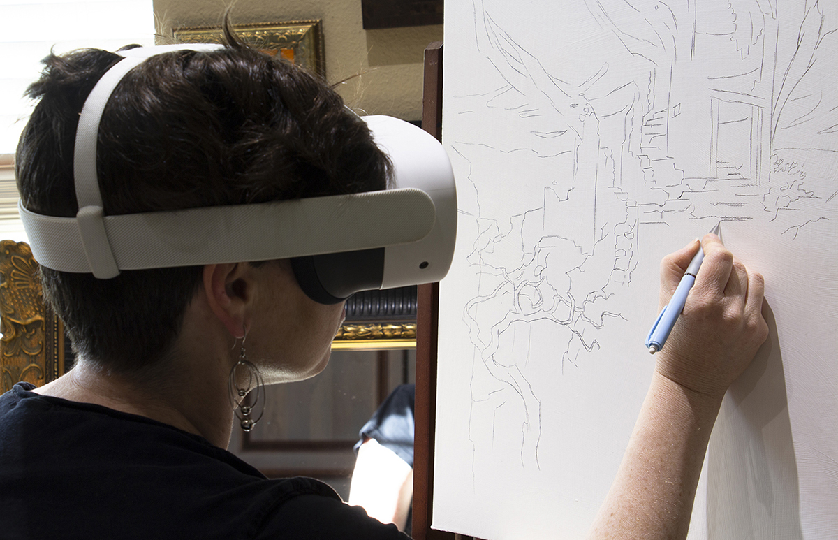
This week I am posting my Legendeer Keynote Presentation on Creating Mood with Light and Dark, a technical walk through of examples of different controlled value and color schemes that illustrators/painters and directors have used over the centuries. This lecture was a primer for the artists before they went out exploring the city and taking in bits of information that could later be parsed into a fully realized finished project whatever and however it is created in the end. Examples would be demonstrated while out and about in the city after the lectures were given.
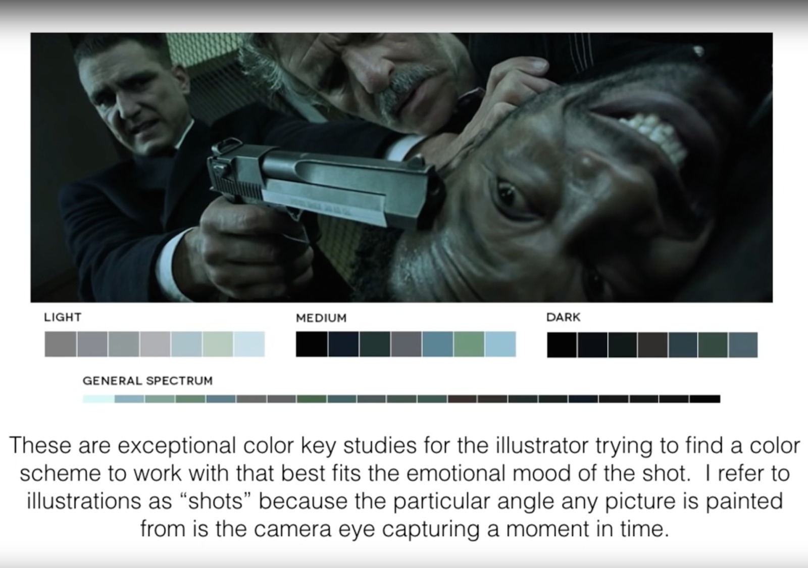

I could have used more broad stroke examples pulling from photographers and more various forms of illustration and painting, some written examples, etc. That will be for next time when I have more time to plan it out.
Anyway, I hope you find this useful minus the lecture that I feel would otherwise glue it together comprehensively and help you make sense of all the slides and why I have them included in this lecture.
Have a great few weeks until next time.


Thanks, Ron. I'm self taught, which means I know so little . . . 30 years and I'm still learning. Why don't you put together this presentation and add a vocal script. “Hearing” you thinking would be educational, too. (Dick Budig, Lincoln, NE)
Thanks, really informative, found the majoy and minor keys really helpful.
This was great. i am fairly comfortable with tonal gray values but form some reason I am terrified of color something I am trying to conquer and this is helping 🙂