I’ve been working at Orbit Books as their Creative Director for 10 years! Which means that some of the very first books I worked on when I joined the team are now old enough to go to 4th Grade…and get fancy special Anniversary Editions! You can check out the blackest most badass book I’ve ever designed here: The Night Angel 10th Anniversary Edition. For this process post, however, I’m going to focus on our other anniversary edition coming out this fall: The Soulless Illustrated Edition by Gail Carriger and Jensine Eckwall.
Jensine was fabulous enough to write up the process of working on the cover and 10 full-page illustrations for us, but before we get to her play by play, let me give you some background:
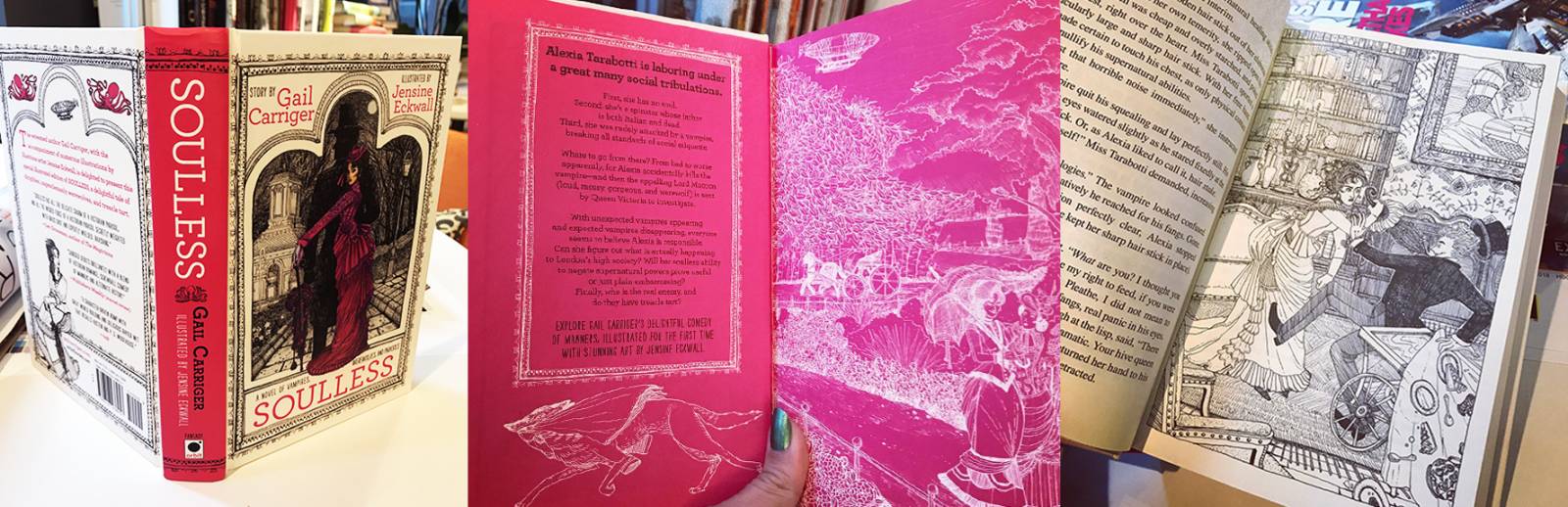
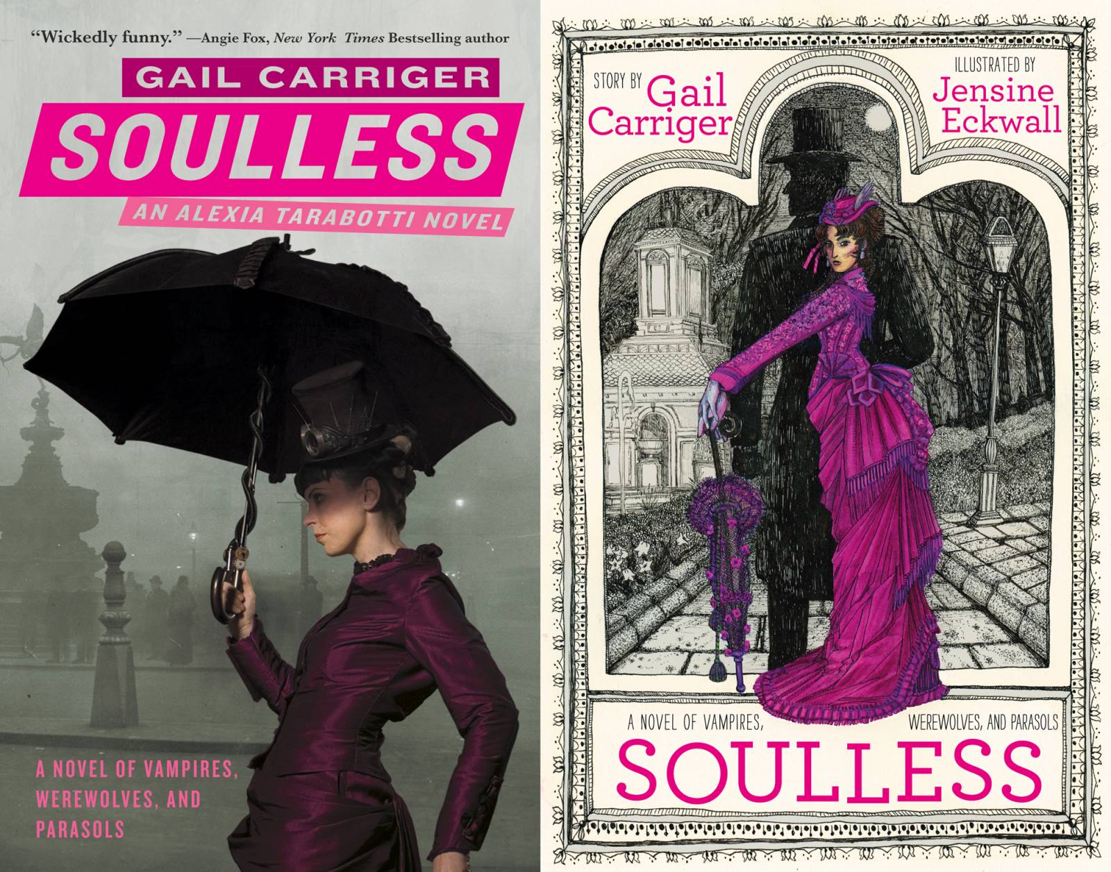
Soulless is the first book in Gail Carriger’s Parasol Protectorate series, and it is one of Orbit’s most popular series. Transcending just the steampunk genre, it’s a hilarious Victorian romantic adventure and comedy involving vampires, werewolves, and a very independent lady named Alexia Tarabotti, who happens to have no soul (which means she can negate supernatural powers). The books originally came out in paperback, then as manga-inspired graphic novel editions. There was even a process video for book 3 that some of you long-time Muddy Colors fans might remember from a process post long ago:
We wanted to publish Soulless as a hardcover, and we wanted to make it special, especially for the long-time fans, as well make it a potential starting point for new fans. Between the editor, the author, and I, we thought an illustrated edition would be fantastic, and after looking over a number of portfolios together, Jensine’s work rose to the top. Her line drawing was the perfect mix of charming and packed with detail. I knew we hit the jackpot when her first email back to me was full of victorian dress references and period book covers for inspiration.

Originally we thought I would design the cover to look like a clothbound Victorian book, and once the type was set I might pull a piece of one of the interior illustrations as a spot on the cover. So we had Jensine dive straight into the thumbnails for the interiors. I sent her a copy of the book and said to pick 10 scenes spaced throughout the book that would make good illustrations.
Each thumb was then be reviewed by me for composition notes and by the author to make sure they were fitting the scenes and felt like the characters. I have to say, Jensine became such an expert on the book, we barely adjusted any compositions at all, and only tweaked minor details. Then Jensine got down to work on the finals.
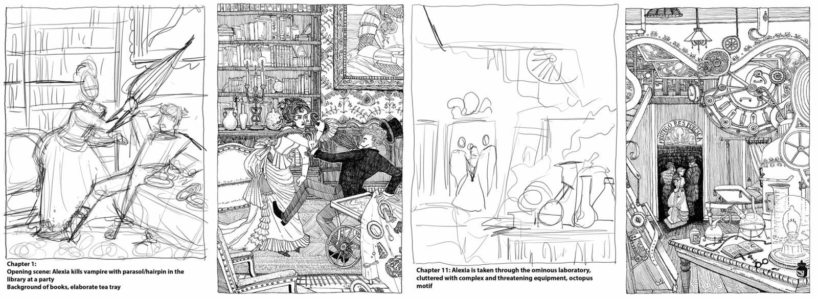
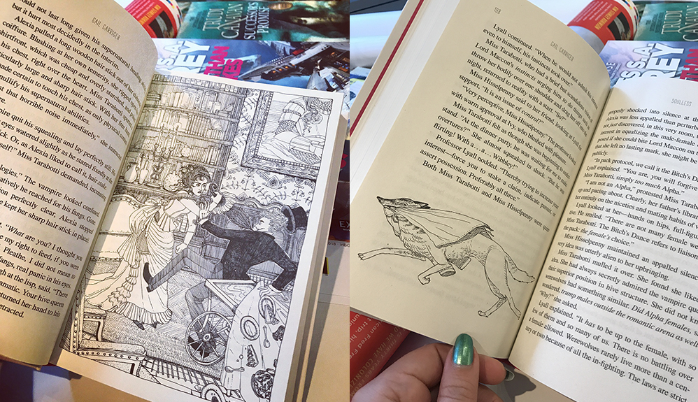
After a few months we had a stack of 10 fantastic interior full page illustrations, roughly one per chapter. And then I got down to work with the scissor and glue stick. I took a copy of the Trade Paperback PDF and made a ton of prints of both the whole illustrations and spot illustrations I isolated from the full-page pieces and I started fitting the throughout the text. I also designed the title page, the table of contents, and the back pages.
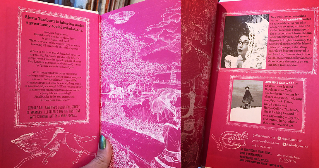
Meanwhile I started working on the cover in-house. We swiftly started to realize an antique-feeling cover just didn’t have the same charm as the interior art. Jensine had done such a great job on the illustrations we went back to her to talk about ideas for the cover. While she worked, I focused on the endpapers. Since the book was going to be a case-wrap (also called “Paper Over Board” or “POB”, it’s when there’s no separate jacket — the art is printed right on the hardcover boards) we knew we wouldn’t have the extra space of flaps for text, so I designed printed endpapers that fit the text we’d normally put on the flaps: credits, author/illustrator bio, descriptive text, etc. We used pieces of Jensine’s interior illustrations in inverse, white lines over a brilliant magenta paper.
Meanwhile, Jensine was working on the cover, and I’ll let her take it from here:
For the cover, which I knew would use a limited palette and feature Alexia prominently, I began by taking inspiration from book covers from the 1870s, the era in which Soulless is set.
Then, after going back and reading my book notes one more time (this cover was made some months after the interior illustrations; my book projects always hinge on my detailed Google Docs of notes kept for each book!), and refreshing myself on both the tone of my interpretation of the book and Alexia’s character, I sketched some thumbnail ideas on my iPad and sent them to Lauren.
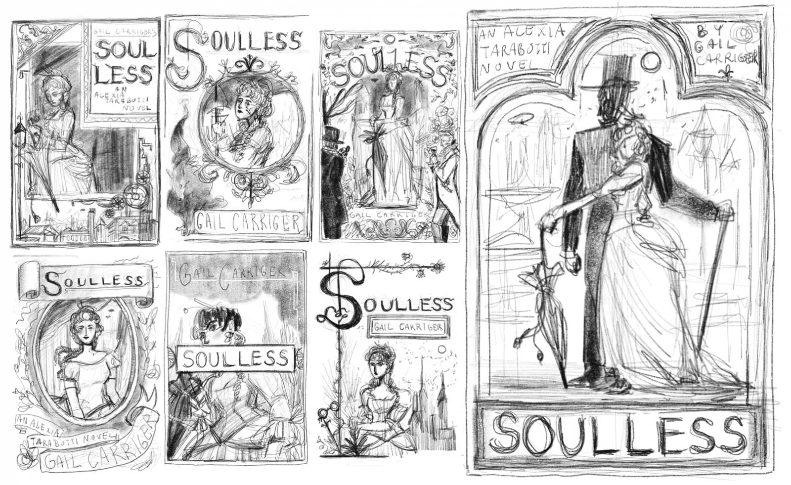
After we chose sketch 3, I sought out reference for the poses, environment, and costumes. I wanted Alexia’s pose to feel authoritative and sassy, and Lord Maccon’s to act as more of set dressing and a dark silhouette to contrast Alexia more than anything else. The environment is based on images I found of London’s Hyde Park in Victorian times, which features in the story. I initially sketched Alexia’s gown as a generic bustle dress shape, with intent to find a few costume samples to reference in the Met online image library that would be both striking and look good with the fuschia color scheme Lauren had suggested to echo the original cover.
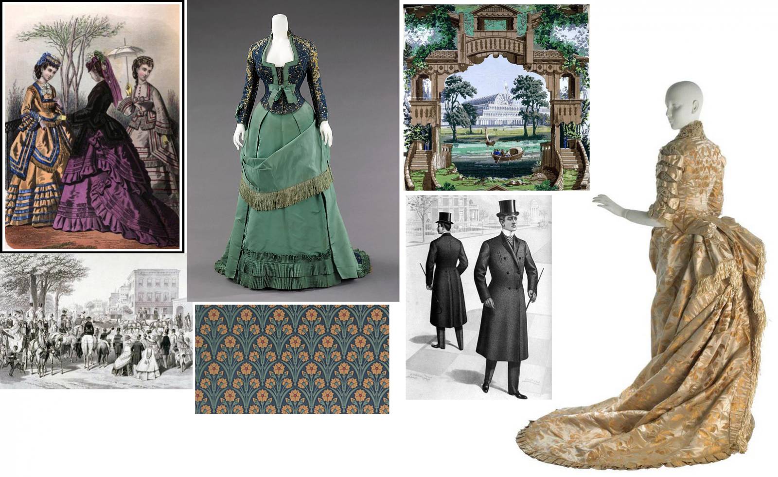
To flesh out the poses, I had my beloved roommates Alex and Krystal pose in our kitchen. For the decorative border, I pulled from the 1870s book covers and a few other sources (medieval paintings, Victorian mirrors) that I thought would fit in and looked cool.

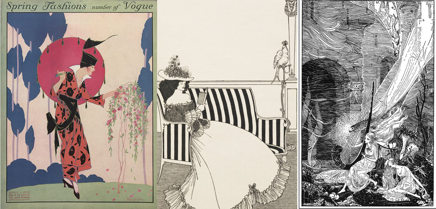
Thinking about my visual and stylistic approach to this cover, a lot of decisions were already made by the direction Lauren and I went in for the book interiors. I was approached at the beginning of the project with the intention of the illustrations to be line drawing. At first, I brought in a lot of my inspiration from Aubrey Beardsley and Harry Clarke. I also looked at Tove Jansson, Helen Dryden, Dorothy Pulis Lathrop, and Kate Greenaway’s work. One of the reasons I liked the limited palette idea for this cover was that it reminded me of the Victorian fashion illustrations that I referenced throughout the book. A lot of my initial direction came from reading author Gail Carriger’s Retro Rack blog! I’ve included here some images I looked at for style reference throughout the interior and cover process.
The line rough and color rough were drawn in in Photoshop with Kyle T Webster’s Mechanical Pencil brush, using my collected reference and the original thumbnail as a guide layer
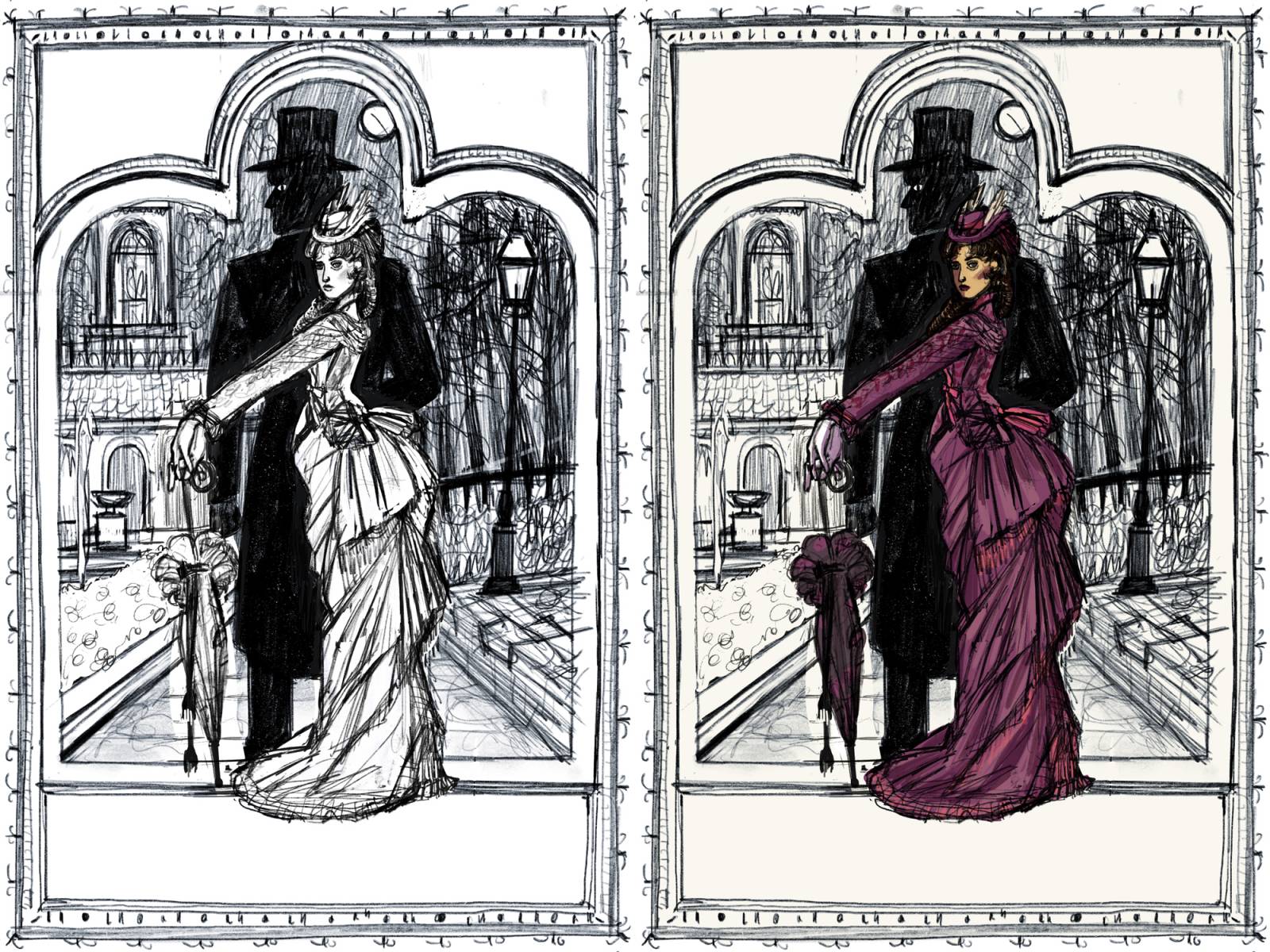
I then printed out the line drawing and taped it to my light table, drawing with Dr. Martin’s matte black waterproof ink and a steel-nib dip pen straight onto Arches hot press watercolor paper taped onto the lightbox. When the line drawing was done I made a high-resolution scan, as I wasn’t sure if my idea for watercolor spot color would look good, or if I’d need to re-approach the colors digitally. For the spot color, essentially just Alexia, I built up layers of watercolor (Holbein and Schminke brand) and gouache (various brands). I scanned everything in at a very high resolution and brought it into Photoshop. In Photoshop, I took out any ink mistakes (I make a lot) and specks, adjusted the contrast, and dropped in a scan of a plain piece of paper as the blank/cream space outside the border, to make everything look really clean. I also added a transparent layer of yellow over everything to try and get back the lively cream color of the paper I use, which the scanner often washes out, and a light blue-grey layer over the background/environment to set it all back into space.
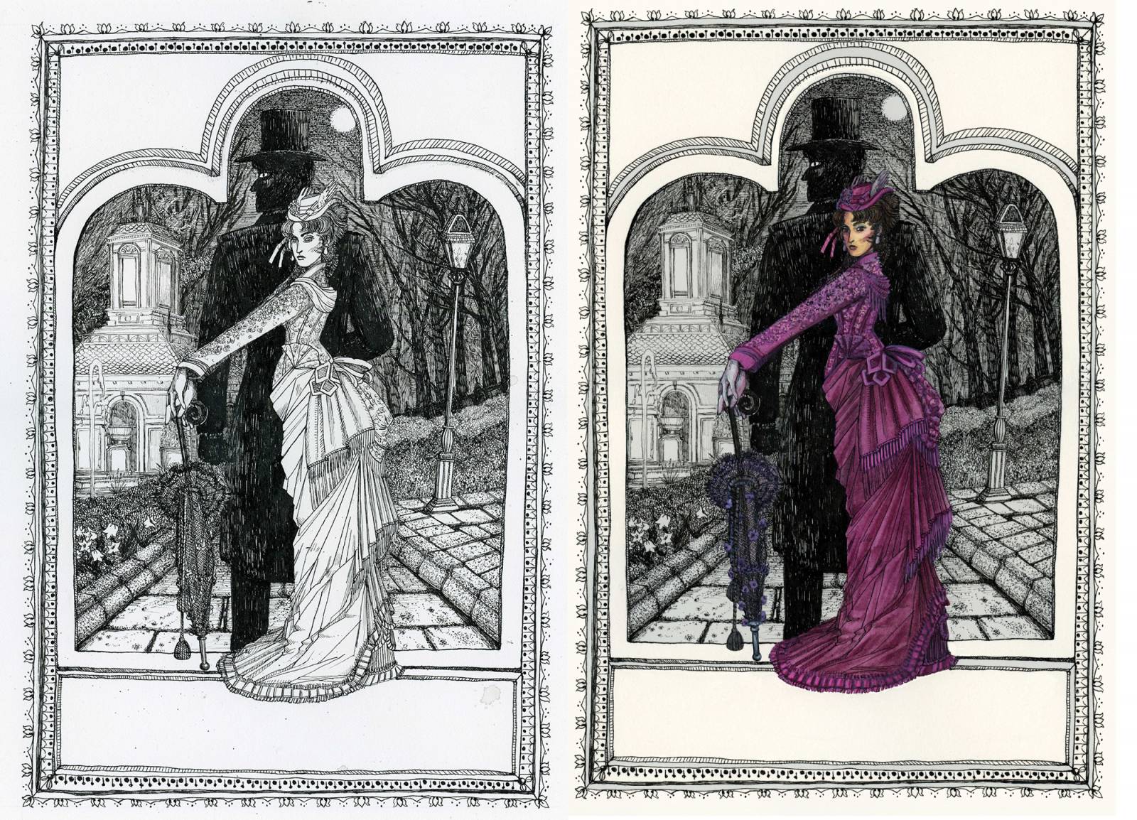
I sent this file off to Lauren for her assessment, and she decided to go with this version. She created the type design in-house at Orbit.
Ok, I’m back!
Once Jensine sent in the final art and it was approved by Gail, I started designing. We ultimately made a few little tweaks — we decided the guy’s eye was looking a little startled so we filled it in to keep the male figure as a full silhouette. I also pumped up the magenta of the dress to look more like the dress and color scheme of the original Soulless cover. We went through a few font options, but the illustration really dictated where the type was going to be…and we knew we wanted it in magenta as well. I picked Archer for the pink type — it’s easy to read, but it has a quirrkiness that felt both a little hand-done and a little historical. Then I picked Strangelove for the subtitle type. Although handwriting fonts can often be too much and distracting, I liked Strangelove for it’s simplicity and for how much like Jensine’s line quality it looked.
Then I designed out the full cover mechanical. “Mechanical” means the actual layout of the entire jacket or cover to the exact size it’s going to be to fit around the book. You have to take the design of the front cover and follow the themes and re-use the art to work on the back, the spine, and the flaps (if a book has them). A spine design is critical once a book is off the display tables and on the shelves in a bookstore.
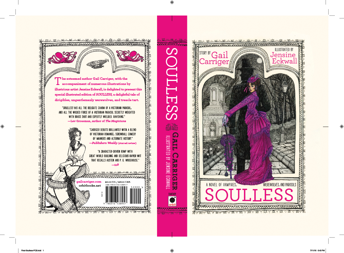
Once the copy is rewritten a few times and then copy-checked by Managing Editorial, Art finalizes the design files (which includes annoying things like calculating DMAX sensitivities) and hands it to Production, who then gets it to the printer. When a book is very important someone needs to go “On Press” to make sure the covers come out the best they can. Printing is an art, not a science, and adjusting one thing on a cover can throw everything else out of whack. Art Directors and our counterparts in Production will travel to the printer and literally stand at the end of a gigantic warehouse-sized printing press and watch covers come out. Then we work with the pressman to adjust the C M Y K values until the cover looks exactly the way we want it (or as close as we can get — inks always have to compromise). Then all the covers for the print run are printed and laminated.
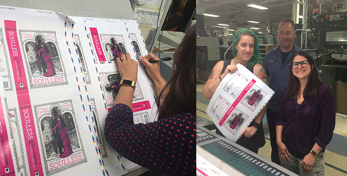
After printing the covers go to the bindery, where they are wrapped around the hardcover boards, and then the page block is nestled in and glued. The endpapers and headbands are glued in. And finally a few weeks later we get the whole package!

And you can order your copy here. Release day is September 18th!
Thank you so much to Jensine for doing such a fantastic job on the book. It’s Orbit’s first illustrated edition, and it’s a great one!
Jensine is such a badass. Perfect fit for her work!
She really did such an amazing job!
Incredible work!
That’s awesome! I’m glad orbit has started producing illustrated books. Hope it’s successful!
The blog is very informative and outstanding. I would love to read your blog. Give me lots of useful information. I will often visit your blog.