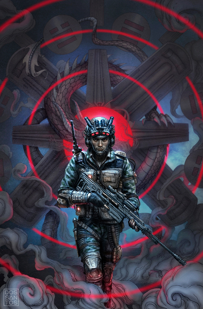
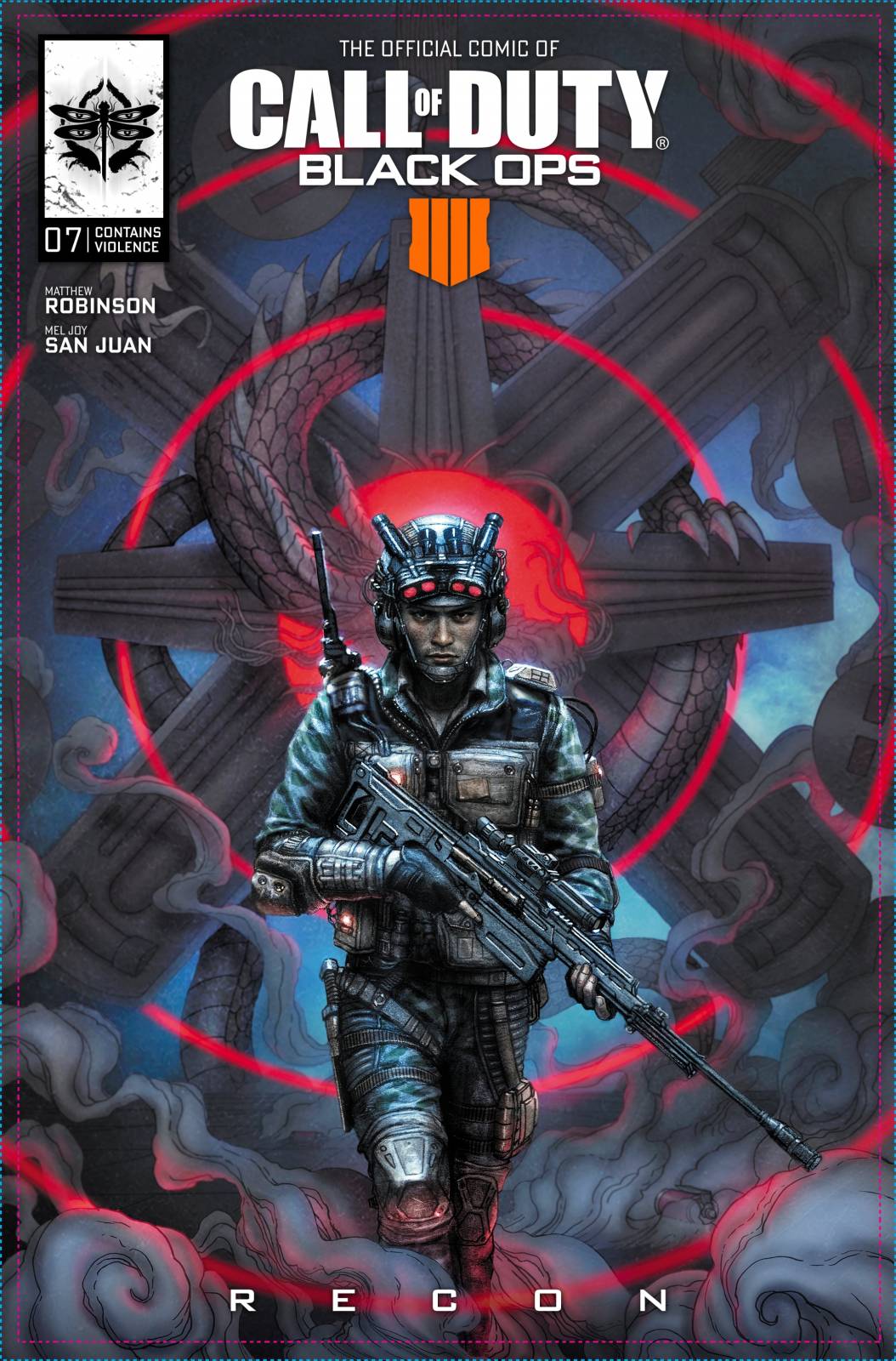
‘Recon’, by Dan dos Santos
Here is a cover I recently completed for an upcoming comic for Activision’s ‘Call of Duty: Black Ops 4’.
Each issue of the comic will focus on a specific character from the new game called a ‘Specialist’. As the name suggests, each Specialist has a particular skill set that affects both the character and the rest of the team. My issue’s story was to focus on the Specialist, Recon.
Recon is an expert in stealth, navigation and sharpshooting. This character struggles with his strict upbringing, and uses his Special Ops missions as an outlet for his anger management issues, which usually surface in a deadly fashion.
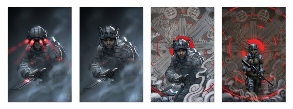
Recon has a lot of cool traits I could have worked with, but the most unique, and most interesting to me was his headset which has 4 infrared eyes on it. Because of his stealth abilities, I wanted to play with the idea of him sneaking around in a low-visibility environment, with only his headset making him visible.
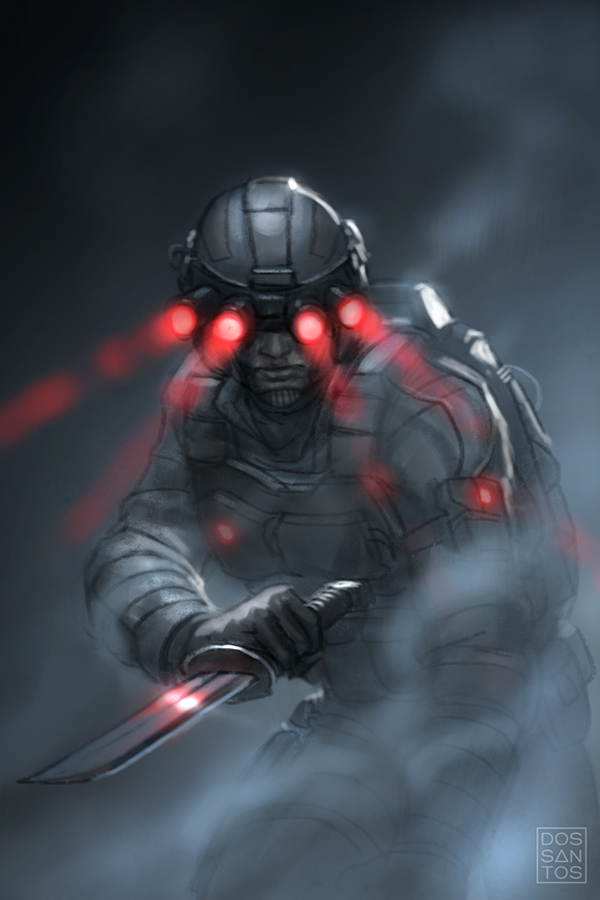
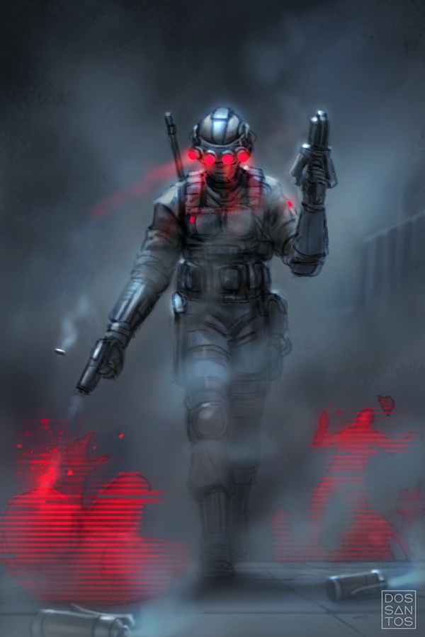
I also thought it would be interesting to show Recon in a more violent state, but depict his victims as just digital forms. I thought that this would be a great way to indicate violence without showing gore, but also elude to the character’s sociopathic tendencies, and how he likely views his victims as less that human, due in part to his equipment’s ability to turn everything into a simple digital representation of things.
Lastly, because the issue focuses strongly on the character’s Japanese heritage, I thought it would be interesting to play with the idea of a dragon, as a symbol of both protection and rage, and use Recon’s headset to imply the eye of the dragon. Recon’s armor is also supposed to be reminiscent of Samurai Armor, so placing him in an environment evoking a traditional Japanese painting seemed appropriate. The radiating lines of the composition are actually one of the character’s devices, a radar-emitting sensor probe.
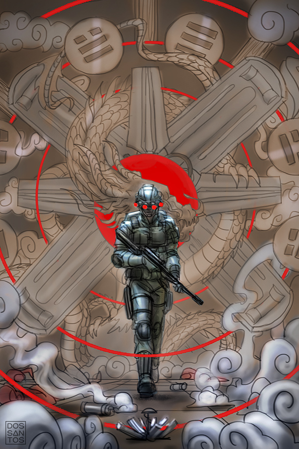
Activision liked the sketches, but wanted to try to combine all the aspects they liked of the individual sketches, and combine them into a single image. They also wanted to downplay the infrared goggles, as they felt is looked too Sci-Fi, and gave the wrong impression of the game.
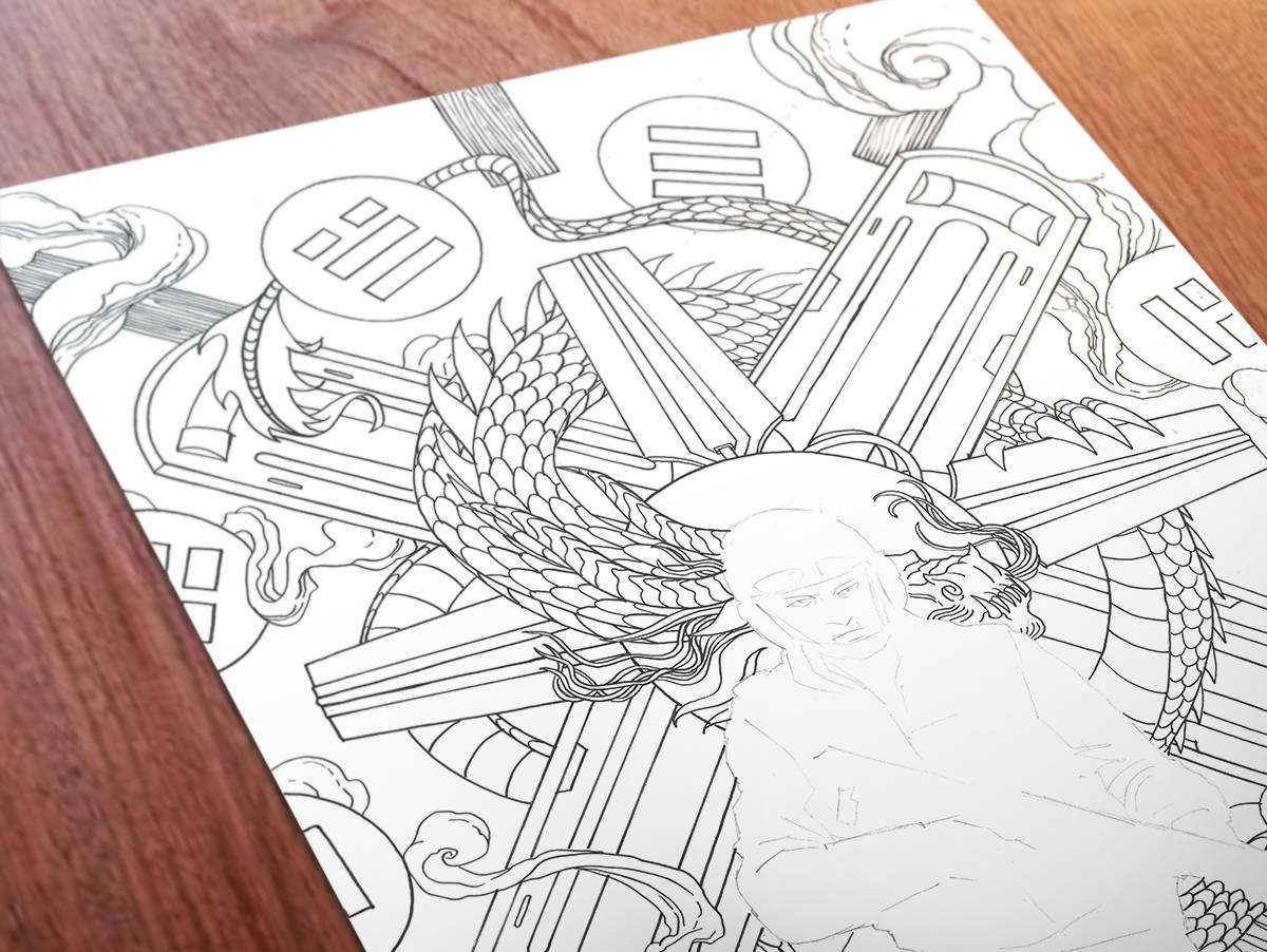
The sketch underwent quite a few revisions until the committee settled on something they liked. The next step was to execute the approved composition.
Anticipating future revisions (which is VERY typical for this kind of work), I decided to paint this piece as separate layers, which I would then combine digitally. The backround would be one painting, the figure another, and the red radar affect would be added digitally. Each section began as a pencil and ink drawing.
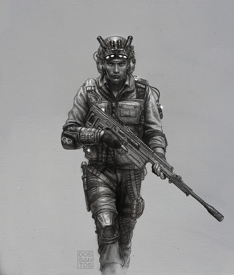
Once completed, I submitted the final painting for review. The image under went few more rounds of revisions; mostly dealing with scaling, costume details, and overall color choices. Ultimately, we ended up with the final product, seen below. A special thank you to Scott Allie who served as my Art Director and Activision Liaison on this project.


Nice cover Dan!….looks a little different from your normal process. The final result turned out great.
Seriously cool!
Dan, this is incredible! So many elements composed in one succinct and compelling image. I love the graphic-like red design and the soft blue lighting. The Japanese homage is beautifully handled yet doesn’t distract from the main character’s expression and pose. This is one of my favorite things about doing a cover. Taking various (and often complex) elements of a story and distilling it down to one image. The challenge is great, but the reward of successfully pulling it off far outweighs the difficulty. Thank you so much for sharing your process. You are an inspiration.