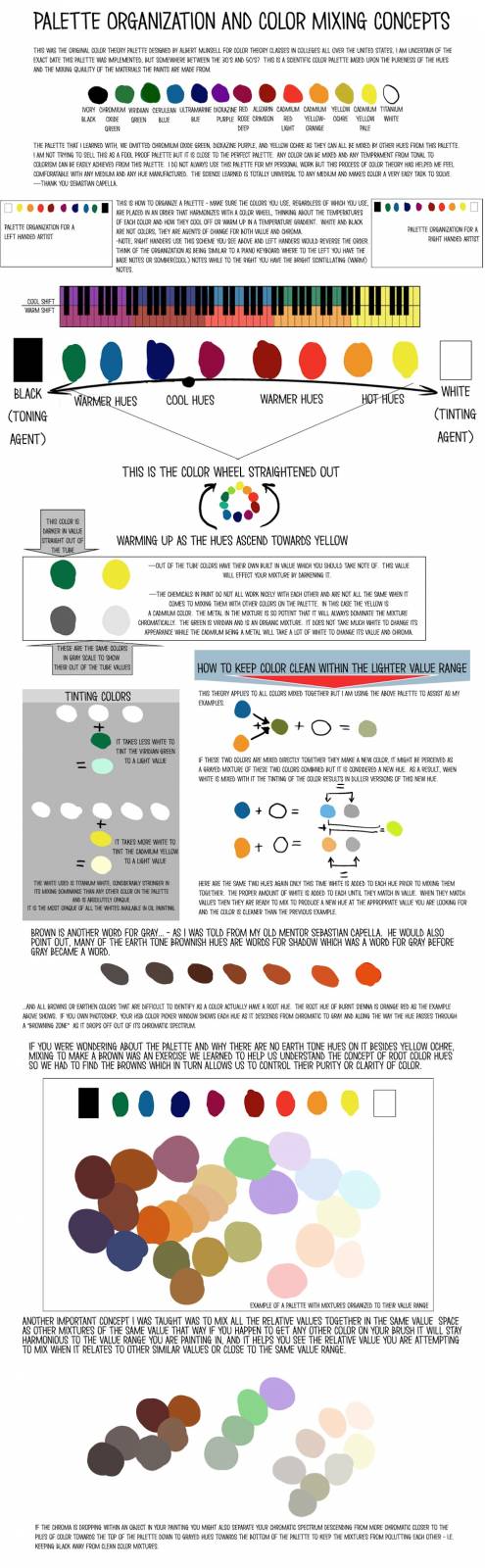
Hello again and hope you are all doing well. I would like to post some tips I learned about palette organization and use and some color theory information I learned with Sebastian Capella in this entry. I had to build the information in these worksheets. I can organize my thoughts easier when it comes to lots of different points and factoids if I build a worksheet of this sort. For a high res version of the below worksheet please click here.
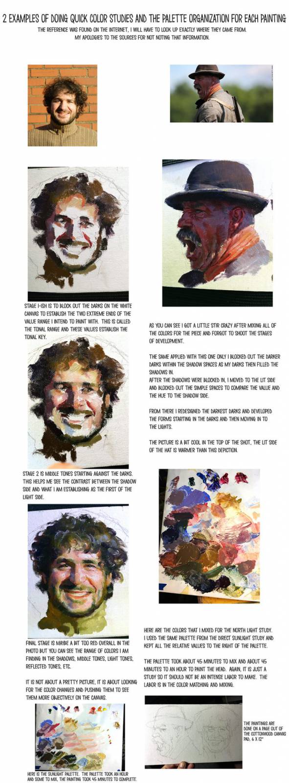
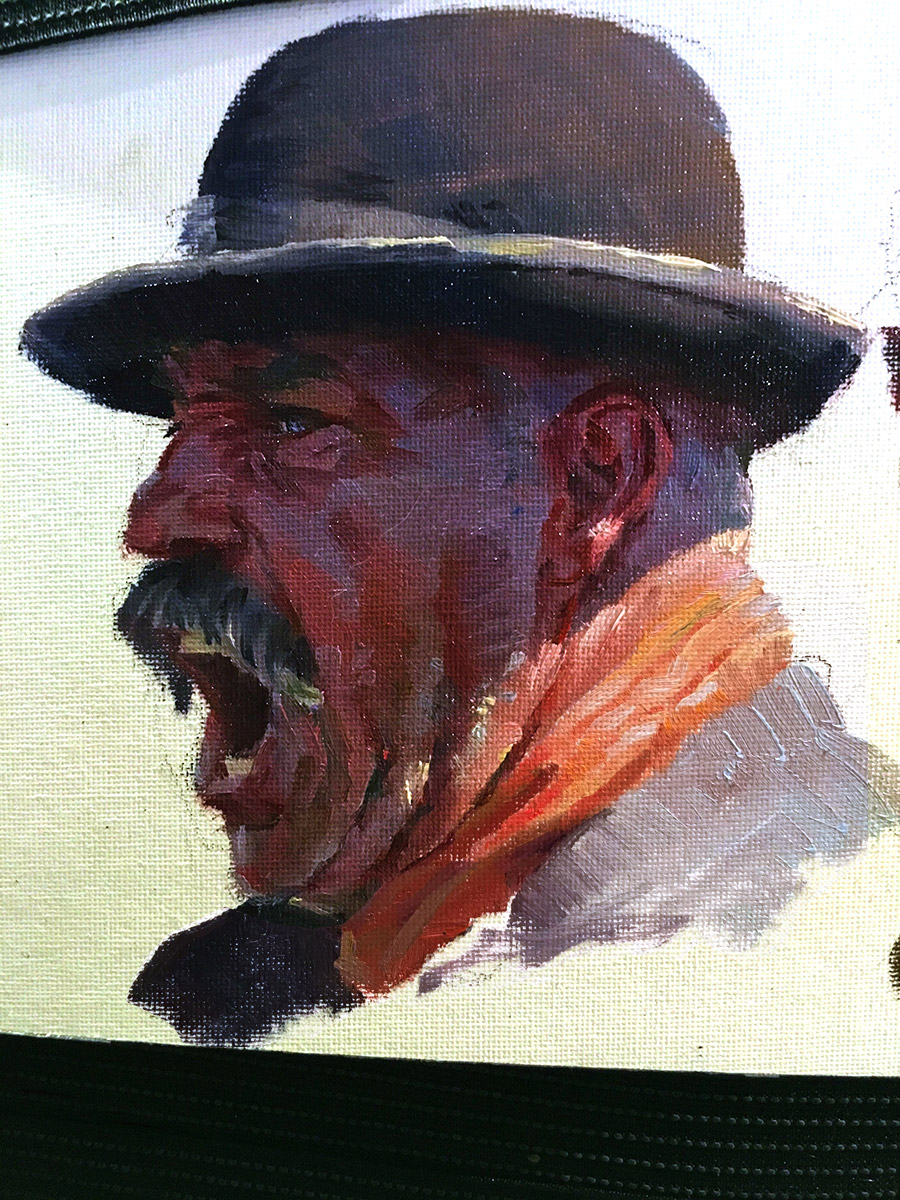
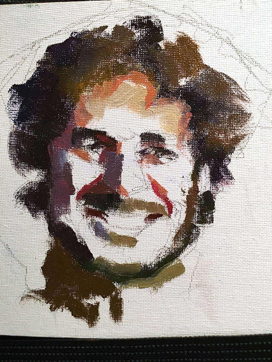
The below examples are using the palette system above and doing small color studies pushing the chroma potential in the paintings. The colors are not made up, they are observed from what color changes are noted in the images. These are both high rez files that I worked from, and although any image we work from will not be perfect, these have quite a lot of extra color information in them that was captured by the cameras used.
The image on the left is a sunlit reference and the image on the right is a north light or indirect lighting example.


Great article – really insightful. The second high res dropbox link doesn't work though. Still, thanks for sharing!
This is awesome! Thanks for posting.
Really helpful! I've been struggling with this recently. Thanks for putting this together. Do you mind having a look at the dropbox links again? The first link leads to a high res of the second image. And the second one links to an error page. 🙁
One question, Mr. Lemen (I have been a long time fan of yours, btw)…what you mention about equalling values with white before mixing in order to achieve a “clean” colour, do you think is it a good idea to do it towards the darkest side? I mean, for example tinting with black a red to get closer to a dark blue or something similar…
I think I fixed the links. I hope so. Let me know if they are broken. They seem to work on my end but then…
Tayete, thank you very much and let me try to clarify what you might be saying. You are saying tinting with black but that is not tinting, tinting is only with white. What you are mentioning is relative to toning but what I am referring to in this lecture has to do with clean colors on the light end. If you are working towards a dark color you start dark and work your way back from there to adjust the value to just what is needed.
If you mix two colors out of the tube and then add white, the result is never as clean as if you mix white into each color that you intend to mix together prior to mixing them together. You are essentially making a new color of each adding the white. Then you are starting with these new tinted colors to achieve your end result which will be cleaner and more direct to the goal than the other direction which will take much more adjusting to get the color at the chroma desired.
I hope that makes some kind of sense and thank you for the question.
Now they can´t be downloaded without a dropbox account. I don´t have one but I could download the linked that worked before you fixed them.
Unfortunately the links don't work on my end. I have a Dropbox account but the links say “The folder '/Public (2)' doesn’t exist”. Thanks for taking the time to put together this second entry on color theory.
I thing both links now lead to “my folder” which makes it inaccessible to anyone but the owner. I might be mistaken but you might be using the image address from your browser window which does not work because it is only accessible to the account owner. In this case you might fix the problem by right clicking on the image instead, selecting “share…” and copying the link they give to you in the dialog window.
Thanks for the answer!
Yeah the link leads to my own dropbox folder and says the file doesn't exist.
I'm having the same problem- the link opens my own Dropbox account and says “The folder '/Public (2)' doesn’t exist”. I just saved the low-res version to my desktop and played with the sharpen tool to make the copy a bit more readable.
ditto
Same here. I'd really love to have that chart.
I'm having the same problem that Steve reported.
I made the image links now open up to a 3200 pixel image instead of 1600 px. Just click the image and open in new window.
OK, the links seem to be an issue, so I've removed them. Instead, I've upped the resolution of the images themselves. Just click a thumbnail and open it in a new window. The image file should now be 3200 pixels tall, plenty large enough to read.
Thank you!
I waited a week so things could straighten out. Did not disappoint! Thank you!
Looks like a really great article. But the writing on the palette organization file is much to small. I downloaded the image to my computer and tried to enhance it but it’s just too small. I don’t know if this problem came through switching to the new website design.The file is a mere 112 k big and has a resolution of 495×1600 px.
The first img seems to be super low res, its hard/almost impossible to read the smaller text. Is there still a high res version of this someone can link to or update the embedded img with?
Hey Peter! Here’s the working link (I hope it works)
http://1.bp.blogspot.com/-pdcYDSPT7pc/VlA6SlpBBkI/AAAAAAAARks/JzMSDqsP0Bs/s3200/Color%2Btheory%2Bworksheet2.jpg
I guess it’s a relic of some Blogspot post by Ron. Thankfully google managed to find it via similar images search. I wish admins would reupload this image to muddycolors for archival purposes, because it is very valuable.
Thank you!! 🙂