I’m not an illustrator. I don’t paint. When I draw, I generally draw logos and type. My tools are fonts and layout and cropping, and my superpower is knowing how much of something will fit into something else (equally useful in book cover layouts as in packing suitcases and cars). That sets me apart from most of the contributors here, and it generally sets my portfolio reviews apart when I’m reviewing illustrators. As far as painting technique goes, I can tell you what’s right about your pieces, and wrong about your pieces, but I can’t be a Donato or Manchess or Dos Santos and tell you exactly what technique you need to use to fix what’s wrong. I can tell you that your anatomy is off, or you need more texture variation in your surfaces, or your colors need to pop more, but that’s as far as I go critiquing what your brushwork looks like.
The real meat and potatoes of what I do, and what I look for in portfolios, is an understanding of composition and layout and emotion. How well do you control the viewer’s eye and lead it where you want it to go? Great artists don’t leave this to chance — they grab a viewer’s eye and make it go there, then there, then around this curve to right there. Some artists do this by gut instinct and some are more calculating. It’s something that will make every piece of work you do better, whether it’s gaming or concept art or comics…but it’s absolutely critical to book covers. It’s what we call Visual Hierarchy.
Simply put, Visual Hierarchy starts with a focal point. What catches the viewer’s eye? Then, once the eye is caught, where do you send it? Where is your secondary focal point, and your third — and more importantly what is the path the viewer’s eye takes to get from one point to another? These paths lend emotion to the piece in a subconscious way. A spiral draws you into a world. Upswoops or downswoops across the page diagonally lend a sense of adventure. Jumping disjointedly from one point to the next with no path between lends a sense of anxiety. Drawing the eye up or down in a straight line makes something feel more serious, like a cinematic reveal.
The fun part is that each artist can achieve good visual hierarchy in their own unique ways. You can use lighting, or contrast, or rendering, or color, or literally any tool in your art toolbox to control someone’s eye path. Those methods you keep going back to develop into part of your overall style.
Ok, clearly we need visual aids!
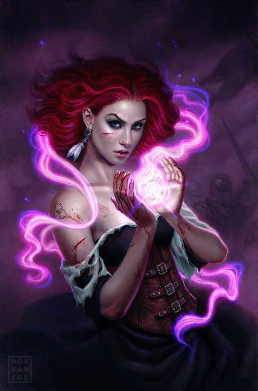
Dan Dos Santos is a master at book covers, and it’s no wonder why he’s painted hundreds of them at this point. Most frequently his tool of choice for controlling the viewer’s eye is light. This is a pretty easy example to follow, because Dan literally painted the eye path. The focal point that grabs the eye is the ball of magic in her hands. Then you pop up with the little upward spurt of blowy magic, and you see how it’s lighting up her face. Then you follow the arc of magic around her head, take in the cool earring and tattoo along the way, then go around her back and oh cool there’s some soldiers there you didn’t see at first. Something you’ll notice about Dan’s compositions is that he will never send an eye path off the canvas. He will always have it curve back into the piece for another loop around if he can.
Look at this piece of his:
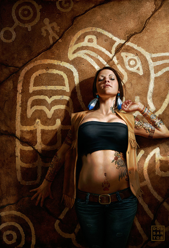
Your eye lands on her neck/chest area — you check out the neck tattoo — then you follow the tattoos down and back up the arm. The hand helps you jump up to the face, then you follow the bird painting’s beak up and around, down the wing painting, then you see her lower hand and the arm brings you back up to her torso and chest area again.
Book covers live or die by their focal points. Remember, you have less than a second to catch someone’s eye — in a store if you’re lucky, but most often now in teeny thumbnail form. There has to be something strong to catch someone’s eye as they whiz past. Remember, a book cover is advertising first, art second. It hurts me sometimes to admit that, since I’m the one standing up for good art on book covers, but at the end of the day an ugly cover that catches people’s eyes and sells is more successful than a gorgeous cover everyone glosses over.
Often simplest is best. That’s why so many covers have a single figure on them. Whereas gaming art can be very complicated compositions, a book cover has to be simpler. Here’s two great recent book covers I wish I had art directed, I think they’re great:
 |
| Jaime Jones |
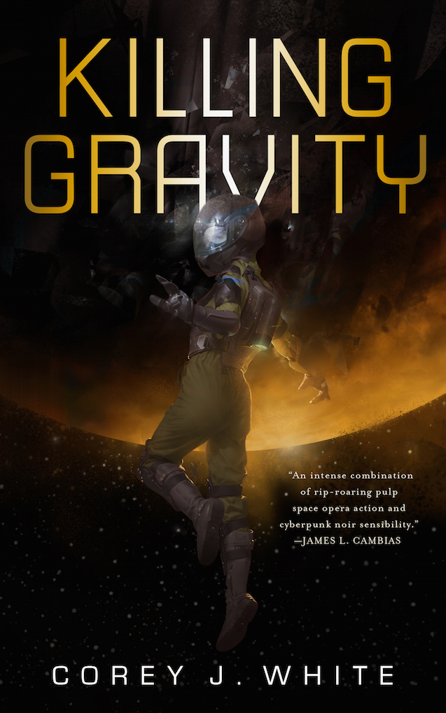 |
| Tommy Arnold |
These are both great examples of a simple single character with minimal background, but have nice strong focal points and simple eye paths. The lighting in the Jaime Jones illustration is a great spotlight, and how it widens/fogs out at the ground level is highlighted by the arc of the cloak on either side. The Tommy Arnold focal point is that lens flare at the edge of the planet, then you follow the rim light up the astronaut’s back and arm to the face. In both of these examples, the type does a nice job of supporting (rather than fighting against) the direction of the eye path. In both cases you take in the figure first, then it leads you to the title.
Here’s some more artists and how they handle focal points and eye path:
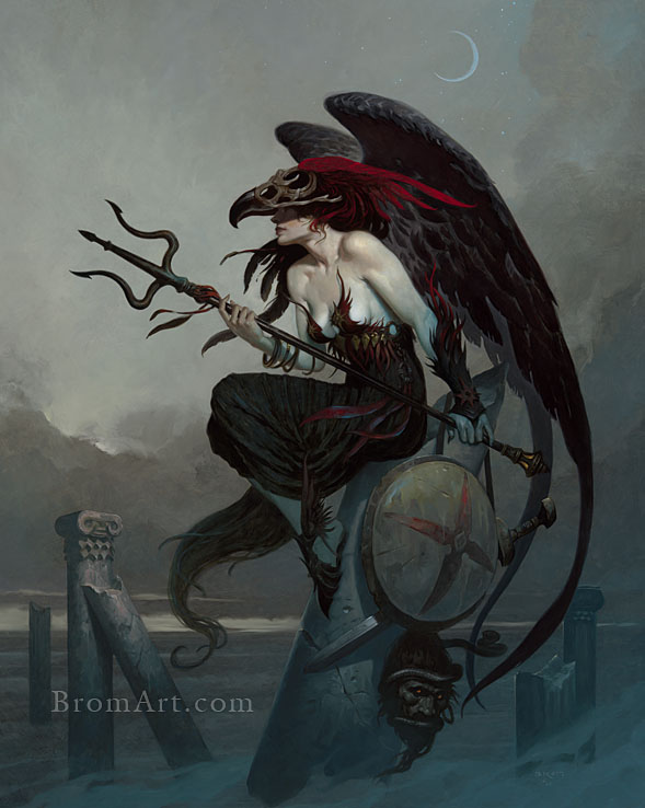 |
| Brom |
The clean graphic silhouettes in this Brom piece are fantastic. That pitchfork literally spears your eye, then you follow the shaft down to her chest, back down her arm, then you wrap down those wings (pointing back into the piece, notice), and you get the bonus of the face down at the bottom of the column.
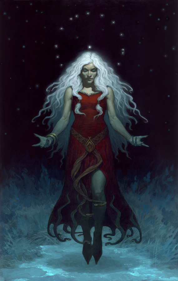 |
| Brom |
Another Brom piece using strong silhouettes and lighting. The focal point is the crown of her head. You see that star, but then drag down the sides of her hair, down her arms, you hit that pop of light on the knee, then the lighting flips on you and and you get the almost completely flat graphic silhouette of the bottom of her dress and her shoes. A simple downward eye path, but it lends a seriousness, a gravitas.
 |
| Greg Manchess |
Greg Manchess is a master of minimal brushstrokes, and most often he controls his focal points by the level of abstraction through his work. The eye goes to the most rendered place first — which in his portraits is commonly the eyes — then the focus kind of radiates out as the brushwork gets more and more abstract.
Here’s a version of him doing the same thing on a book cover:
 |
| Greg Manchess |
Your eye goes to the most rendered point — the helmet/face (which is also helpfully highlighted) — and then radiates out pretty equally, following the limbs out into the abstract space.
Not everyone who is a book cover master keeps to simple compositions, however. Donato Giancola clearly likes to challenge himself to make his compositions as complicated as possible, yet still maintain strong visual hierarchy:
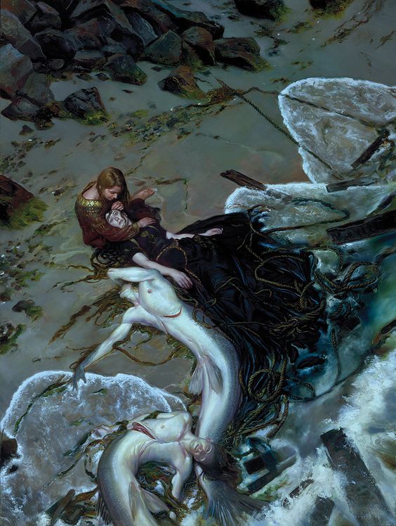 |
| Donato Giancola |
Here your eye is drawn to the light curves of the mermen’s bellies. That great arc leads from the merman’s arm up to the woman’s arm, which you follow up to see the intimate emotion going on between the two human characters. There’s a lot going on in this piece, between the waves and the nets and 4 figures, but it’s not confusing to the eye at all. Most artists would have gone straight for making the human figures’ interaction the focal point, but Donato introduces a timed reveal here, just using visual hierarchy. That’s a master at work.
Here’s some more illustrations I found at random poking through pinterest that made me itch to put type on them (a good sign that your piece feels like a book cover to me):
 |
| Grzegorz Rutkowski |
 |
| Miranda Meeks |
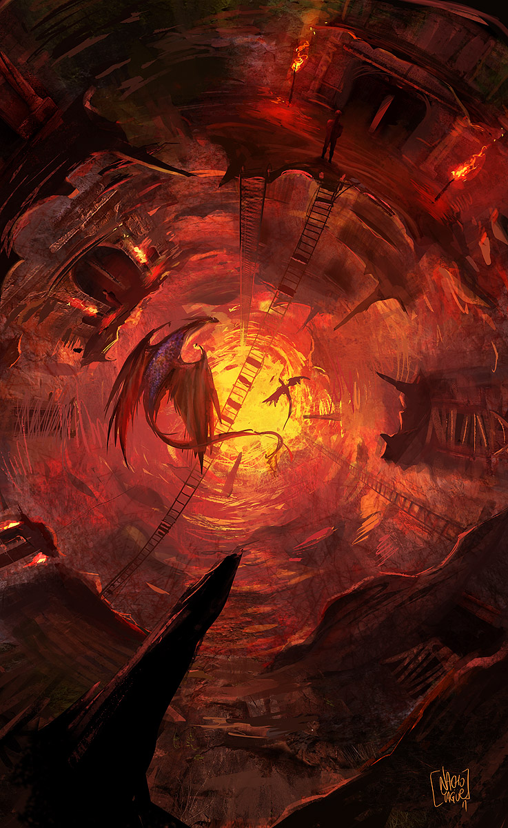 |
| Nacho Yague |
 |
| Daniel Dociu |
Most importantly: remember visual hierarchy has to be thought of as early as the thumbnail. It’s something you can craft as you develop a piece, but the main focal point must be mapped out first, and the thumb should be constructed around that. You should be thinking about what your eye path should be when you’re thumbnailing because it will develop your composition as you go. Weapons, hair, lighting effects, a comet’s path — all these things will have to go in certain arrangements to further your eye path, and poof, there’s your composition all worked out for you. Then as you work, remember to keep details like hair, decoration, folds of cloth, roads, the line of a spaceship, all support your established eye path and keep bringing the eye back into the composition.
And yes, this is AS important to work out for landscape scenes as it is for character pieces. Perhaps more so, because you have to literally lead the viewer’s focus around the scene. Dociu’s piece above is a great example. You grab the eye with that circular landing bay, pull them down the highways and across the from tot the piece to the right, then up that ruined bit back up to the buildings.
Master visual hierarchy and you’ll have no problem making pieces that intrinsically feel like book covers. Ignore visual hierarchy and your work will never feel like an impactful book cover, no matter how gorgeous the art is.


Super helpful and great examples! And yes, totally need to keep this more top-of-mind when sketching thumbnails.
Also, it reminds me of when I worked in advertising and my team started putting some work through the 3M VAS tool. I thought it was pretty interesting how they'd made algorithms of this stuff. I never got to sneak a painting into it though, haha.
Lauren,
Awesome post…really nice explanation and great examples…putting this one in my “Inspiration” folder.
Great job!!
Oh i know, they've done great studies with the eye mappers. I'd LOVE to have one in the office!
(for those of you who don't know what we're talking about: http://solutions.3m.com/wps/portal/3M/en_US/VAS_NA/Home/?WT.mc_id=VAS14_Home )
<3
'The pitchfork literally spears your eye'
Oh god that's not what 'literally' means.
I really liked everything else though.
super helpful, cheers lauren:)
Thanks for linking this post Lauren! I am going to re-read it this morning.
Thanks for sharing 🙂
Lauren, I just love your posts. Keep giving us wise observations and thank you so much!