After I’d handed in Yusri, Fortune’s Flame, I was asked to do a second painting featuring Yusri, my current favorite fire demon. This time, he was meant to be pulling a woman out of the rubble of a collapsed building. The woman would be unscathed and there needed to be some indication of connection between them as though the ifrit were recognizing his lucky equal somehow.
Given the requirements of the assignment, I decided that the scene worked best as a profile view. My reasoning for this was simply that any three-quarter or over-the-shoulder view virtually eliminated one of the characters. This is a problem when dealing with an image about the meeting of two characters. It’s especially a problem when those two characters are supposed to be recognizing one another as equals. So, I felt it important to represent that by having them both equally (sort of) present in the image. But a completely equal representation didn’t quite work out given the other necessary aspects of the story (the woman being pulled from the rubble, which visually reduced here presence within the piece).
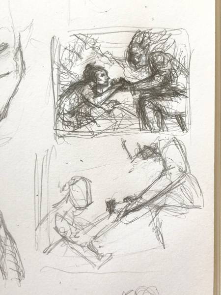
My explorations and thumbs tend to be…scribbles at best. Still, I manage to at least start chipping away at the direction I want to take.
The thumbnails I drew instantly reminded me somehow of the album art for Pink Floyd’s album, Wish You Were Here, and I strove to nod to that art in some way.
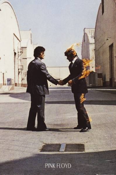
A crop of the album cover, photographed by Aubrey Powell. There’s a whole sequence of images, actually, with varying amounts of flames on the business man at right.
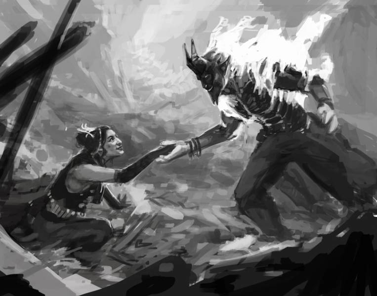
Keeping the above image in mind, I did the sketch up in Photoshop and submitted it.
As you can see, the sketch ended up not being a literal recreation of the Aubrey Powell’s photograph. But I think I managed to keep some spirit of it intact, nevertheless. Whether or not the fine folks at Wizards picked up on this reference, I have no idea. Regardless, the only requested change was to have the ifrit floating above the rubble instead of standing in it. This change pushed the image even further from the Pink Floyd artwork, of course, but it kept this image more consistent with my initial depiction of Yusri.
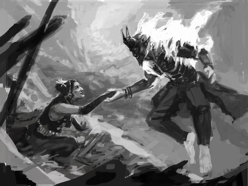
While I wasn’t asked to submit a revised sketch, I did anyway. I always like to make sure the art director and I are on the same page. Besides, since I’m going to project the sketch to transfer the drawing for the finish, it behooves me to follow through.
In the design of the woman and her clothes, I tried to make some subtle suggestions that tied her to the ifrit. The most obvious suggestion is the gold coin-like decorations that run along the base of her vest and thus surround her like the ifrit’s gold coins. It’s a tiny detail, but it’s something I felt helped tie them more closely. Everything else was about gesture, and expression.
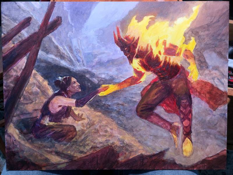
Similar to the first painting I did of Yusri, I blocked everything in right off the bat. Unlike last time, I painted the fire yellow, rather than leaving the white gesso show through.
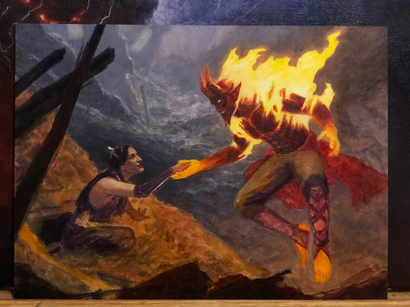
Amazing what a second pass can do to a piece. Another shift in process I made from the first painting of Yusri, I mostly painted this one from background to foreground. This isn’t something I typically do, but I felt it aided in speeding my process as it allowed for a natural progression in my palette as the days went by. I was generally moving toward a warmer palette with each passing day.
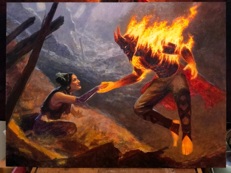
By this point, I was starting to get into the figures pretty seriously. For Yusri, I was able to just prop up the first painting I’d done of him for immediate comparison. But the real trick was the painting of the woman. I probably painted this piece a tad too small as the woman’s face ended up being a bit smaller than I’d have liked. It was tough to get right, honestly. And getting it right was very important given that this piece was about subtle gestures and expressions.
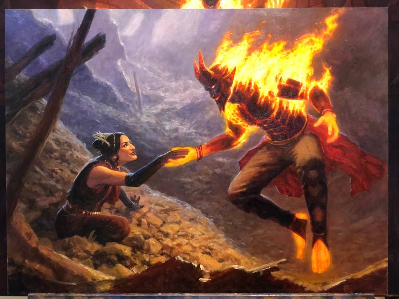
I was getting there by this point, for sure. Some tweaks here and there, but mostly it was about getting that rubble down. If I had any regrets, they’re mostly rubble-related. I wish I’d done a better job of mixing large and small shapes in the pile that she’s emerging from.

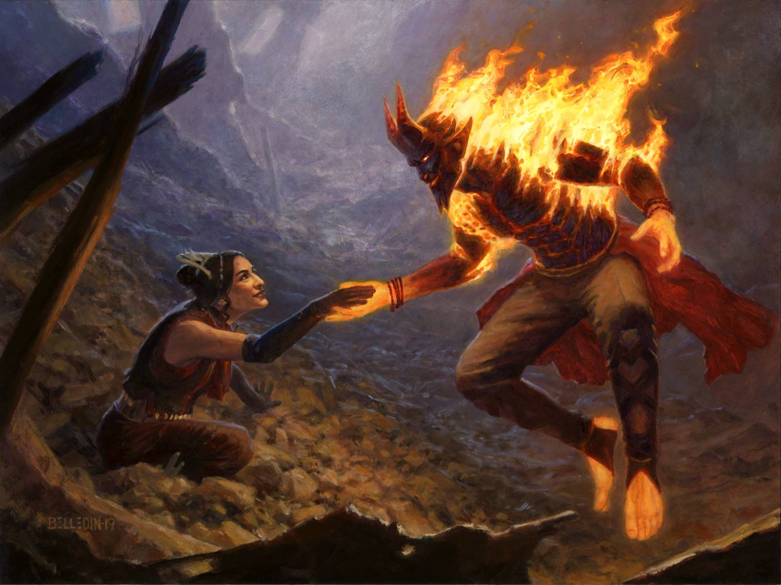
And here’s how it landed. Managed to soften the lighting a bit and disguise the uniform size of the rubble shapes in the rubble. Also managed to pull more of those cools from the background and pull them further into the middle and foreground.
The finished piece is called Chance Encounter, is oil on gessoed hardboard and measures sixteen inches wide by twelve inches tall. It was also art directed by Cynthia Sheppard.
It’s funny. At the start of the piece, I had it in mind to very directly quote another image. But the needs of the piece required me to veer away from that path. I’ve personally found it very important to retain a high level of flexibility when working because my initial intentions don’t always survive to the end. The journey morphs a piece and the direction can broaden, narrow, or change direction altogether. It’s important to be able to let it—both because that’s sometimes what the client needs and also because that’s what the piece needs too. Had I been hard-headed about referencing the album cover, I’d have likely ended up with a piece that was less satisfying and failed to tell the story that needed telling. Still, despite everything, I think the spirit of the thing is still there. Aubrey Powell’s photograph continued to be an inspiration visually (if not thematically), and instead of something to quote it became a springboard.
Both Yusri pieces were a lot of fun to work on. They were an interesting exercise in design and story-telling. And the degree to which I succeeded on either of those fronts is going to vary from viewer to viewer (subjectivity is fun!). Regardless, in this second piece, we’re talking about some difficult things to depict.
Two people meeting and recognizing an immediate connection, in art that will print only a couple inches wide? Also, one of those people is on fire? Not easy stuff to begin with—especially at such a small scale. Well, more accurately, this kind of stuff isn’t easy for me. So, with that in mind, it’s kind of nice to be able to look at the finished piece and feel some level of satisfaction. While I’d be lying if I said that I love everything about either piece, I’m still pretty content nevertheless. The fine folks at Wizards seemed pretty content, as well. And honestly, if you’re happy and the client is happy, what more do you need?



Ahh cheers for the follow up post. Thrilled to see both of these back to back, and see the slight changes in process. Hope someone out there caught the Aubrey Powell reference. Thanks for the posts!