Last month I delved into the sketch process for the painting, Defiler of Instinct (link). In this article, I’ll cover the process of actual painting the piece.
As a refresher, here’s the sketch again: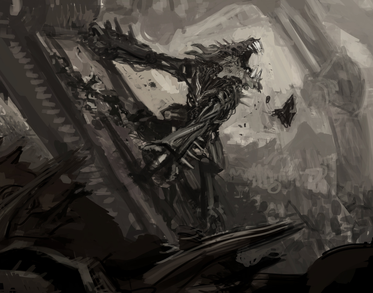
As I’ve discussed before, I tend to transfer my sketches to my panels or canvases using a mini digital project I bought on Amazon. The only downside to the projector (besides being incredibly slow to boot up) is that it only projects at 720p. Fortunately, that tends to be just enough as I’m really only worried about keeping the proportions and composition consistent from sketch to final painting, so the transfers are more about edges rather than details. Once transferred, I might do some clean up on the drawing in an attempt to fix a few things, but I don’t bother with shading. I find it easier to do that in paint.
After the drawing compositions is transferred, I tend to seal the drawing off with at least a wash of acrylic paint. But I’ve been taking my acrylic under paintings a little further recently since I started to incorporate acrylic inks. In college, I used acrylic paint extensively. But eventually, I found that I was trying to force it to do things that oil paint does effortlessly. So, I made the switch. But recently I’ve been trying to work more in water-based media—mostly because I want to stretch and push myself a bit further and try new things. I don’t want to get too comfortable. While this recent experimentation has allowed me to get a better handle on using acrylic, I still have to say I don’t really love working with it.
In fairness, most of the acrylic paint that I currently own dates back from the 90’s. Obviously I’ve gotten rid of the tubes that stiffened, turned solid or separated, but very little of what I have is new. Even the new stuff I’ve bought doesn’t improve my feelings for the medium. And if I had to point to one aspect that really caused me a good deal of grief with acrylics, it’s viscosity. Standard tube acrylics are just too stiff to me. This is why I picked up some acrylic inks. They’re thin, they have excellent coverage, and they work for my purposes beautifully.
(As a quick aside, yes, I know about soft body acrylic paint and I’ve started working with a little bit of that, as well. However, in order to minimize waste, I feel obligated to use up the old stuff I already have before replacing it all.)
Anyway, the use of these inks isn’t something new in my work (I’ve been using them for over a year now). What is new is that rather than use small brushes to trace, correct or reinforce my transferred sketch, this time I used a dip pen.
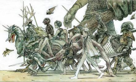
Revolutionary, I know. Big deal, right? But it kind of is for me because I always assumed the texture of the gessoboard was too rough to get good lines out of dip pens. I expected to spend more time cleaning up blobs than actually drawing. However, I was surprised to find that I had no issue. Before doing several washes of a mixture of red and black ink, I first went to town on the kavu (the central creature) with a dip pen and black ink to map out the darks and the details.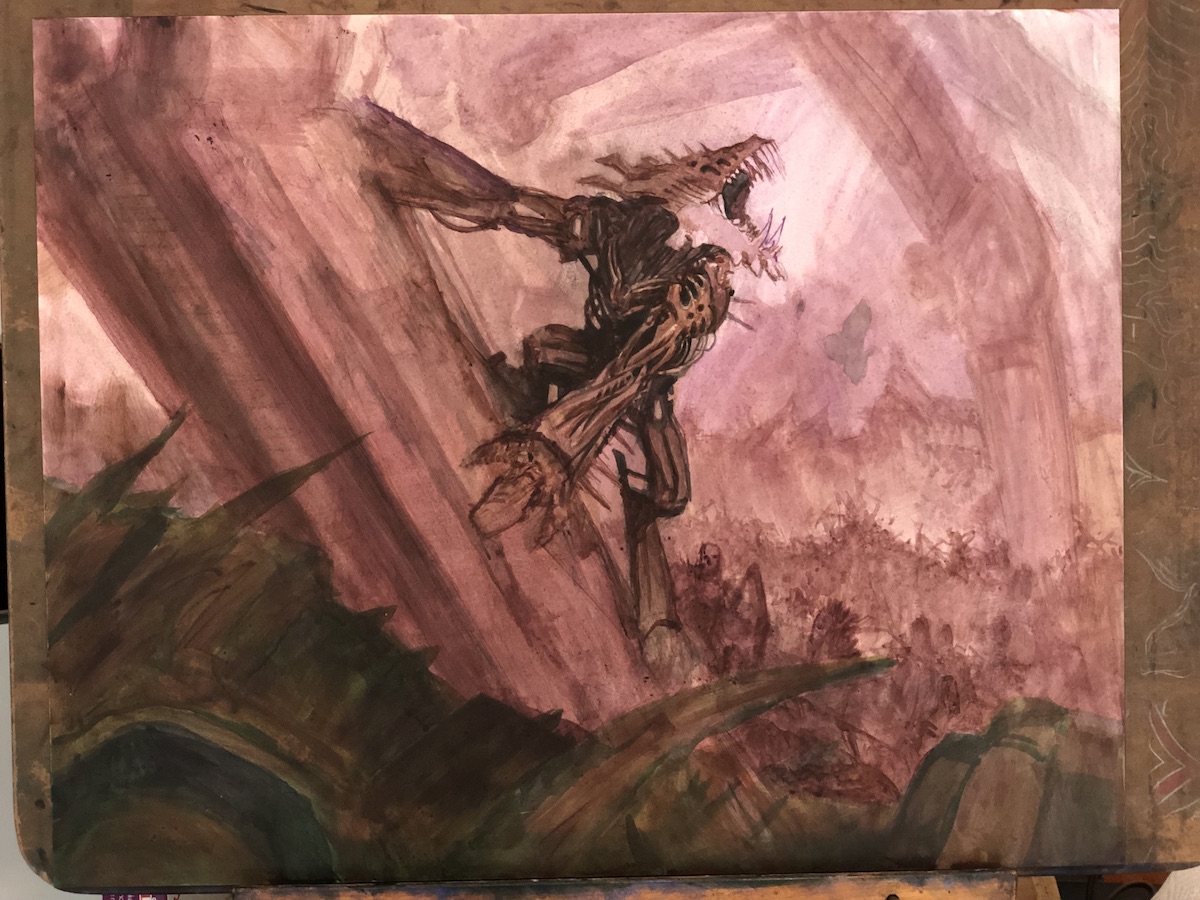 This is what the first, rough pass looked like. It’s ugly, but I already nailed down a lot of detail in the kavu, and it was tight enough that finishing it wouldn’t be a prolonged process.
The use of the pen has been something I’ve revisited regularly of late and it’s also been something I’ve done as part of finished work a couple of times, as well (but I can’t get into much detail about that right now).
 The second pass I did was a mixture of acrylic ink and normal acrylic paint. Considering how thin the acrylic inks are, the coverage and opacity they provide is impressive to me. The battle in the background is all just light blobs done with a brush and dip pen with various shades of color. The metalwork was basically a pass with two different shades of gray and single shade of white, leaving the dark areas that I’d blocked in before left to sit as they were.
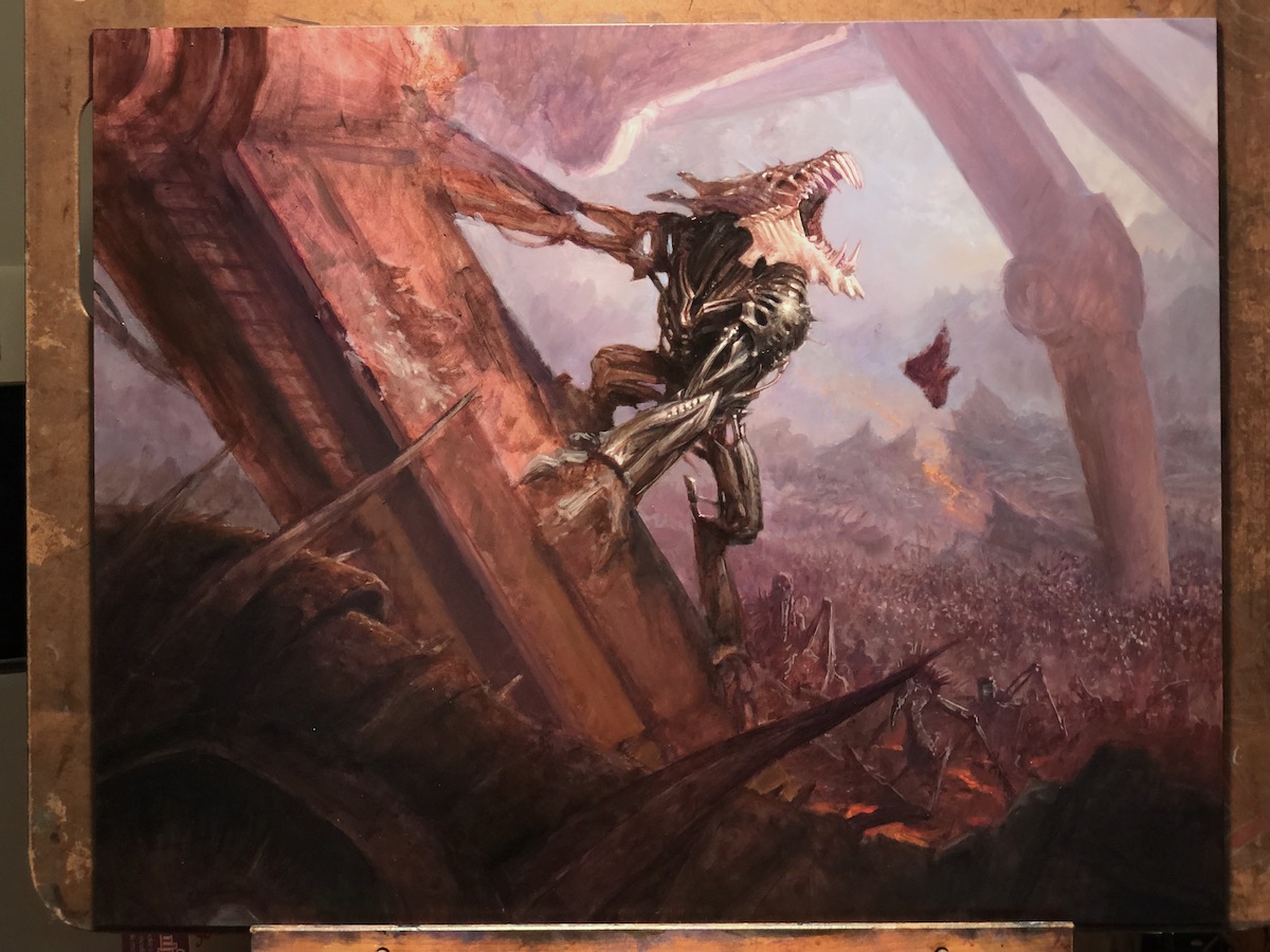 This was a weird piece for me, because I had a pretty high degree of confidence going into it and so I could just have fun in the making. I also really enjoyed pushing myself to see how much of the piece I could get done in acrylic paint. After about three days of working in acrylics, though, I kind of hit a wall and decided it was time to switch to oils. So I got to work blocking in and defining areas that I’d left undeveloped in acrylic.
 Here’s another shot at the same point as above but with a better look at the more finished areas. Lots of pen work still visible in the battle scene (in the edge light and details defining the closest creatures especially). While the vast majority of the battle scene is merely indicated with varying blobs of paint and ink, those combatants closer to the viewer gave me a chance to reference some of the Phyrexian creatures from Magic’s past.
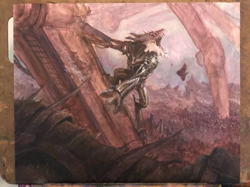
 Developing things from the background to the foreground isn’t something I always do, but it felt like it made sense here. Looking at the piece again, though, it’s just as likely that as a left-handed person I was just moving from the right of the painting to the left in order to avoid dragging my hand through completed areas.
Whatever the reason, this shot documents something that I find often happens a lot while I work. Certainly by this point one would have expected that I’d at least begin to define the kavu’s hands and right arm (the one that sticks out to our left). But for whatever reason, I avoided them like the plague. If I’m honest, I think I avoided that arm because I wasn’t completely sure what I was going to do with it, and also because I wasn’t sure how much detail there really needed to be quite yet. Also, that claw is making contact with another unresolved area and it made the most sense to me to figure it all out at once.
 Finally, I got brave and blocked the rest of the piece in, finally making some decisions on those unresolved areas and adding details to other areas that were well on their way.
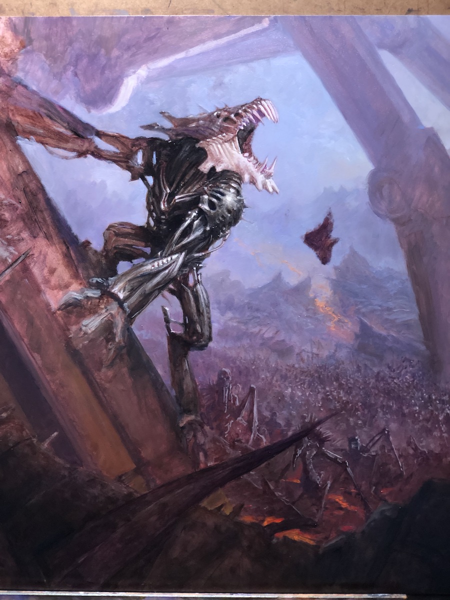
 The last major bit of painting I did on this piece was the torn metal. I waited mostly because I had a devil of a time finding reference. Torn metal is a tough thing. A lot of images of torn metal just don’t have any heft to them. It feels more like aluminum foil than anything. Fortunately, I stumbled upon an image of a piece of battleship armor (which has a similar thickness to what I was painting) that had been shot by another battleship’s gun. That really helped me sell that aspect of the story.
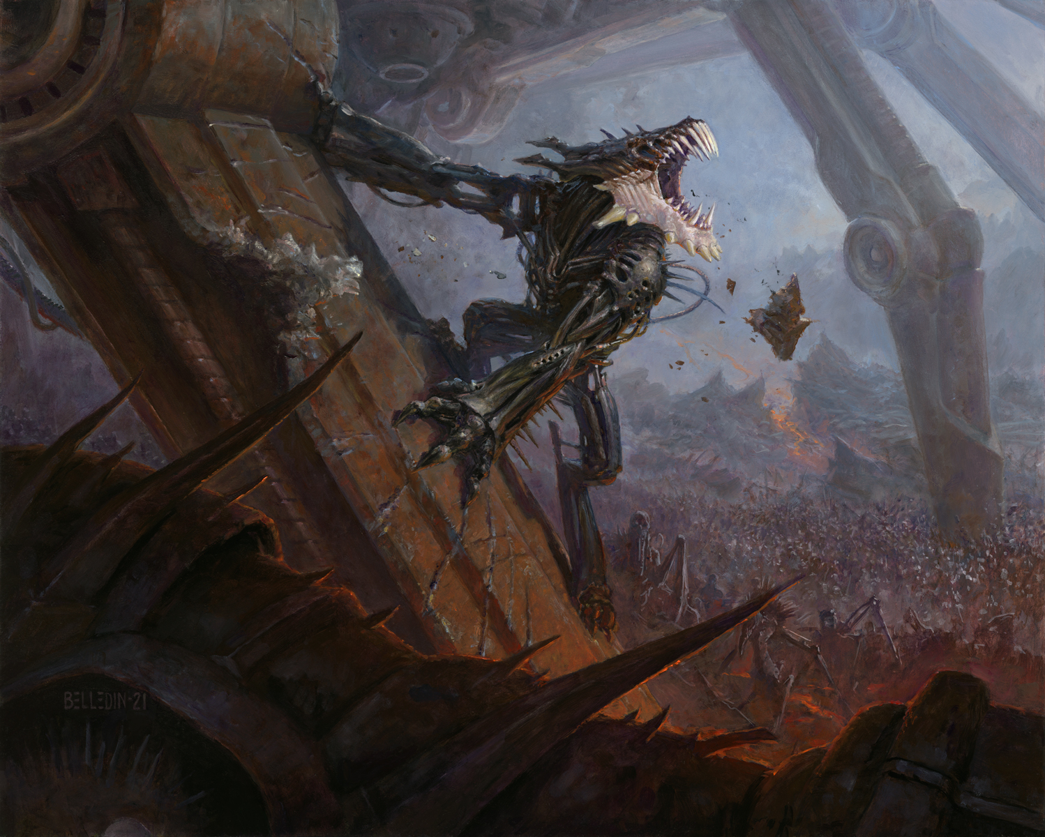 The final painting is oil and acrylic on hardboard and measures twenty inches wide by sixteen inches tall. It was art directed by Zack Stella.
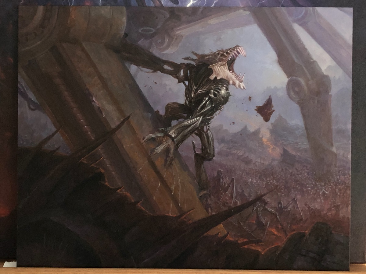
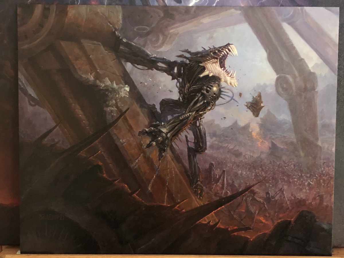
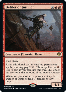
And here it is in card form:
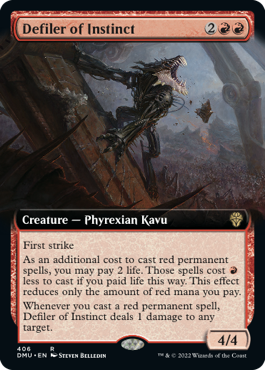
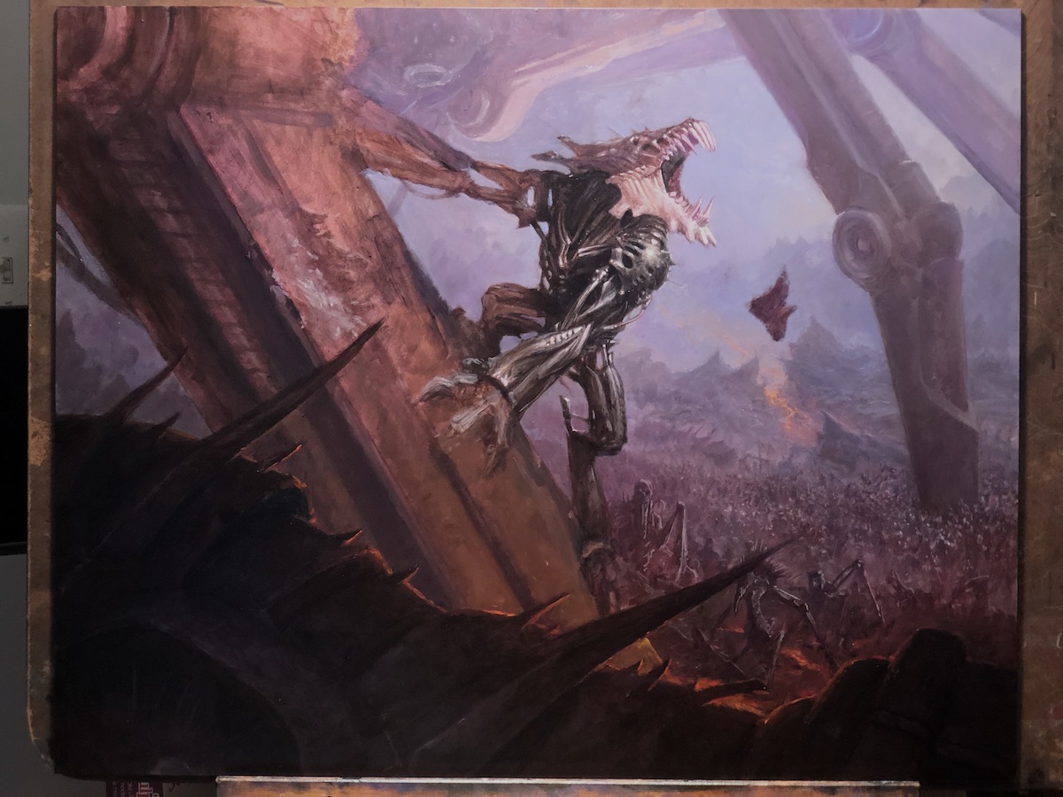
Over the past several years, I’ve gotten a lot of these assignments that come in two card versions. The paintings usually end up with a LOT more background than I might otherwise include because of the needs of the full-bleed crop as in the version at bottom above. Sometimes that can make for very bottom-heavy paintings, and so I’ve dealt with that in different ways depending on the piece. Sometimes I paint more image on top that will never be seen on either version of the card, in order to balance things out. Other times, I paint the piece with a fair amount of extra image but then extend the work digitally to the required proportions. This piece was one of the times where I felt the bottom-heaviness wasn’t too big an issue, and I liked how the piece felt compositionally.
Anyway, one of the most unusual aspects of this piece for me is that I left a fair amount of acrylic exposed and visible. A lot of it got glazed over with oils, but there’s a surprising amount of the live surface of the painting that is just acrylic. Usually I paint over everything completely. But I was really confident in a lot of the acrylic work, and it stood up well to the oil work that was immediately next to it.
In the end, this was a lot of fun to paint, and it was a really excellent piece to work on after several months of forced time off. I wish they were all this fun. Hopefully it was at least a little fun to read about.

Nice work Steven and awesome step by step process!
Great piece- love the texture and sense of scale. You really nailed the thick torn metal on the walker’s leg too!
I have never thought of using Acrylic Ink with Acrylic Paint! That’s interesting and I’ll have to try that out (did even know you can do that especially with a dip pen)! Super cool and love the process