
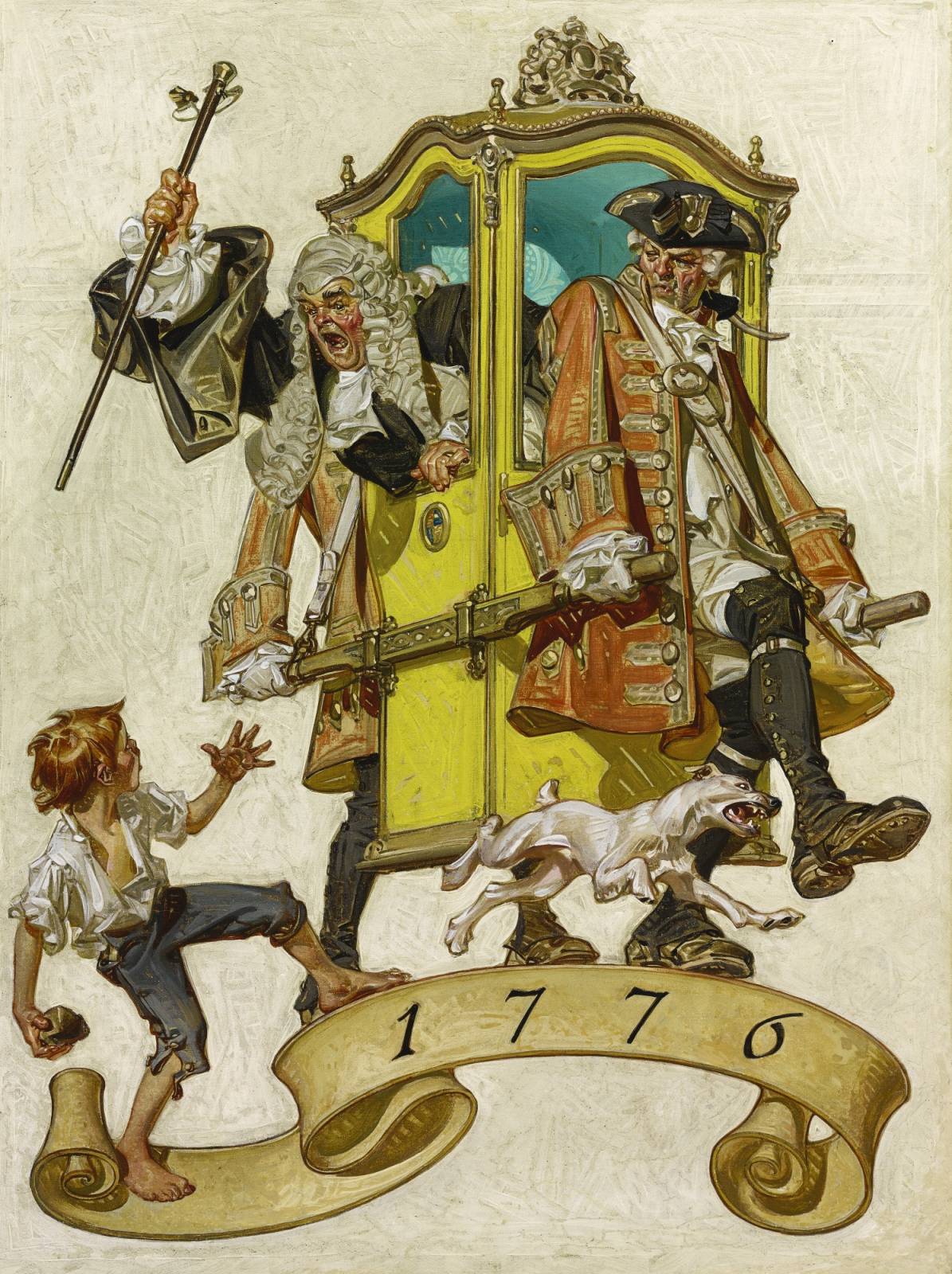
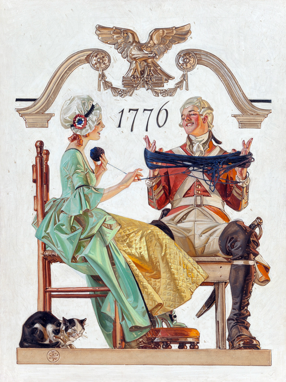
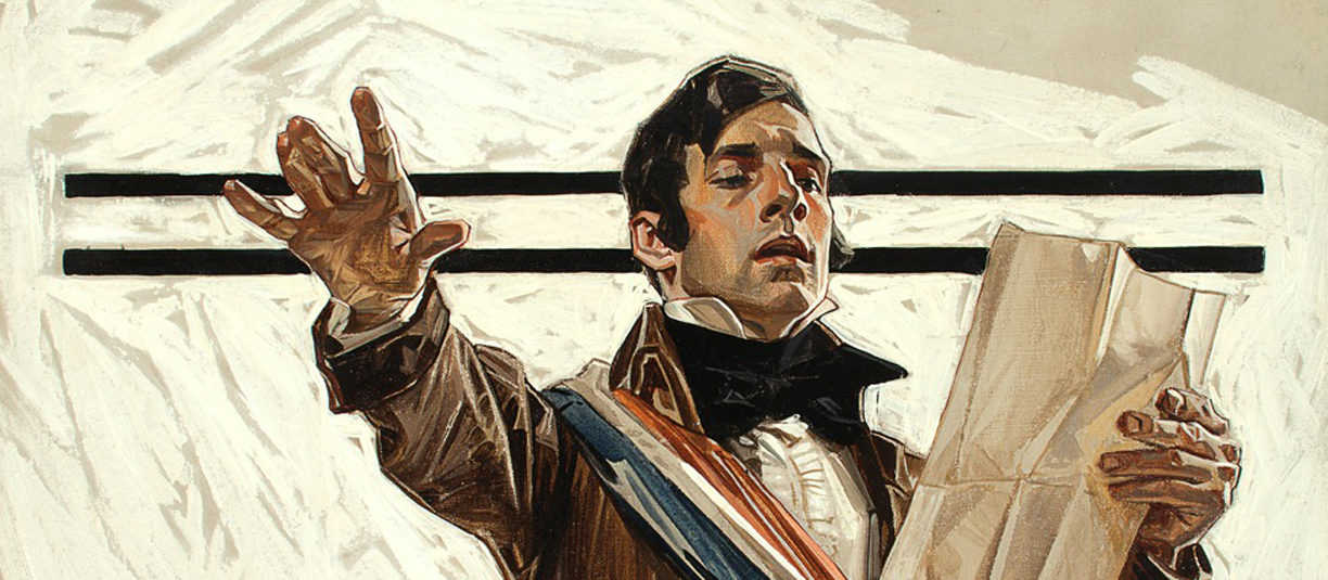
With a nice batch of paintings by J.C. Leyendecker, Muddy Colors wishes everyone a safe and happy Independence Day!


Thursday, July 4th, 2024
With a nice batch of paintings by J.C. Leyendecker, Muddy Colors wishes everyone a safe and happy Independence Day!


Arnie . . . I have a Leyendecker question for which no one seems to have an answer . . . why did he use so many times a nearly white, abstract background, or a very light background. Also, why did he “outline” in a dark value so many of the figures in his work. Thanks for the post and the great Leyendecker work.
It’s only guesswork on my part, but the light or white backgrounds may have been at the direction of clients, like “The Saturday Evening Post,” so that the figures & situations would pop. Backgrounds varied for other assignments—remember the black backgrounds for many of the Kuppenheimer ads—or could be completely rendered scenes (thinking of his painting of Anthony & Cleopatra as an example). I suspect that the abstract brushstrokes for pale backgrounds, like the darker figure outlines, were his style and design decisions at the time. Whatever the reason, they’re definitely memorable!
Thanks Arnie . . . after years of wondering, and asking, someone comes up with a plausible answer. Good show. Thanks
The legendary Leyendecker.
I have a Leyendecker, question, have not found the answer anywhere: A big fan of his work for over three decades, why does he create shadows, separated brush strokes, instead of a flat color, chooses to use parallel brush strokes, allowing spaces in between of a lighter color? I love the look, and it works, but I can’t help but feel that, as a professional illustrator, if I were to do that, the modern day art director would ask me to ” fill in those gaps”, it seems that the great illustrators of our time , especially, “the Golden Age”, they did what they want, and it always worked!-Thank you, Craig Zuckerman