Hello Muddies,
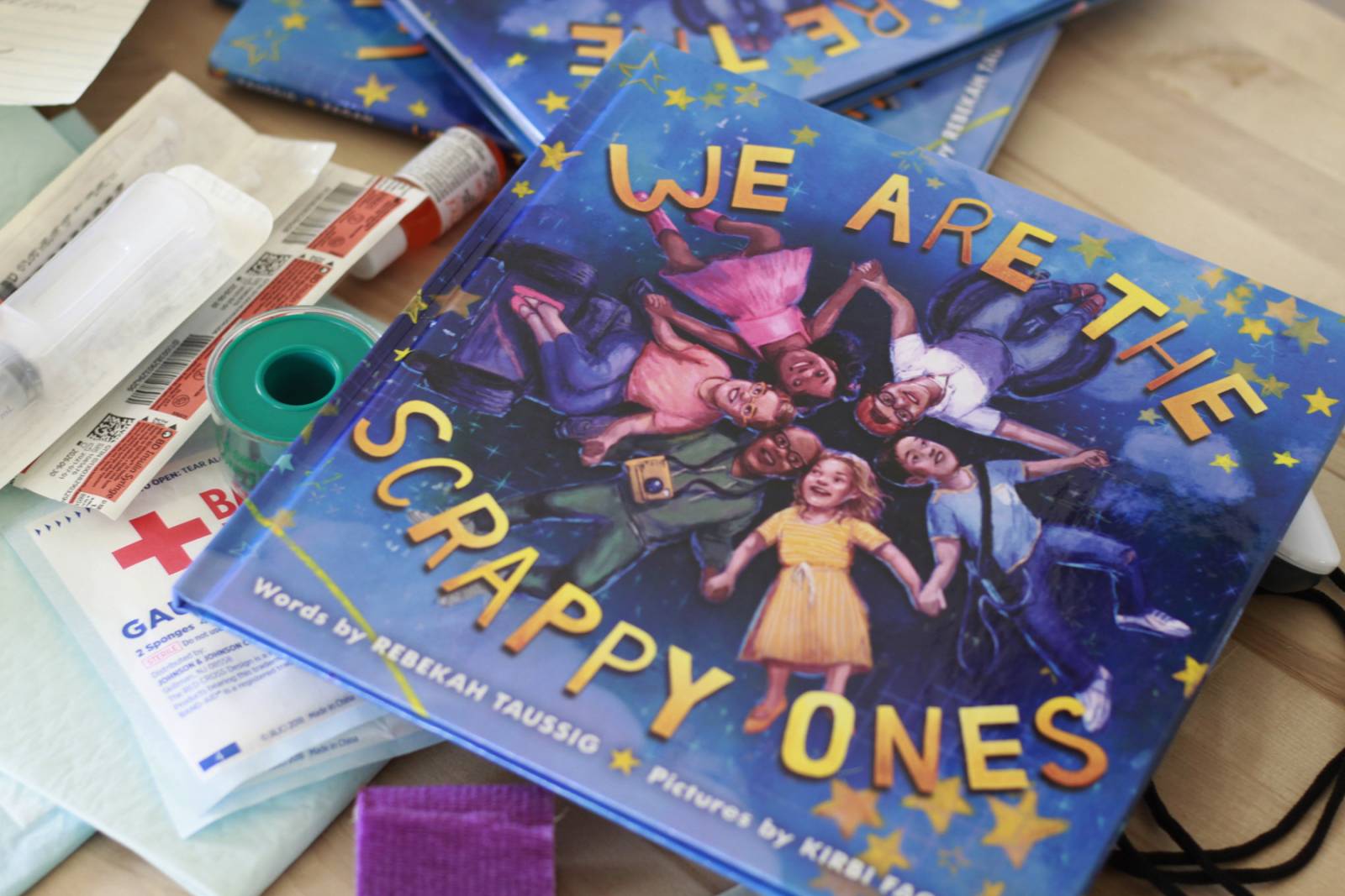
I’ve come off an exciting month, launching We Are The Scrappy Ones. In other great news, my first author-illustrator project is launching this fall and I just heard news that the Junior Library Guild has selected it to be a gold standard selection. 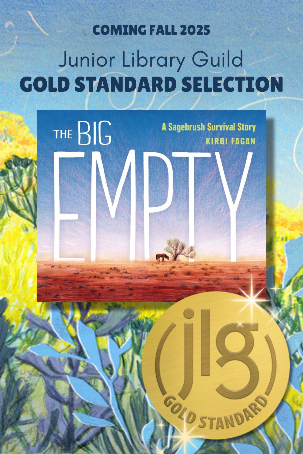
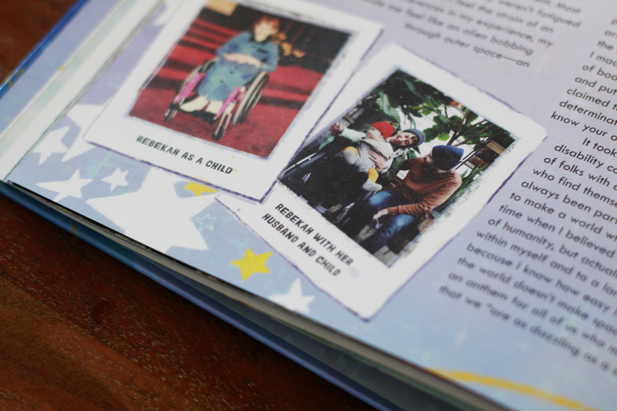
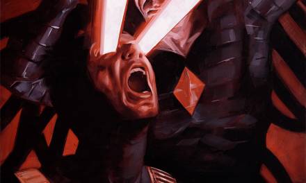
We Are The Scrappy Ones was my first time creating alt text for my illustrations. While I was hesitant to put words to my artwork. This was where the illustration could shine in their purpose and aide in steering the boat of the message of the book.
What is alt text?
Short for alternative text, Alt text provides brief description of an image for screen readers to use. Alt texts aims to provide equal access to visual information. The Alt text I’m talking about today is primarily used by readers who are blind or visually impaired using screen readers.
Should artists provide alt text to their artwork?
Not only can these descriptions support engagement, context and interpretation, alt text can change the way people find you on the internet. When anyone searches for images, alt text helps the internet navigate to images the searcher is looking for. Subtitles on books can have a similar SEO affect just like in blog posts. Using alt text gives artist a chance to expand their audience, including those who may not be able to see the artwork directly.
How to write alt text for your illustrations
People say pictures can say 1000s words. Alt text is usually 1-2 sentences. When describing charts, infographics, historical photos and you guessed it – art, can be several sentences to a few paragraphs.
- Use clear, accurate descriptions. Do not editorialize the information. Focus on what is visual without assumptions. Do describe hair and skin tone but don’t make assumptions about gender, disabilities or ethnicity,
- Use key words purposefully – while it will help your SEO, google can tell when you are overdoing it and ranked lower online for keyword stuffing.
- If the image has text in it, be sure to describe.
- Don’t start with the obvious like, saying it’s an image.
- Images that are purely decorative are often not included in current practices on websites and blogs.
- Consider breaking the descriptions of the foreground and background if needed.
- Don’t repeat yourself.
- If an image has a caption that described the image well, the info does not need to be repeated in alt text.
The best choices for your future alt text depends on the setting, the user’s needs, and the image’s complexity. Accessibility closely looks at what is needed and matches it to solutions that creates equal access custom to the setting. When you are sharing you work, don’t forget the alt text to expand your audience and share more about the context of your work.

That’s some food for thought. It’s not a topic I’ve considered. Thanks.