
For the past weeks, I’ve been trying to find the time and the excuse to try this Kuretake brush that I bought and never got the chance to use. Not also because I was curious to see how it would work, but also because I was needing a switch in my process of work.
Drawing and inking a Wolverine sounded like a good, relaxing way to achieve that.
I’m not used to working with inks or to even think in black and white, so I allowed myself to enjoy the ride without expecting too much.
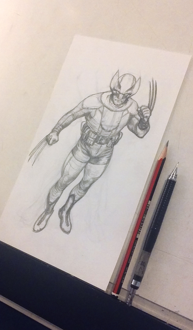
First, the drawing. It’s quite small as you can see. Also, is quite simple and straightforward. I’ve used a 2B pencil and a mechanical pencil, 0,5 also 2B.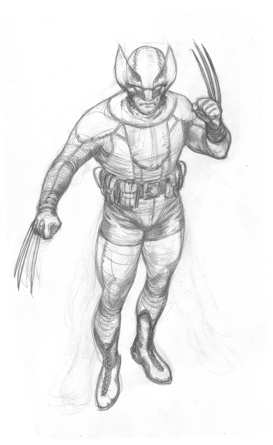
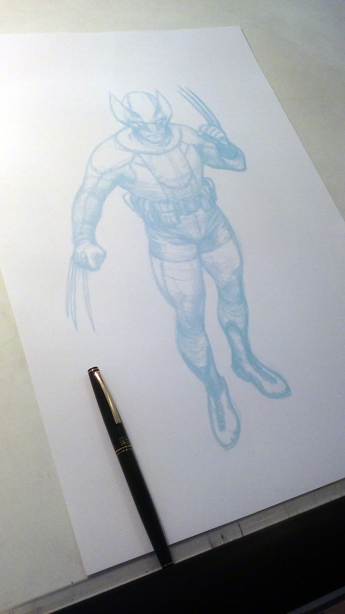
After scanning the pencil, I colorized it to CYAN, to easily remove it digitally later, in case I wanted to.
Then, I printed the image on an A3 + size paper. I’ve used this paper that has a canvas-like texture. It looks really nice on prints, and I was curious to see how the ink would run through that texture.
My tools were the following: My new Kuretake brush, and my beloved Pentel brushes. I really like these brushes because of the way you can regulate the flow of the ink to the tip, so you can go from a beautiful rich black line to a dry brush texture effect. I’ve also used a 0.2 Micron for a few small details.
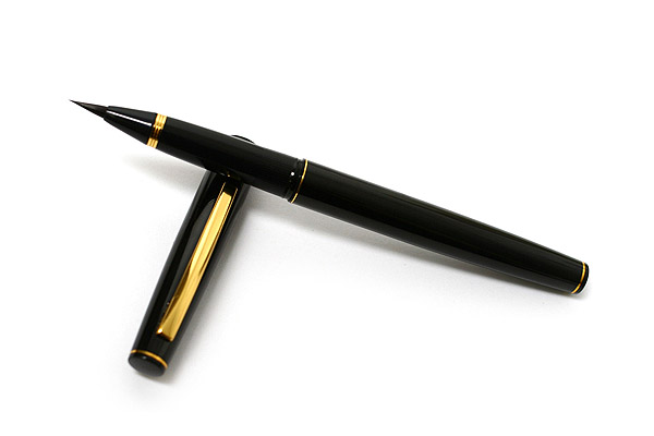
Kuretake Brush
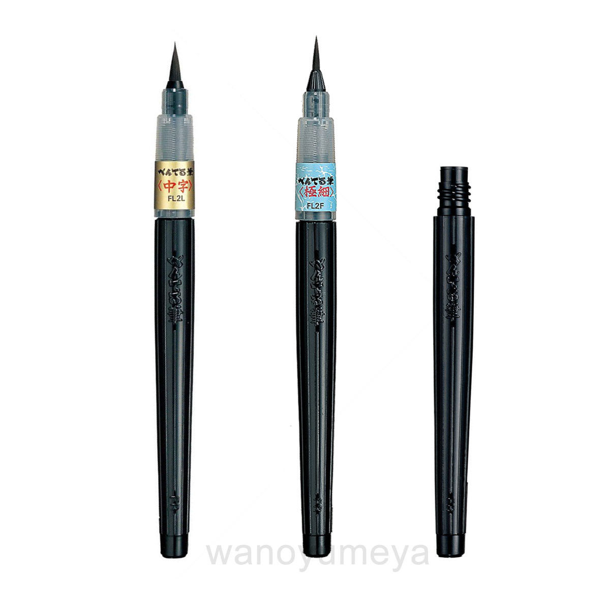
Pentel Brushes
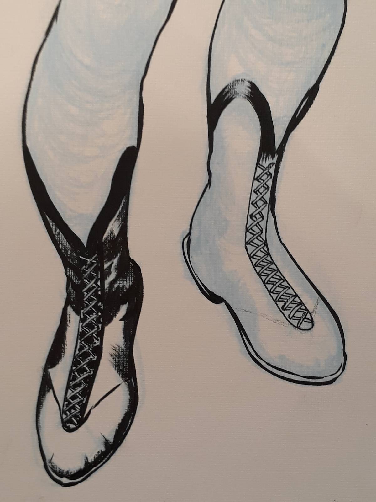
After so much time without inking, I didn’t have the guts to start with the face, so I started with the pants and boots.
The Kuretake turned out to be a very good brush for this kind of work. I felt it more manageable than the Pentel brushes, but the Pentels are great to achieve textures and grays. Also, you can make a mess with the tip and it always goes back to its original form.
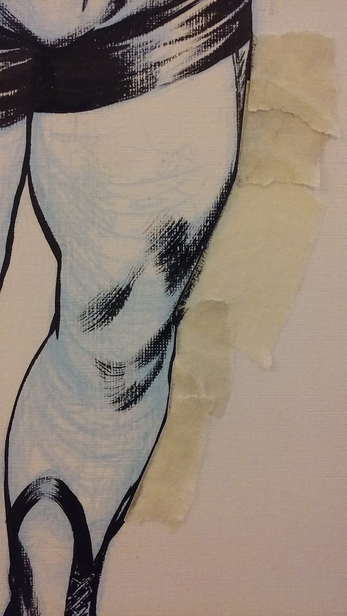
I’ve used tape to mask some areas and work freely with the brush.
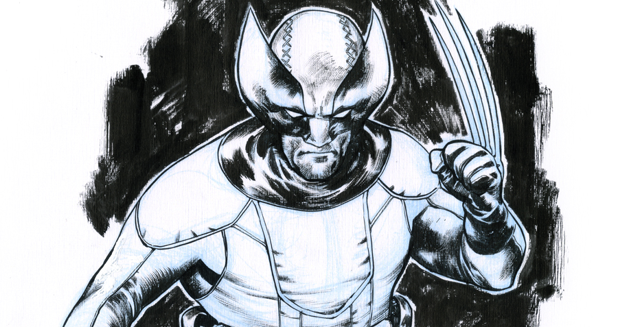
OK. Here’s the finished piece. I haven’t screwed it completely, and that alone is enough to make me happy.
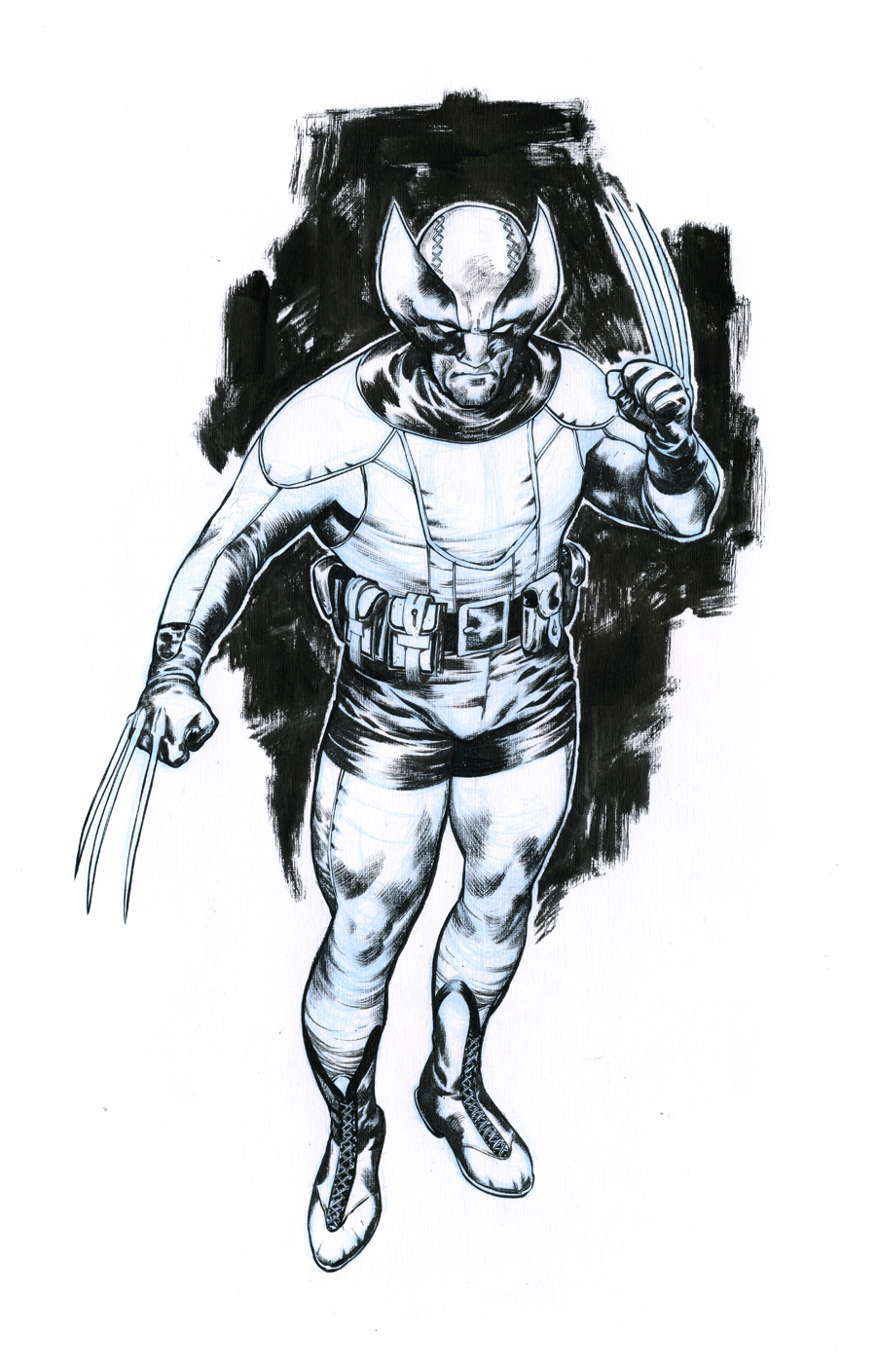
The canvas-like paper looks very nice when you have the original in your hands, but I wouldn’t recommend it for artwork that’s going to be digitalized and processed through a bitmap filter, as is usually the case when painting line art inks. The Pentel ink looks very nice in this paper, though. Black and shiny.
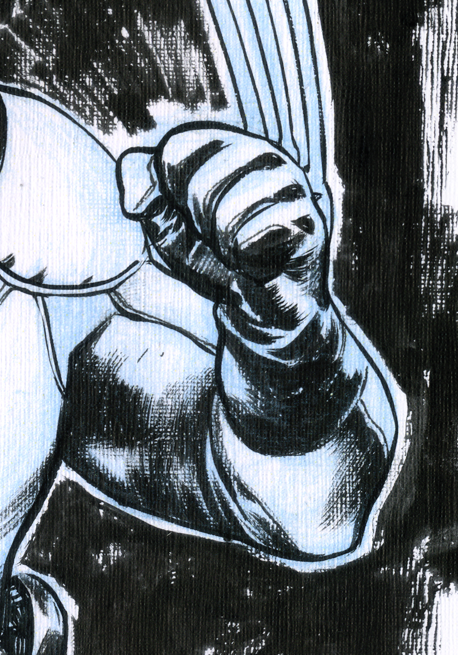
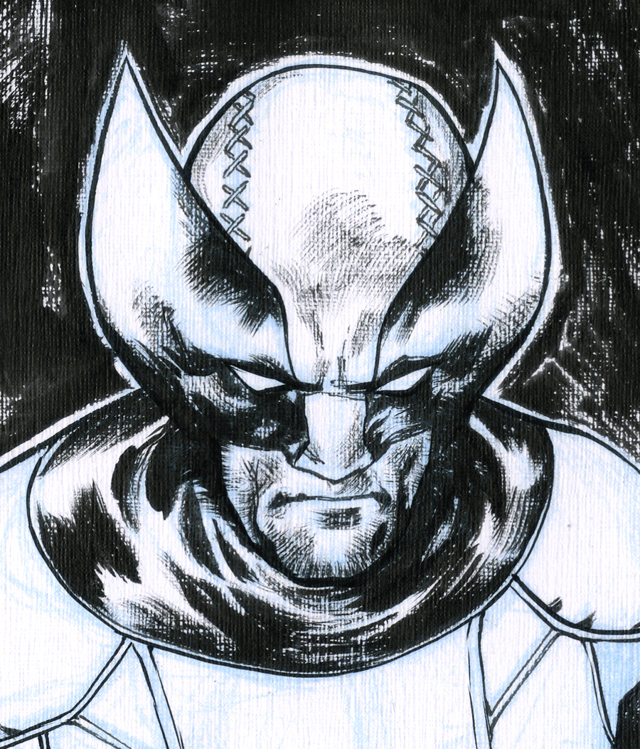
Here are a few details.

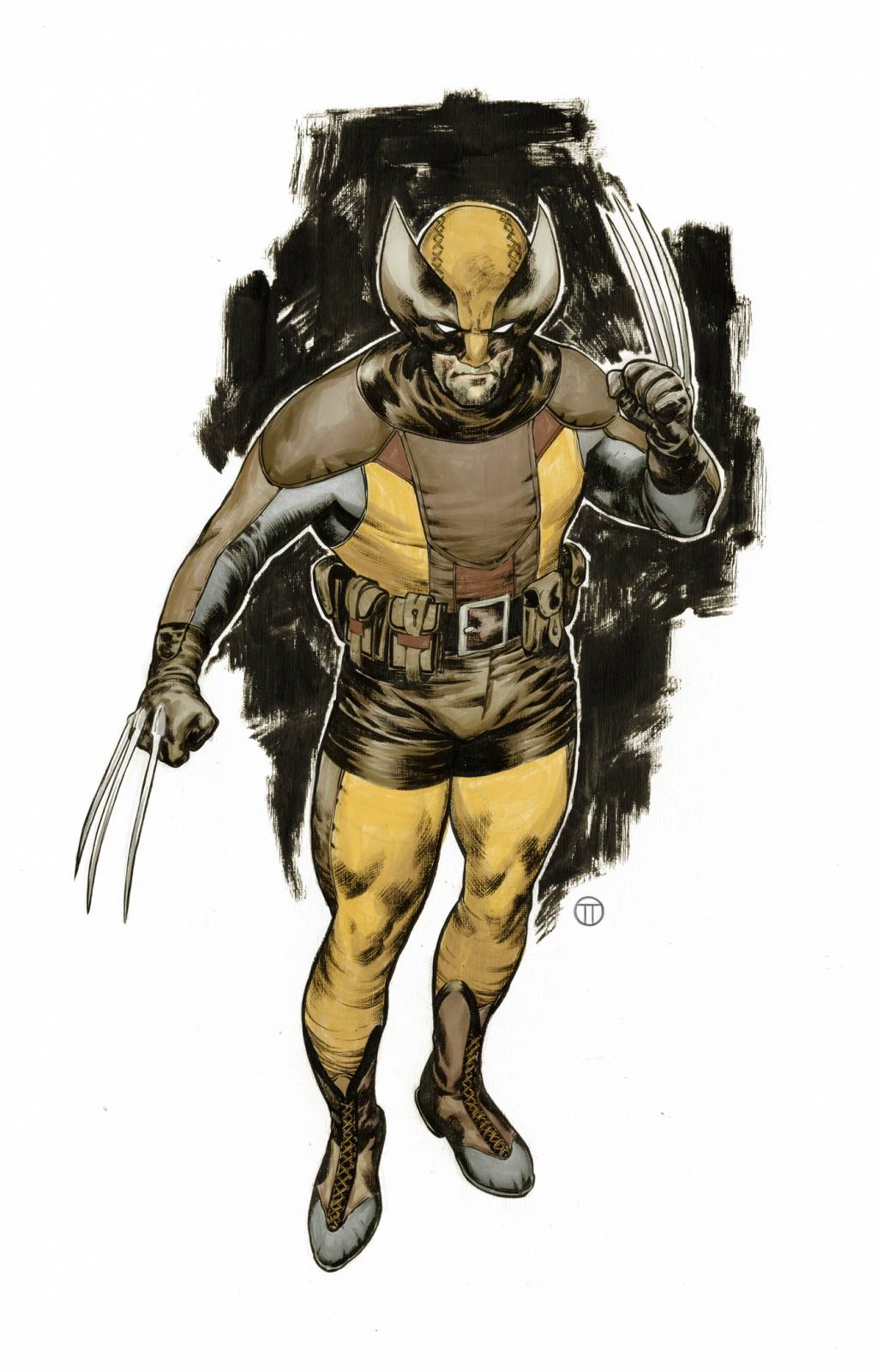
Once it was finished, I thought about adding some colors in watercolor, but I’ve used a correction pen in a few places and figured that adding watercolor on top of that would make a mess.
Sooo, I took it to the good old Photoshop and painted it. Very roughly, very simply.
As an extra, here’s a video of the coloring process. For some reason, there are two cursors recorded in the video. Please ignore that 🙂
Anything you’d like to ask or share, feel free to leave a comment. Always happy to hear what you think!
Awesome work, Julian!
Thanks, Dan!
ʜᴏᴍᴇ ᴄᴀꜱʜ ᴇᴀʀɴɪɴɢ ᴊᴏʙ ᴛᴏ ᴇᴀʀɴꜱ ᴍᴏʀᴇ ᴛʜᴀɴ $500 ᴘᴇʀ ᴅᴀʏ. ɢᴇᴛᴛɪɴɢ ᴘᴀɪᴅ ᴡᴇᴇᴋʟʏ ᴍᴏʀᴇ ᴛʜᴀɴ $4.5ᴋ ᴏʀ ᴍᴏʀᴇ ꜱɪᴍᴘʟʏ ᴅᴏɪɴɢ ᴇᴀꜱʏ ᴡᴏʀᴋ ᴏɴʟɪɴᴇ. ɴᴏ ꜱᴘᴇᴄɪᴀʟ ꜱᴋɪʟʟꜱ ʀᴇQᴜɪʀᴇᴅ ꜰᴏʀ ᴛʜɪꜱ ᴊᴏʙ ᴀɴᴅ ʀᴇɢᴜʟᴀʀ ᴇᴀʀɴɪɴɢ ꜰʀᴏᴍ ᴛʜɪꜱ ᴀʀᴇ ᴊᴜꜱᴛ ᴀᴡᴇꜱᴏᴍᴇ. ᴀʟʟ ʏᴏᴜ ɴᴇᴇᴅ ɪꜱ 2 ʜʀꜱ ᴀ ᴅᴀʏ ꜰᴏʀ ᴛʜɪꜱ ᴊᴏʙ ᴀɴᴅ ᴇᴀʀɴɪɴɢ ᴀʀᴇ ᴀᴡᴇꜱᴏᴍᴇ. ᴇᴠᴇʀʏ ᴘᴇʀꜱᴏɴ ᴄᴀɴ ɢᴇᴛ ᴛʜɪꜱ ʙʏ ꜰᴏʟʟᴏᴡ ᴅᴇᴛᴀɪʟꜱ ʜᴇʀᴇ.
.
ᴍᴏʀᴇ ᴅᴇᴛᴀɪʟꜱ ꜰᴏʀ ᴜꜱ —————➤ Cash43.Com
Brilliant as always, Julian!
What type of paper do you use for pecil drawings?
Thanks, Daniel! For this particular drawing, and because I knew beforehand that I was going to ink it on a different paper, I’ve grabbed a random piece of paper from my drawer, but for penciling my covers, I usually use the Strathmore 500 Series Sequential Art Bristol.
Thanks Julian, this is fantastic. Really inspiring and insightful to a beginner artist like myself.
Great work! the texture of the paper came out really nice.Quite interesting indeed.As a side note, I like the design decisions for the torso’s costume. specially the central part,