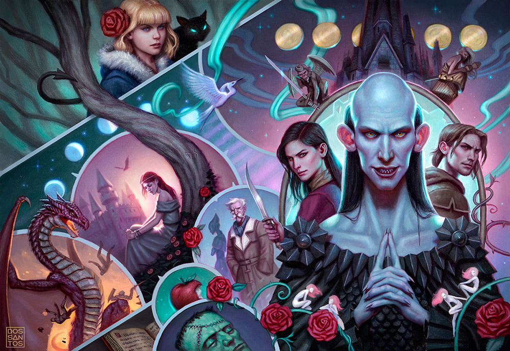
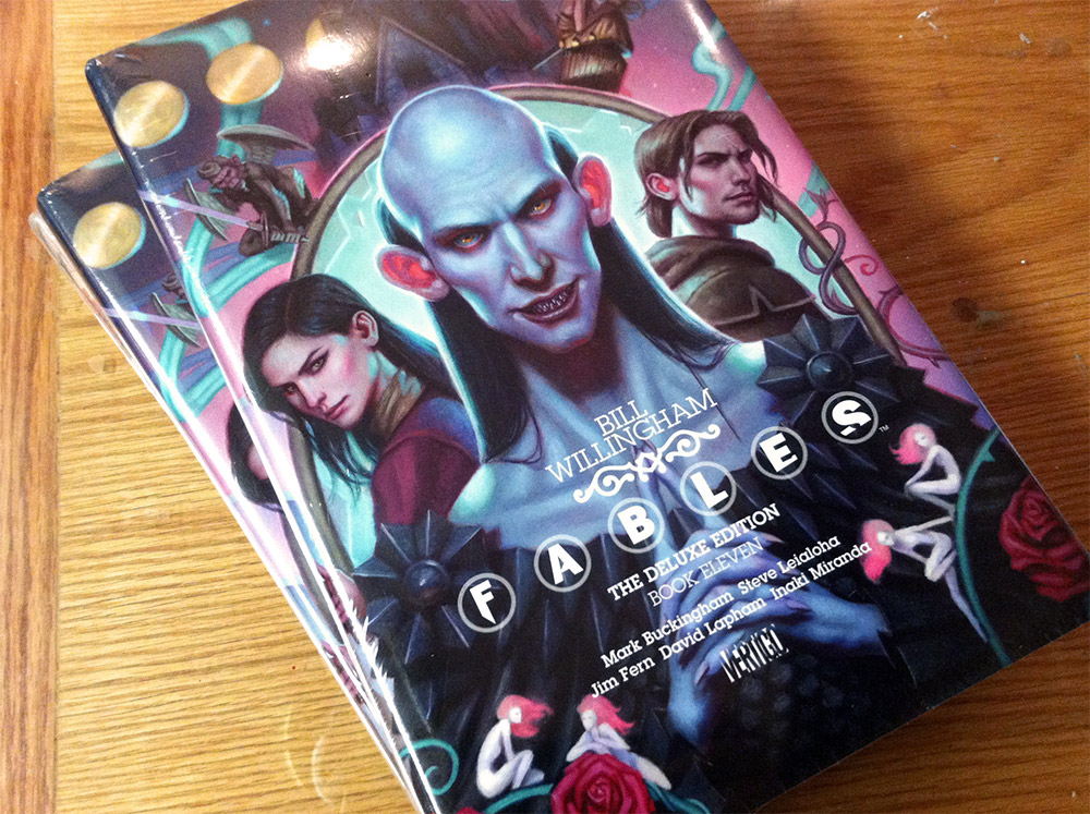
Here’s a new piece that just hit the shelves last week. This painting was done for the DC Vertigo Comics ‘Fables’, Deluxe Edition, Book 11.
I’ve really been enjoying doing comic book themed work, which has given me a chance to draw more unusual, design-oriented compositions, as well as paint more imaginatively without relying quite so much on reference.
Although I am usually a strong advocate for using reference, I actually think too much reference can be a detriment to comic book work, as it sucks some of the fantasy and whimsy out of the image. Skin tight costumes and bizarre looking characters don’t always work very well when you make them look TOO realistic.
I also tried some new techniques with this piece, with mixed results.
I did my drawing on a toned board, with colored pencil. This allowed me to use white colored pencil to establish highlights very quickly. I then went in with some white gesso and really punched up a few of the larger areas that I knew would be extremely bright.
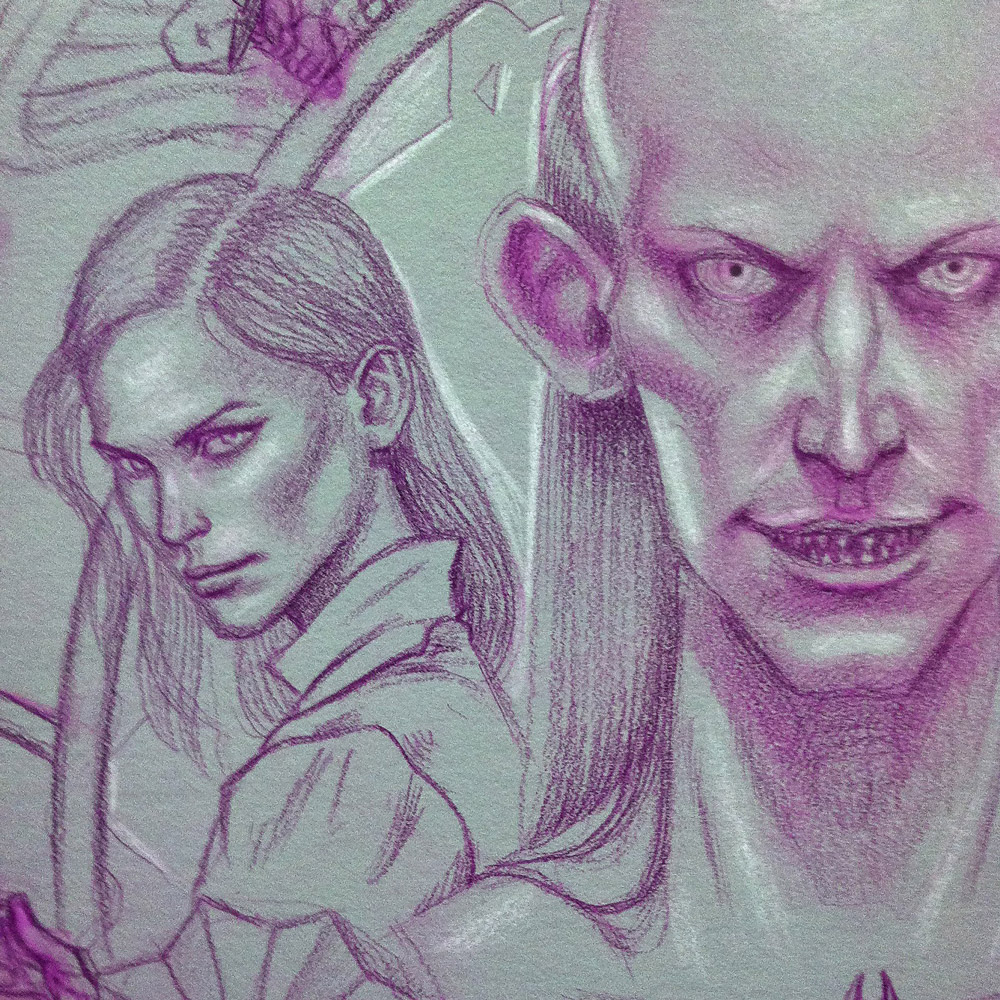
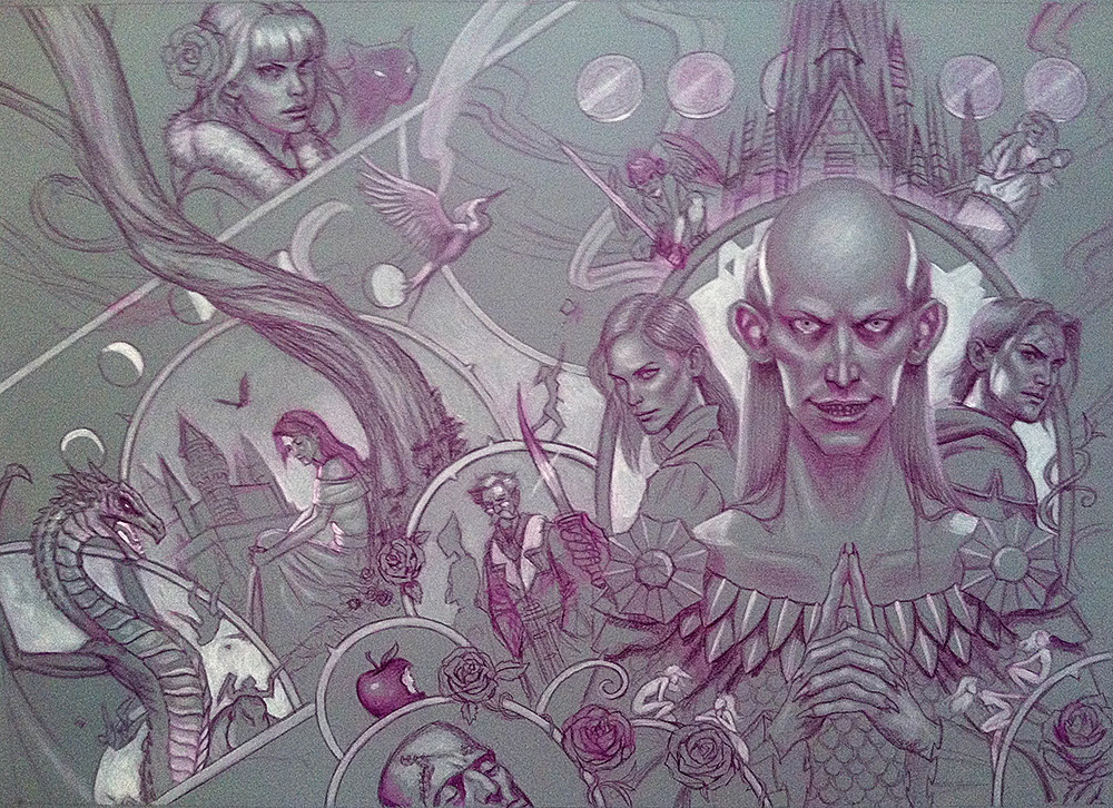
For the most part, the new process worked fairly well. However, because I used a slightly lighter pencil than I’m used to, and drew on a slightly darker surface than I used to, the drawing got lost VERY quickly.
Typically, I can paint a thin coat of oils and still make out my drawing beneath it (which actually does a lot of the work for me). But in this case, the slightest coat of paint obstructed the lower contrast drawing so quickly that it almost became moot. If I were to redo it, I would probably do the drawing in black graphite as per usual.

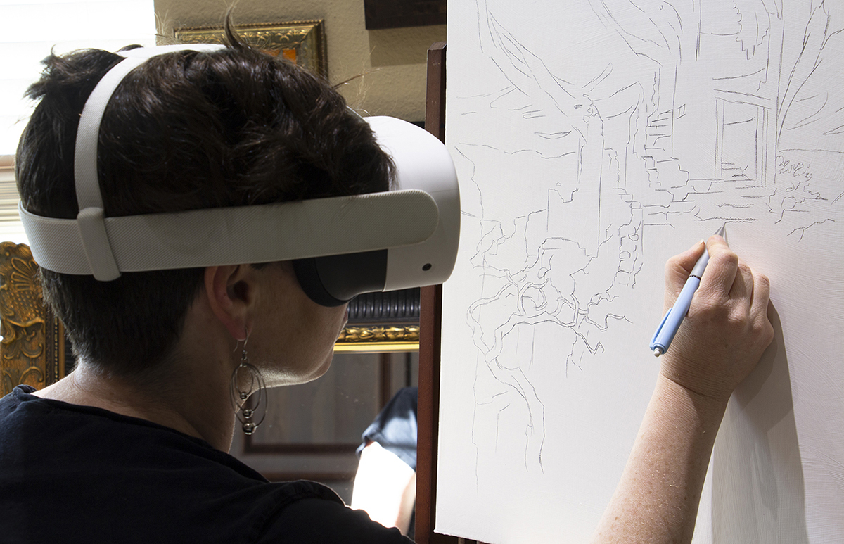
Although I started this commission at home, many of our readers may recognize the painting from the most recent IMC, where I painted the majority of it as an in-class demo.
And finally, here is the finished product, complete with type design.


Dan, is it safe to assume this is a wrap around cover? It would be a shame if the left half of this is not on the back. It's beautiful!
Yes, Brian. It is a wraparound. Though a surprising amount of it gets faded out and covered with type. You can barely make out the dragon on the back. But I kind of knew that would be the case. At a certain point, I'm doing it just for my own gratification.
That's a bummer.. Thanks for showing it here so we can see it in it's full splendor. It's great to see how much extra you put into a piece like this even
knowing some of it will be lost.
I always enjoy your process posts, they get me itching to work. Thanks again!
Great post, Dan, and a gorgeous piece! Thanks for sharing.
Interesting post and great piece Dan!