Just a quick side trip from the color theory series for an important tip on how to use photo reference to take full advantage of what is seen in them.
This is a simple tip to help you work from photos that takes some time to work out, especially if you do not shoot photos often and don’t pay much attention to when you are shooting.
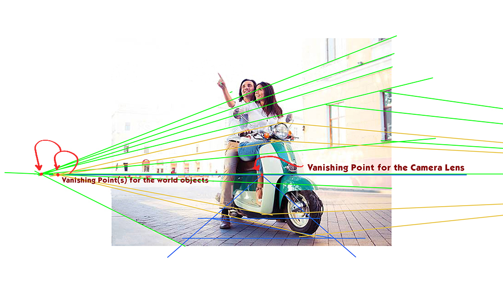
Every photo is essentially one point perspective through the lens. Objects might be turned in 2point perspective but the camera is still pointing at one single point in space. To work from the photo, find the horizon line to ground plane relationship and you will then understand the subject in perspective within the scene space of the photo.
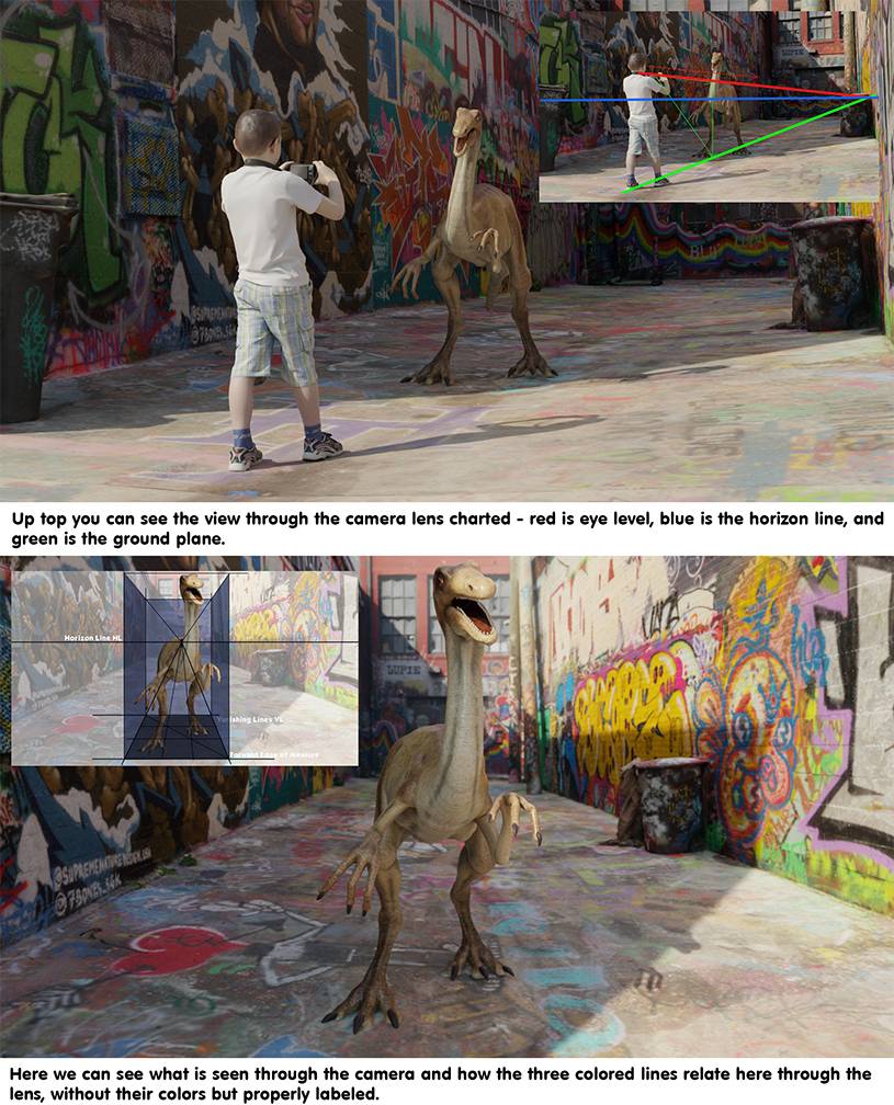
Regardless of the ground plane texture, you are not looking for the perspective of the space, you are locating the VP made by the camera, and the floor plane in direct alignment in 1point perspective relative to it. It is that simple.
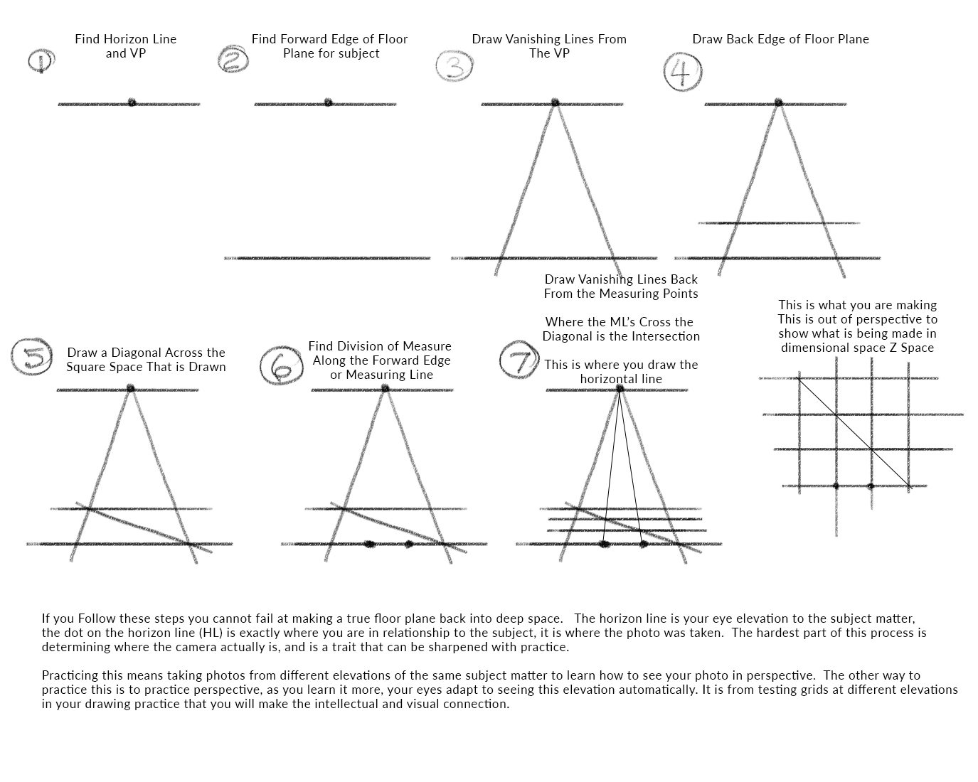
Here is a handout I have made for my students that I work with online because we are working from photos exclusively. This is the closest thing to “getting them to share the same space with the model” as possible without actually being there.
A few things to note about figure drawing reference.
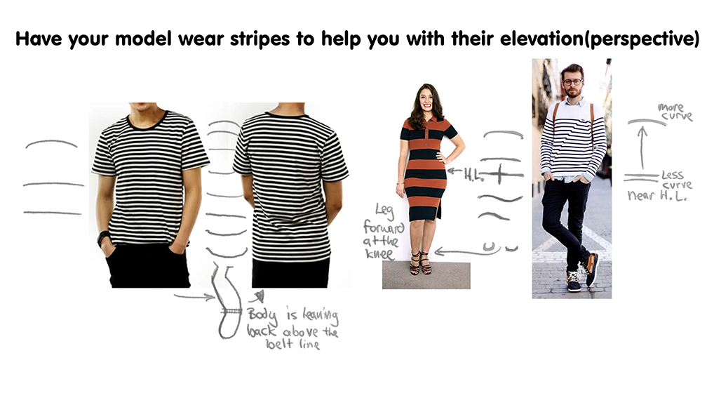
Most reference that is shot well with a 50 mm lens, the lens that matches our eye, will be shot on a tripod. These figures standing will have the camera elevated to roughly their sternum level, the bone on the front of your chest. On average, the tripod will be elevated to around 50″ tall if everyone were 6′, and a few inches lower for shorter heights.
For the photo exercise above on the handout, shoot your reference wearing stripes or plaid if you can, as the extra horizontal bands will help you see the change of elevation through their elliptical qualities around the figure.
Remember that its about connecting with the reference and not just “assuming” what you see. The smarter you are about your studies the closer to the truth you will be with your results.
I’ll be back with more color theory in my next installment.


Hello Ron,
First, I always read your post here on MC, a lot useful information.
Love the last tip of using stripes on the clothes of the model to
help with the perspective, really good advice.
Best,
Thank you for the reply and the kind words.
Thanks Ron, I’ve also been reading your articles from ImagineFX magazine from a while back and they’ve been super helpful. The simplification and explanation is so practical. Makes figure drawing and anatomy seem simpler and less daunting
Thank you Peter, I really appreciate the kind words.
This is really cool. I appreciate the tips on how to use reference better and integrate it with perspective. Thanks for sharing.