
Almost a year ago, I began working on Legacy in hopes of finishing it in time for IX Arts. Let’s take a look at how it came together…
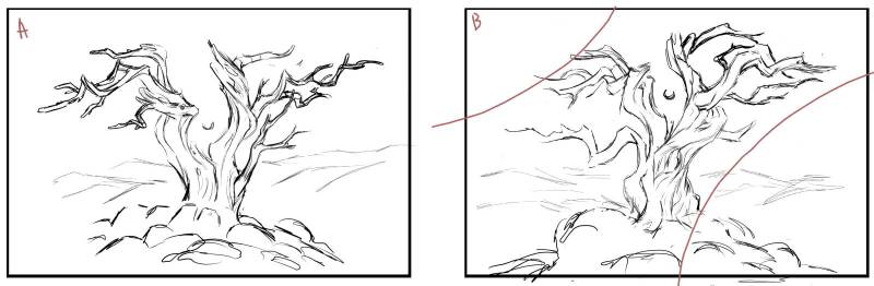
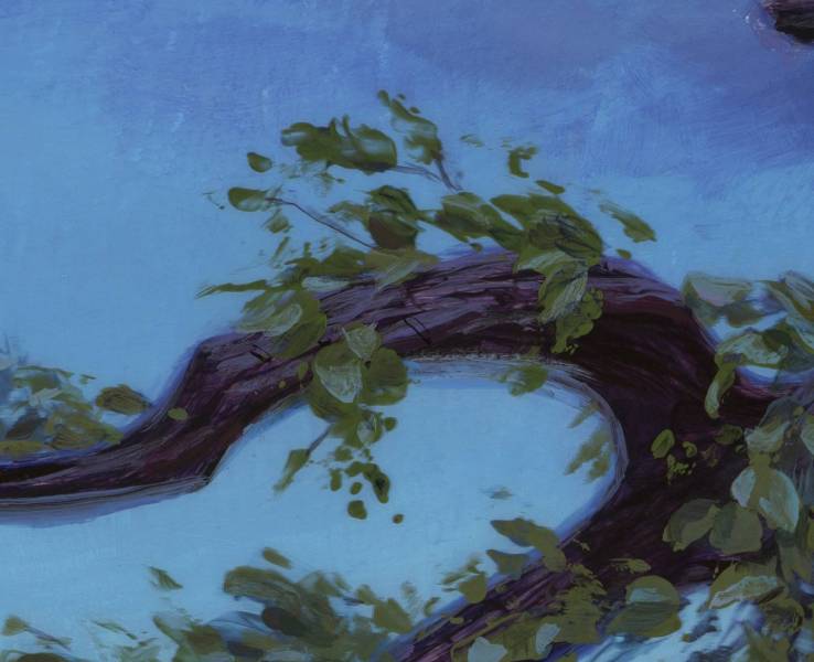
As I was alternating between these two possible sketches, I started to notice the balance of the overall shape of B was standing out as more appealing. Beyond the gesture of the trunk and branches, the outer shape was getting a nice diagonal tilt. I brought over a few features from A that I liked, but switched at this point to exclusively refining sketch B. 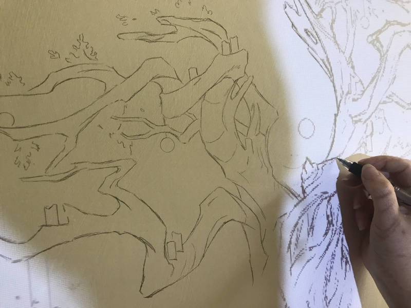
As usual with anything larger than a tablet, I projected the sketch onto the canvas. Since this painting was intended as a companion piece to another I had done a year earlier, I chose to keep it the same size at 20″ x 30″. As I sketch, I drop in cross-contour lines to help me remember how various parts of the limbs move forward or backward in space.
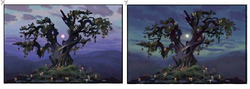
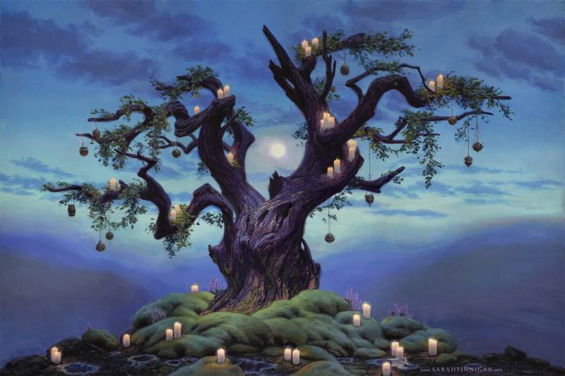
Since this painting was to feature regrowth in the wake of a fire, I knew the color scheme had to incorporate green well, and I wanted a peaceful, hopeful feel to it. The color thumb X nailed the mood, but the gradient with a darker horizon lightening toward the top (which makes much more sense with a setting full moon!) drew attention upward toward silhouetted branches. When I compared the color thumbs, Y kept the viewer centered. 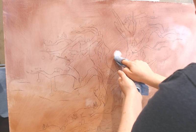
I applied an underpainting to contrast the sky, planning to let it show through in places. After, I masked the tree with tape and an exacto blade, painted the sky, and then removed the tape. It was time then for the tree to get definition and detail.


After some knots and texture were painted on, I used a rough brush to add a transparent layer and shadows. The stiff brush made strokes that went along with the grain already established, further implying texture. Although the highlights on the charred tree would be blue to bounce light from the sky, and opaquely applied, this layer would remain visible in the areas in the midtones and near the candlelight.
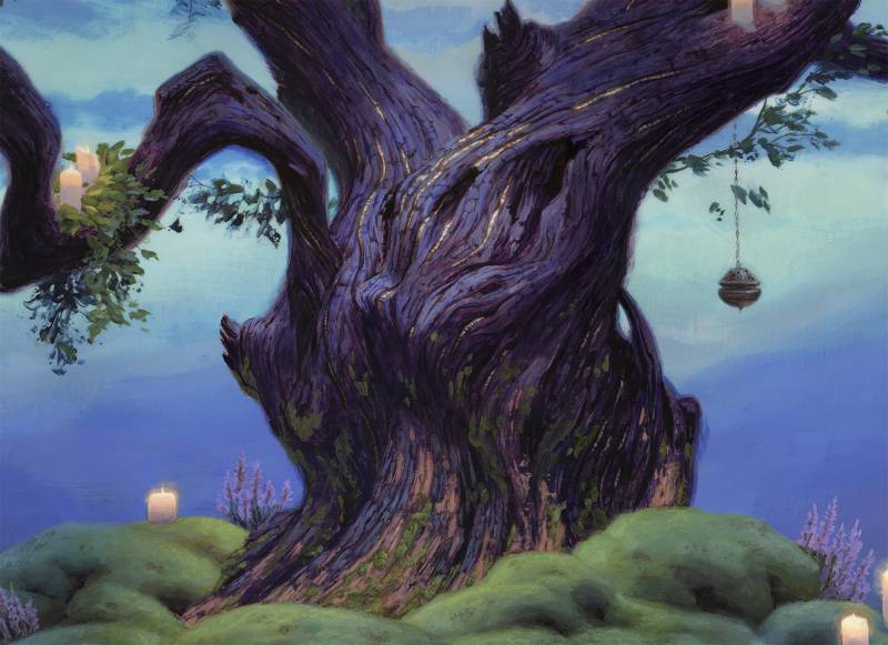
Painting the sky around masking tape caused the edges of the tree to be harsh and raised. I used layers of medium to level out the surface, which allowed for me to paint in the edges the way I want them without any unwanted texture in the way. Softening edges can make an object feel like it has roundness, and varying the sharpness/softness of edges can attract/detract attention. To help the tree surface feel rough, I ‘dry brush’ some of the edges to create a broken transition.
In observing real life, you’d always see perfect sharp edges, but I’m not painting real life. If I leave the edges of the tree as sharp against the sky, the tree can feel unnaturally cut-out, like a collage or a photoshop layer. Vibrant edges are often one of the best places to enhance color, and it helps the sky behind feel like it is emitting light. Below, I point out a couple spots where the edge varies in color, and when you look at the image as a whole, it makes the sky feel more saturated while not punching everything up too much. Since we paint with pigments that absorb light and don’t emit it, as we approach brighter subjects, the color collapses toward white and loses saturation. (The same applies to digital, since monitors don’t have variable brightness one pixel to the next, independent of color). We can add that color back in on the edges of an object, implying that something is both bright and colorful.

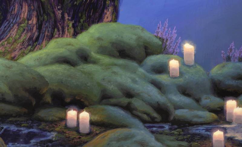
For a soft mossy texture, I stippled the blending over the green-covered rocks at the base of the tree.
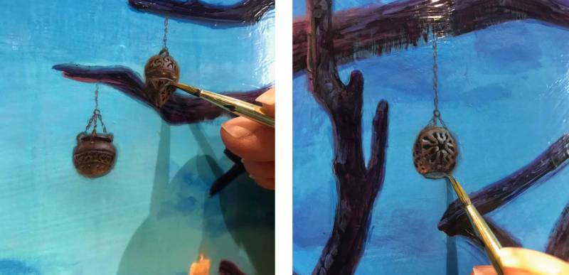
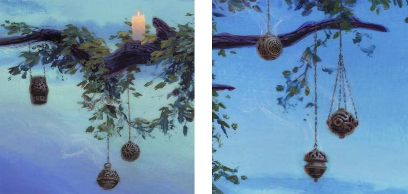
 Initially, I had planned for all of the thuribles to have the same design, but I was torn when I tried to narrow down one look. I liked so many different ways incense burners have been designed and wanted to play with that variety. Physically on the canvas, they’re pretty small and certainly don’t need the amount of detail they have to read in the overall painting. Landscapes lack a face or a great hand to close up in on, and so I look for places like these to add in some extra love. You’ll never see it on the .jpg, but I like to think I’m not in the business of making .jpgs. An in-person viewer can step in closer and find more to discover.
Add some vines and greenery, and we’re done!

Thanks for sharing another great process post- the painting looks beautiful as well!
Love reading your process as always, really nice post, Sarah! Love how you soften the edges of the tree.