-By Dan dos Santos
One of the great things about painting the covers to Science-Fiction and Fantasy novels, is that the genre tends to reap a lot of sequels and trilogies. The benefit of this is two-fold. Not only does this mean more reliable commissions (as an AD will rarely swap artists mid-series), but it also presents the Artist with an opportunity to tell a better story.
An Author has hundreds of pages in which to capture the essence of their character. The Illustrator on the other hand has just one shot. Unless, of course, the book is part of a larger series. Then we are presented with a chance to flesh out a character further than we could on just a single cover. With the initial cover behind us, and a hopefully faithful readership already established, the hero doesn’t have to be ‘super-bad-ass’ or ‘in-your-face’ on every subsequent cover. Instead, you can explore a vulnerable side to them, or maybe an introspective moment, or perhaps a subtle eroticism. For me, this is one of my favorite aspects of illustration… developing a character, and not just a generic pin-up.


A series also presents the Artist with a chance to create a ‘theme’, a visual thread that ties the whole group together. In the ‘Mercy Thompson’ series shown above, the tattoos are the most obvious theme. But there are other themes that are more subtle. For instance, the character always appears ‘head to knee’, and is always the exact same size on each cover. This may not be important as far as any individual book in the series is concerned, but when you see them all together on a shelf, it adds a great sense of cohesiveness.
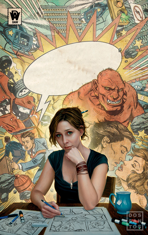 Another series that I work on is the ‘Willow Tate’ novels, written by Celia Jerome. In the story, ‘Trolls in the Hamptons’, Willow is a female comic book artist. Uncannily, whatever she draws seems to come to life. It is not made clear if she herself is causing these things to happen, or if her drawings are simply precognitive.
It’s a really interesting story, and it presented me with some wonderful opportunities to experiment quite a bit. I have always had a real passion for comic books, so I couldn’t pass up the chance to incorporate a looser, more comic-book style into the image. Of course, that’s a bit difficult to do in paint, so I also experimented with splicing my traditional oil painting with a digital background. In the image to the right, the background was drawn and colored entirely in Photoshop. The woman and her desk are all painted in oils. Having painted her on a pale yellow background, it was very easy to then splice the two images together.
It’s still to be seen whether or not the cover is successful, since the book just went on sale this month. But the publisher has contracted several more novels regardless, and has already commissioned me to do the second in the series. Again, we decided to maintain an obvious theme, and use the comic-book style background a motif throughout the whole series.
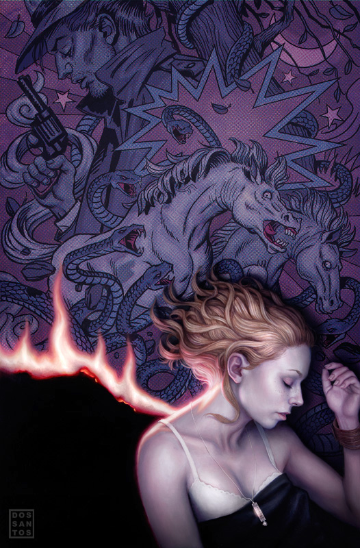
The second novel is titled ‘Night Mares in the Hamptons’. Given the nature of the title, I thought it appropriate to make the image a bit darker than the first, both literally and figuratively. The palette is much darker in value and cooler in tone, creating a more dangerous atmosphere. The actual content is also a bit darker. The heroine is not smiling like in the first cover, the fire seems threatening, the man is not in a romantic embrace this time, and the mares are obviously in distress. All of these elements together help create a coherent mood, and provide a stark contrast to the fist novel. Meanwhile, the stylized background, and narrative nods like the pendant, ensure the series holds together.


Hi! Mr. Daniel
This is really nice article! Your artwork always influence to me… These are very effective and realistic!
The Willow Tate cover is phenomenal, Dan!!! I'd love to get a larger scan that I could print out for my studio!
Thanks for this 🙂 I have always loved the Mercy Thompson covers a lot.
I really love working in series. The potential for learning is just greater. Great stuff Dan.
Great post. I specially like how you made the hair in the last cover.