A few days ago, I discussed a basic Value Structure technique. I showed how we can emphasize the spacial distance between Foreground, Middleground, and Background by restricting each area to a specific part of the value scale, either Black, White or Grey.
That very same principal can be applied to Color Temperature as well.
Try breaking your composition down into three distinct temperature ranges: Warm, Cool and Neutral.

Just like value, restricting certain areas to a particular range of temperature will create a more legible composition and a greater sense of depth. Once again, you can arrange these temperature in any order.
By using tryptic schemes for both color temperature -and- value you ensure focus and legibility in even the busiest of compositions!

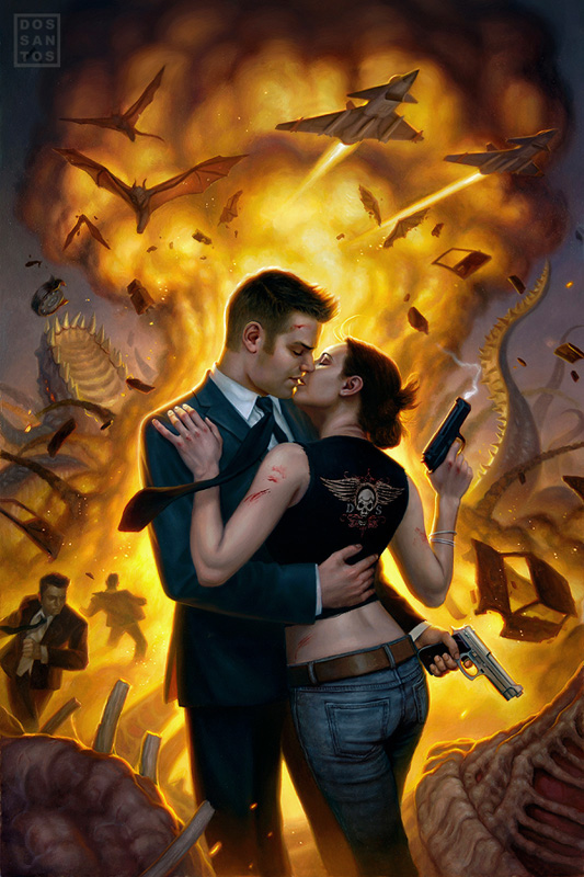
Once I’ve decided on the basic value structure, I reinforce that with the same tryptic structure of color temperature. In this case, I chose to make the background neutral, the middleground warm, and the characters of the foreground cool.

As I paint the image, I incorporate a lot of different colors into each of these areas. But just like the value range, I am always careful to squint at my piece, making sure that the general impression of the area still falls within the temperature range I decided on earlier.


This last few posts you have been posting are really helpful, at least for me an aspiring artist, thank so much for sharing your knowledge Dan!
That makes a lot of sense. I've not seen it explained that simply before.
Thank you!
Love this series of posts. You explain these things in a way that make me understand how to apply them in my own works, which is something I've been missing (especially for colour!).
Great article Dan. thanks. 😉
Keep it up please.
__________
illustration
Terrific tips.
Thanks!
Thank you Dan, for each of these. Very helpful.
Love this article series, great lessons!
These tips are life-savers for me, thank you!
Man. Write a book already, would'ja? Please?
Dan, i wanted to offer my esteemed thanks. I'm doing a series of 50 still-life's and i'm coming up on number 10. these ideas of composition while in school have really helped me with the last few under-paintings/drawings. I think i may just owe you for some of the best in my career so far!
Thank for sharing this article! It will save my project.
Oh man. This lesson and the value one have brought new delight to my work. It is finally starting to really pop and read. Thanks so much.
Hi, I'm loving your posts about composition basics. Could you (or have you already in another post?) elaborate about the emotional/psychological effects of different value and temperature structures, and the mood that each generally creates?
Thanks Dan,
Cutting large problems in small understandable pieces really helps. Hope to see more.
Regards Eric