 |
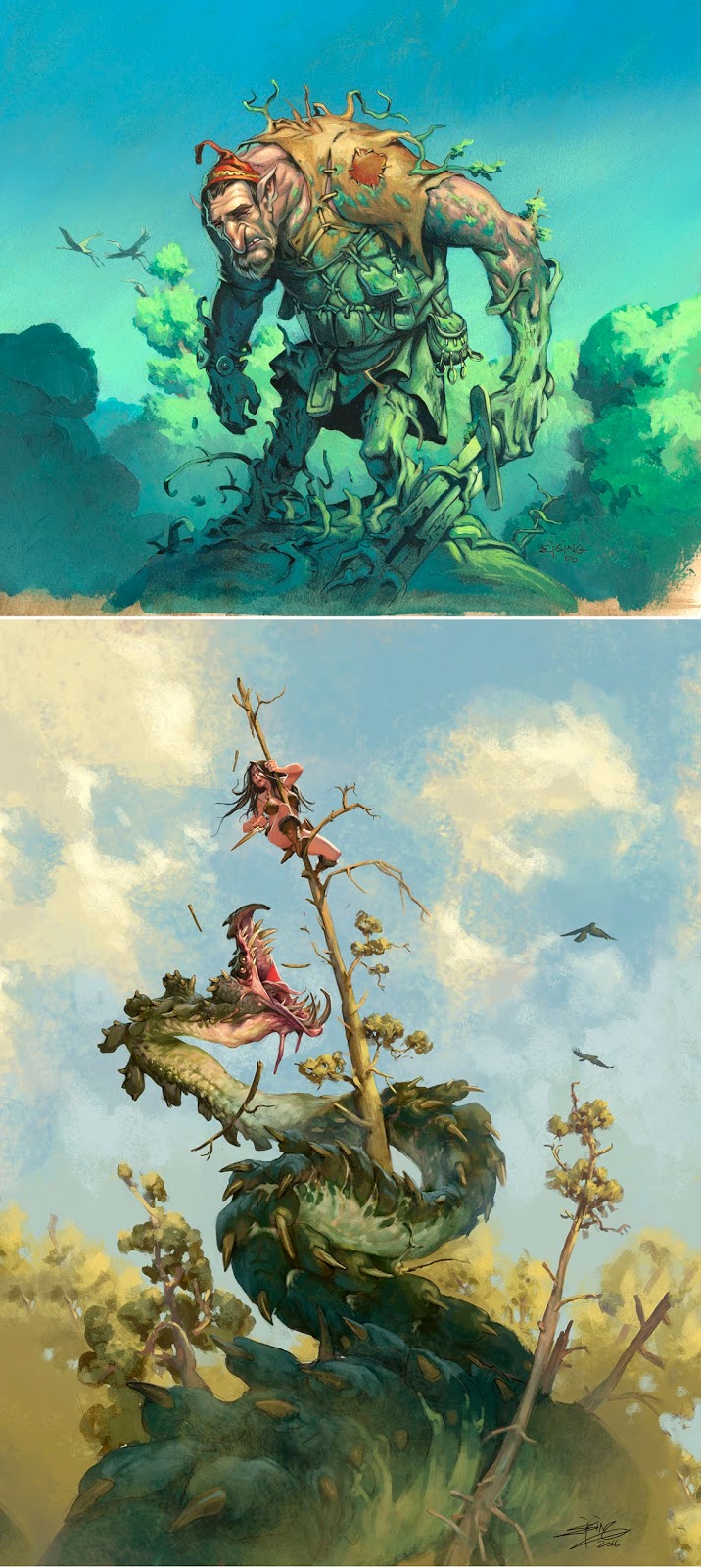
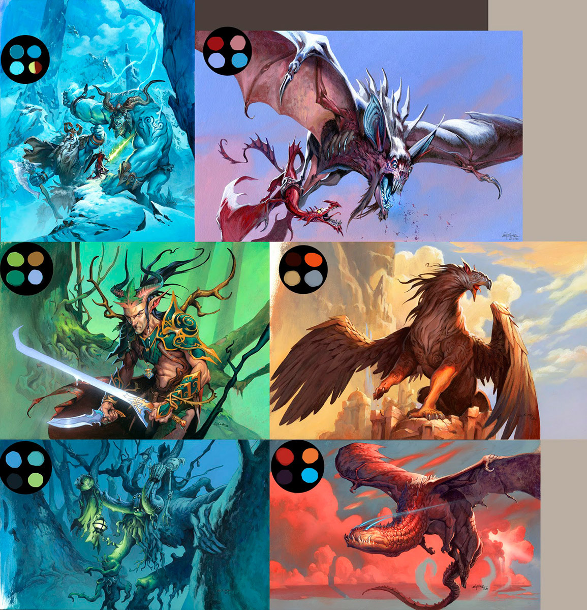
| Top image is Lignify, Magic the Gathering, from the Lorwyn set |
The first image of the giant being rooted to the ground is my first magic card illustration from 2006.
The lower image is an illustration I did last year for a charity book at the Emerald City Comiccon. There is about ten years of painting in between. I paint about 50 paintings a year so that’s about 500 paintings between the first and the last. At first glance they look a lot like each other and it seems like I have been stalling out completely and haven’t moved a bit. Well; image choice and genre has not changed, and I have a deep-rooted feeling that it will not move much within the next ten years ahead.
Similarities: Both images have a very strong readable silhouette. That is a darks mass of figure against a muted down and light blurred background for atmospheric perspective. Both figures have darker bottom and lighter top to draw attention to the faces. Both images have birds – I like to use that for a sense of movement. Like it is a snapshot taken with a fantasy camera.
Differences: To me what strikes me the most is that it seems like I have abandoned the outline and the very black shadows in favor of a lighter approach using colors in shadows and generally having a more painterly finish.
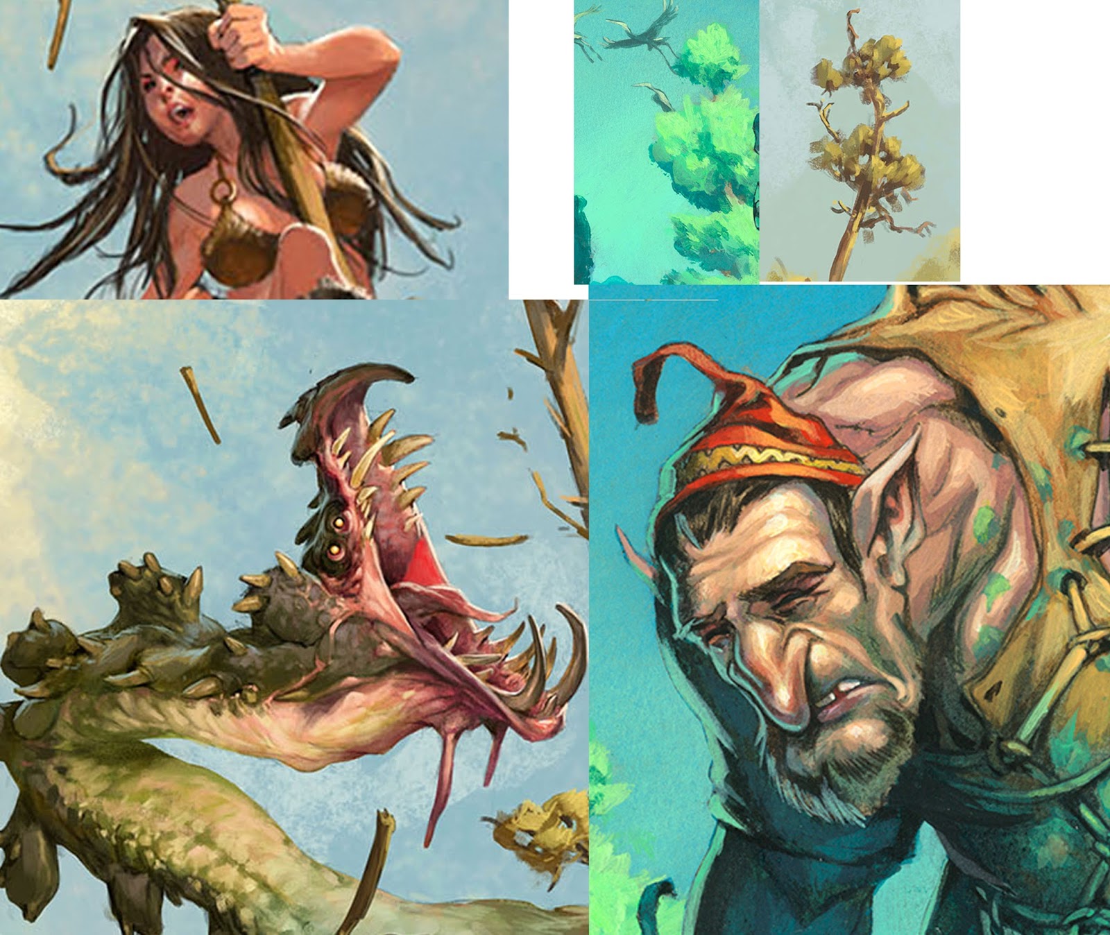
I did come from a background of doing comicbooks. So it is not strange, but if you see how much outline I use in the first image and how little in the second, there is a huge difference. In the giant painting my mindset was: “ I am coloring a black and white outline drawing” in the wurm painting I thought: “ I am painting shapes in light”. To me that is the biggest difference between the two. And it has a bigger impact on everything I paint now. Because I see things differently I try to focus rather on paintings shapes rather than things. If I think too much that I am painting elements the end result is a bit like a painting-by-numbers painting. Like the hat of the giant. It doesn’t really seem like it is in the same light as the face. It is a red hat almost like a cutout with nothing tying it to the face but the green rim light. As a contrast I see the way the colors gently glide into and out of each other in the neck of the wurm. The whole wurm is considered more to be a whole shape painted with different hues but close in value. None of the colors are restricted to certain elements. The red and pink of the mouth goes out into the face and jaw. The greenish brown of the body goes out into the teeth. Everything is more woven into each other.
That’s one thing I learned from painting digital. If I have an area like shadows that have become too dark and uninteresting, I add a soft light layer and gently use the Gradial Radial tool to add color to the shadows. It is a great way to edit the colors in the darkest area before taking an image to final. But I think of it every time I paint traditional too. And I boldly take paint on my brush and smudge it into the darker shadows. I have never been unsatisfied with the result.
The result of having a more painterly approach I think also comes with the fact that I wanted it to change. I was comparing myself a lot to Chris Moeller, and fell in love with his seemingly effortless and carefree brush strokes, which made his artwork seem more “artsy” to me and made my own seem stiff and too controlled. So my search has been to go for a more painterly finish. Controlled slobbynes. And turning halfway digital has helped me a lot. I often just go about and try something in acrylic, in my mind thinking “Bahhh, I can just change it if I do not like it” Painting digital also has made my acrylic much more reckless.
BTW the wurm painting is a digital painting. Not that I think it matters much. It is painted by the same mind and hand and the differences is not in any technical skill but only in the approach.
Excellent! The bit about bringing the reds and pinks out of the creatures mouth and throughout the face has made me rethink color application and the limitations I've imposed on it.
Thank you for sharing!
Great post, thanks!
I don't think I'm familiar with the “Gradial Radial tool.” What software is this in?