Never one to shy away from trying something new when creating art, when fellow MC contributor Jeff Miracola brought Arches ‘Oil Paper’ to my attention in his excellent ‘Art Tip Of The Month’ series, I was like a dog seeing a squirrel! I had to chase it up a tree. (Thanks Jeff!) See it here: https://www.muddycolors.com/2017/11/art-tip-of-the-month-5/
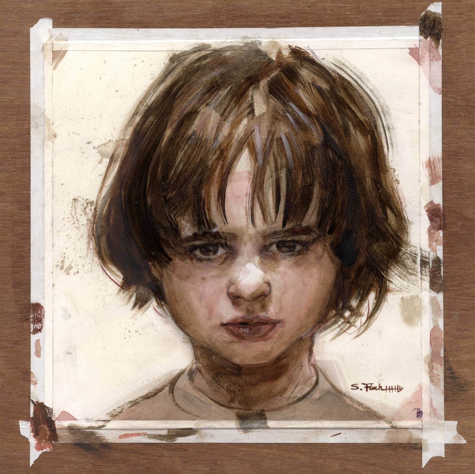
I am not new to the idea of doing a watercolor and oil painting. I did it a number of years ago on the above piece titled ‘Brooding Boy’. That is Watercolor and Oil on Strathmore 500. What I love about water media is its ability to pool. Mmmmm…. washes of pigment settling into the nooks and crannies of the paper. Yum… the random stuff that happens with gravity. Ooo or how the puddle often dries darker on the edges of the pool. And as much as much as I love the visuals of water media, I also love how fast it dries! It allows me to lay down a smorgasbord of random texture goodness, and then start refining on top with layers of oil.
However after the watercolor stage (which always happens first) you have to seal the heck out of the surface in order to go over it in oil paint. Which I would do with crystal clear and matte medium, creating a layer of plastic between you and the paint. With Arches Oil Paper, there was no need to seal anything!
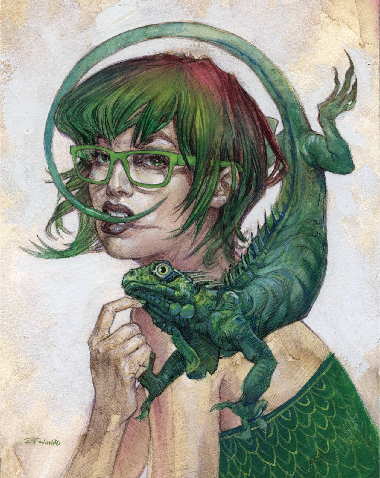
So for ‘Iggy’, I wanted to capture that feel of ‘Brooding Boy’. But also maybe incorporate some of the things I’ve been chasing lately with cross-hatching. (If you want to get deeper into this piece, you can jump down to the 8min video I made talking you through the whole thing!)
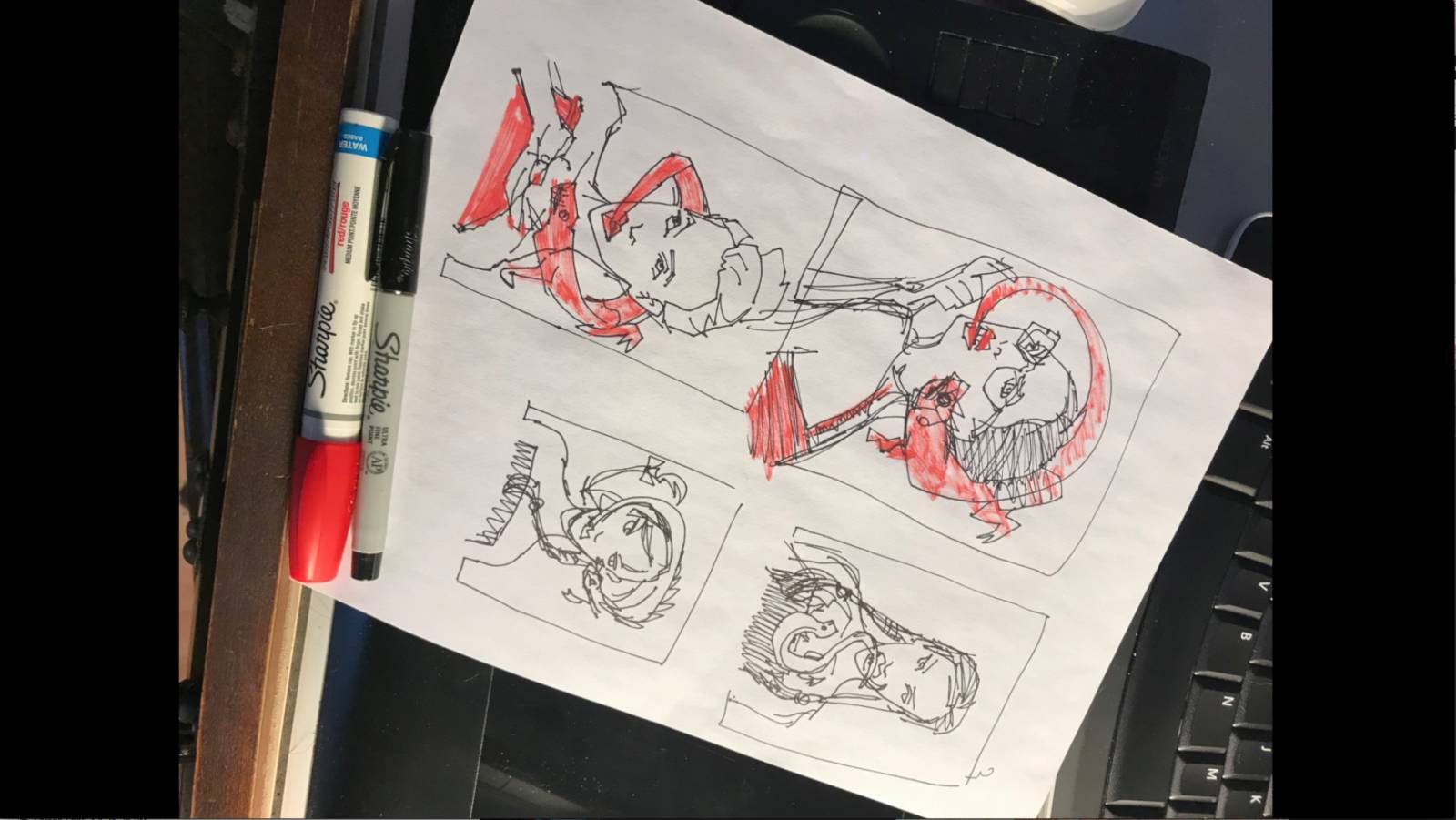
To begin with I started with a few thumbnails and selected the one I dug the most. The idea for this piece was as simple as, “Hmmm what do I want to paint today. Well how about an Iguana?” Nothing deeper than that, lol. I wanted to get painting ASAP.
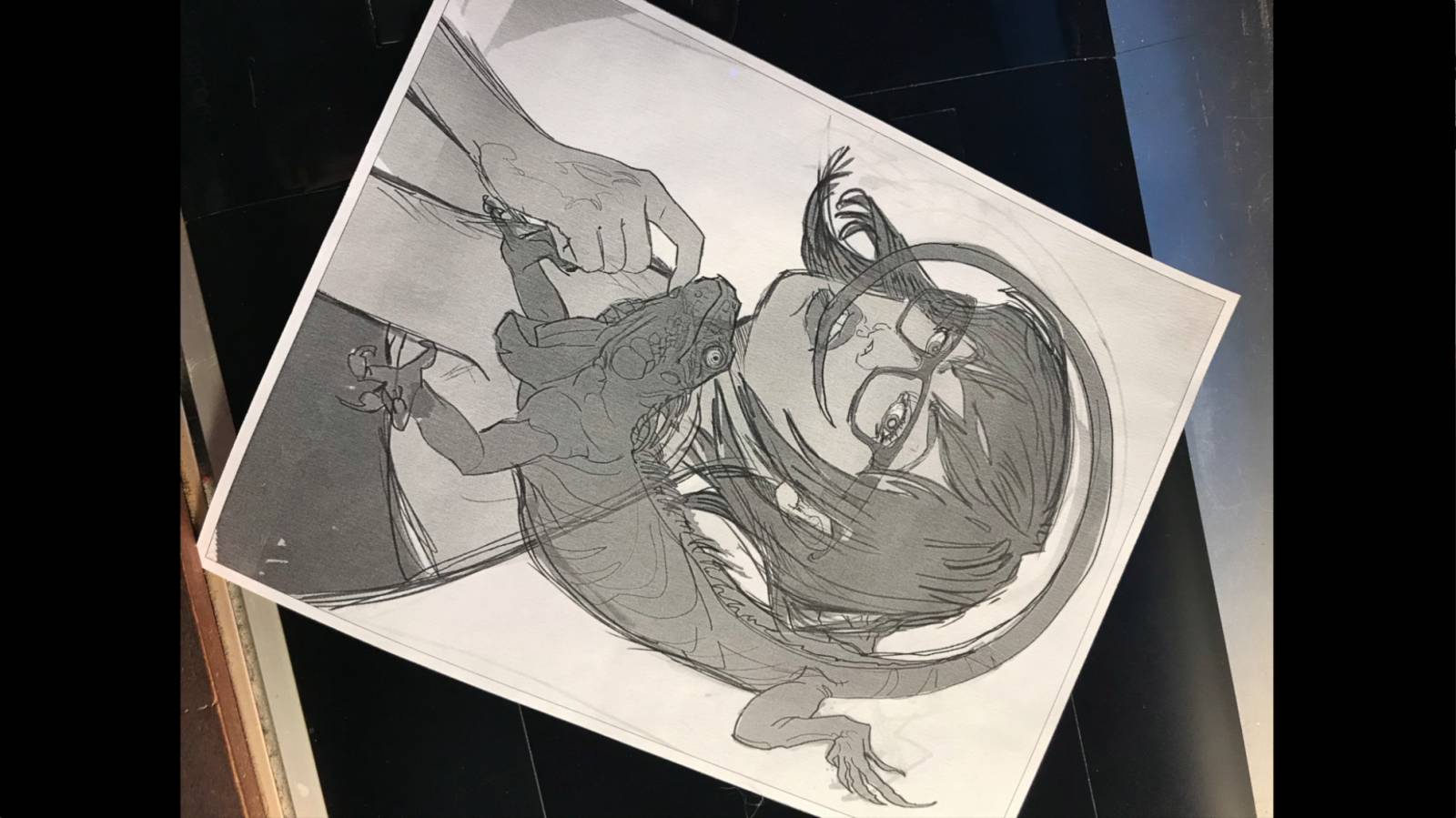
The next step was tracking down ref, breaking it to my will and drawing up a tighter comp in Photoshop.
Time to make it real. Another great thing about this oil paper, as opposed to say a gessoed paper, is that is was easy to lightbox the above comp through the surface!
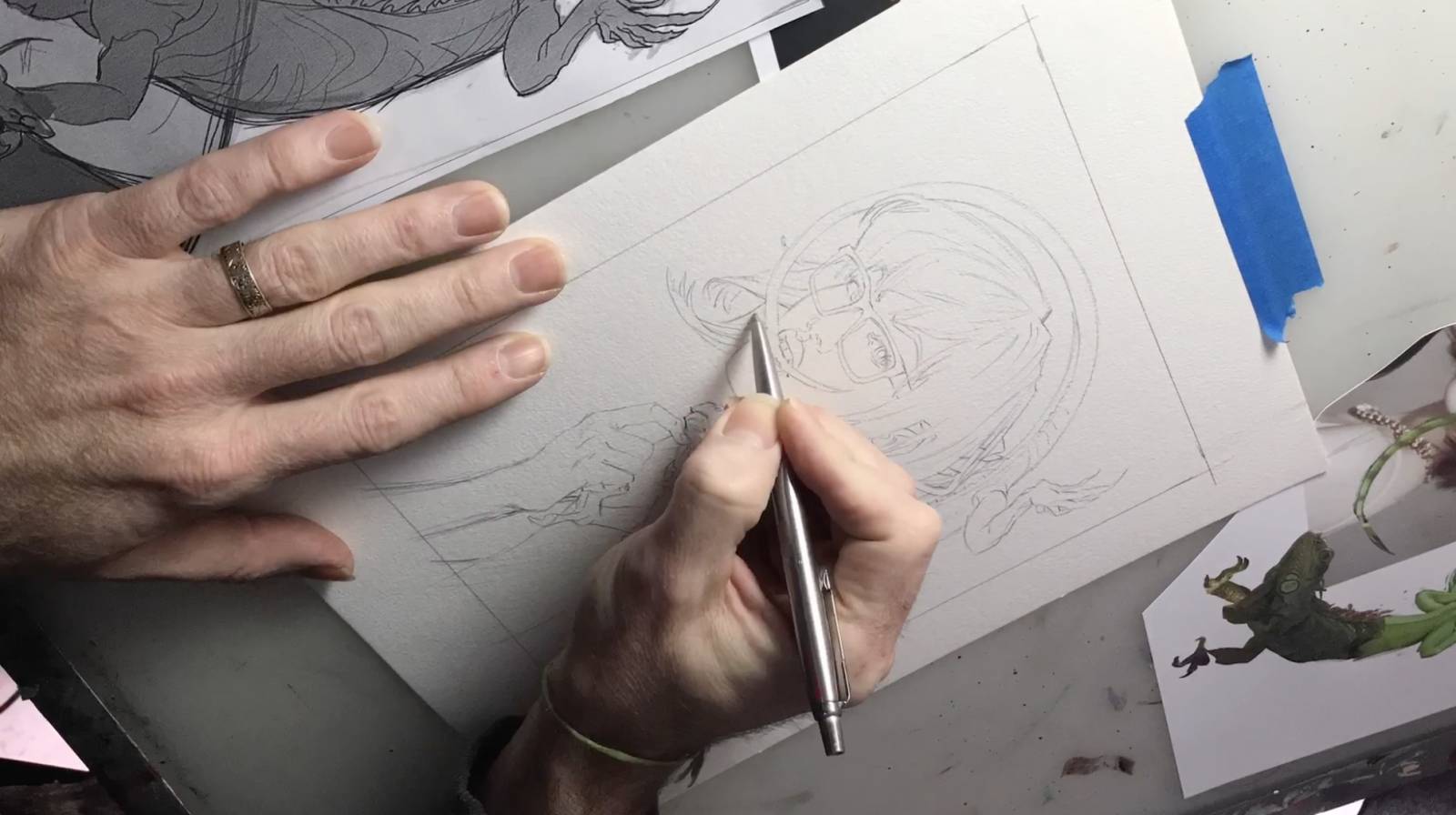
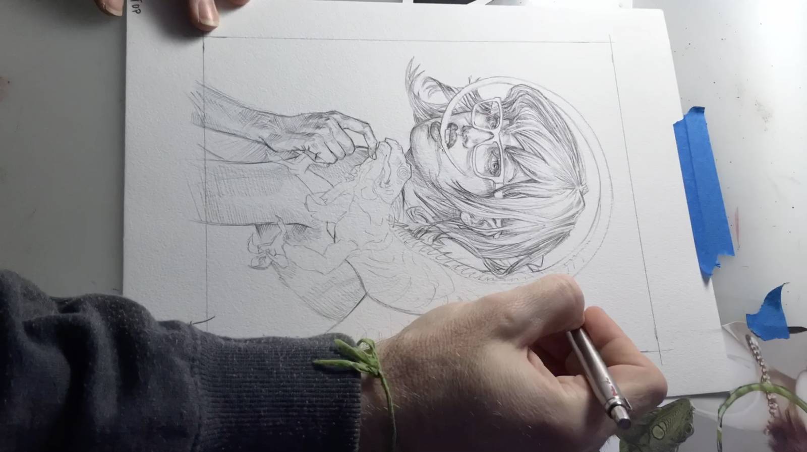
Taking a note from my inktober sketchbook, I am drawing in ball point pen here. I mostly use Parker Ball point. Note I am using my hatching direction to build form, like a sculptor, and not just using it to ‘shade’. The first thing I noticed on the oil paper is that the ball point is not going down as easy as on normal paper. I had to press harder. But the resulting value shifts were awesome.
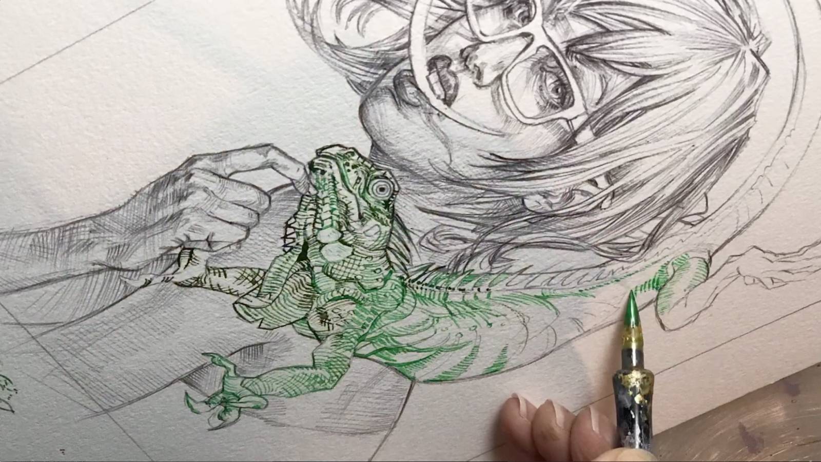
For the Iguana I wanted to ink him in a color so that he would have a different feel than her. I broke out a few shades of green FW Acrylic ink and my trusty Nikko nibs and went to town. Again, the FW ink took a bit more to get it down than on normal paper. Remember, by design this surface is not as absorbing as normal paper. You have to build it up more.
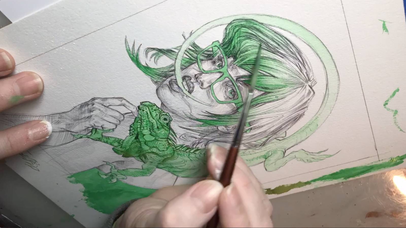
Finally time to lay some washes down. Using FW acrylic ink again. I have a few little paper cups that I am putting the ink in and color mixing drops of this and that like a mad scientist. Again the paper is resisting more than it normally would. It is a slow, gradual build up of gradients.
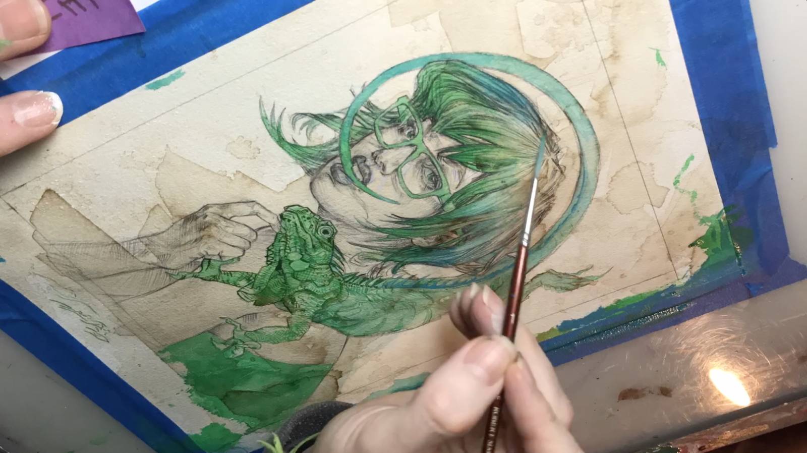
My impatience gets the best of me, and during my coffee break, I literally break out the coffee, and start painting with the nectar of the gods itself- making a mess- having FUN! The idea is threefold: 1. get some random puddle coolness in there. (Look how those puddles are drying darker on the edges. Yum!) 2. Mute the saturation of the green with some brown. 3. Establish the middle value for her skin. But really, sometimes the slow-wash method creates a simmering pressure in me and I just have just explode in media, and react to the aftermath. Often when we are feeling stagnant in a piece (Or in life? Woah deep man.), we just need something to react too to give us direction.

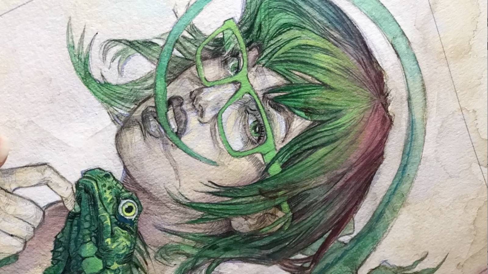
OK. Explosion over. Time to wash again. I tell you this hair was the toughest part of the whole piece. it took MULTIPLE gradients of the FW Ink to get the transition from green to a wine-brown down.
Allrighty, I needed to cut out the negative space around the figure with white FW ink to know how far I would need to push the values in the girl.
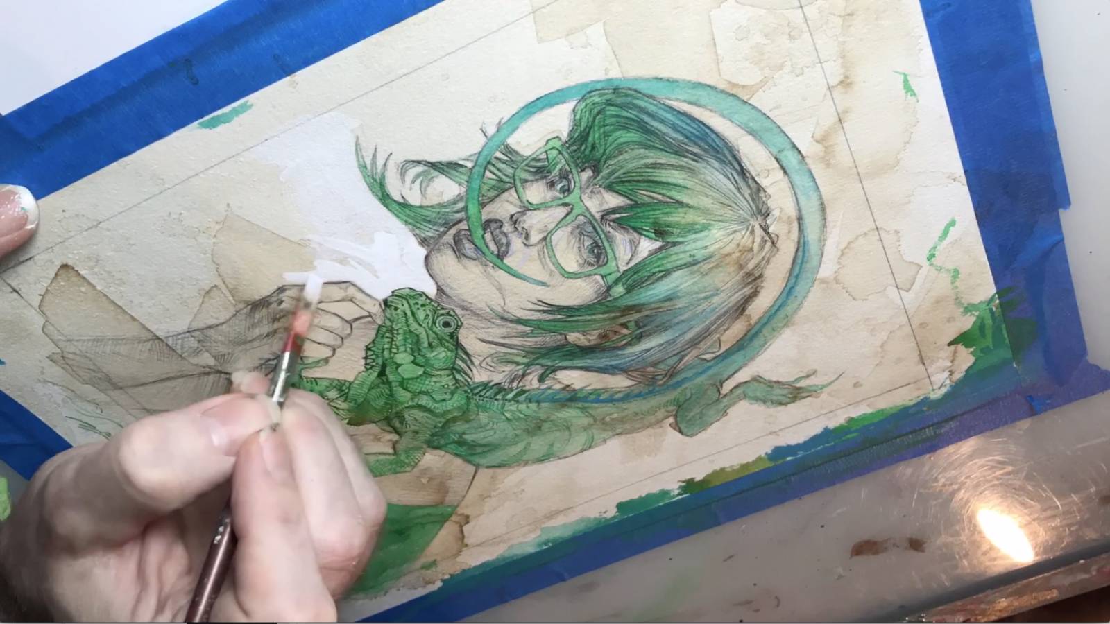
Understanding my middle value on the girl starts me down the path of final values for everything. For instance I went darker on the iguana to make it pop off the lighter values of the girl.
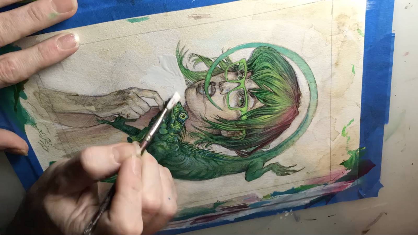
Well it is about time I break out the oil paint! I do the final highlight building on everything with oil which I am mixing on a little square of plastic. I am using a Robert Simmons white sable ‘liner’ brush. With Gamblin Fast Matte oil paint, and my medium here is Walnut Alkyd. The oil allows me to make smoother transitions and also hammer those final accent marks.

Last up is using 1-Shot lettering white oil enamel paint. It goes down so opaque I call the stuff the gouache of oilpaint- and it is the perfect thing to clean up my negative space one last time.
And that is all she wrote my friends! In final review I have to say I really dig this Arches Oil Paper. It took everything I threw at it, even if it took a bit more build up and pressure than I am use too, I adjusted fine. There was a bit of buckling of the paper when I was really saturating it, but I did not stretch it first, and it settled pretty well when dry. Before framing, I used some acid free glue and stuck it to some thin plywood and it is super flat now. But I have to say, the thought that I could just about put anything on Arches Oil Paper that my heart desires, with like zero prep was totally liberating, and I will be using it again soon.
If you’d like the longer, verbal walk-through for what is going on in this piece, check out the narrated 8min You Tube vid I created for it.


Very cool painting and article! The video was great to see it all in action, what an awesome age we live in to be able to see that. Thanks for putting this together!
Hey Nico, you are very welcome sir. Thanks for checking it out!
Great process. I have used Arches Oil Paper in the past and found that it is a very strange surface to work on in comparison to my slick finely sanded gesso panels. I love how the dry brushing comes out while using the paper. Does the ball point pen ink bleed through the FW Ink and oil? I have seen ballpoint pen bleed through my acrylics in the past.