I always try and keep my palette fairly simple… but it doesn’t seem to stay that way. There are some colors out there that are just too darn convenient to have around. That being said, painting with a fairly limited palette, like the “Zorn palette” of White, Yellow Ochre, Vermillion (or another strong red like Cad. Red Light) and Ivory Black, is a great exercise. I will often choose a few colors and experiment with the constraints it presents. But, when I have my full palette out I can’t resist adding in some colors that speed things along.
Gamblin makes a few of the colors that I love for this reason. I wrote some time back about Gamblin’s Radiant line of colors. They are a rainbow line of vibrant pastels that are beautiful and very useful. Added to those are their cool and warm greys and whites. They seem to make their way into so many of my mixtures these days. When I paint from life, I will often use the Warm White instead of Titanium White. It speeds things along as it is already warm like most of the flesh I am painting. The Cool White makes for a great neutralizer of the high key mixes. Same for the Warm Grey and the Cool Grey. It’s easy to add a little red, yellow or blue to each of these and push the grey into whatever mid value flesh you are painting at the time.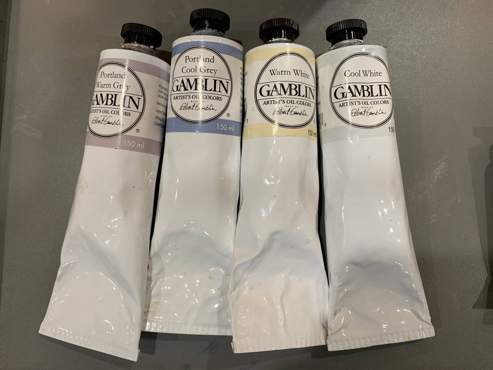
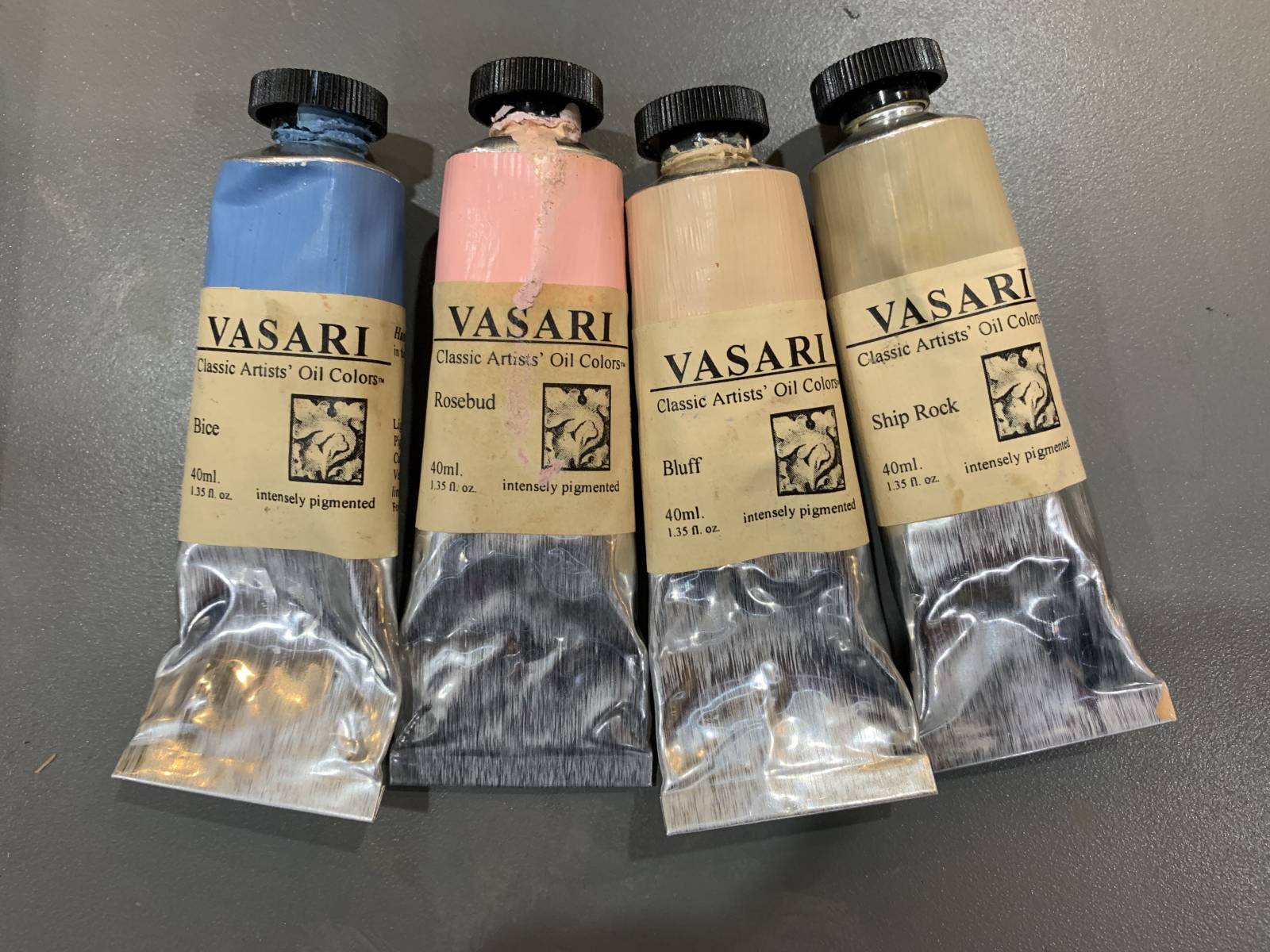
Here are four more colors that I will put on my palette at times that I find very useful for flesh tones. All four are from Vasari Classic Oil Colors. Vasari makes beautiful paint and it’s wonderful in texture. It stays fluid on my palette longer than other brands of paint it seems and their pigment strength for some colors is at the top of the charts. Their Cobalt Blue, for example, is the most beautiful, strongest version of that color I have used. Not even close. It’s also almost $70 a tube. In fact, that’s my only concern with their paint. It’s expensive! But the follow four colors aren’t too bad and they are quickly becoming a permanent part of my palette. From left to right; Bice, Rosebud, Bluff and Ship Rock.
Bice is a strange color. Casey Childs introduced me to it. It isn’t a very strong blue. You can add it almost any mixture to just cool it down a little, without turning it blue. I don’t know what is in it (okay, that’s a second big concern with Vasari, you don’t alway know what they actually make their custom mixes from), but it’s very useful right out of the tube for flesh. Part of that is because it is a middle value, which means when you mix it with other colors, you don’t have to adjust the value too much for flesh mid-tones. Another reason is because it isn’t too strong (like Ultramarine Blue, Cobalt or the assimilating Borg entity that is Phthalo Blue) it’s easy to add it to existing mixes and slowly adjust them. Because many flesh mixtures fall into the orange spectrum, Bice works as a great neutralizer.
Rosebud is a really pale pink. I have tried to mix the color using Cads and Vermillion and I haven’t been able to get it. I think that by milling it, Vasari can get an intensity that you just can’t get with a palette knife. It makes for beautiful clean flesh mixtures at the high end of the value range.
Bluff is another great color that is very close to many lighter complexions, but also in the highlight range of some darker complexions. Like Rosebud, it is a very clean mix of colors and with a nudge of red, yellow or blue, makes for a great flesh base.
Ship Rock doesn’t see as much use, but I still keep it on my palette, especially for subtly warming up mid-tones. It has a richness to it, while still almost sitting in the grey space on my palette.
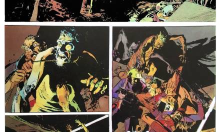
Below is a painting that I did this week in my weekly 3 hour portrait session. It is 9″x12″. You can see the use of the Gamblin Warm white in the highlight on his forehead. You can see some of the Radiant Violet and Radiant Turquoise around the eyes and where the hair transitions from the forehead. The cheeks, nose, lower lip and right ear are tinted with Rosebud. the little pink highlight just under the nose on the upper lip is straight up Rosebud. The mid-tones, just before the terminator of the shadow are greyed down with Gamblin Warm Grey and the chin is greyed down with Bice. Could I do this with a simpler palette? Just about, but these colors are really helpful and like I said about Rosebud, I haven’t been able to mix a pink of that intensity at that value. The shadow in the neck and parts of the hair have Ship Rock as a base. My model had a very pale complexion, but all these colors are still very useful for darker complexions, just at a different place on the forms.
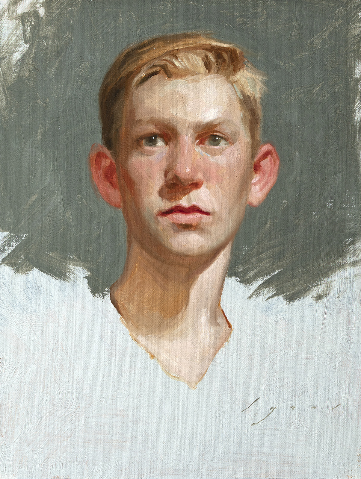
I was happy with the clean flesh mixtures on this one. I started with a linen panel from Strada Easel. I used a panel that I had done a previous portrait on, but didn’t like it so I re-primed the panel with some lead white, tinted with a little cool grey. The texture you see on the panel is how I applied the ground. When doing these faster paintings, I like the added texture. Either the irregular weave of the linen, or some brushy-ness in the ground. It adds interest, but isn’t so pronounced that you can’t add some refinement.
Here is a video of the painting from start to finish. I started with a Raw Sienna drawing, thinning the paint with Gamsol. Once that was done, I didn’t use any medium, just paint out of the tube (it’s important to have fresh paint). Establish the darks and lights then start developing the form. Once that is worked out, dial in the subtleties in color and then refine the details.
Thank you for giving my post a read!
Howard

Smashing stuff! Thanks for the post.
Thank you, Charlie!
Awesome article! Thanks for sharing!
Colour mixing is an important skill to learn and master, but in my humble opinion it is only there to give the artist the deeper understanding of colour, not to bind him/her to it forever.
The same goes for being able to render details, make smooth transitions, know value, understand light and all the other things we need to grasp, before … we can adapt them to our own sensibilities and workflow speed. Abstraction in brushstrokes, suggesting detail is also nothing more than a shortcut, so is having premixed paints that help get things done.
I love all of the many tubes and bottles of paint in my cabinet. I also respect the purists out there, but we are different. And that is good!
Great comment Nico! Thanks for reading and giving your input!
Thank you Howard! It was really helpful
Beautiful painting! I watched your oil painting video on Muddy Colors Patreon. You talked about Bice color. I think it might be a mix of Cerulean and white. Could also be cobalt and white. In watercolor, Cerulean blue and Cadmium Orange are compliments that mix a lovely grey. When I added Titanium white gouache or watercolor to the mix it was a lovely soft grey. Other similar orange pigments or mixes would also create a soft grey with Cerulean blue and cobalt as well.
Kings Blue by Michael Harding and Vasari are a mix of Ultramarine blue and Titanium white. Vasari adds zinc whit too. Kings Blue by Williamsburg is Pthalo blue and Titanium white.
I was wondering if anyone used cerulean or cobalt with white and orange for a grey. Looks like that could work well.
I wonder if the Vasari pink is high pigment content of Quinacridone pinks or reds plus white. There is a warmth to it so a yellow probably has been added. Quinacridones are very bright but transparent so white would make it opaque. Maybe the yellow is Naples Yellow.
Thank you for demonstrating how you use convenience mixtures. If you use them often, it saves time not having to mix them yourself.
Again, beautiful portrait. I love the lively colors they produce.