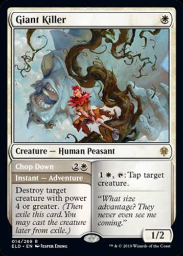
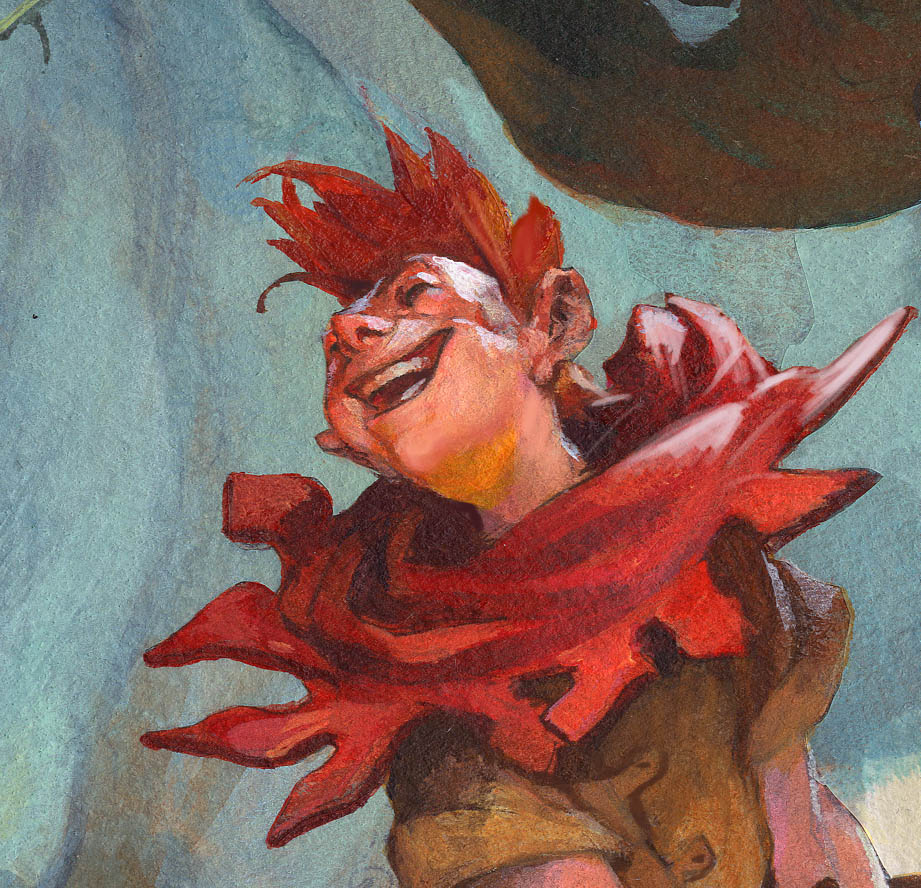
Giant Killer, Magic the Gathering, Throne of Eldraine
 When it comes to narrative illustration I find them way harder to do than figure portraits. Portraits is all about figuring out the figure and the mood and the personality. Those illustrations are difficult in their own way, but I think, not as many routes and choices as a narrative illustration.
In an illustration where a story line takes place, I try to narrow down on the bit that engulfs the whole story. I try to think of the moment right before the outcome is certain. not the end, not the beginning, but the exact moment where the drama is on a knife edge and the balance can tip both ways. At least, that is the idea.
This specific illustration is called Giant killer. It is a Magic the Gatherings version of Jack and the Beanstalk. Let me start by listing up all the difficulties I had with this one and you can see if you think I solved them right or if I could have chosen different to a better result? Because I think that is what illustration is all about: weighting the decisions in order to tell the story as simple and clear as possible, with as least noise as possible.
I had an artdescription asking for a figure portrait of the Giant Killer, a young woodsman. He was excited swinging at a beanstalk with a mighty sweep chopping it over at its root. The cutting of the beanstalk makes the giant higher up, fall dawn and get himself crushed in the fall. When I read it I thought”Damn, I am gonna need 3 illustrations to show this” And also I was very concerned that the illustration still called for the little woodsman boy to be the main figure, the portrait.
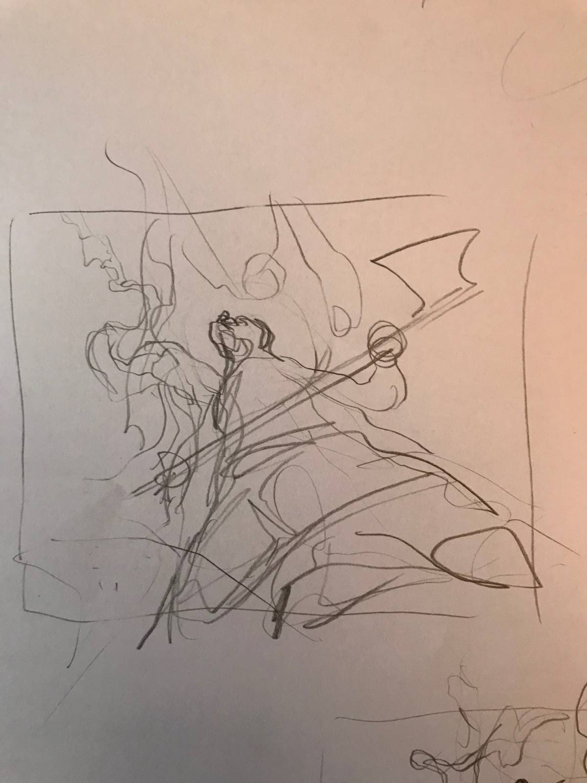


My first idea was to use a very low angle so that we could see the wood chopper looking up, following his eye and see a giant and a crubling bean stalk falling to the ground. When I sketched it out in thumb size I think it showed too much crotch area right and center and very little giant. I was concerned the size of the giant would not be clear, and the part of the chopping was all over at the point where this fantasy-photo was taken.
My next sketch was to try a more moody angle where the distant was zoomed more out to allow the giants size to be clear. The main figure is smaller but placed high and center and in a darker silhouette against a lighter giant to show distance ans scale. I really liked that one. it was clear and precise in what we are looking at. The little figure was still perceived as main character and the scale and everything was clear. But, there was no chopping and it would be difficult to show a happy face in such a small character. Also It kind of went against my theory of capturing the scene at the balance. this is a scene from when everything is over and the dust has settled. There is no real action going on and the outcome is really not up to any doubt.
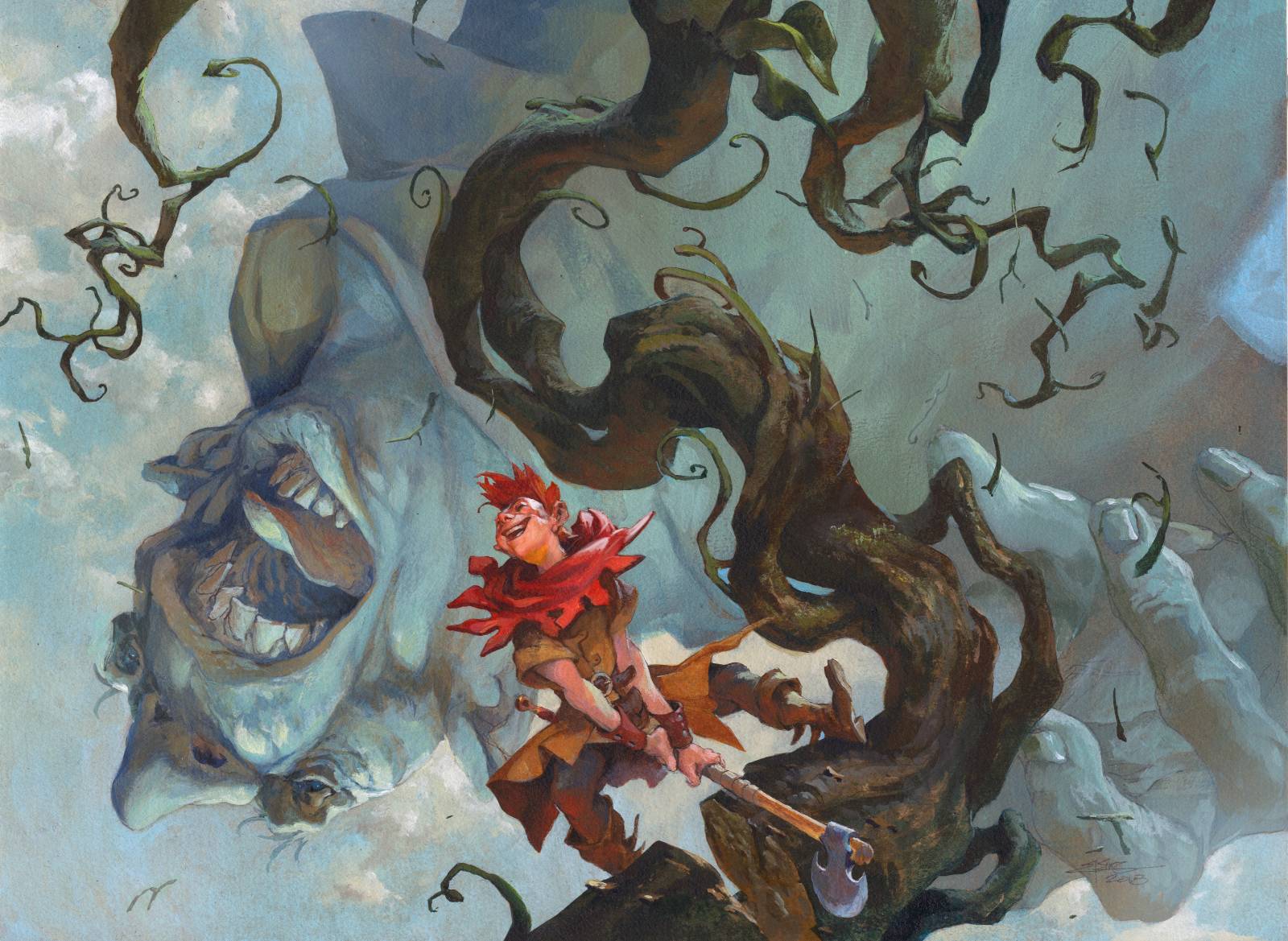
So I went back into it and tried out a version that was an action version of the 2. The boy has just chopped the last heavy axe cut and is looking up to see the result. The giant is mid fall, screaming as he plunge to the earth. Beanstalk is starting to fold up. i kept the dark foreground against the light background. I pulled the main figure out to the side of the beanstalk to have him read clearly in silhouette and I placed the head of the 2 figures closely together for a nice centered main interest. What I liked about this thumb was that it showed the emotion of the giant and it had all the things i aimed at; the chopping, the falling ans so on. Only thing that bugged me was that the main figure was very underplayed. I decided to make up for that in final and started to sketch him out first. 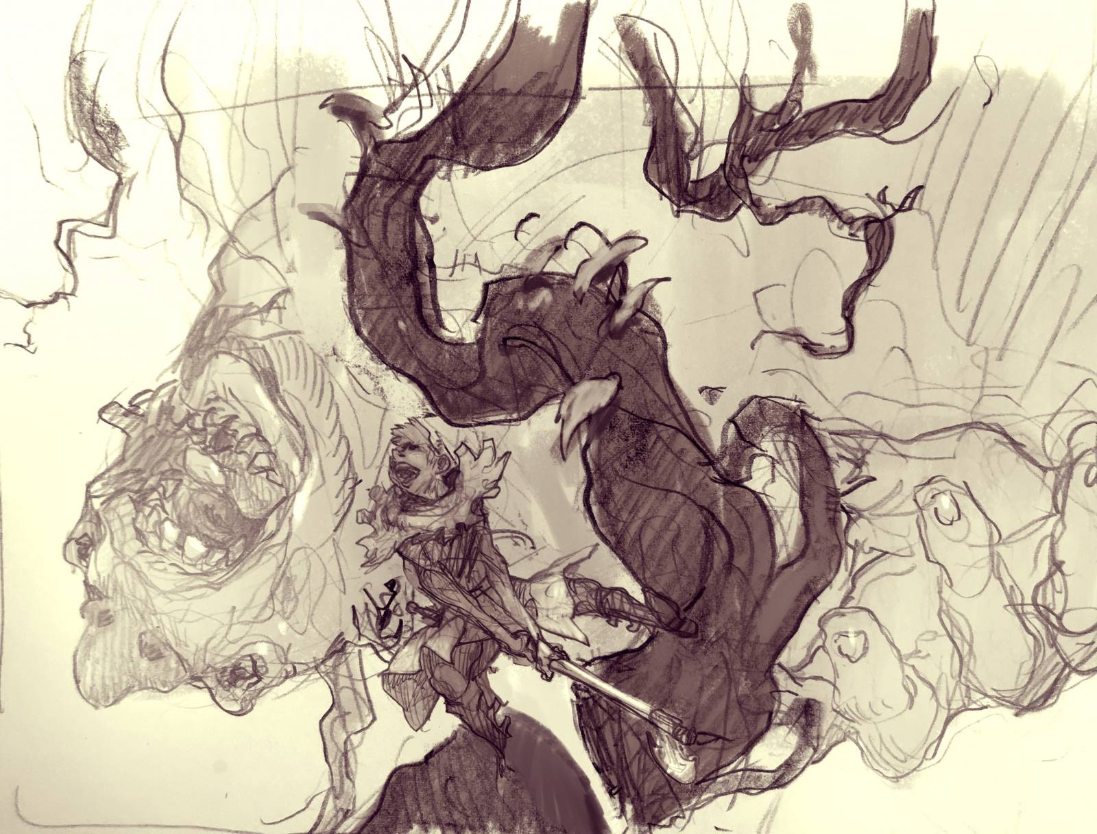
This is the final sketch. I ended up zooming in a bit more than on the thumb and made the boy bigger.
The sketch was transferred to a board and greytoned in black acrylics.
Then I tried out a couple of themes for color. One is greenish and one is more reddish. in my mind I always had the greenish in mind, but I needed to see it in a different hue to make sure i liked the green one best.

When I started painting the final i ended up pushing the red of the boys clothes and added some orange bounce light to his chin. Actually i pushed all the red and orange hues as much as I could. reason was, that when i paint in a acrylics I always mask out the figure with frisket film. In this case I had the boy and the beanstalk masked out with film and then I painted the sky and the giant. They turned out a bit more blue than on my rough, because when i started on the sky I disliked the green sky. So when I peeled the masking film off I thought he contrast would be better if the boy had more orange, thus creating a better contrast to blue.
The result was very much how how i visioned it from the first thumb sketch. The face of the Giant Killer might be the most cartoonie face I have ever done for magic, and I really like it. To me, the cartoonie style, make sit easier for me to add some personality to the figures.

I really love this composition. I Think you nailed it!
Gotta say, and it should be known that I own Elsewhere, this might be my favorite Jesper Ejsing piece of all time. You totally nailed this difficult action shot!