This month I have two guests, Paul Canavan & Ben Zweifel, talking about how being color blind (or colour blind in Paul’s case, as he’s from across the pond) affects their careers in fantasy illustration. I happened to see this post from Paul on twitter a little while back, and I was fascinated to hear more about it. Ben chimed in on the thread, and I asked both of them to weigh in on a guest post here on Muddy Colors. Thank you for writing this out for the MC readers, because I am sure there are more people than we realize dealing with differences in seeing color.
oh hey, now that I'm just working for myself and some amazing clients, I feel comfortable talking about a big old thing which has plagued me throughout my life and career as an artist and art director:
I am colourblind.
Like, really quite colourblind. pic.twitter.com/BYnpZLBXOr
— Paul Scott Canavan (@abigbat) August 2, 2019
Paul:
I recently posted a short twitter thread about my life as a colourblind artist. This was the first time I had spoken openly about my struggles, and while I expected it to garner some interest and hopefully inspire other budding artists, I did not expect it to accrue close to a million impressions and a slew of (rather sensational) articles online.
By means of introduction, I have been working professionally as a concept artist, illustrator and art director for 12 years now, for clients including Wizards of the Coast on Magic: the Gathering and Dungeons & Dragons, and for Axis Studios, creating AAA cinematics for games like Destiny 2 and Guild Wars 2, and while I have been extremely lucky in my career thus far, this curious disability has always somewhat marred the experience. There’s nothing quite like sitting in a room of senior artists and directors, listening to them question your colour choices because you didn’t realise you had accidentally painted the sun green and having to shakily justify the “decision”.
The response to my thread was extremely positive and had the unexpected outcome of introducing me to a bunch of colour blind artists working in the industry, and so today I have the great pleasure of chatting with my friend Ben Zweifel, an illustrator & concept artist who has worked on Battletech, Humblewood and Book covers for Orbit, tabletop games and a bunch of other neat projects. This felt like a great opportunity to discuss colour blindness itself, our experiences over the years, and how we learned to cope with what many would consider a pretty overwhelming disability for an artist.
Spoiler: it’s totally possible.
Oh, and before we get started, it’s worth noting that Ben and I are from other sides of the pond. I’m Scottish, and so will be saying “colourblind”, while Ben will be using “colorblind”, which is obviously wrong.
So, to kick things off, maybe we should talk a bit about what colour blindness actually is and how you first came to know you were colourblind?
Ben:
Hey Paul! I too, am colorblind, or so I have been told from a young age. I think I did some sort of standardized Ishihara Plate test (you know those color blind tests with the different colored dots where you have to see the shape, letter or number). I have a vague memory of being told that the way it would affect my life is that I may not be able to pass the color observation requirements required to get a pilot’s license or to become a train conductor. So I chose something completely unrelated with no requirement to accurately perceive color. An artist!
Paul:
I find that actually expressing what it feels like to be colourblind is the most difficult thing in social situations, because it’s presumably feels totally alien to most people. I can’t necessarily point at a colour and tell you what it is because to me there’s a lot of overlap: greens and yellows can be hard to tell apart, and the same goes for blues as they slide towards purple, and greens and browns are totally interchangeable.
As an artist I have to rely on a combination of common sense and colour theory to actually colour-pick a lot of colours in the environment; the grass is presumably green, but it’s being affected by the blue sky, the bounce light off that wall and the shadow from that tree, so I mix the colours I assume would exist based on that breakdown of elements rather than just eyeballing it.
Ben:
I think one exercise that would be great to show our non colorblind readers what the comparative difference is for us to show them a simulated version. One big assumption that a lot of folks with normal color vision make is that color blindness means we see in black and white when that’s actually an extremely rare manifestation of it.
I am not an eyeball scientist so this is very much my layman’s understanding from what I remember being taught in school. So let’s rewind for a minute to high school biology, the year is 2002 (in my case) and we are learning about the structure of the human eye. Light passes through the cornea, the amount gets modulated by the iris and the focus is modulated by the lens, which projects it against the inside of your eyeball, the retina. A surface covered in photoreceptor cells called rods and cones. Rods are responsible for low light vision and only perceive values and not color. The cones come in three flavors, S, M and L and they are sensitive to different segments of the color spectrum, short medium and long wave respectively. However for our purposes the best way to think about them is blue, green and red. The best analogy for artists is probably gamut and value ranges. Think of the rods being able to see a huge value range but no color and the cones being a full hue gamut but in a reduced value range. It’s why when your in the dark things seem drained of color, because the rods are doing most of the heavy lifting because the cones need more visible light to operate properly.
Most people have Trichromacy, that’s normal color vision where you perceive the same with all three types of cones. A lot of people who are “color blind” have anomalous trichromacy (It’s what I suspect both Paul and I are), this happens when one of the three types of cones has a slightly altered spectral sensitivity, so one of the cone types is slightly hue shifted and its throwing off our whole color vision as a result.
There are more severe varieties too, Dichromacy is typically caused by the total absence of one of the cone types and Monochromacy (you guessed it) is total color blindness where you literally perceive things like a black and white photo and that happens when either two or all three cones are missing.
It’s pretty evident if you have one of these more severe versions of color blindness, and neither of us has that type of vision deficiency so we are going to talk mostly about anomalous trichromacy.
There are three different varieties, some much more common than others. Protanomaly (color shifted red receptors), Deuteranomaly (color shifted green receptors) and Tritanomaly (color shifted blue receptors. Most people are Protan or Deutan, Tritan is pretty rare.
There are some excellent pieces of software out there that do a great job of mimicking color blindness, these aren’t exact but they do a pretty good job of showing what it might be like for non color blind people. So I took Sargent’s Carnation, Lily, Lily, Rose, a painting full of incredibly subtle greens, blues and reds, and put it through the wringer. This is the painting that made me realize how terrible I am at perceiving greens.
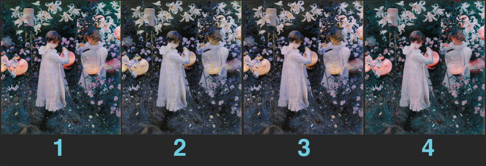
1: One of the better high quality true color reproductions I could find.
2: A simulation of Protanomaly
3: A simulation Deuteranomaly
4: A simulation of Tritanomaly
These are fascinating examples to me because they show the subtle differences that most people with color blindness deal with. For me I can perceive differences in the red and green between #1 and the other 3. However #2 and #3 are very subtle differences for me, mostly I notice a change in the amount of red and some subtle changes in the green. After questioning a lot of people it seems like I’m definitely not perceiving a lot of the subtler greens between 1,2 and 3.
Paul:
I always find these visual examples interesting and a little confronting because, as in this case, I can’t really see any difference in the first three at all (and as soon as you say this, people gasp in horror). I have to go in really close and overlay them in Photoshop to even make out changes, and even then I can’t put my finger on what it is that’s different, mostly small shifts in value or something just not seeming right.
Ben:
I definitely have some very similar experiences but I think mine might be in slightly different color bands and possibly less severe than yours, although arguably it’s pretty difficult to determine. In part because it’s a perception issue and in part because we’ve both worked hard to differentiate between nuanced color differences.
While it’s clear to me that I see certain ranges of color in a more diminished and compressed way that’s slightly color shifted it’s surprisingly difficult to determine where my vision is actually abnormal. I’ve mostly pieced it together from context clues. Here is where I think my weaknesses are:
Similar to your color ranges, the white zones represent areas of color overlap, If you showed me just a tiny slice of any of the areas represented by white, I would most likely be doing some guesswork about where they are on the color wheel. The biggest one for me is green/yellow. I’m fairly convinced my perception of green is less vibrant than what other people experience, I think it heavily bleeds into yellows and browns for me.
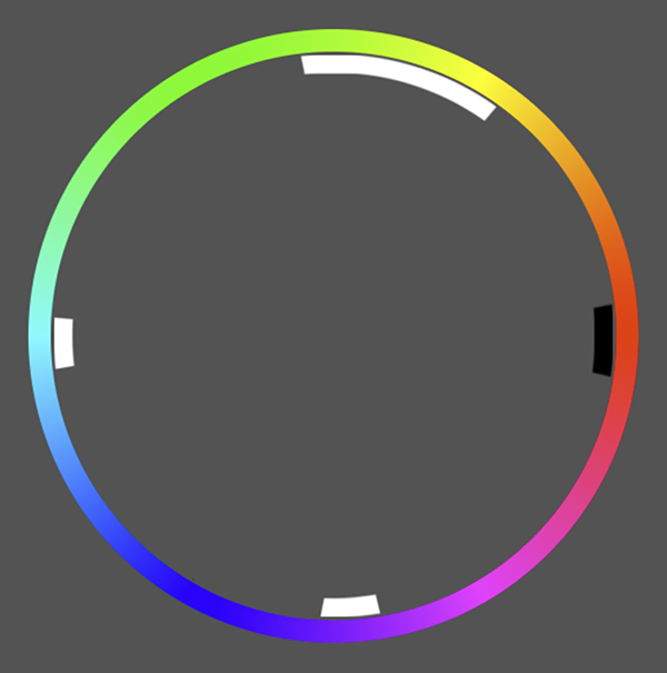
The green/blue range is mostly one of color mis-identification. I’ve had enough interactions with my wife where I’ve said something like “Oh the teal one.” and she responds with “Do you mean blue?!” (To clarify my wife is also an artist and not color blind, she knows her color theory.).
The purple sector feels similar, however here it often feels like it’s more of an issue of identifying the temperature of just how warm or cool the purple is.
The red is the most interesting to me, I feel like I don’t have any issues identifying it, yet it doesn’t grab my attention the same way it seems to for other people. An excellent example of this is I was briefly watching a stream of Remedy’s new game, Control, and the streamer kept flicking open the map to check their location and the little arrow indicating the player is small but bright red on a midtone grey background. I had to pause the stream and it took me a good 10 seconds to spot it. Once I knew where to look I could perceive a saturated red arrow and identify it as such but for me the chroma difference is representative of a significantly less contrast than it would for other people.
Paul:
Your Control example is so relatable; I can’t count the number of games I’ve played where some crucial piece of UI information is just entirely lost to me. Multiplayer games are the absolute worst; I often cannot tell the difference between the players and teams, and this can be thanks to the UI’s colour choices and also the uniforms themselves. Some studios are becoming wiser to it, Blizzard in particular getting kudos from me for offering a very customisable version in their games where you can literally shift the colours around to your liking, but it’s still a big issue.
In terms of your work, are there any useful strategies you’ve developed to help you deal with colour misidentification? One of the most important lessons I learned was not to beat myself up too much about “cheating”. Colour-picking from my references is pretty vital, even if it’s just to double-check that I’m in the right space, and I’ll sometimes take entire colour schemes from master paintings and save them as swatches for use in future. More recently I’ve been using 3D software to help compose scenes and figure out both the lighting and colour space; the results aren’t perfect, but they are easy to control and give me a good starting point to work from.
What sort of tools/workarounds do you use?
Ben:
Our approaches seem pretty similar and I use a lot of the same strategies. One of the big things for me is if I get the values right and if my color makes sense in context to the rest of the painting I’m not too worried about the nuances of it, although I’m sure I have some odd color variability in some of my paintings, in general I trust my color sense enough to paint pretty naturally. Like you, I do however very frequently check against the color wheel using my color picker, most of my painting is very context driven, often the decisions I make are about warming up or cooling down a local color and the color picker is extremely helpful with cross checking that.
Paul:
I think we work pretty similarly, my focus is very much on value too. Earlier I alluded to the uncomfortable situations I’ve ended up in thanks to my colourblindness. For the most part it’s been fine, and I don’t think anyone I worked with was ever aware, but I’ve always been a little on edge just in case someone suddenly calls me out. A lot of my work has been extremely colour-forward, including painting colour scripts for AAA game cinematics and the like, so reviews have always been somewhat fraught. I’ll always aim to get a friend to check my work before submitting, but that isn’t always possible.
How has colour blindness affected your career? Any spicy anecdotes or tricky situations?
Ben:
That’s an interesting question. I think mine might be a little less severe than yours, or maybe I’m paying less attention. My parents are graphic designers and illustrators so I grew up exposed heavily to a professional art adjacent environments and it was never a thing I thought a lot about until I really started to learn color. I’ve definitely handed in some weird pieces that have a little too much green or aggressive red in them, especially early in my career. I’ve never done color scripts or anything so maybe my career so far has been a little less color dependent. I will say, most of the art directors I work with regularly, know I’m color blind. I’ve definitely had them color adjust some of my pieces a touch after I hand them in.
Paul:
That’s interesting, I guess growing up around artists in that way maybe made you feel more comfortable around the issue? I studied art at school, of course, but I think even by that point I was already trying to hide it. In all honesty, I almost quit art a hundred times. It seemed way too difficult and I always had this voice in the back of my head saying, “you have this thing for a reason, you shouldn’t be an artist”. Why do you push forwards instead of becoming a chef or something?
Ben:
Honestly being a chef sounds like WAY more hard work. But I had supportive parents who are also in creative fields so I never dealt with any of the negative pressure a lot of my peers got from parents who simply didn’t have a good concept of what an art career could look like. While I, like basically everyone else I know, has thought about quitting hundreds of times it’s never really been motivated by my color blindness, more like the fact that drawing and painting are mind-bogglingly difficult. It feels like there are probably a ton of people out there that are slightly color blind and don’t have any idea. It’s only once you start doing a deep dive into something like art where your sensitivity in color perception really matters that you begin to unravel it.
Paul:
This has been such a pleasure, Ben. Honestly, just finding out that I wasn’t alone this whole time has been so valuable to me, and I hope those of you reading enjoyed this insight into what is a pretty strange artistic experience. In conclusion I just want to say: if you are worried that a career in the arts is inaccessible to you because of your colour-blindness, or any disability really, there are always workarounds. The success of that Twitter thread introduced me to artists who were fully blind, and artists with a host of other astonishingly impactful disabilities, but they found a way to make it work and that’s so inspiring to me.
Ben:
Thank you Paul, this has been a really interesting experience because I’ve never really been forced to define a lot of the color deficiencies in my vision so I’ve actually learnt a lot writing this article. If you want to see where your color vision stands there are some great tests you can do and you can find some of them here:
https://www.color-blindness.com/color-blindness-tests/
Paul:
Thanks!
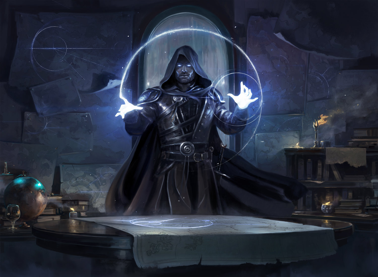
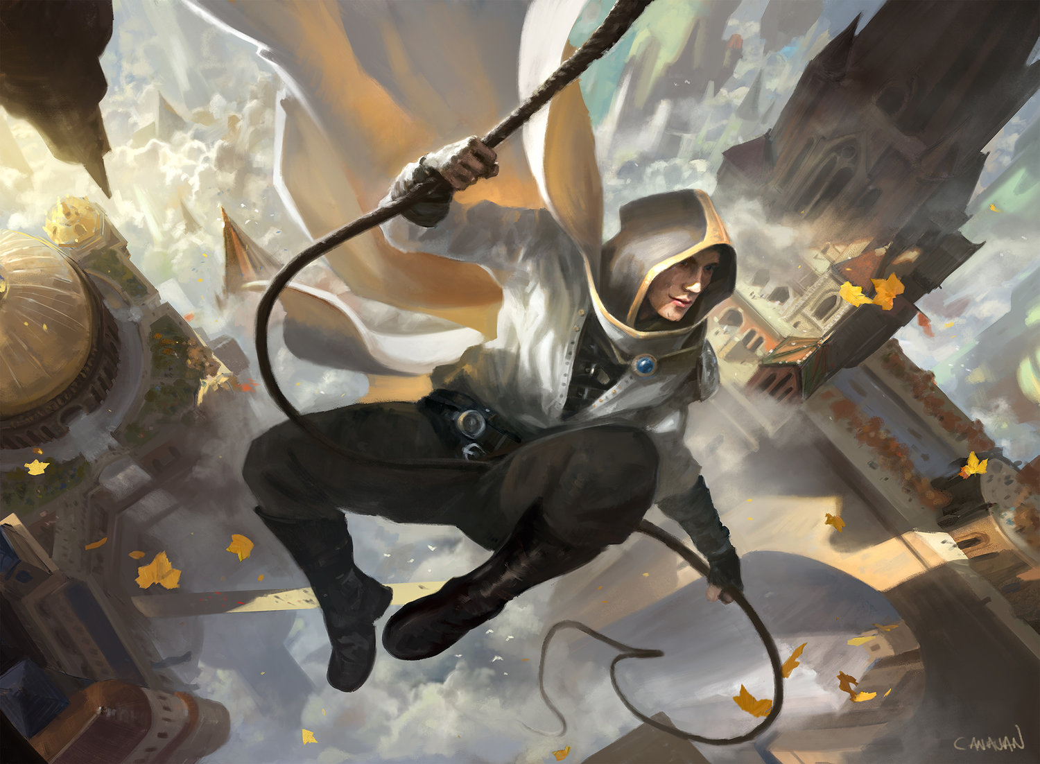
Thank you so much guys, I wanted to pop in and show off some of their work. I can’t believe these pieces were done by anyone who can’t see color the same as I do. I have worked on 5+ covers with Ben and I had no idea he had any trouble with color at all!
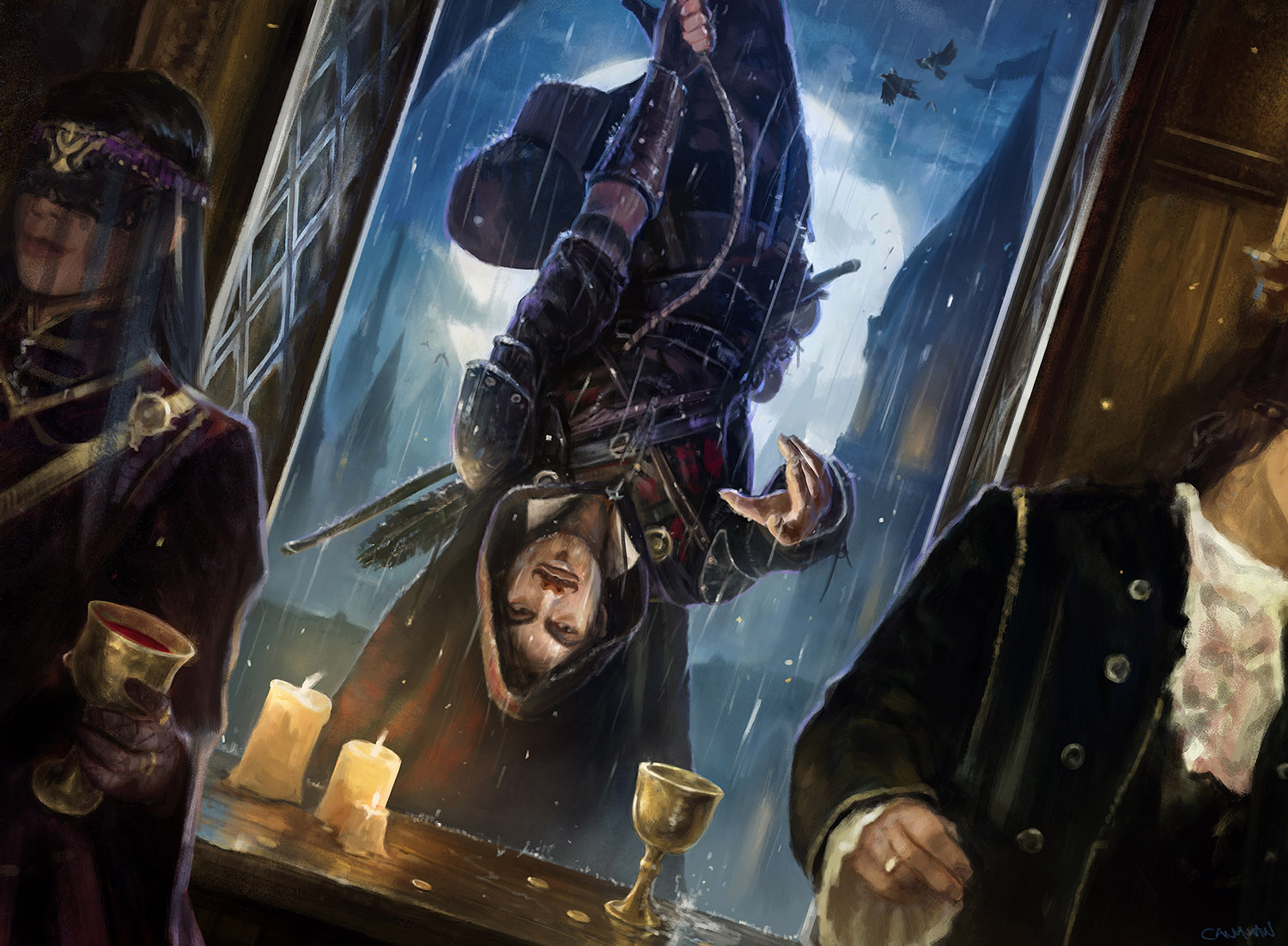
Paul’s work: more on his site


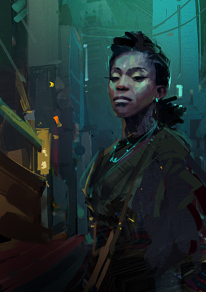
Ben’s work: (more on his site)


Thank you so much for posting this fascinating conversation! I too am a color-blind painter. About four years ago I bought a pair of color-correcting sunglasses and I have to say they changed my world! If I may, here’s a link to a blog post I wrote about my experience:
https://web.archive.org/web/20180522122132/http://kmizner.blogspot.com/2015/04/red-buds-in-sunlight.html
As an update since I wrote that article, I believe my color vision has actually improved even when I’m not wearing them. Apparently, most color-blindness isn’t a physical defect, but a brain-interpretation thing. Wearing those glasses has taught my brain to see color better. Not perfect, but better.
Thank you!
Oh how fascinating! I didnt know that color blindness of some types could “correct” itself
The manufacturer of the glasses alluded to that possibility in their literature when I received the glasses. Honestly, I didn’t take much stock in it, but I’ve worn them as much as possible for over four years. Recently, and just for the heck of it, I took their color-vision test and for the first time in my life I passed it! I am not cured, but I do know I can perceive color nuances that I had difficulty with before.
Hello, I’m a bit late, but thank you for sharing the experience you had with the colorblind glasses. I have mild deutan discromatopsy (mild color blindness, I just can’t see some shades of green and for me is often very hard to distinguish between grey and green, or brown and green. I recently tried those glasses and they seem to work, I see some colors better (but I have them for just 4 days so far, it’s too early yet), but also seems to me that I can read depth way better, objects stand more vivid and well shaped, it’s easier for me to catch the right depth of things. Did you notice that too? And what about the improvement you got even without wearing the glasses, you mean that now you can perceive more color nuances than before just looking at something without the glasses? seems impossible to me. anyway, I’ve seen your artworks and I gotta say, it’s impressive! I like how you deal with lights. and since you’re color blind, that’s even more impressive. And Paul and Ben digital artworks are amazing, it’s hard to believe that they’re actually color blind. This interview is a good read, I liked it very much. thank you
Thanks for this article. I am a colourblind 3d artist so seeing these two describe their journey has been inspiring.
I was wondering about focusing mainly on 3d modelling and animation but after seeing what these guys have done I am confident I can succeed in texturing as well!