By Jesper Ejsing
I struggle everyday with ”overlap”. Or at least I think about overlap and how to use it for my convenience. Overlap is pretty basic and something most people learn early on. But I tend to blunder sometimes at it and thought that everybody could need a reminder from time to time.

I have drawn up a very scientific illustrations that shows ALL implied what my theory is all about. The first guy with the knife ( and yes, you are right. There is absolutely no reason why he should hold a knife ) has no overlap in him. The guy next to him has an overlap line in his arm, that shows us that the part of the arm holding the knife, is in front of the rest of the arm, ergo he is pointing the knife at us. The sleeve of his shirt furthermore indicate the arm is pointing toward us. I added a little overlap line in his collar to show how it also add depth. Underneath we see 2 islands. But there is no way to see if they are next to each other or whatever one is in front of the other, since the 2 lines meet at the bottom. The drawing beside it shows how easy an overlap line clarifies it for the spectator. ( Yes; some of you might have been able to guess that the left one was the closest to us. Lets call that female intuition. ) The last example is a guy standing next to a tree. The outline of his body parallels the outline of the tree trunk. It is called a tangent line and it ruins our ability to read depth. You cannot see which part is in front or behind since the lines meet. One way to clarify it is to pull the guy away from the tree and get to clearly readable silhouettes, but I would argue that the last one is more interesting; namely placing his outline so it overlaps the outline of the tree. As an extra bonus I filled in a drop shadow. The favourite follower of overlaps. This is extremely basic stuff, but in praxis it becomes very complicated when you are doing a scene of three figures fighting a giant monster. Lines tend to tangle up and gets messy as soon as you start sketching away. That is when the rule of overlap becomes really important.
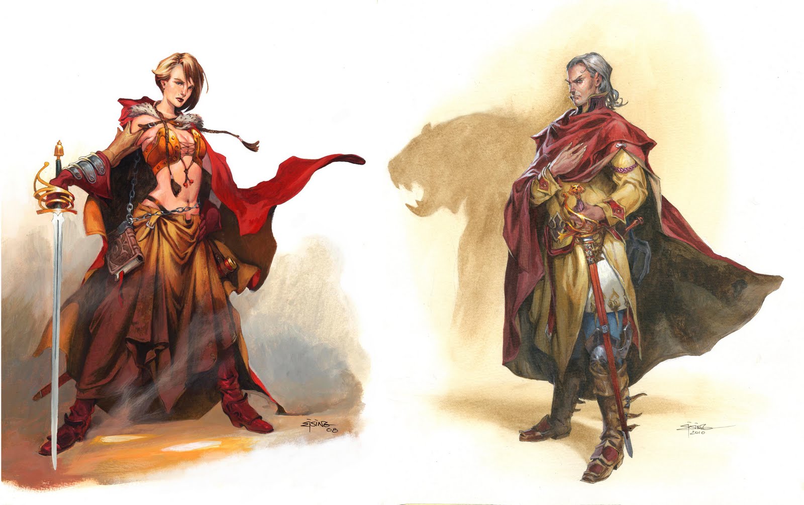
Lets go to scientific example number 2.
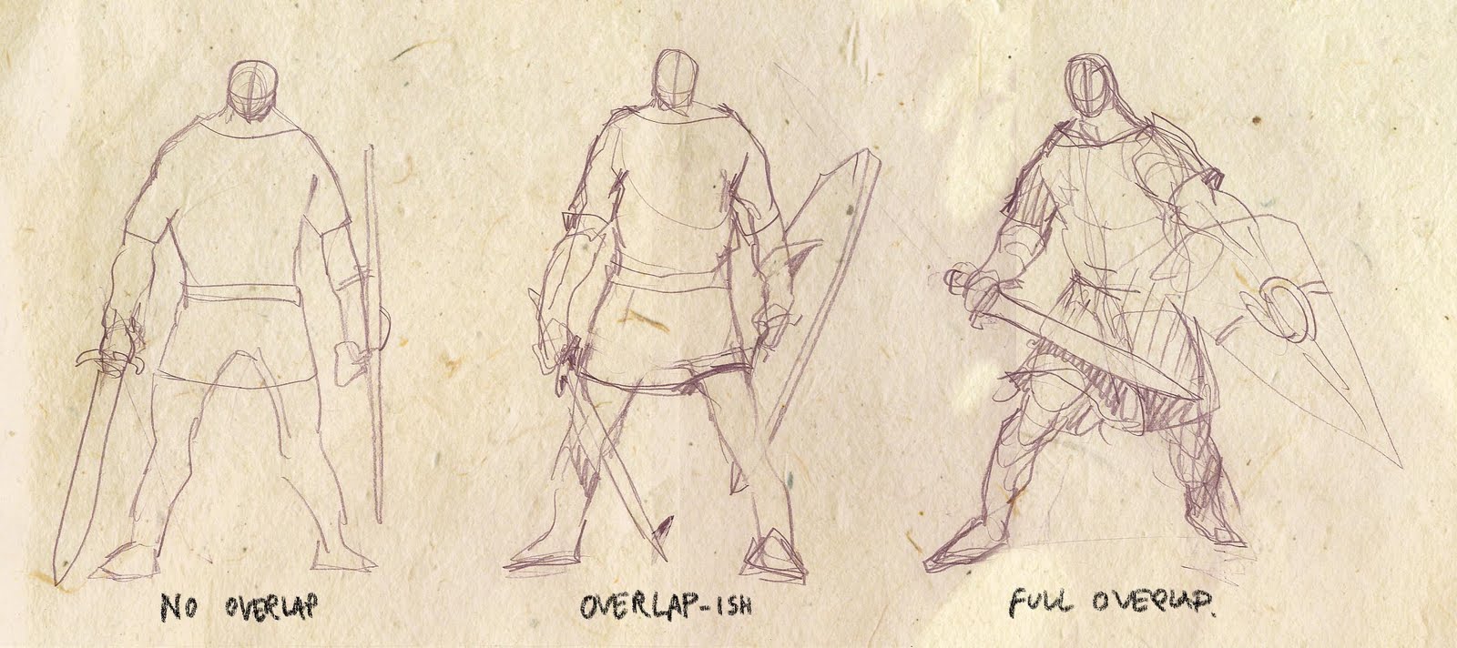
The first fighter is straight forward. He is drawn almost 2 dimensional with no lines or anatomy parts overlapping each other. He creates no depth. Lines of belt and sleeves are not overlapping and makes it look like his clothing is sprayed on like body paint. The shield is seen right from the side and it looks like his arms and legs are on a line. In the middle one I added overlap to the sleeve holes and pulled the sword in front of him, added a foreshortening to the hilt, pulled one leg back and the other forward. I tilted the shield and placed it behind his leg. It is almost the same drawing but it has overlap in line and in the equipment and posture.
The last drawing is to show how to pull more into depth and overlap. By twisting his pose a bit I get the shield to overlap his arm making us look into the picture. In turning the body his body parts overlaps each other giving the clothes a direction. Everything is now either going away from us or coming towards us. Now the drop shadows becomes important. At this stage of choosing a way of portraying a pose I am really thinking mostly of chunks of forms and clearing it with surface lines. The end of sleeves, tunic, belt and outline of the shield, is showing us which way things point.
Why is depth better? A painting is a 2 dimensional flat form. As an illustrator I aim to pull the spectator into my scene and universe. I try to create a window into another world. The more my illustration do to create that illusion of depth that transform the flat paper to a 3 dimensional form, the better.
The first fighter with the sword is flat and becomes a representation, or a symbol of a fighter. The last one is a living real guy ready for battle.
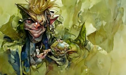
I have circled in a couple of places in this fire Efreet I did for Pathfinder nr. 24 by Paizo.
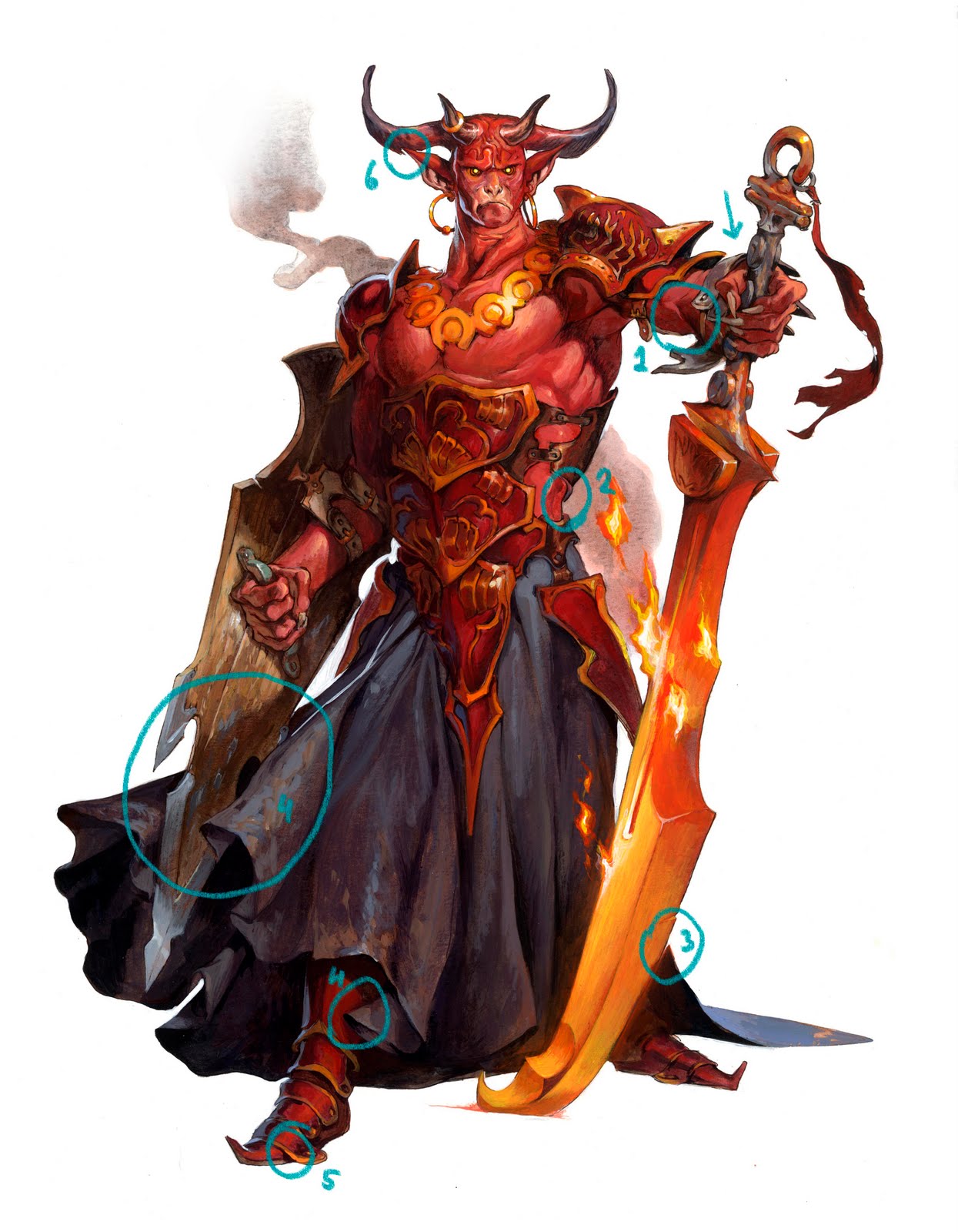
Nr1: The line of the arm shows that the underarm is in front of the biceps.
Nr2: These lines are very important. The straps of the harness is bulking out of the silhouette of the torso. They circle around his body as opposed to being a tangent along his outline. I really try to think of these small elements as lying on top of each other layer upon layer to bulk out of the silhouette.
Nr3: The sword blade is very clearly overlapping the line of the dress in an angle that is not to be confused to avoid tangent line.
Nr4: To even further the illusion of depth I have the dress fan out and cover different elements like the shield or leg. this allows me to play with shadows of stuff casting drop shadows onto other parts of the figure. It creates a believability that things has volume like that.
Nr5: A little overlap in armour gives the foot a clear reading of coming out toward us.
Nr6: The ear is clearly in front of the horn. I used the white of the background cutting into the silhouette to make it readable.
Even though this guy is almost a straight forward guy with a sword and shield. I still twisted his pose enough to make depth to his anatomy and to make the pose 3 dimensional and interesting.
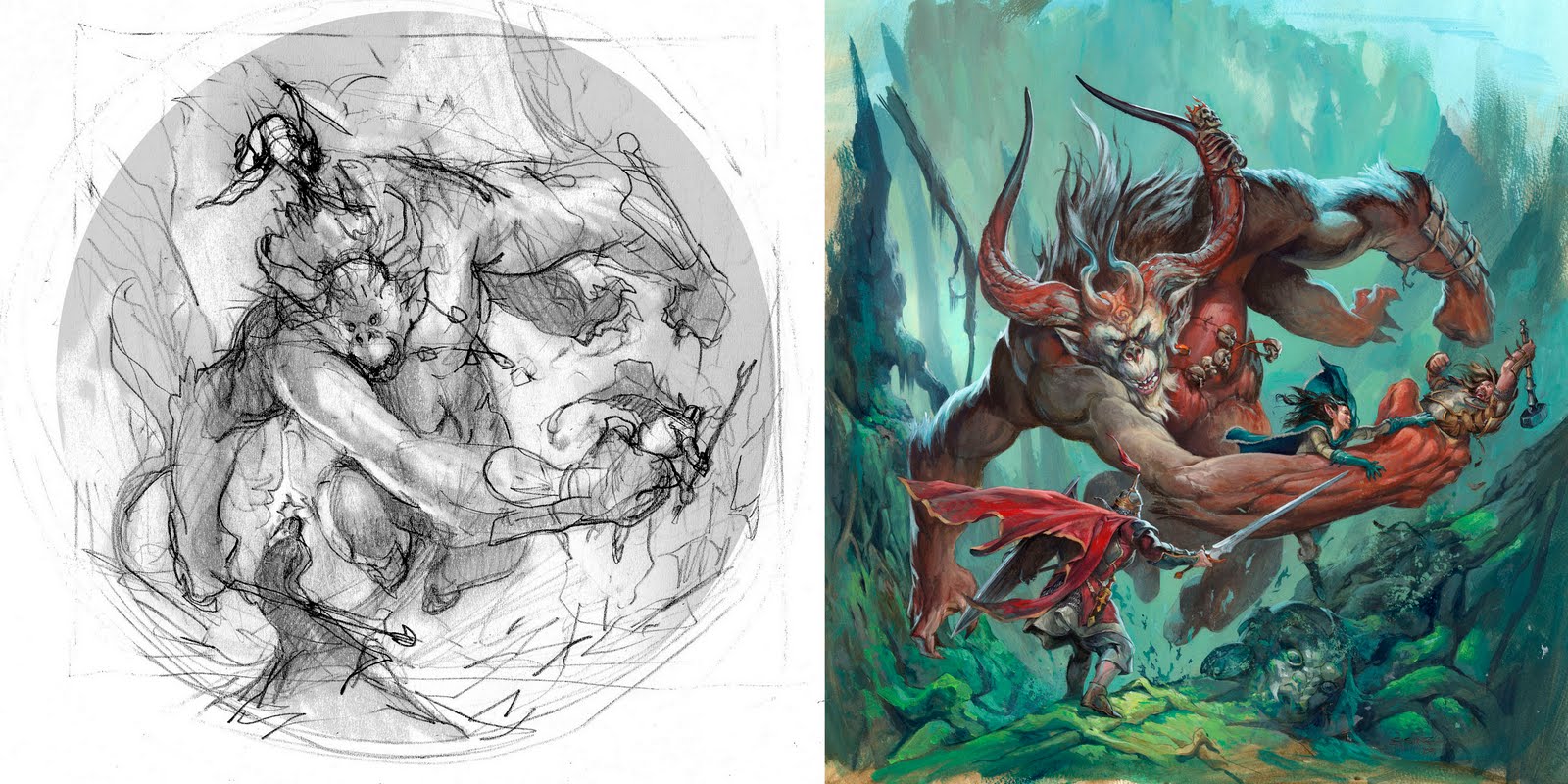
As a last treat I added a cover from years back: It is a Runebound cover I did for Fantasy Flight Games. In the sketch you can see the guy in front as standing free of the monkey silhouette: almost like the second version of the “guy next to a tree”, in scientific example one. The girl is hanging in the top of the figure. In the final I changed those 2 things. The girl was being to nicely places around the monsters edge. The figures looked too coordinated in the picture, so I hanged her from the arm of the demon trying to pull her friend free of the grasp. The story becomes much better this way. The fighter I pushed in front of the demon to gain distance between them and to have most of his outline overlap the demons muted down silhouette. The red cloak is pulling the eye into the scene with its extreme foreshortening.
Great post, Jesper! I love your examples. Also, tell Claus hello from RC if you see him today!
This is great, thank you! I've always had trouble getting that “3 dimension look” to my drawings/sketches, but never had a good lesson in how to push things forward/back to emphasize form and shape. Wonderful and easy to understand tutorial.
I'm just starting to learn about illustration, and found this very helpful. Thank you for being willing to visit the basics.
Great post! Overlap is something I'm trying to work on in my own work, and this really helped open my eyes to some of the things I've been missing.
Overlap is such an obvious concept, yet everyone overlooks it.
David Chelsea talks about overlap in his book Perpsective for Comic Book Artists.
overlap is so simple, yet so powerful.
at several places in walt stanchfields “drawn to life” books, he quotes a list of tools for getting depth into ones pictures:
-surface (placing one thing higher up in the picture than the other one)
-size (drawing one thing smaller than another one)
-surface plus size (the first two combined)
-overlap
-volume lines (any kinds of lines that follow the volumetric form of a body)
-foreshortening
most of them are so simple, yet easy to overlook in favor of starting to ship out the vanishing points and try making a dull/wonky setup believable by constructing it.
Thanks for the tips
This was really helpful! I'm so glad that there's such generosity of knowledge.
Download MP3 Gratis
Noah Terbaru
Peterpan
Lagu Barat
Lagu Reggae
Lagu Dj
대전출장마사지로 쉽고 간편하게 집에서 경험해볼 수 있습니다.