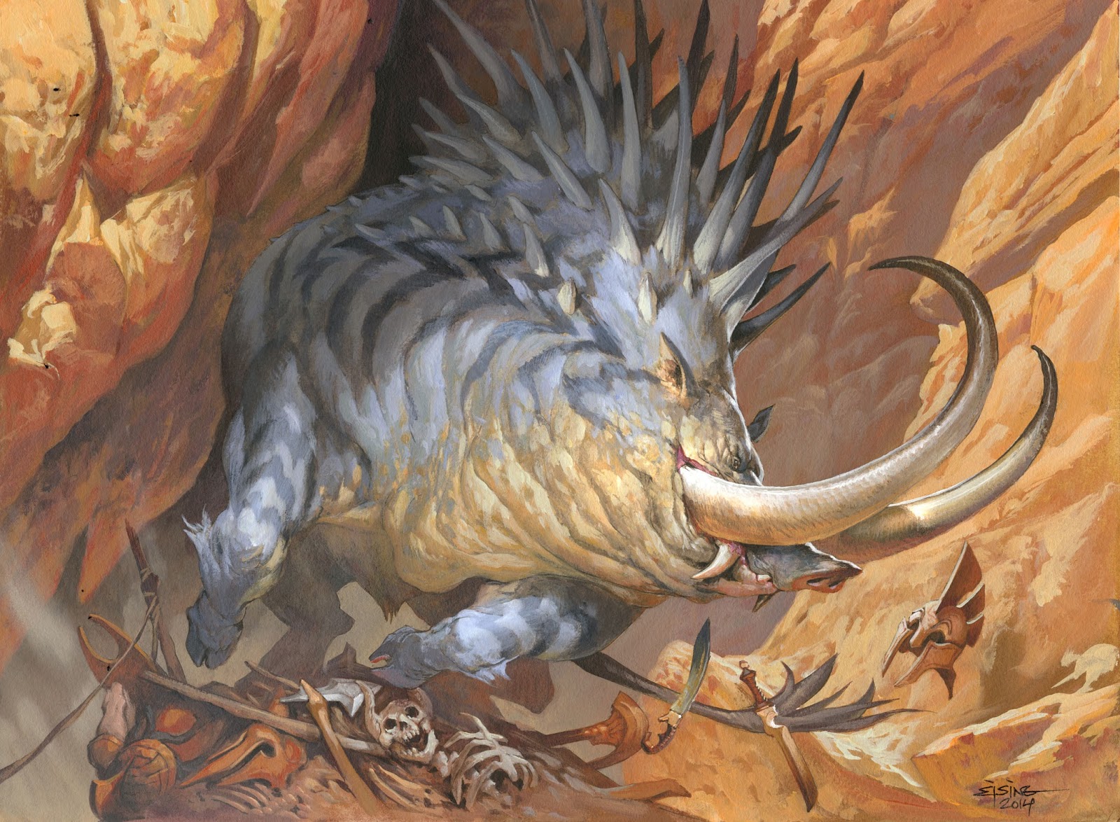
Here is a magic card illustration I did a while back for the Origins set. The setting is Thereos, a Greek inspired world. The description asked for a spiked-ridged boar charging out from a cave mouth, the bones and remains of fallen heroes scattered around the canyon bed. I had not much to play with for the setting to sell the Theros world placement since I had no buildings or people. I settled on the very clear helmet flying in the air and a strong sunlight adding a lot of bouncing light.
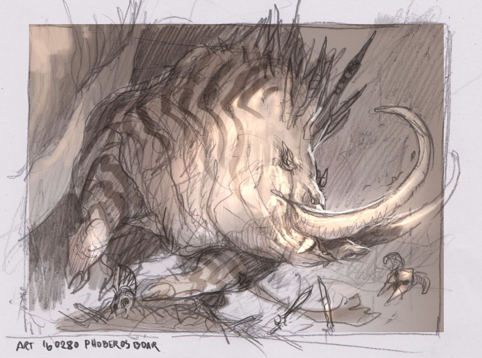
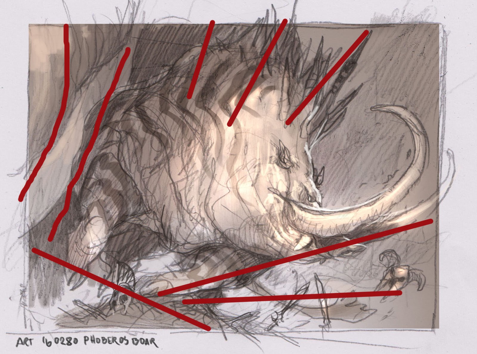
This is one of the rare paintings where the steps went smoothly from one to the next and with me hardly changing anything. The thumb is simple and clear. I wanted the cast shadows from the cliffs to cover part of the pig to make him emerge from the shadows. It is also a very nice tool for adding, almost a flashlight-like spot, to the focal point. When sketching the cliff sides I tried to think more on shapes and compositional direction rather than detail. The shapes function as directionlines for the movement of the pig. I think these lines are very important. But I must also be very clear that they are not something I make up before hand and let the drawing be dictated by them. The easiest way is for you to be open for them to be able to recognize the ”good” lines while the happen during thumb process and use them, and even enhance the rythm they give to the sketch. Often you will have to clean up lines or elemnts that ”muddies” the image to make the lines you keep more important.
Recently I have found this cleaning up proces very rewarding. Less is more. But also, at the same time as I have been simplifying my drawings ( less elments, stronger shapes, better direction lines ) I have instead enhanced the detail levels within the shapes. Take the head of the Boar as an example. I have added nothing since the initial thumb sketch in form of shape, but instead added all kinds of skin texture and color details and smaller wrinkles and folds. These details makes the image seem rich, even though it has been tidied up to an almost boring detail level.
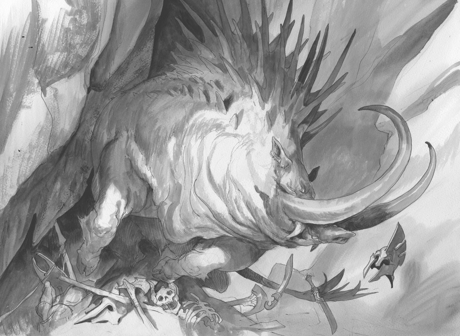
As ususal I transfer the sketch to a watercolor board by smearing a blwn up version of the thumb with graphite and pushing the lines down onto the board. I try to only transfer the most important lines and then I redraw the whole thing on th eboard to keep it fresh. Then I ink it with a waterproof pen and adds greytones for values.
I masked the figure out using frisket film and started on the background. I pulled out my Grand Canyon book and found a photo of some stones with lots of bounching light.
In creating the stone texture I try to just let the brush dot away on its own. I stab and push some paint around until it creates shapes I can use as rock formations. When I have some shapes I begin to enhance the structure by adding the light and colors from my photo ref. In this case lots of orange and yellow in the surfaces pointing down and almost white/yellow for direct sunlight. Notice how little of the cliffs is on the transfered sketch and how much is happy accidents. I think rock shapes can easily becomes to dead if they are planed carefully. I used a purple tone for depth in the rocks since I needed an area to fall back into the distance. To be able to read the hind legs as dark I had to add a mist to the lower part of the rocks. The Boar I chose to paint in a slightly bluish tone to have a good contrast to the orange/yellow background.

Cool piece Jesper. I love the note in the first sketch “Phoberos Boar”…”Phoberos” (pronounces Fo-ve-ROs) meaning 'terrible', 'menacing', 'to inspire fear' or even 'awesome'…I definitely think this boar is φοβερό!!!
I've been looking at a lot of your early work from 2008 on a Danish forum and your work with texture and colour shifts within the same value range it's by far one of the biggest improvements and part of your energetic style
I love the texturing around the neck
A well written and informative post. Thank you.