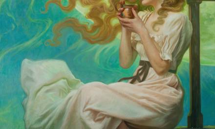
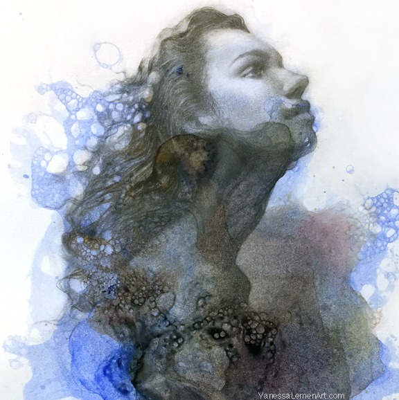
Our good friend, and really talented artist, Howard Lyon just posted a wonderful article on color theory on his blog.
Titled ‘Building Harmonious Color‘, Howard breaks down for his readers how to achieve a a cohesive color ‘scheme’ for a painting in very simple, easy-to-understand terms.
If you have trouble using a limited palette, or difficulty achieving ‘mood’ in your pieces, this is a really good read. You can check it out: HERE


Thank you for providing the link to his blog! It was a great read and I think it's going to help my current work tremendously!
Very good read. Just solved a problem I did not know I had.
Hmm rly helpful. One thing still haunts my mind though…if we choose a redish to orange light (a sunset) then what happens with the shadows and where do they stand in our colour wheel? At sunset the shadows tend to go rly cool and bluish but according to this whole principle above they should be warmer and purple. Does this whole thing apply only to the lighted areas?
The shadows at sunset are actually a little warmer than usual because they are being filled in by reflected light, which at a sunset will be warmer as well. However, because the the direct light is SO warm, the shadows often appear bluer than they are. Color is absolutely relative. Think of this method like a template for compositions, and not a scientific analysis of color accuracy.
Thank you!Said so it rly helps me. Had a mindf… today at sunset watching some cliffs. I could swear they were blue, yet they should have been warmer.I am looking for the easy-scientific way behind it all 😛