| By Paolo Rivera |
|
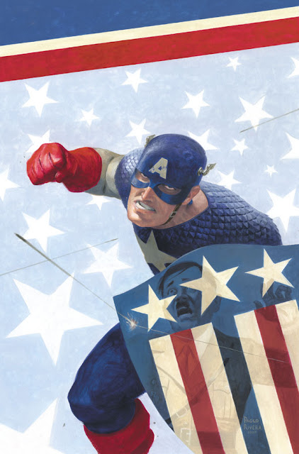
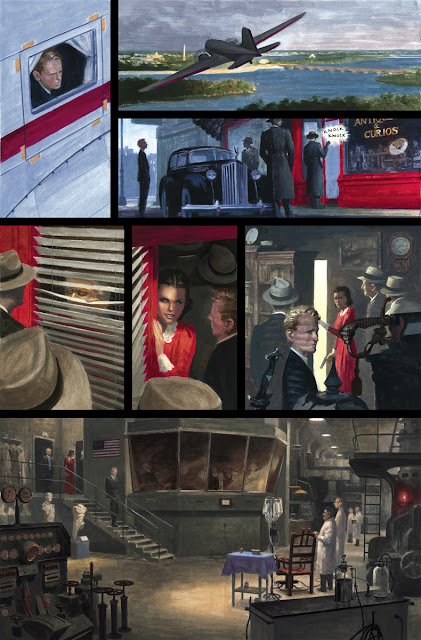
Mythos: Captain America. 2007. Gouache and acrylic on bristol board, 11 × 17″.
|
 |
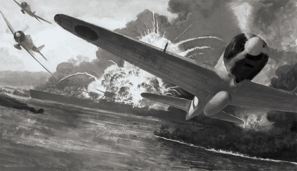
| Mythos: Captain America, Page 19, Panel 2. 2008. Acrylic and gouache on bristol board, 11 x 17″. |
|
But Cap was different. This was a period piece that demanded earnest historical research. Every detail in every panel had to ring true, even though the story itself flirted with fantasy. While I used every source at my disposal, what often helped the most was the on-line community of WWII reenactors, whose dedication to accuracy — and willingness to share — afforded me an authority I would not have otherwise had.
|
| Mythos: Captain America, Page 12, Panel 3. 2008. Gouache and acrylic on bristol board, 11 x 17″. |
 |
|
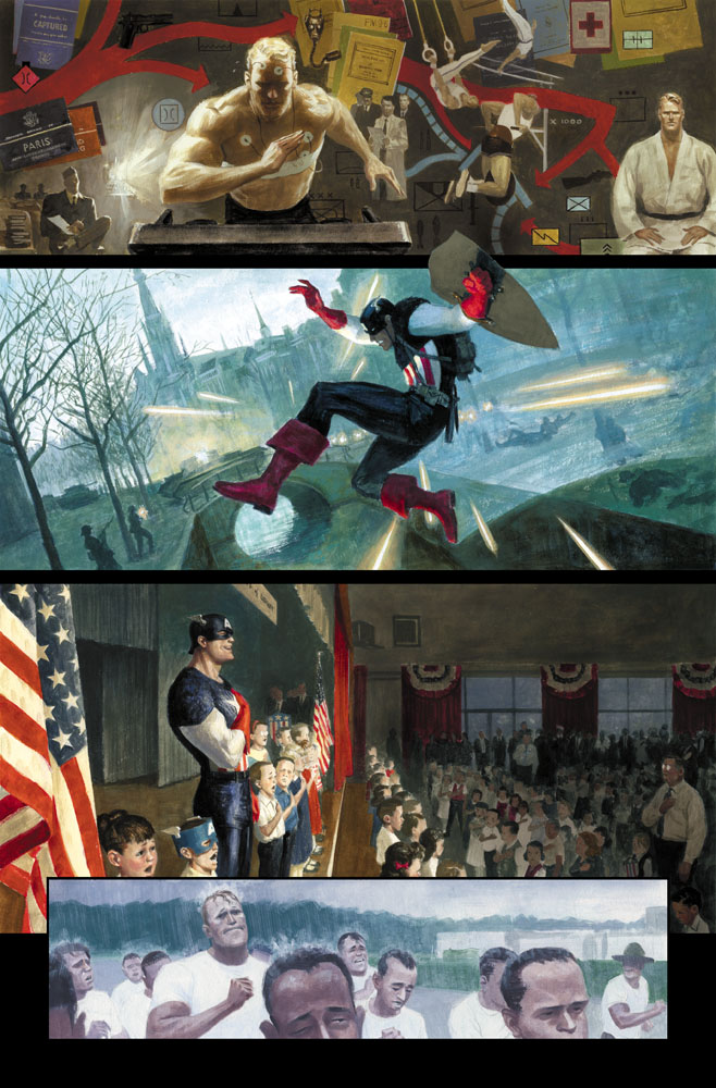
Mythos: Captain America, Page 18-19. 2008. Gouache and acrylic on bristol board, 22 × 17″.
|
The fact that I was commissioned to work on Marvel’s flagship characters so early on was a privilege I recognized from the start, however, the benefits extended to my original art sales, which quickly became a third of my income (a much-welcomed addition since I was such a slow painter). If you’re not familiar with the comic book art market, the price paid always comes down to which characters are on the page. Art is a commodity like everything else, and fame always trumps any intrinsic value. Captain America was (and always will be) more famous than me, but he has been kind enough to let me share in the spotlight.
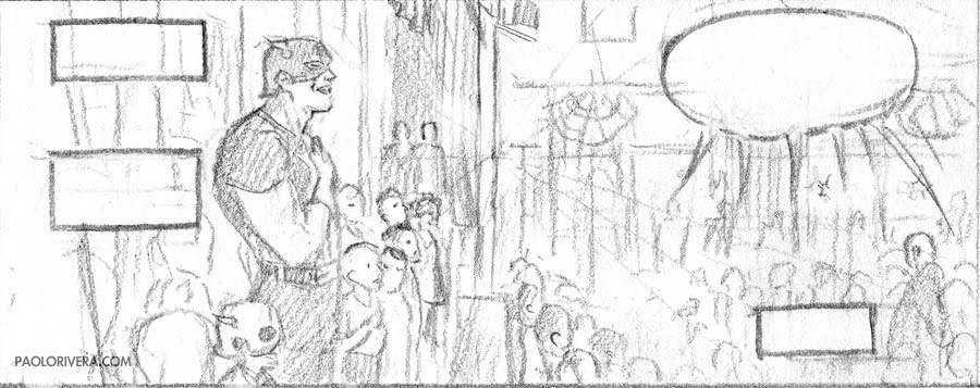
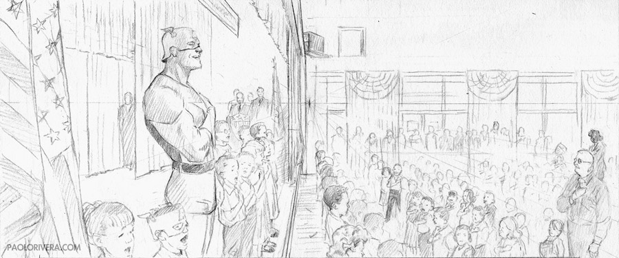
With regard to my painting technique, it had not changed much since Mythos: Ghost Rider. I was a little older, more experienced, and more confident in my skills, but the basic process was the same. If you’d like more details about my methods, I took an exhaustive, 6-post look at the creation of the above page on my own blog. I don’t paint much anymore, but when I do, the steps are basically the same.
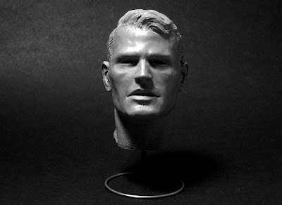 |
| Steve Rogers. 2008. Super Sculpey Firm, 3″ tall. |
Another practice that I continued with Cap involved sculpting maquettes. One of the things I love most about Marvel heroes is that they don’t always look the part. In fact, Captain America was the first in the entire Mythos series who had the classic heroic look (despite the fact that he doesn’t start out that way). Creating that square jaw from scratch ensured that I got exactly the look I was going for, panel after panel. This was the largest of the maquettes I’ve made — the head’s about 2 inches tall — and I still use it as a general reference for all types of heroes. You can see more pictures of it here, and more about my sculpting tools here.
 |
|
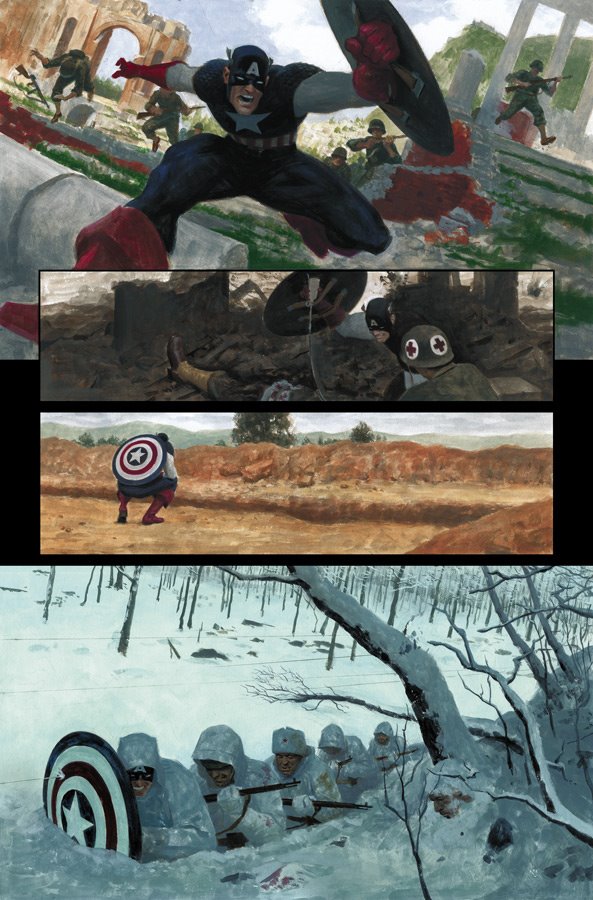
Mythos: Captain America, Page 14. 2008. Gouache and acrylic on bristol board, 11 × 17″.
|
 |
|
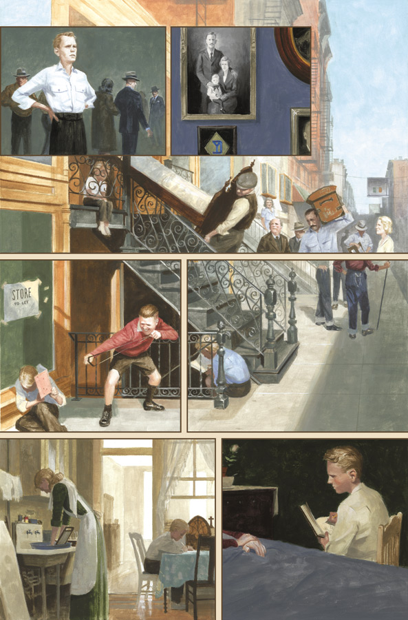
Mythos: Captain America, Page 2. 2008. Gouache and acrylic on bristol board, 11 × 17″.
|
Cap’s story was also a dream to paint because of the wide array of places and people that set his stage. At first glance, he may seem to be one of the most jingoistic creations of all time, but in terms of setting alone, his adventures spanned continents, from the Lower East Side to Italy to Russia to Tunisia. No other book offered such diversity.
 |
|
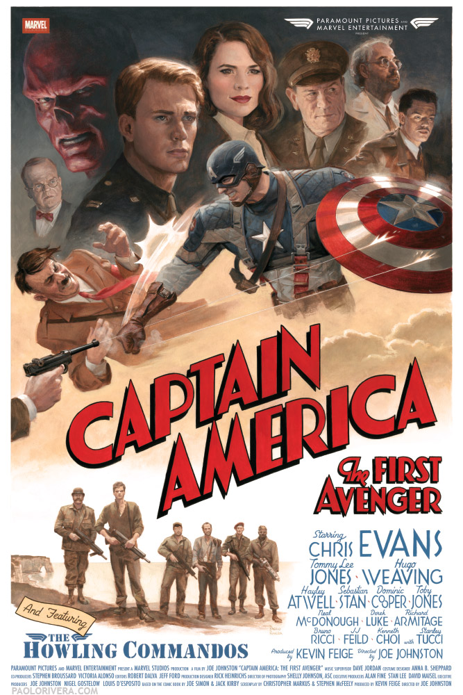
Captain America: The First Avenger. 2011. Gouache and acrylic on bristol board, 16 × 24″.
|
Perhaps one of the coolest things to come out of painting the issue was to be cited as an inspiration for last year’s movie. Cap himself, Chris Evans, mentioned our issue in an interview about his preparation for the role (video below). To top it off, I also got to paint a limited edition poster that was given to the cast and crew, including Joe Simon, who co-created Cap along with Jack Kirby. I heard that he loved it, which is more than I could’ve asked for.
That wraps up this rather extended look at Mythos. If, by some incredible chance, you still haven’t had your fill, here are all the Wacky Reference Wednesdays that feature art from Cap: week 12, 24, 32, 33, 35, 39, 40, 49, 67, 70, 71, 72, 73, 77, 79, 80, 81, 83, 91, 99, 100, 109, 110, 113, 122, 139, 140, 154, 186, and 190. There’s also plenty more of the original art that can be seen at Splash Page Comic Art.




These are just stunning Paolo. Crouching in the snow, wow.
Awesome, Paolo! Not only did I love that Mythos book but, as a huge Cap fan and an artist as well, the behind the scenes here is fantastic.
Keep up the great work!
I've always loved the bottom panel of Page 14 ever since I first saw it in Spectrum, Paolo, and the composition on Page 12 is outstandingly good – but I also want to say that I really enjoy the little treasures that emerge the longer one looks… the light in that kitchen scene is just sublime… beautiful!
Awesome art, it's not coincidence Chris mention about it 😉
I second Bill's comment about that page: wow!
Thanks, everybody! It was an absolute joy to work on.
Nice Work, I love to watch your work I am also a fan of Marvel Superheroes. I am sure you also love to draw other Marvel Superheroes characters. You should try Thor, Iron-man, Ant-man and the wasp. As Marvel is going to release its new movie you should Watch Ant man and the Wasp 2018 Online trailer. That gives you another idea about the Ant-man and the wasp.