 Of all the stages in making art, the most confusing and least clarified is the thumbnail stage. I am working with a few students currently who are having a difficult time recognizing that simple is important, and that the thumbnail is clarifying problems that later will later be encountered in the finish. Working them out in a simple template is so important to free the mind for the finishing performance in the end.
Some feel that the thumbnail paralyzes creative freedom, others do not think the little scribbles they do will lead to very much, while others don’t know what they are looking for and think the step is confusing and should be done away with. And I also hear “if I do the picture more than once then it gets old, boring, and it loses its luster and charm”.
However, if everything in the process of making an illustration is done correctly, then there is very little to no real repetition at any stage, and there is never a dull moment in the process. Each step leads to discoveries for the next step until the piece is finished; the journey is the destination. The thumbnail is the impetus for everything done in the final piece of art.
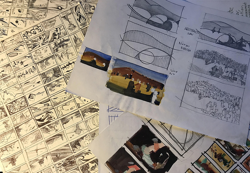
If done properly, there will be a series of thumbnails, not just one, that each explains a different part of your design and finishing process. The matrix, or armature of the composition is resolved, the design is worked out, and the shape language is formed. The depth of field is developed, or the layering process is worked out, the color palette is developed, and the color harmonies are established. And in the grand scheme of things, the message is clear.

With that said, it is easy to see why the thumbnail is so important with all of the heavy lifting of the piece worked out in this miniature, “preview mode”. In this small scale, like a map our journey is planned out, every step accounted for, and the final goal established. Then it’s off to do reference studies, the final line drawing, and the finished product unhindered by idea. When everything is pre-planned, it is very similar to the intensive weeks or months rehearsing a stage play, or better yet, rehearsing a song list to perform in shows that needs to be heavily practiced and memorized and not sound like amateur hour or no one will be there to listen to you play.
Do you know if you are using the thumbnail stage to your artistic benefit? Here are a few traits that might clarify the answer to this question:
- 1. Jumping straight in to the Finish without any thumbnails – “Every time I sit down to do a thumbnail, they just suck and I already know what I want, I’m just going to go straight to finish” – quoted from a former student. Unless I can see what you are doing, I cannot give you a definitive answer why this might be a thought, but do remember that there is no way possible for a job to be completed these days without a thumbnail, mostly because clientele will not allow you to do so, period. Unless the client knows you very well, it is impossible to proceed to a finish without predefined concepts. Illustrations should not be a surprise to the client. You are not gifting them your Gosh-Given-Talent, you are hired to do a job they need you to complete in their way. Every step is well regulated and every step is signed off from the art director. IF you are working for yourself, nothing should be any different. Ideas cannot be culled without seeing them. No one has that good of an OS to see it all inside themselves before execution, and if someone does it should be called endless unknown errors amidst minute victories until completed with a poker face when the errors arrive.
- 2. Talent Will Get You the Answers You Need – I can hear one somehow well-respected teacher in my head who puts it in others that “you are either talented or you are not, and those who are not will not get too far with art so hopefully you like doing other things too.” Teachers say this to students, our family and friends innocently feed us with lines like, “you are so talented”, oh you have “the Gift”…etc. alluding to some divine intervention of sorts. Talent is a word that gets misused. It means natural aptitude or skill, but…really, Talent is someone well versed in what they do and is extremely efficient in their delivery. This means that to have “talent” you’ve worked for it, but maybe not as hard as others, and the field is easy to read or well defined so the path to completion is less of a strain. You cannot just paint something correctly every time right off of the brush to canvas for a job well done; all great ideas go through a rigorous planning process before they are executed.

- 3. Not Framing – An idea without a frame is like a sentence without punctuation. The impact of the piece is determined by where the subject matter exists within the framed space. Every drawing we do is similar to shooting a movie or photograph. The space is predefined and what we fill it with is either data, noise, abstraction, or story. Where we place it and how heightens its impact. Symbolism, metaphor, allegory, and other hidden concepts require planning within the frame to increase their intellectual value, and like a book cover, a frame is important to contain the space with all mechanical parts used within to design a better visual matrix for legibility and hierarchy of the piece, around the title, authors name and the UPC code box.

- 4. Scribbling With No Structure – I see this one more often than not, loose scribbles attempting to say something but falling short of something less than desirable by a child. This not only leaves more questions than answers, it also prevents us from believing in our own abilities to think on paper like we should be able to. Scribbling is a thing and I totally encourage whatever mark making that is necessary, but use a tighten down method for the scribbles so they aren’t left hanging in obscurity, stiffness, or broken by structure, in other words, fill them in so they aren’t a messy mesh. I sometimes use the tornado method to work out forms, to find them in an organic position knowing that an outline can stiffen something up before it has a chance to breathe. This is a controlled scribble, and as I solidify the forms I use more of the side of the pencil to fill it all in quickly and easily. The lines in a scribble can be well informed and well placed, alluding to form and space. It’s a type of “form-feeling” surface distortion and plays on the concept of “Edge Loops” or “cross Contours”.

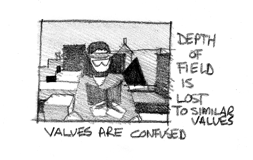
- 5. Misusing Values – I see this quite often, any random values used to separate objects in the thumbnail so they can be seen, or easy to separate in space, which is not necessarily the goal of every piece. Values should not be a random choice. The local colors/values, the light/shadow values are specific to the story beat, specific to the advertisement’s mood, harmonized to the product and product logo. Every color is a value when converted to gray scale, and ideas start simple. Keep the organization clear if it is about separating space layers, if it is about distinctions between surface color and strength of light source, grouping of objects or strong separation of objects and depth.
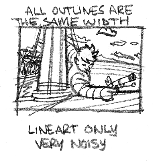
- 6. Outlining Only – most art these days is full value or full color, line art is a rarity and an occasional treat when done really well. Thumbnailing in a way that is not connected to the finished piece is probably not a good idea. While the lines might help you see the matrix a bit easier, there is so much lost in translation in a line only thumbnail. Without tone we cannot see separation of or grouping of shapes. It is difficult to assess depth and overlap, as well, the notan design of the local values or of the light source, leaving the visualization process unfinished and incomplete. And, the outlines take up space as well, the line has width and eats into one of the sides of its boundary, thereby skewing the scale of items in the pictorial space. Have you ever done a thumbnail in line only, then go to do your finish and there is a lot more space around everything than you had planned? That is line distortion.
- 7. Wrong Scale – For someone who does not believe a thumbnail will help, that person will often draw them up really fast thinking that part of the process is “whipping them out” but more often than not, the hasty approach leads to all sorts of pre-finish issues like, too much or too little space, fixing arms and legs and naturalizing the otherwise extremely generic thought of where they should go and what they should be doing, and everything somehow feels out of scale. But where do we begin fixing the issue? Draw towards solid shapes or forms represented by clean and easy to read values. SLOW DOWN, and blur your vision a lot, looking at the image out of focus to see what jumps out at you. Bad positioning, blurry concepts, tangents, and scale are easy to recognize in Squint-O-Vision, you might develop pre-mature crows feet to the sides of your eyes-call them battle scars and wear them with pride.

- 8. MST3000 Effect or flawed perspective – Remember the show Mystery Science Theater 3000? Yeah, well many of you might not have seen it but you probably thumbnail to it. This is a crossroads drawing where an artist who has possibly studied figure drawing and/or head drawing and no perspective or any formal training in composing beyond classically placing the figure and the portrait in the middle of the page for their studies. The obvious solution here is to practice not only the basics in perspective, but sketch the spaces you visit and the people in them. Sketching is the bridge to ideas and the more you do it the easier it will be to organize a picture so we don’t have players and audience all in one space.

No!
- 9. Overdrawing – “I started with the intent of just getting something down on paper and several hours later I realized I went too far!” Is this you? I was a part of this elite group of F-UPS for many years before I learned my lesson. I could not escape the trappings of an idea manifesting before my eyes and had to see it through to completion, right or wrong. The thumbnail process is about solving mechanical stages of design that will help structure the image to a strong finish, clarifying any problems, and to make objective decisions based on something seen and not just thought about. They should be simple, easy to translate, should be easily accessible during the final stages, and they should be simple-yes, that was repeated. It is sometimes hard for the render trained artist to think of anything less than rendering but remember that making art is done in stages and each stage has its own needs, its own pictorial dialog with you.

This was one of my early “thumbnails”…clearly didn’t know some things here…too large and too finished!
- 10. Making Thumbnails Too Big – I can’t be creative unless I really get into it and express myself at a size I feel comfortable working with, aka. I make finishes to figure out my finishes…this is a result of working at one size, or close to the one size all the time and not engaging in different scale drawings for diversifying the hand, developing a greater breadth of hand-eye coordination, and for practical purposes like building manageable thumbnails and efficient color studies, etc. prior to blowing budgets because of restarting on that expensive Belgian linen over and over again. As said before, stick to the steps, and keep each step within its own needs, which includes scale, and be practical. Building big is exciting but for the ideation stage in my opinion is a drain of energy and a waste of precious resources if done in excessive scale…but can be fun as an exercise in letting go

…wait…did I just contradict this last point? Tune in next time, where I might just explain.

Man this is so great. Thank you so much man.
I have been struggling with this lately and very confused about it. This is just the good doctor ordered.
Thanks Ron!
This is what I am looking for. Thumbnails. Now to understand it. I will reread this until it clicks. Thank you, thank you, thank you; so very much.
Solid Kid, thank you and I am glad it found you when you needed it most. Take two…heh Thank you again.
Great Post! thank you for the advice.
Thanks Ron. Very helpful breakdown of how to use thumbnails. I wish I had had it years ago!
I ran into trouble with an illustration the other day. I thought I had it all clear in my mind. But I ended up floundering around until I finally could call it “done”. Not a very satisfying process. Your article made instantly clear where I went wrong: no thumbnails. Thank you for kicking me into the right direction.
I violate a few of these steps, particularly the one about scribbling, and can’t help feeling that tightening up this foundation will lead to better images overall. Thank you for clarifying each point and showing why they’re important.
This is quietly one of the most informative posts on this site. I have the habit of breezing through thumbs only to be frustrated later on. All of the points you made are incredibly valid, and all too familiar. Thank you.
Amazing article about really important step. Thank you for it
Ron, thanks for this. Your writing is as great as your art. Im passing it along to the apprentices. I am so grateful for the time I had with you, Sir.
The more thumbnails I do for a piece, the more of these issues I seem to avoid, so I’m definitely moving into the camp of “do a lot of thumbs for every piece”
It’s interesting to cross-reference these errors with Jon Foster’s thumbnail process at https://www.muddycolors.com/2010/11/the-thumbnail/ and DDS’s at
https://www.muddycolors.com/2017/12/composition-basics-sketching-thumbnails-2/
Awesome post and great advice that I will try myself, I do bunches of sketches but not complete thumbnails as to
get down on paper the complete idea and image that’s going on in my head. Just difficult with as many sketches
I have accumulated over the years and streaming ideas running thru my head to concentrate on one and get lost with all the others. Trying to resolve this problem.
Thanks for this, Ron. Both your writing and your art are superb. I’m distributing it to the apprentices. I’m incredibly appreciative of the time I spent with you, Sir.