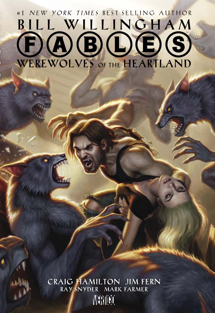
In 2009, I was asked to paint the cover for Bill Willingham’s ‘Fables: Werewolves of the Heartland’. I am a big fan of ‘Fables’, and as such was really honored to do the cover for one of my favorite authors.
The book, unfortunately, was absolutely plagued with delays. It would be slated for release, only to be delayed over and over again. It even went so far as to appear on the cover of ‘Previews’, only to be delayed yet again for another whole year! This was not through any fault of the AD or the Author or Artists, mind you… it really was just bad timing. The artists who did the interior work had other time sensitive projects to work on. Additionally, the Editors felt that certain things needed to be further established in the ‘Fables’ timeline before this standalone book should be released. The result, a 3 year gap from creation to publication of this cover!
Well, I am happy to say that as of last Wednesday, the book is finally on the shelves. Which means I can publicly share the cover and it’s process in entirety.
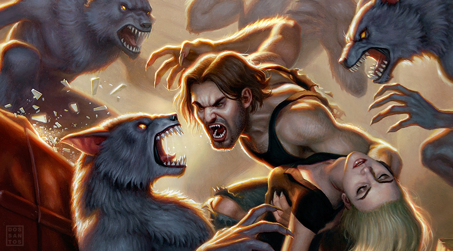
The basic premise of the book is that Bigby Wolf (A shapeshifting werewolf who happens to be THE big, bad wolf of legend) stumbles across a midwestern town where apparently ALL of the residents are werwolves. The residents take Bigby hostage, not realizing that he could easily escape anytime he wants. He chooses to stay imprisoned in order to further explore the mysteries of the town, and figure out how it is that there are werewolves he didn’t know about.
The Editor, Shelly Bond, gave me quite a lot of freedom, and simply sent me the manuscript, asking me to come up with some initial concepts.

She hadn’t specifically asked for a wraparound cover (which most artists usually charge extra for). But as I mentioned, I am a big fan of the series, and so I really wanted to do a large piece that I would be personally proud of.

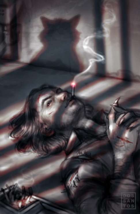
In order to get the sketches done as quickly as possible, you may notice that female figure in this last sketch is actually cut and pasted from a previous painting of mine! I of course planned to change that in final, but for the purpose of the sketch, it was the quickest means by which to get the concept across.
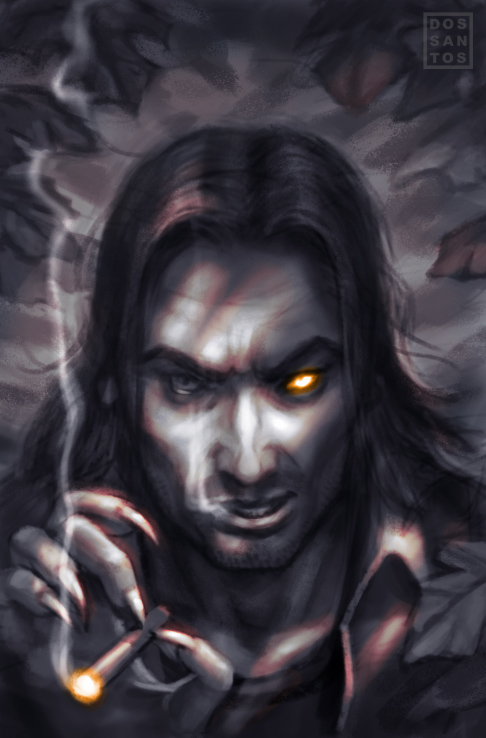
I think we all felt the first sketch best captured the ‘essence’ of Bigby, and was really close to being the chosen cover. But ultimately the AD and the Author both saw that was I personally invested in the wraparound cover, and let me go ahead with the image.
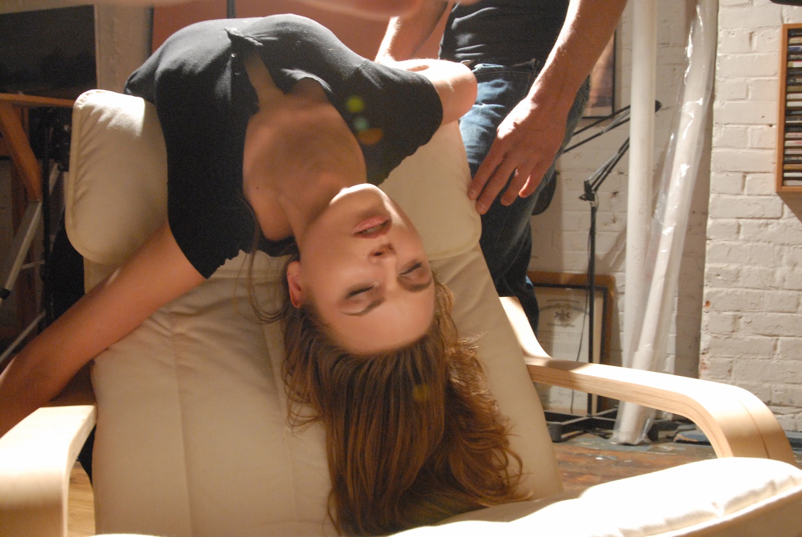
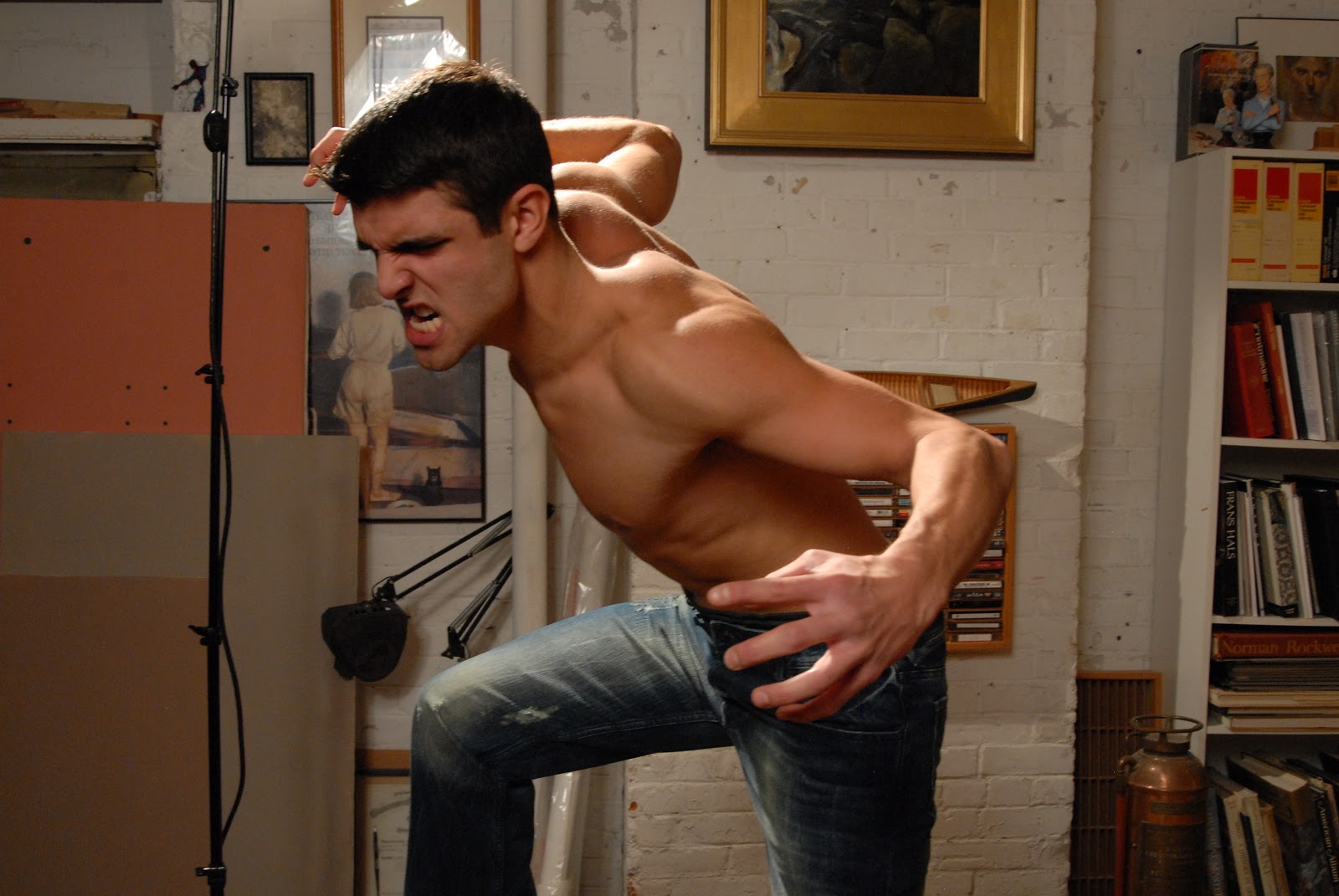
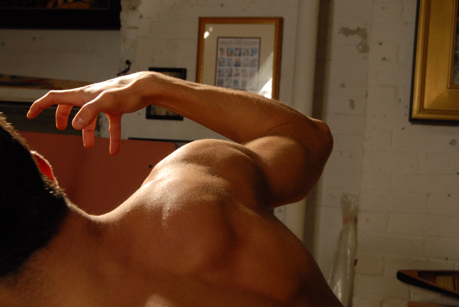
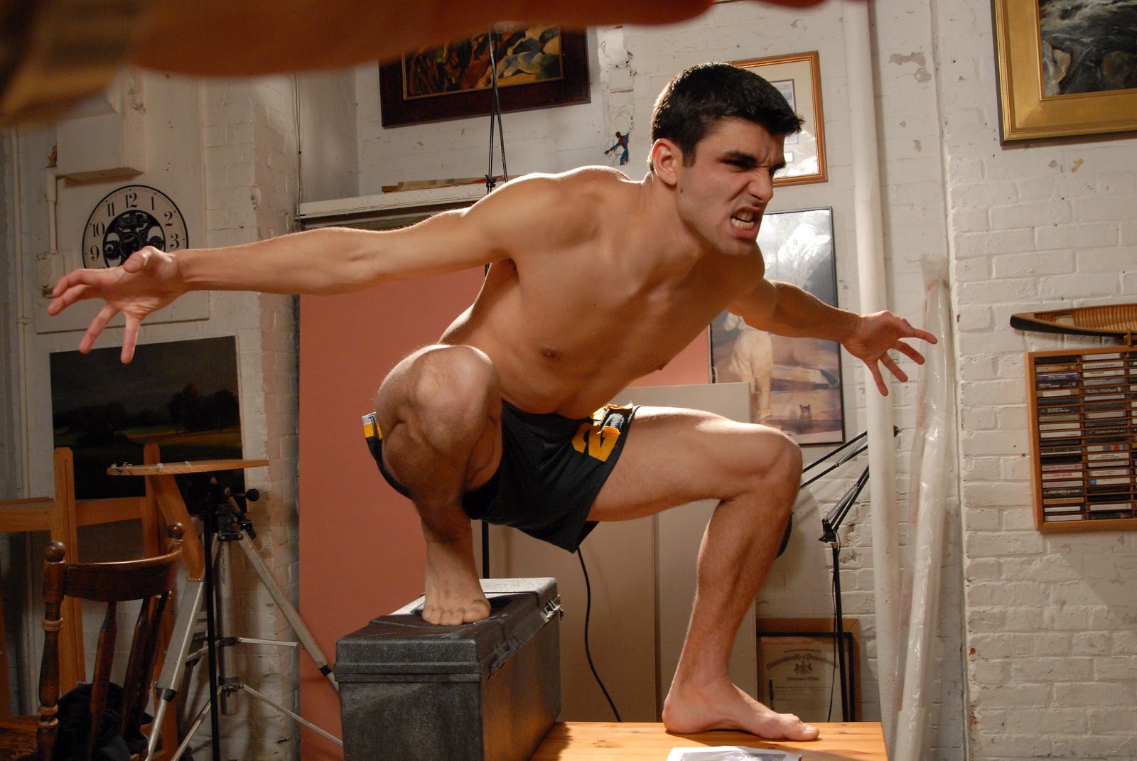
Once I had approval, I booked a model shoot as per usual. Even though most of the figures would be werewolves, I still wanted to make sure my anatomy was accurate. This was particularly important to me in a few spots I found tricky to draw, most notably the hands, the foreshortened knee, and the back arm of Bigby.
I also made a very crude maquette from a kneaded eraser to see how light would affect the main werwolf leaning against a red car. In doing so, I discovered the intense rim-light resulted in a wonderful reflection on the car, that I otherwise would not have thought of.

Admittedly, this particular sketch was WAY more refined than most of my typical sketches, and it took surprisingly little revising before I was ready for final. Really, just a quick color study, and I was off.
Being 3 years old now, there is of course a LOT I would do differently if I could. But all in all, I think this piece stood the test of time better than a lot of pieces in my portfolio. Below is the final wraparound art, and the front cover with type treatment.
And for those interested, here are some reviews of the book: The L.A. Times, IGN, Good Reads
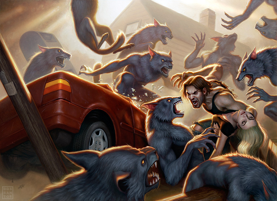 |
| Oil Paint on Board, 26 x 36 inches. |

So cool to see the back cover. I had no idea this one was a wraparound!
Love seeing your reference photos… Really nice work! — Steve in PA
Thank you for sharing, very interesting!
Thanks for showing us the process! I also really like the first sketch you did of him lying in the cell, it's interesting.
I remember seeing hints of this at your DragonCon panel. So cool to see it here again! I have to say I absolutely *adore* the cover sketch with Bigby lying in the cell looking blasé. It's just perfect, even though it wasn't the one that was chosen. I still get a laugh when I see your kneaded eraser maquettes. Just when we thought maquettes should be a complicated process with super sculpey!
I'm glad to see the book is finally out! Bigby is one of my favorites from Fables and I'm looking forward to reading it. Also, I have to say your covers are a perfect complement to the James Jean covers. Beautiful art all around!
I also dig the one of him lying in the cell… but obviously it doesn't fit the bill if they wanted an action image. Nice work.
Another great post. I can't thank you enough for your generous sharing!
Seeing your process is SO educational, Dan! Thanks bunches for sharing. Man, that painting is CRAZY-complicated. I'm awed.
It's great to see they finally published this awesome battle scene Dan. That car with the kneaded eraser werewolf is the best!
lovely! i am a huge fan of fables as well and am so glad that this is finally being released – and with such a beautiful cover. thanks for the insight into your process.
Hi Dan another great piece of art and awesome post! I was just wondering how do you capture your artwork? Being an oil painting I imagine you take a photography? Is this correct? I am wanting to get back into my oil painting but the one thing that holds me back is how to best reproduce it. I have tried photographing in the past but have found it difficult, especially since I am not even an amateur photographer and all I have access to is a digital camera. What do you do? And what do you recommend for someone like me? Any advice would be greatly appreciated! Thanks.
I'm doing a post THIS WEEK about photographing paintings. Keep a look out.
It's great to see your process. Thanks for taking the time to break down all the steps for us, it's very educational.