I have always been told that my paintings are very colorful. I have even been told that they remind you of wrapping paper for candy bars. (That last part hurt a little, Mr. Lockwood) But when I thought about it I tried to turn it into a strength. I went all candy color.
I had 2 major influences in using color: The Hildebrandt Brothers is one. The other thing, is a little annoying sentence that Donato told me 15 years ago, when looking at one of my first attempt at acrylic.
“You should never use black, Jesper”.
Stunned, I asked, “What else should I use for shadows?” Thinking, is he serious? Black is THE shadow color.
“You should just use anything else”, he said.
Damn that Donato. His words dawned on me some years later. Since then I have tried to think of ways to add color to every shadow area of a painting replacing dark with color, to get the atmosphere of light into my painting.
But another factor is, that when I started out, doing book covers in Denmark, I was very young and very inexperienced. And I did not know anything about colors even less about colors having different temperatures. So I developed a system that couldn´t go wrong. If I only used 2 colors that mixed well, there wasn´t much to mess up with. . So I made some yellow/orange paintings. But after a couple of almost monochromatic paintings, that seemed kind of flat, I found out I needed a contrast color to make the 2 well-mixable colors seem alive. Preferably a contrast color. So I made a whole bunch of covers in yellow orange, with a dab of blue…Suddenly I had a system. I am still, to some length, using that system.
What I do is, I chose a family of colors that goes well with each other and that blends easily together (if there is a scientific explanation of which colors mix well, I do not know it ).
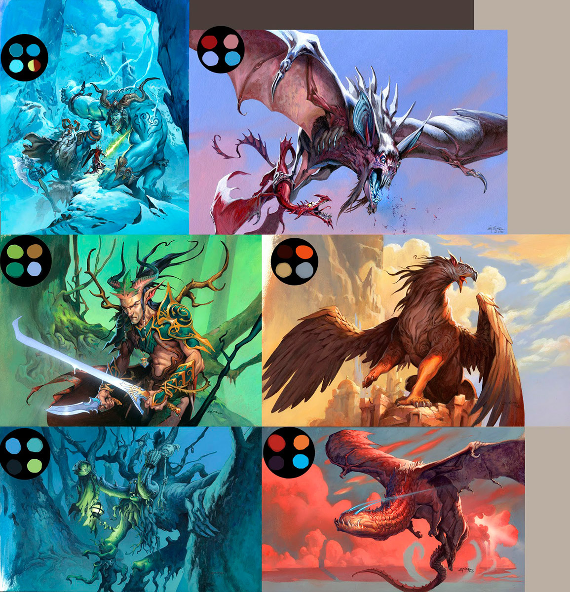
Take the dragon painting bottom right for instance. Purple, orange and red are in a familiar theme. Orange and purple tough, do not blend well into each other, but red acts as a transition color between the 2. And for a splash color I picked the turquoise blue that is the least reddish of the blues, so that it becomes the highest contrast. ( You can argue that I also used grey as a color, but grey is almost neutral, so lets keep that out of the discussion okay? ) What I learned from the Hildebrandts is that colors have temperatur. So If I have a painting that is mainly build up from a warm color family, I use a cold color as a splash color, and visa versa.
So if you have difficulty choosing color or figure out which colors to use, try minimizing your palette by using “Ejsings Bullet-proof Color System for Dummies”. In the corner of the paintings I have added the three main colors that builds up the most of the painting and the splash/contrast color.
Great works, Sir. Even if they are candy colored 😛
Great tip! I'm still struggling using colours but I'll be sure to try “Ejsings Bullet-proof Color System for Dummies” method next time. 🙂
Although I almost never use black, only sometimes a little bit of Payne’s gray, it has to be said that, for instance, John Singer Sargent used much black paint in his painting process. However it is true that Blacks that are created by mixing blues, greens, reds (alizarin crimson) and a little bit of black are more vibrant than a pure black paint.
As far as the use of colors is concerned, I think it’s not that important what we use, but how! This “how” should primarily depend on the dialog between our starting point and our aim. For instance, and quite generally speaking, if the starting point is the creation of a book cover ( including the accompanying aim), the splashy, intense colors and/or the strong contrasts are often desirable. On the other hand, if the starting point is the creation of a painting, a gallery piece, meant for hanging on the wall instead of being published, more sensitive and refined color scheme and tonal arrangements are often a better solution. This is just an example. There are as many starting point – aim combinations as artists.
However, Jesper, I like the intensity and brightness of your colors (although to some people they can appear a little too garish) because of two reasons; first- they fit the energy of the world they depict, second- within that color scheme, within that logic, the colors are very skillfully and tastefully used and combined. So, I am still very interested in trading one of my paintings with one of your “candy bars ” 🙂
Thanks Jesper, this is a really insightful post. I'd like to try some of these thought patterns in the next illustration I do..
Cheers!
-Will
High chroma illustrations aren't a problem when they are mastered as you do.
Your values are just perfect and that's the real deal of course 😉
color schemes… reminds me of color theory class, how important color thumbnails are and the importance of neutrals in a painting. i tell my high school students to learn complements and use neutrals! in their paintings to bring out intense hues. i have them create at least 4 color schemes if they are creating a painting of their choosing.
thank you for the reminder.
Awesome work and colour sense.
yeah Petar
I really wanna trade also for one of your sulky brown/grey creations.
When we see eachother next time,…
Your technique kind of reminds me of Jame Gurney's Gamut Mask technique. Could your technique be a variation on that?