By Jesper Ejsing
I have been wanting to paint a painting just for me, for a very long time. Last year I did a small painting for the MicroVision Expo, and that little image sparked a lust in me to do some more of that kind. As my professional life is, I constantly fill my schedule with charging monsters and epic battle scenes. But if I really ask myself what I would do if I had totally free hands, is a question I rarely have had the time, opportunity or even reason to ask…until now. I secretly have envied Justin his images that he do out of pure joy and when I lastly saw his troll and Boar painting I showed the drawing I was doing away and started on a personal painting that has been rummaging in my mind for a while.
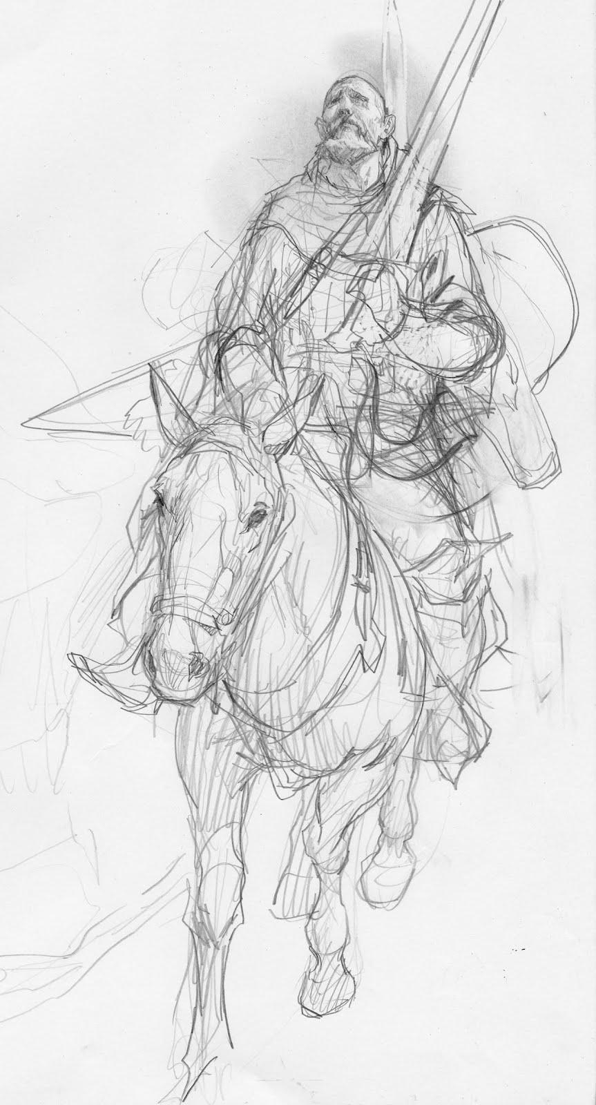
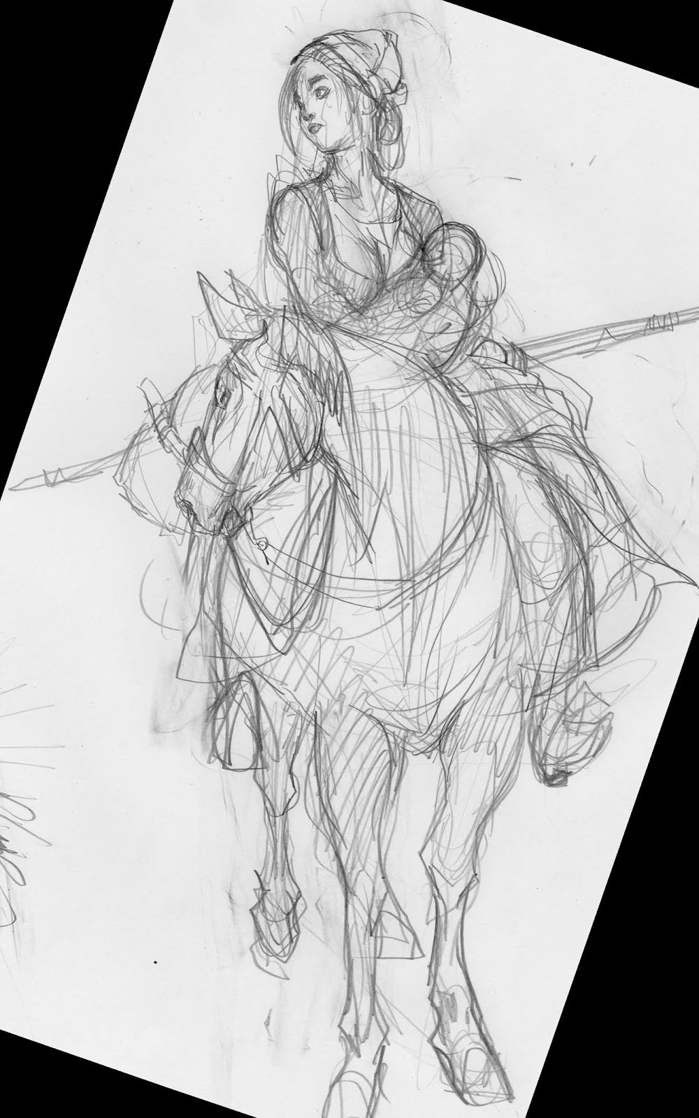
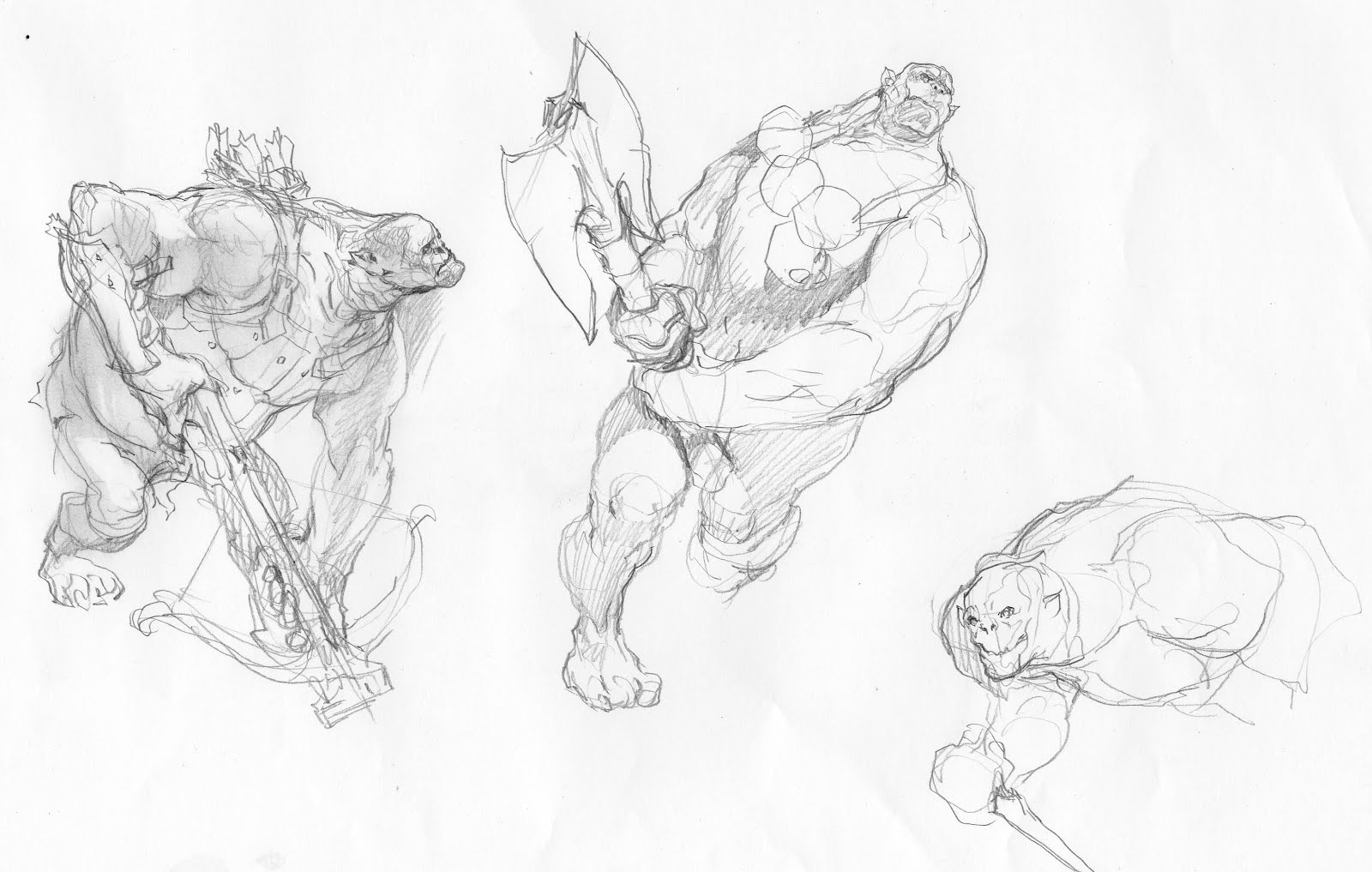
Here goes: I want to share it with you during the progress. I will confess; I am not even sure it will ever be finished, but I hope it will. The idea is this: An old warrior protecting a young female. He is their escort through the wilderness. As the “camera” opens up, we are looking at them descending down a slope. Cliff-walls on both sides prevent them from going anywhere but down. Behind the cliffs and rocks, a group of troll/orcs are hiding ready to ambush the not- knowing hero.
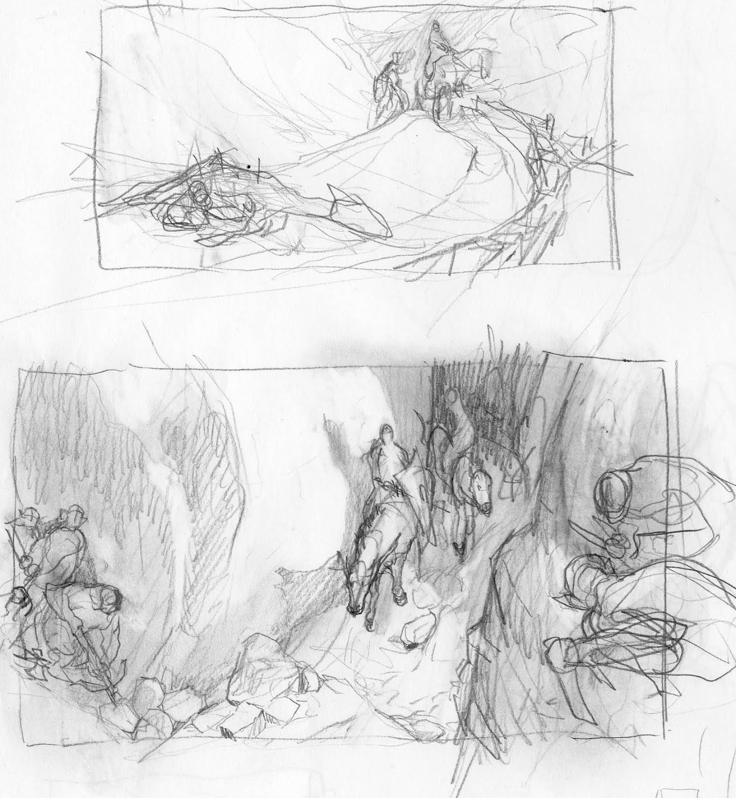
Top thumb, was one of the first versions where the trap was out in the open. The hero was midway in drawing his sword, sensing danger ahead. The story was not as tense as I had imagined it. They could escape by riding back. The heroes chance of survival was greatly improved since he already knew something was up. The second one was exactly what I wanted: I always try to capture the scene, the moment before everything runs amok. The moment where the spectator does not know how the story is going to end. You have to imagine one outcome or the other, and I will of cause give clues in either direction. If the hero was on guard, we, by instinct, feel he can overcome anything. So it became important to me that he was unaware. If his horse sensed something, it would be the same. Instead I made it so that the female and her horse, was more aware. Perhaps they heard something making them turn the head, but they are in the back and might not be able to warn him in time. The idea of adding a baby to the female was to make the whole outcome more precious and horrible. I toyed with the idea of having the woman breast-feeding the babe, but thought against it. It would be very difficult breast feeding on a horse and a bit corny too. It would look like an excuse to show some breasts. And hey, bare breasts would draw the attention away from the theme. Ordinary I wouldn’t shy away from a chance for some nudity, but today I made an adult choice.
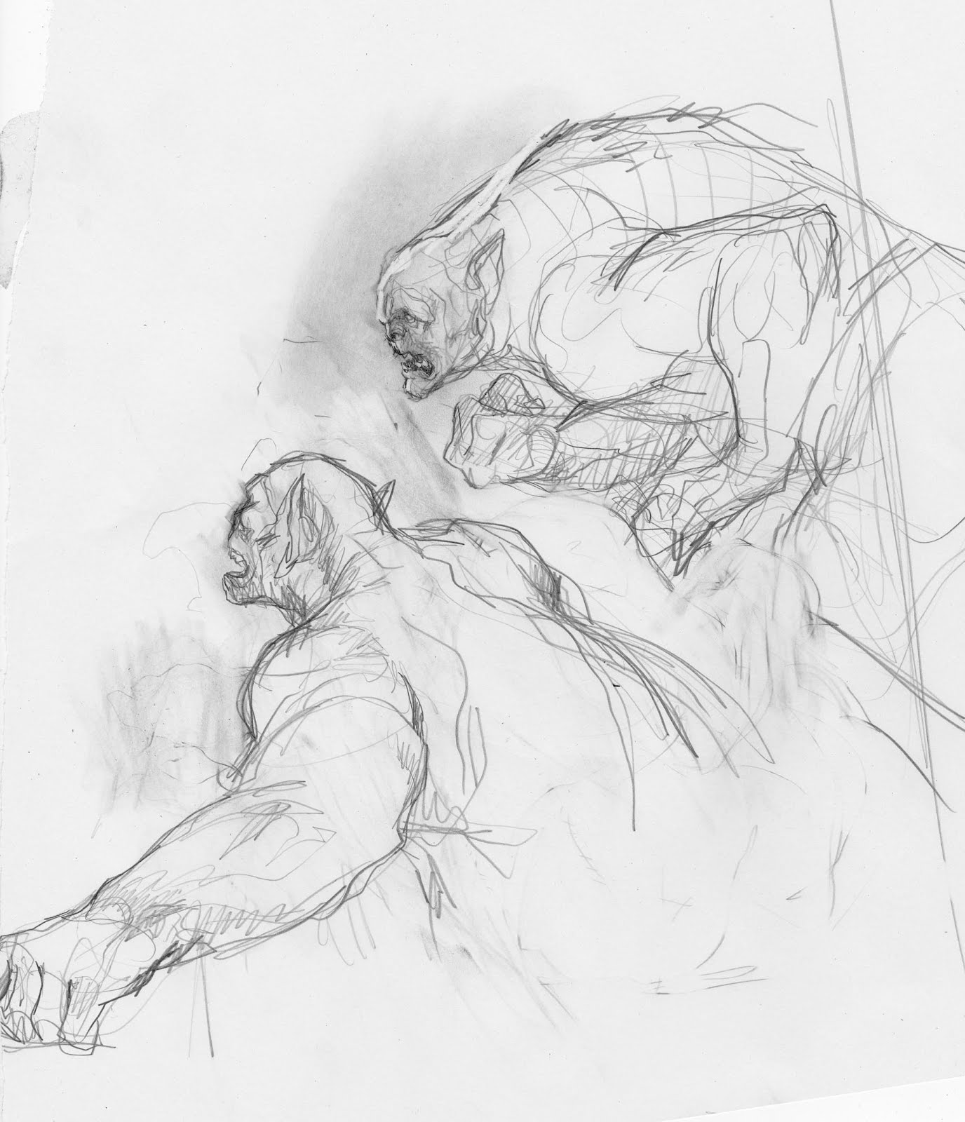
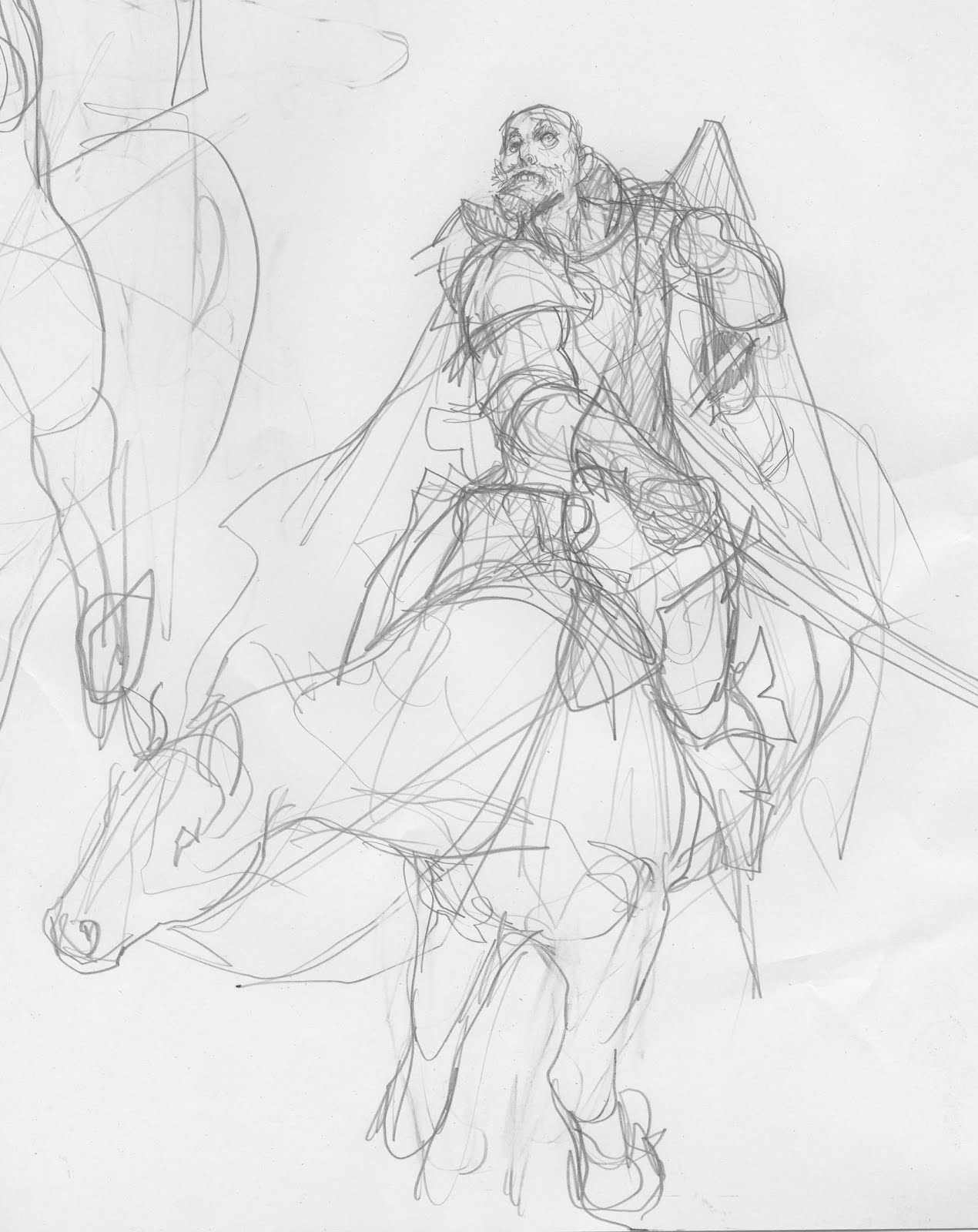
So, as always, I sketched each figure separately on a very large piece of paper. I cut out a very large piece of Watercolor paper ( About a meter by 60 cm ) This is going to be my biggest painting yet. I made a lot of different sketches. I might scan some later to show you all the wrong turns I made down that road. The hardest part by far, was doing a horse riding down. Seen a bit from above. I used some toy animals, but they didn’t help at all. What I ended up with was a sketch with the heroes horse seen too much from a standing viewpoint. So I made a new horse, but am still going to keep the rider. The trolls, was so fun and came out quite effortless. Bulky anatomy just seems so much easier than horses.
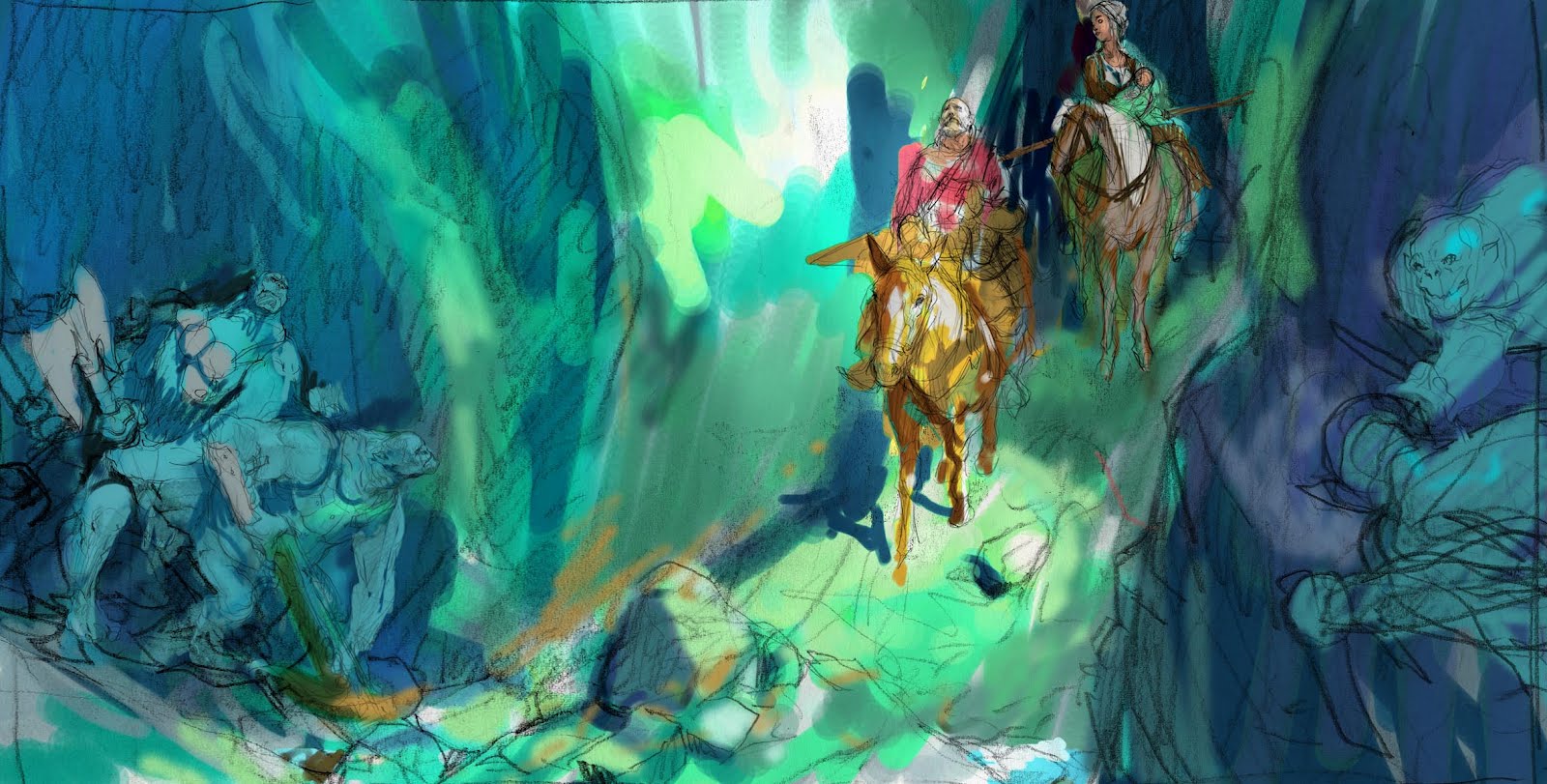
I tried to put the sketches into the thumb in Photoshop and while I was in there anyway I sloshed some digital colours at it, to see if I could capture the light I had in my head. I did not succeed. There is something better about the thumb, and I need to get the horse of the hero perfect. The colors I think needs to be lighter and less contrasted to make room for the figures. I still want to keep the idea of the hero riding out into the sun light and the female still in shadow ( hiding, safe ). At this stage I would happily hear from any of you out there who have thoughts or suggestions as to how I could improve the clarity of this painting. You can do a paintover in photoshop or just write the words if you like. I will try to address the problems before my next update.



This looks so promising! Keep it up Mr. Ejsing! Although i might add that the color thumb seems to lack some drama (?) i dunno if it's just me… i sort of saw this like with a diagonal compositon, or even a greater angle between the 2 groups of trolls…
Great Job anyways! love the sketches and the trolls are superb man! 😀
wonderful.. gonna take a close look on this
Looking good! Great horse studies.
I like the pose of the woman by herself, but when placed in the composition, she appears to either be looking behind her or at the rocks. Her and the horse looking in the same direction promotes a strong visual line, that's perhaps not utilized. Something to consider.
I love seeing the progress an sketches! Please post often!
I love this project, do more 😉
Of course your work is always dynamic and great but even the greats struggle at times.
I like 'drawabunch' suggestion of diagonal composition.
or
My only suggestion might be, even in this horizontal format, it may benefit from a more vertical emphasis.
I would try looking at the work of Franklin Booth, a master of the vertical design compositions, even when he uses a horizontal format, …actually he is a composition design master, period.
oh, i cant wait how this will unfold, jesper!
for one, im really a sucker for grizzled, old heroes instead of young in-their-prime swashbucklers. there just is something about a fighter tempered with experience and wisdom both in general character appeal as well as in upping the stakes: a young but strong fighter taken unaware? almost instant hotheaded noob situation. but someone who knows the ropes heading towards a trap, unaware of everything? now that must be truly dangerous territory and monsters!
as for own thoughts: when i started reading your description, i thought of an extremely vertical painting, to show less of the fighting grounds and keep the characters “locked in” not only by the scenery. however, i think that might sacrifice much of your beautiful drawings and im not sure whether it might be as effective as i think it might be.
the description of a cliff walls situation reads outdoors-y to me – that is something the color thumb does not yet show, to me. it looks more like a cavern. when you have that slope with the characters coming down, maybe you could silhouette the girl against the sky – which you could use to set much of the environment with – and use lit rock/shadowed rock to convey the narrowness of the heroes' path a bit more as in the thumb.
thats really just what my newbie head tells me 🙂 id love to see some of the dead ends, though – just to see what kind of explorations you do. if you want to make this super helpful, you could annotate on the thumbnails why those ended up in the bin.
I'm curious to see how you resolve and capture the appropriate moment that you want to paint of this scene!
I liked your individual sketches of each of the characters/creatures, but I would almost rather see a 180 degree turnaround of the entire scene: the horses going up the passage, but away from the viewer instead of toward us; the girl with baby and the horse with its head turned in the foreground are now looking back at us, and the grizzled warrior further back (still leading the way up through the passage), and maybe the trolls both in the extreme foreground as they are now, about to chase the hero and his charge toward even more certain danger — it's a trap! So there are more trolls (visible or possibly implied) at the extreme background ready to pounce and crush. 🙂
Great work,very flowing.Can't wait for updates! 😉
Perhaps have the female looking behind Her? This would then give the feeling that perhaps they are cut off! I think this would give more of an edge to their plight. I'm liking the rest of the composition, the Man looks like He's far away lost in thought.
Awesome! I don't feel qualified to give a critique but i agree with kristi about the horse looking in the same direction as the woman. It takes the focus away from the scene ahead. I think it might be better if the horse would look towards the 'camera'. I also find the rock-formation on the right a bit hard to read. But it looks awesome and from what i've seen of your work it seems both a nice departure and a great complement.
B
The thing that immediately captured my attention from your thumbnails the way way I felt like I was looking down into the canyon right along beside my fellow Orcs waiting for the unsuspecting traveler. I did a quick paintover below.
http://www.bfowler.com/wordpress/wp-content/uploads/2012/02/jesperpaintover.jpg
I love the Orcs on the left side that you have. The way they are peering around the corner. Great story telling but it pulls me out of the above the canyon feeling. I redrew that side of the composition and put them above the riders. Now, all the bad guys are ready to reign terror from the high ground. I've let my light pour in through the canyon path and used the cast shadows from that to separate the Orcs on the left and to light up and really focus on our hero. I've also moved his shield to be hanging from the side of his horse so that he can hold the reigns of his fair maiden's horse to lead her through the pass. I think it makes him a little more vulnerable and adds to the story that he's protecting her.
I love your stuff and can't wait to see how the piece turns out.
First off, let me say that this is going to be great. Just a couple of observations. In my head before I saw your color comp, I imagined the peril to be much closer to our heroes. I think by compressing the left edge and closing the separation between them, the danger would feel more impending. Color wise, I was imagining a really overall warm palette, much like the slot canyons in the desert Southwest of Utah and Arizona. Yours just feels too cool to me to be in a narrow canyon. Might be that I see it that way because I am from the west, but lots of oranges, browns and yellows were stuck in my head.
Oh and on the crits:
Maybe make the hero look straight on the way in a relaxed but hard way?
And something should break the illuminated rock wall.. but I think you will break it by stone structure already… I'd love to see the hero's armor shine and sparkle in the sun.
I wonder if you intended the illustration to happen in a jungle?
@ Horses and stuff: I think the hero's horse is perfect. I'd only lower the woman and her horse, since she really looks like seen from the front.
@ Tension: I guess the tension would rise if you move the rock corner more to the right.
Yeah,
all the best!
Stryke
Hi, Jesper.
Very insightful your sketches. I would like to use the complete painting to illustrate a blog post that I am going to publish soon. The text is about a battle in Ancient China in which ambush was used to achieve victory, so your work fits perfectly.
How is it possible?
Regards!