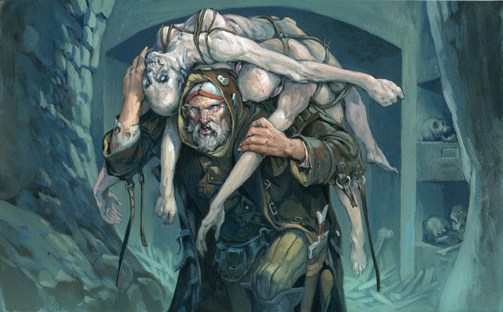
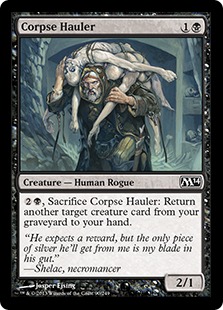
Here is an illustration for one of the newest magic cards.
I was asked to do a morgue thief dragging away a corpse from a tomb.
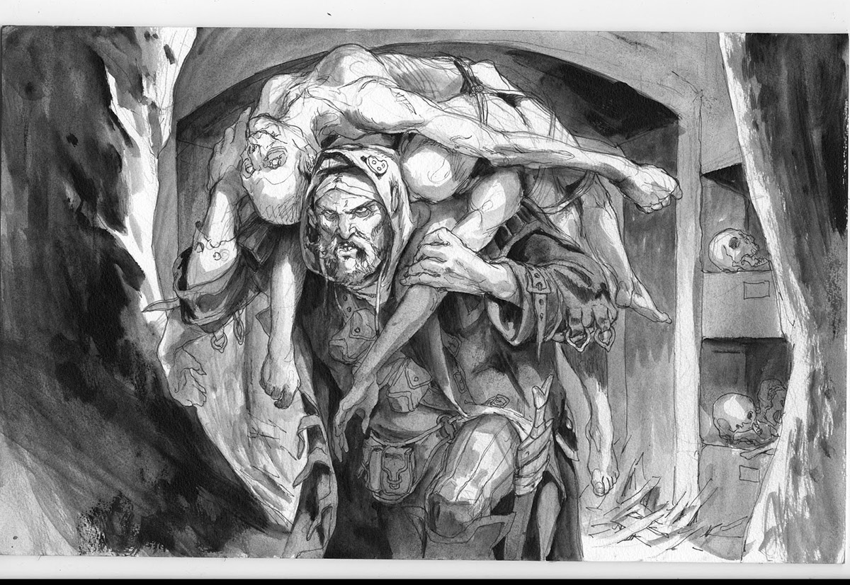
I sketched away on some ideas. The first one focused mostly on the Thief. I would have a great opportunity to show an ugly face smiling nastily, but I thought the idea was lost a bit, since the dead body wasn´t very clearly readable. To be honest I think doing corpses is walking a fine line. When it become too bloody you tip over into the Heavy Metal & tattoo segment. On the other hand it is a corpse and needs to look dead.
Even if the description did not ask for multiple corpses I thought it would sell the idea better, so I submitted a sketch with the guy dragging 2 bodys on his shoulders bend down by the weight.
I wanted to have some reference for the body parts. It is hard to think up, the way a dead body rests when lying on a pair of shoulders, so I asked Bodil, from my studio if she wantedto be a dead zombie. To be honest, Bodil is a little girl, but when she was resting on my back she felt heavier than she looked. And I noticed, that the pose of the figure would be much more hunched, than I would like it to be. I wanted him to look into the “camera”, not bendt down. The hardest part of the shoot was for Bodil to relax enough to seem dead while she was being balanced on my back. The first couple of photos she was holding on to me. Not very dead-like.
I finished the sketch with the photos as reference. I found a photo from a tomb in Rome and loosely sketched the background. It was going to be a very simple one anyway. I used the sides of the wall to kind of frame the figure.
For colors I had only one thing in mind all the time: I wanted the dead bodies to be very light and almost white in color to make a shiny contrast to his dark outfit and warm living skin color.
I knew the almost bare chest of the dead girl might be a problem, but I figured if I strapped it up with cords and did not show anything but a side boob it would be alright. (because in my deluded mind a strapped in boob is not naugthy at all; doh!)… I was asked to cover the tits, of course. So to make up for my naivety, I removed them completely, instead of having to cover the bodies with cloth. The uncovered dead bodies seems to me more raw, than a semi-covered hollywood version.
When I looked at the final painting it struck me that I had not given the outfit of the Thief many thoughts. It had ended up looking almost like a dirty trench coat with a hoodie underneath. So I gave him some straps on the jacket. A guy hauling bodies could benefit from a couple of straps. he could use them for strapping on dead bodies or body parts.





What a wonderful painting. It's a joy to see your work.
How/where did you find reference for the thief's apparel?
Can you imagine the smell in there 🙂 How much bigger do you work when doing cards than the image will be printed? Do you plan for the images to be used in any ways other than the card?
James Gardner Art
This is a really stellar piece Jesper. Love the contrast between living and dead and the character quality of the dead body.