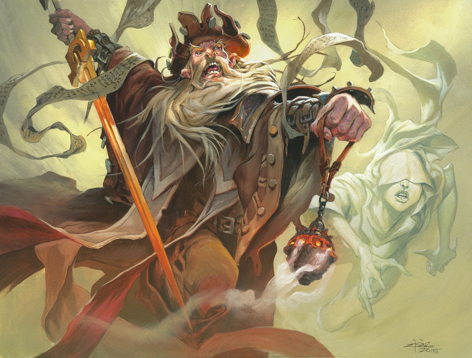
Today I would like to share with you a new Magic card illustration. The card is called Sanctifier of Souls and is from the new set called Eldritch Moon. The process was something totally out of my comfort zone. Let me get to that.
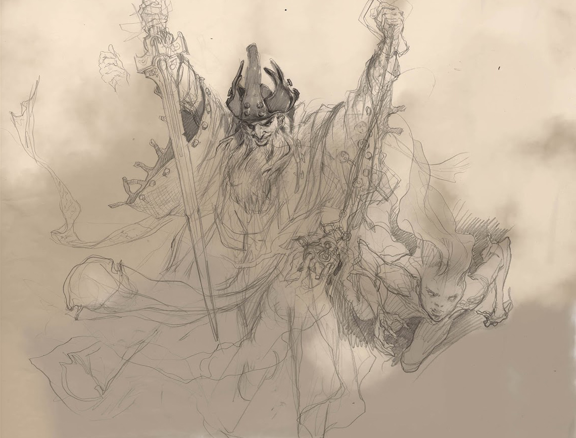
As always I sketch a couple of thumbs and decided on one very simple and clearly readable pose. I was inspired by some of Brom´s very symmetrical compositions. I think symmetrical and clear poses are good for good guys. So started sketching the priest more detailed and ended up with a real great face…Just not for him. The feedback I got from my art director was that the pose was fine but he looked way too sinister and evil. I looked again and completely agreed.
In my sketching for a cool looking face, I completely forgot what kind of figure I was drawing and ignored the fact that he was supposed to be a good guy. “Duh” palm to face, and back at the drawing board. The more I sketched the more I felt the pose falling apart. When I tried adding the spirit woman, who I up until now, had ignored completely I noticed another rookie-mistake. “How could I not have taken into consideration that a symmetrical composition is going to be utterly ruined by a figure to the right”? I sketched the main figure without the second figure in mind and when I tried combining the 2 it all felt wrong. “Duh” palm to face again.
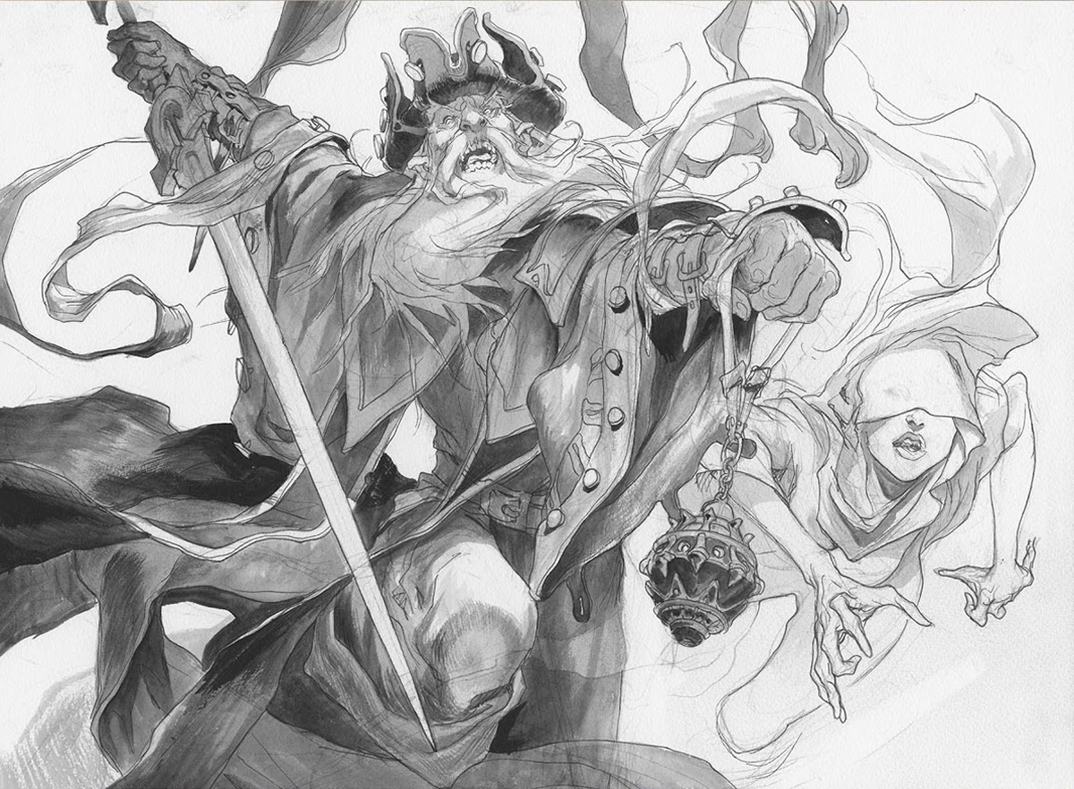
So, I had a good sketch for the secondary figure and an unsatisfied main figure already transferred and sketched up on the watercolor board – and the feeling of failure in the gut. So I erased the main figure. And here comes the part that I have always warned everyone, including myself, about. I resketched a completely different figure directly on the board.
The reason why I never do this, is that I normally take a bunch of different tries to get the gesture and the angle right. I search for the absolute best way to describe the figure and the mood of the illustration. In sketching directly to the board there is no room for these searching and changing angles and so on. I always think the “direct” approach makes for a weaker solution than when I get there by trial and errors. But in this case I luckily created a figure with a more dynamic twist to match the secondary figure. I happily drew a facial expression that I liked, and I settled for a somewhat diffuse and not very defined lower body and legs that I decided to cover up with some smoke and cloth.
I am positive that it was mostly out of luck that everything went well. Still I reflected that it might also have something to do with me having been drawing digital for while. The digital sketching allows you to not take line so seriously. The mindset that you can always go back and erase and add newer and more refined layers, gives you a believe in your own drawing skills, that to me is a brand new thing. Perhaps some of that mind set trickled into my skull and allowed me to be less restrained when sketching in pencil.
In the end I am really glad I did not go for the symmetrical composition. The billowing capes and prayer banners adds motion and beauty to the background. Last thing I did after I scanned the original was adding the orange light to the underside of his hat. I really like that part but didn’t dare doing it in acrylic.


good Dog Stomach Swelling
Jesper, what about this, how does it relate to the mistake you're talking about?
http://frankfrazetta.org/images/frank_frazetta_thebarbarian.jpg
Unless something's lost in translation or you know something I don't, it seems like you're using symmetrical poses and symmetrical compositions interchangeably. In the strictest sense I suppose, a symmetrical composition is the same on both sides along it's center line, but I don't think that's what you're talking about(?). And yes, if you have a symmetrical composition based on a symmetrical character pose and you add an element anywhere you don't have a symmetrical composition anymore. We need new elements in our composition to balance it,those elements aren't necessarily a character. And we may end up with a strict symmetrical piece, or one that's balance and accentuates our symmetrical pose right? At least, the above is all I've read and learned so far on composition.
Personally I like your first thumbnail much more than the final composition this time. It may have needed more to get the right symmetry into the composition again and a new, less sinister face, but the final guy doesn't look like a good guy either, just less bad (to me at least).
As an exercise, if you don't mind, I edited the first thumbnail and tried
to balance it, bring out the symmetrical pose. Any ideas?
Trying to keep piece as “clean” as possible.
https://drive.google.com/open?id=0Bx4_061W224BeXg4YUNRaW5ESU0
Flipping the guy and editing to achieve balance.
https://drive.google.com/open?id=0Bx4_061W224BM0ZoOWNKZTFDdTA
Editing the original to achieve balance.
https://drive.google.com/open?id=0Bx4_061W224BazVWLS1jQUF0N3M
Also, symmetrical poses are good for girls too.
https://cdn.shopify.com/s/files/1/0894/8394/products/Woman-with-a-Scythe-TFA.jpg?v=1436975801
http://frankfrazetta.org/images/frank_frazetta_afightingmanofmars.jpg
http://g02.a.alicdn.com/kf/UT8ioWBXb0aXXagOFbXH/119597964/UT8ioWBXb0aXXagOFbXH.jpg
PS: I'm viewing this blog post as sort of a group sketchbook, which is why I'm trying to discuss the matter. I'm not trying to be a smartass, and I understand it's easy to come across as such in these cases for the easily offended. If this isn't the place for something like this, then just ignore my post.
I meant something like this;
https://dk.pinterest.com/pin/324399979382901487/
the reason for the change was also because I felt the pose was boring and the weight of th ebody and figure seemed flat and uninterested…to me at least. I follow my gut feeling mostly and only afterward try to explain and make sense of it. Switching between intuition and analysis
I suspected you meant that but your pose had the body facing at an angle so there was a conflict and I couldn't be sure. Thus, there was a loss in translation.
I too go with my gut, I don't really know any other way when in the creative process. Here however I was trying to not stray from you initial design so, analysis.
What I like tho in your first thumb is the potential the setup has. Yes the pose is boring, and yea the girl sticks out like a sore thumb. In other words such a setup must be done all over, but I like the potential more than the final, but the final works well in the end.
What you said about drawing digitally allowing you work for fearlessly. It's kind of a paradox; you'd think taking your art as seriously as possible would make it better, but I've always felt that my best work happened when the risk was low and I had no fear of consequences.
I see what you mean about Drawing Number Two. MAN that is one evil grin!