 |
|
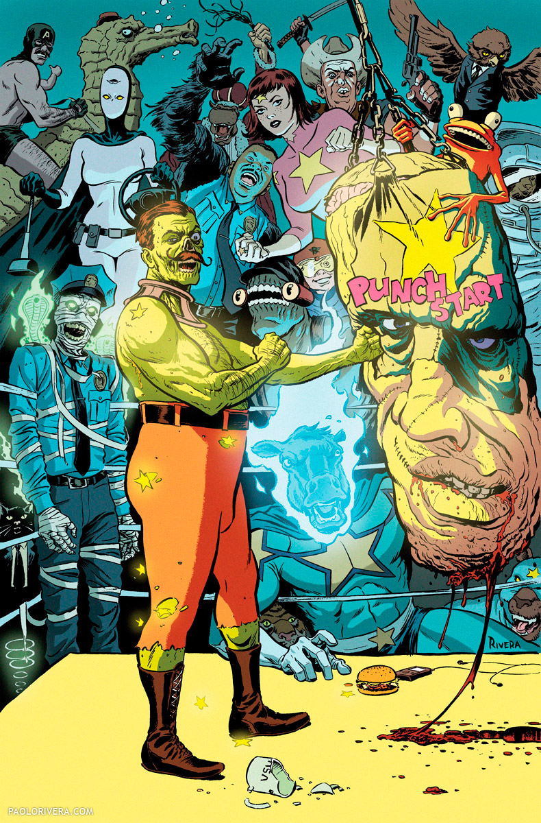
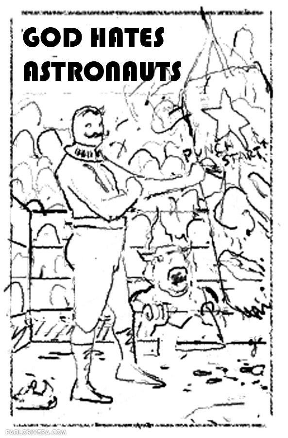
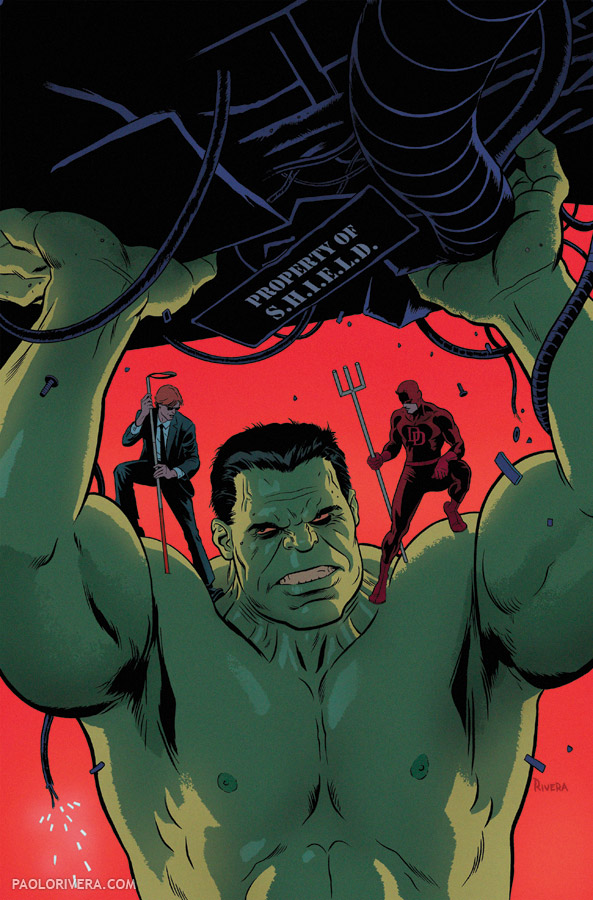
God Hates Astronauts Poster. 2013.
Ink on bristol board with digital color, 11 × 17″.
|
Ryan Browne has created his own mythology… and it’s quite irreverent. For those of you who don’t know him, he’s the creator of God Hates Astronauts, a web comic that has transmogrified into a bulldozing Kickstarter campaign and a handsome hardcover. He’s also my good friend and former college roommate. When I saw how well the pledge drive was going (it made over 75 grand!), I got on the bandwagon by offering my services. The above poster was used as a stretch goal that will now accompany every hardcover. Although the campaign is over, you can still purchase the book from Ryan’s Etsy store.
The poster was colored in Photoshop using my basic two-tone style. (I’m currently working on a process post for digital coloring, complete with videos, so I’ll leave those details for later.) While my Dad usually inks all my work now, I decided to do this one myself — I do miss using a brush on a regular basis.
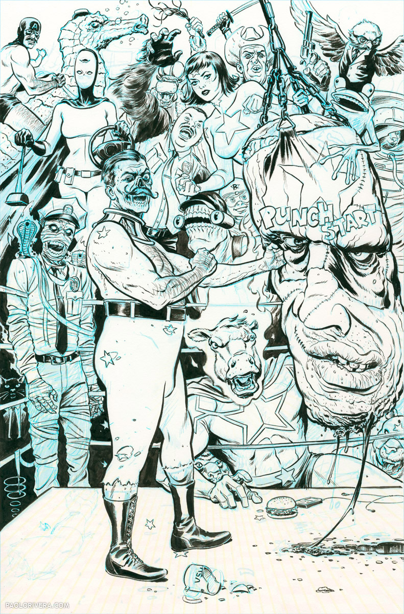
It’s inked with a Winsor & Newton Series 7 #6 brush and Holbein Drawing Ink. I like using a large brush because it holds more ink for longer strokes and fewer dips in the well. Furthermore, the longer the individual hairs, the better they hold a point. But the real secret of big brushes is that they act as shock absorbers, yielding smoother lines than any tiny brush can provide. The smaller the brush, the less space between your tremulous hand and the unforgiving page. The only way to achieve the same look with a small brush (or a pen) is to move quickly, which isn’t always an option when dealing with intricate details.
 |
| Inks |
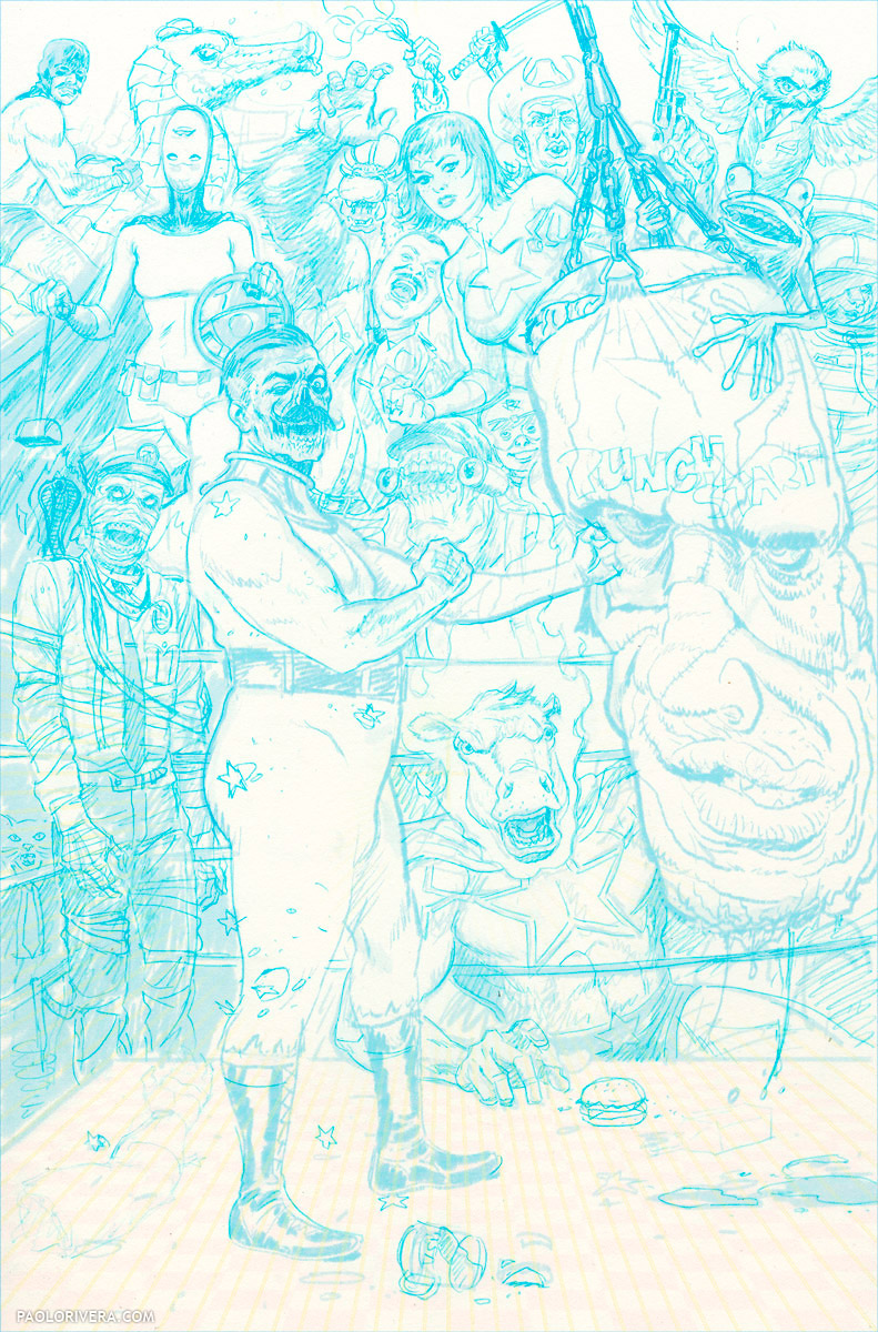 |
| Blue pencil |
When inking myself, I use a non-repro blue pencil that, once scanned, can be easily filtered out in Photoshop. I avoided blue pencils for most of my career because they had a reputation for being waxy and difficult to erase. I was pleased to find, however, that there’s a 0.7 mm mechanical lead by Pilot that had all the attributes I desired. Its density requires a soft touch, but that tends to be my preference anyway. They also have a full spectrum of colors. (Any 0.7 mm mechanical pencil will do just fine, but I use the Pentel Graph 1000, which is very lightweight.)
 |
| Digital Composite |
 |
| Digital Layout |
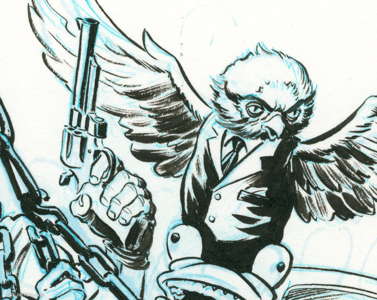 |
| Uh-oh… it’s Owl Capone |

This is gorgeous.
When I ink, I'm always afraid to connect the lines of a foreground subject with the lines of anything in the background. I give the foreground figure a thin aura of white as a result. Does that made any sense?
Anyway, this looks great. Tells me I should be a little more bold and let lines connect up.
Thanks, Adam! That makes perfect sense, actually. I do it in some cases, especially if someone else is coloring the art. If this were to be a black and white piece, I would've done it very differently.
Wow, I love the drawing and the inking, but the color is especially nice. Did you do that yourself? And if not, who did it? I'm looking for a colorist and need a good recommendation.
Thanks! Yep, that's me as well. I generally color all of my own work, the only exceptions being my run on Daredevil and an issue of Spider-Man.
I just tried your idea about using a larger brush, and wow! I have been using a W&N s7 #2, which is a great brush, but I tried a #4 and it was just as you said – the detail was easier and finer, and the strokes were smoother. It looks very large in my hand but it's definitely an improvement.
Glad to hear it! I try to tell as many people as I can.