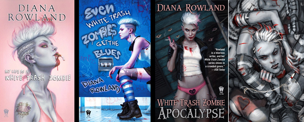
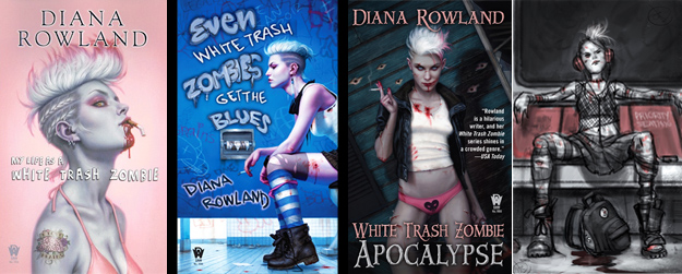
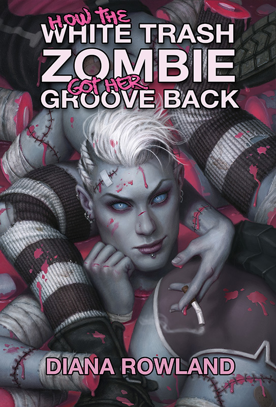
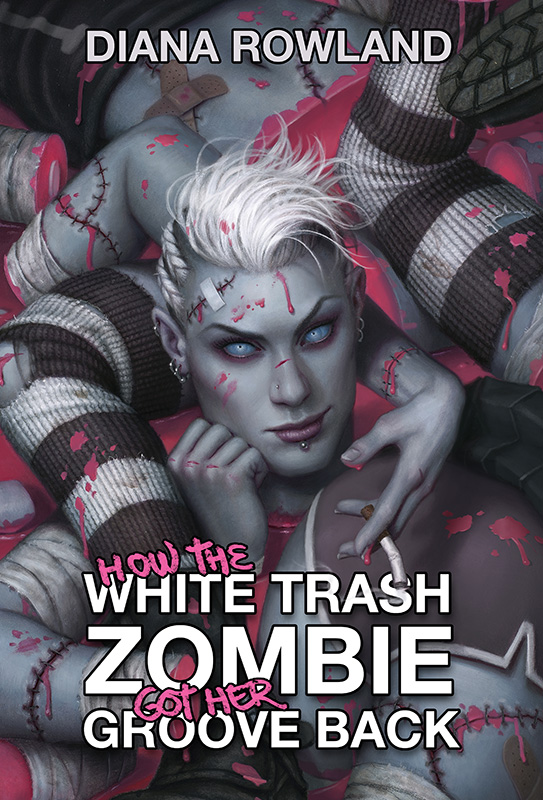
Here is a new piece I recently finished for the latest in Diana Rowland’s ‘White Trash Zombie‘ series from Daw Books. This is the fourth book in the series, for those keeping count, and is called, ‘How the White Trash Zombie Got Her Groove Back’.
We have already set the tone for this series of covers as being a little edgy, so I am allowed (and encouraged) to get a little crazy on these. Honestly, if your client is cool with your depicting smoking, urinating, and scant underwear on the first three covers, they probably aren’t going to scoff at a crazy suggestion for cover #4.
There were a few important considerations right from the start. Firstly, the title ‘How the White Trash Zombie Got Her Groove Back’ is a really long title, and that takes up a lot of space. That means I needed to create a relatively simple composition in order to accommodate all those words.
The other consideration, of course, was the plot. This book takes place in New York City, where the heroine proceeds to kick some major ass and also get her ass own kicked in the process.
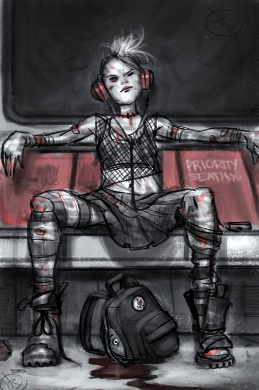
After some back and forth with the Editor and the Author, we decided on the dismembered sketch. Part of that decision was because we liked the concept, but part of it was because of how the composition looked in relationship to the previous covers. It needed to appear related, but not redundant.
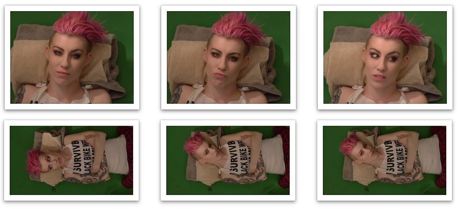
Once I had sketch approval, the next step was photo reference. Once again, my ever fearless friend Comicbookgirl19, was willing to pose for me. Unfortunately, she lives across the country from me, and so her show’s Director, Tyson Wheeler, was nice enough to take photos for me. He matched the eye level and lighting in my sketch, and gave me about a hundred great pics to choose from.
As usual, I reworked my sketch with the new reference. I messed around with some colors (which proved to be surprisingly important in the end), and then began the process of drawing the image directly onto my illustration board.
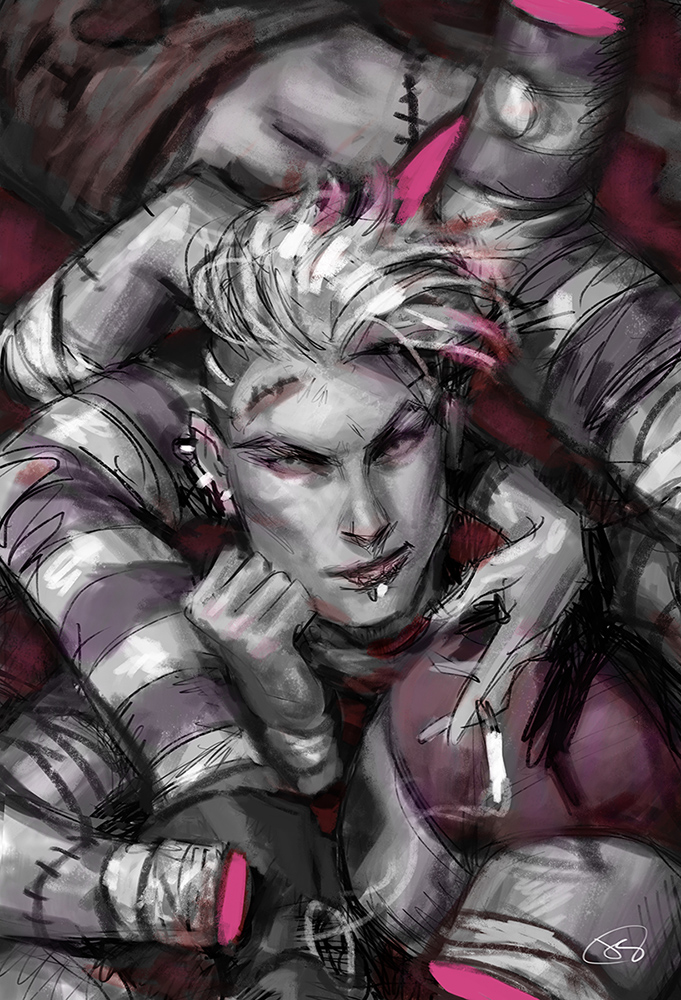
For no particular reason, I decided to use charcoal instead of pencil for this underdrawing. It was quite nice. The ability to soften, smudge, and erase with ease made the process much more like a monotone painting than a drawing. That’s good for me. It means I was able to play with soft edges more.
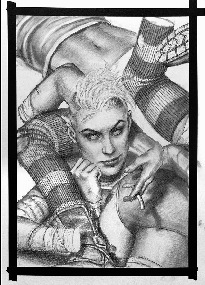
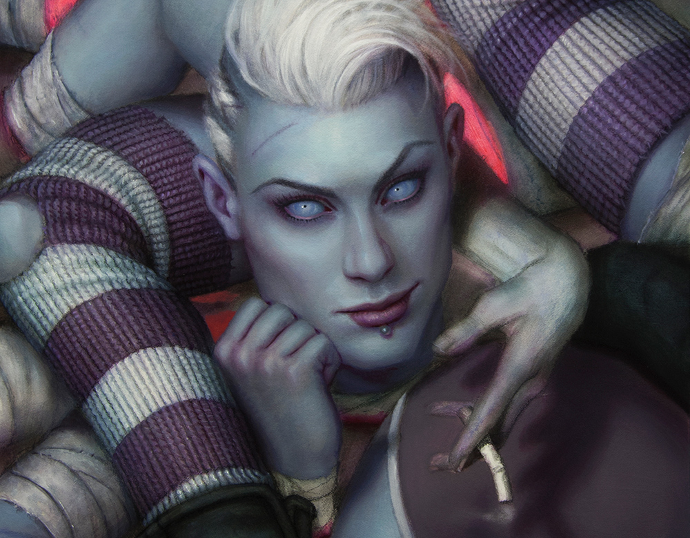
I spray-fixed the drawing, and did a few passes of thin acrylic washes followed by some airbrushed shadows and highlights. After that, I did my usual treatment of oils. Below you can see the first coat of oils, along with some unpainted areas where the acrylic washes are still showing through.
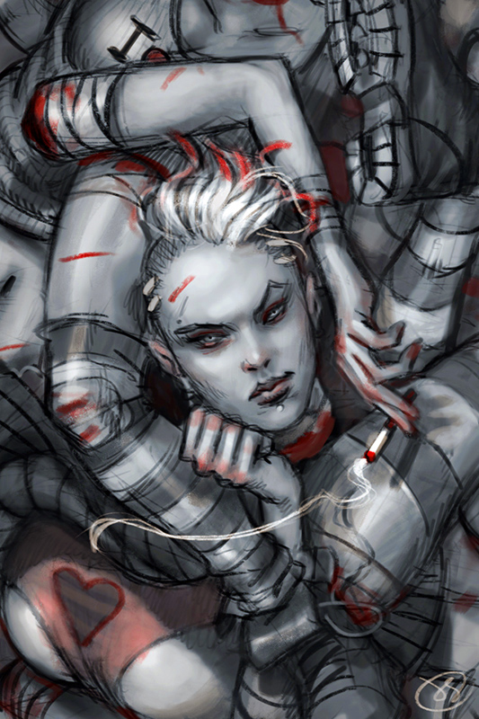
This piece posed some unusual problems. The more realistic I made the image, the creepier it got. Red blood made it too gory, and for some reason, the prettier I made the severed head, the more disturbing the whole thing got. Like, upsettingly so.
I felt like I needed to handle the concept in a more comedic manner, so I decided to make the blood pink, make her internal anatomy unrealistic, and simplify her face so that it looked more cartoon-like. That way the idea of dismemberment would still come across, but we aren’t grossed out by it as much.
Below is the finished painting.
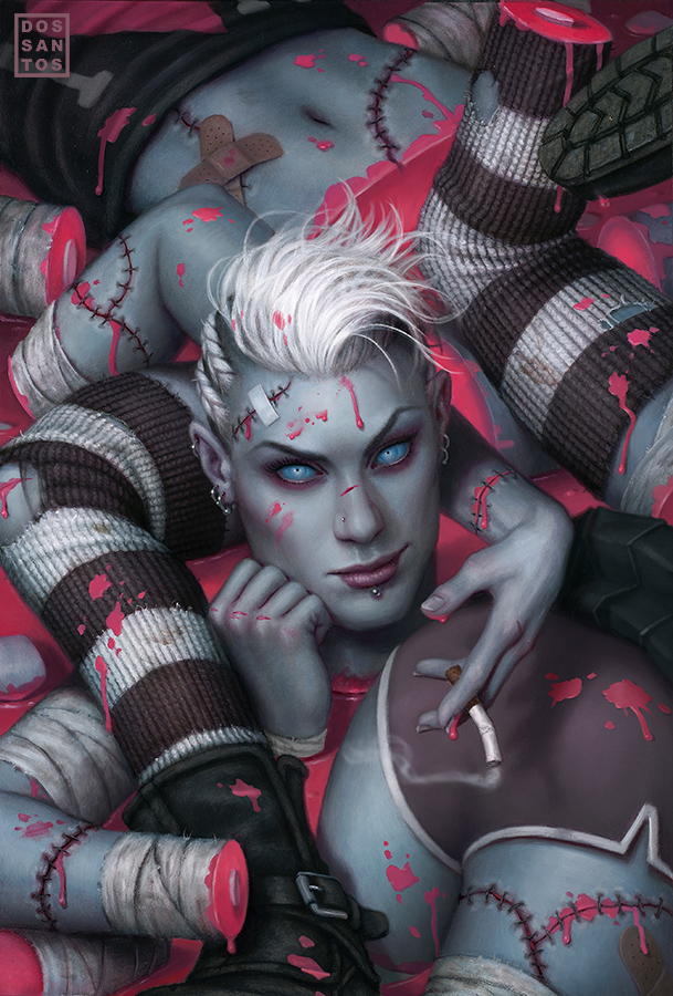 |
| ‘Butts and Pieces’ © Dan dos Santos (Oils on board, 15×21 inches.) |
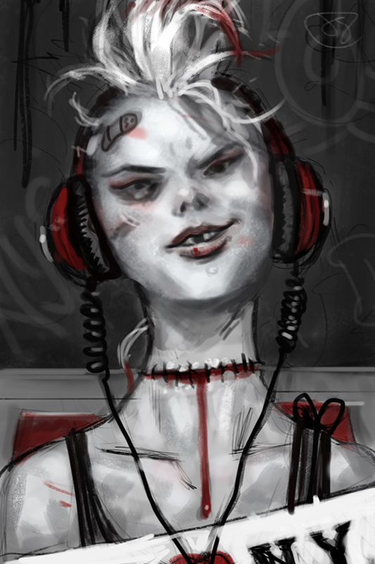
Like I mentioned earlier, the type was an important consideration too. So the Editor asked that work up a few type design options for them. I stretched some areas, and cropped as needed, and eventually managed to get the whole title in there, and actually still have some space to spare. It was really only intended as a basic design suggestion, but they ended up running the final cover with it as is.
I love the pink jello cross sections. I would have been so tempted to have a nice pile of intestines in there.
Ah so great as usual!
love the 2 butts part.
Great post, this painting is so dang fun (as is the whole series of paintings). I like your decision to make the blood and gore more stylized. I'd like to think I would have thought of that too (but I don't think I would have)… very cool. It keeps the mood of the cover in the right zone.
It took me DOZENS of color studies before I stumbled across it myself.
I didn't know what would work, but I did know that the red was wrong. So I just stuck with it, because I didn't have any alternative really. I'm certain you would have done the same.
Fantastic solution. Painting looks great!
Great work! I've always really loved your covers for this series and I think you did an amazing job with this one. Love, love, LOVE the pink blood and it absolutely does as you intended. I definitely think if it was more realistic in color then the humor wouldn't be so quick a read so good decision making.
Hi Dan,
I was wondering what kind of illustration board do you use (thickness) for your paintings?
Super blog I love this hope some one will like my blog http://guruofmovie.blogspot.in
It's great that the pink blood also references the strong pink elements in the other covers.
It's like you learn my thoughts! You seem to grasp a lot about this, like you wrote the book in it or something.
I believe that you just could do with some p.c. to power the message house a little bit, however instead of that, this is fantastic blog.
Obat Kanker Pankreas | Obat Batu Empedu Tanpa Operasi | Obat Penyempitan Pembuluh Darah | Obat Tonsilitis Herbal | Obat Mastitis Herbal
An excellent read. I will definitely be back. Thank you very much has been sharing the information that helpfull.
I finally found a blog that can make me happy. it is easy to understand, may remain calm. thanks you author.
cara mengobati tukak lambung
obat gejala kanker payudara
cara mengobati biduran
thank you so much for all the articles that have been the author wrote, it was so helpful to us in helping the task. May the blessings of this writing continues to flow, amen.
obat asam lambung
cara mengobati infeksi lambung
cara mengobati disentri
The write that your provide in this blog, make help me in build my task. thanks. atasi sinusitis dengan obat herbal – cara mencegah galukoma pada orang tua
although his blog design mediocre, but the content is very good indeed. I love the contents of the blog. Thank you.
obat untuk penyakit liver
obat untuk menyembuhkan nyeri sendi
I have long sought a blog that the same criteria with this blog, but there are only a few. Contains very fond of blog authors have this. Thank you. cara menyembuhkan anemia
I did not clever to thank, but the writing on which is the information I was looking for already a long time, finally I can be grateful to the author. Cara Mengobati Gagal Ginjal Akut
Finally, i can find this blog. Content in this blog can inspire anyone for make the best a writer. thanks. cara mengobati gagal ginjal akut
A few weeks ago I had stopped here, but I did not find the article I was looking for. But today it has available. Thank you very much.
obat herbal tumor jinak di pundak
cara mengatasi kekurangan darah putih
cara menghilangkan stretch mark
cara mengobati kurap di selangkangan
Several times I to this blog, and a lot of knowledge that I get. I am very grateful to the authors. keep the spirit of the author.
Obat Tradisional Untuk Limpa Bengkak
I'am often to blogging and i really appreciate your content. The article has really peaks my interest. I am going to bookmark your site and keep checking for new information.
http://greenujer.blogspot.com/2016/05/cara-mengobati-gagal-ginjal-selain-cuci.html