
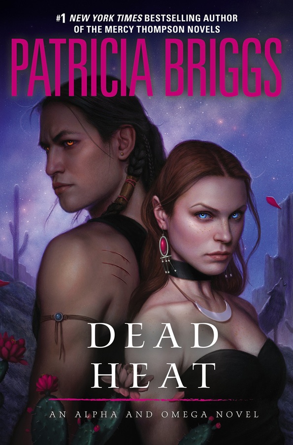
I’ve painted quite a few of these covers, but they’ve always depicted the male lead as a wolf. I had yet to paint him in his human form, so it was really nice to finally give him ‘a face’, and delve into his specific character a bit more.
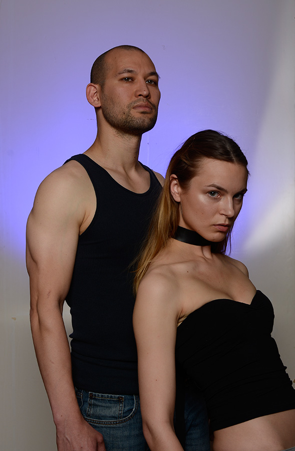
My friend Eric Fortune, who was visiting me for a while, was kind enough to pose for me. Thanks to the wonders of Photoshop, it wasn’t too difficult to make a Vietnamese man look Native American. (I just went into Filter > Stylize > Ethnicity, and pushed the slider to the right little).
This piece was actually a bit unusual for me. Instead of using my typical medium of oil paints, I decided to do this piece primarily in airbrushed acrylics and colored pencil. It started off the same, a pretty solid pencil drawing and some washes of color.

I then made a frisket using a few sheets of tracing paper and spray glue. I placed it on the painting and carefully cut around the figures using an X-acto blade (being extra certain to not cut too deep into the board). I removed the background portion of the frisket and airbrushed in all of the sky.

I then removed the frisket over the figures, and put the previous frisket that I saved from before back in place over the background. I could then airbrush some basic colors into the figures without messing up the sky.

Once I removed all the friskets, the picture honestly looked pretty completed. The rest was mostly a ton of colored pencil to modify the form and soften some edges. After I pushed the colored pencil as far as I could, I did a little bit of glazing in oils to deepen the shadows and smooth some forms on the figures. The cacti were painted entirely in oils.
The piece went through a few revisions, mostly to remove the facial stubble from the guy in order to make him look more Native American (which was pretty simple to clone out digitally). Once approved, the cover got it’s type treatment from Art Director, Judith Murello.


I can see Eric pushing through. I'm glad this airbrush/pencil thing is working for you Dan. I'm sure you'e saving time. Another great piece.
Dang it, I'm having way too much trouble finding that Ethnicity filter.
Oh, Dan. This is just LUMINOUS. (I can see Eric in there too!) The process seems really labor-intensive but WHOA is it beautiful. And really inspiring! Thanks, as usual, for sharing.
I've discovered it's a crap shoot. If the piece is really large, and I'm painting huge heads like this, it's fantastically easy. But I tried it on the next piece too, which had lots of tiny figures, and it was a disaster. I just don't have the interest in making insanely complicated friskets for every little detail. At a larger scale, I can freehand most of the airbrushing, which keeps it fluid and fun. Scaled down… ugh.
It's right next to the 'Add Creativity' filter. You can't miss it.
Great work. Too bad they pulled all the saturation out of the opuntia flower in the final treatment. It was a nice compositional element. It created a triangular rhythm with the eyes of the figures that helped move the eye around.
Yeah, I was disappointed by that choice too. I can see why they did it, though I think that pop of color would have enhanced the type rather than hurt it. I actually comped it out that way intentionally. Oh well.
Mmmm – love it Dan! This is one of my favorite covers of yours I think. The airbrushed elements are really beautiful (and yes, it's great to see a male figure on one of Patricia's covers.)
I've loved all of the covers you've done for Patti's novels. Even though I don't know what a frisket is I sort of figured it out from your description. A very interesting process and a fabulous result! Thank you!
Gorgeous!
I have to tell you that i appreciate all the covers you have done for the various series of Briggs books. A copy of my favorite hangs on the wall of my studio to remind me what i'm shooting for when I paint! I love the effects you are getting from using this technique and appreciate the fact you have given the character a face. What i appreciate most is you sharing how you did this!! Thank you, Dan!
It's my pleasure! I'm happy you find the article helpful in some way.