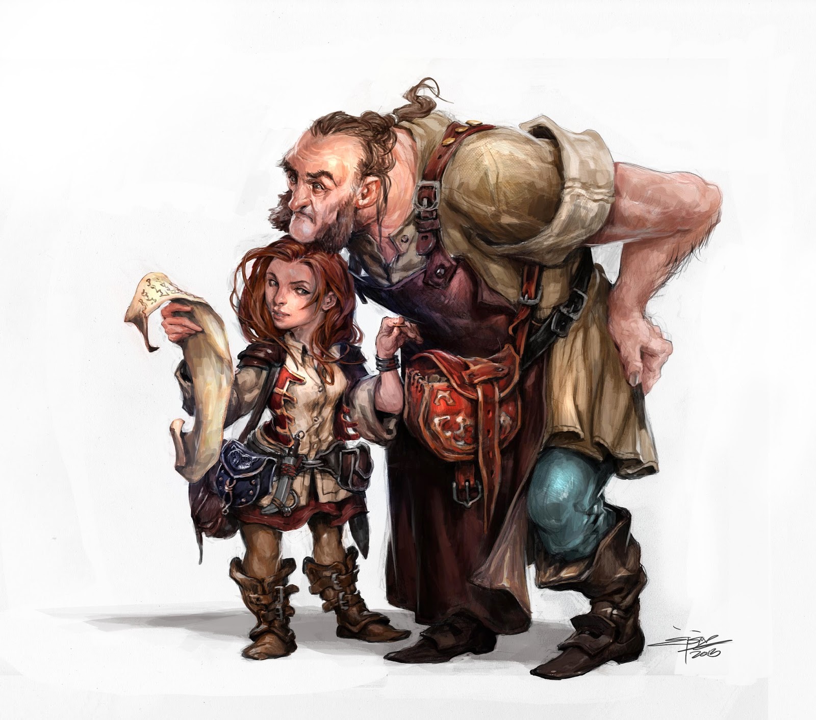
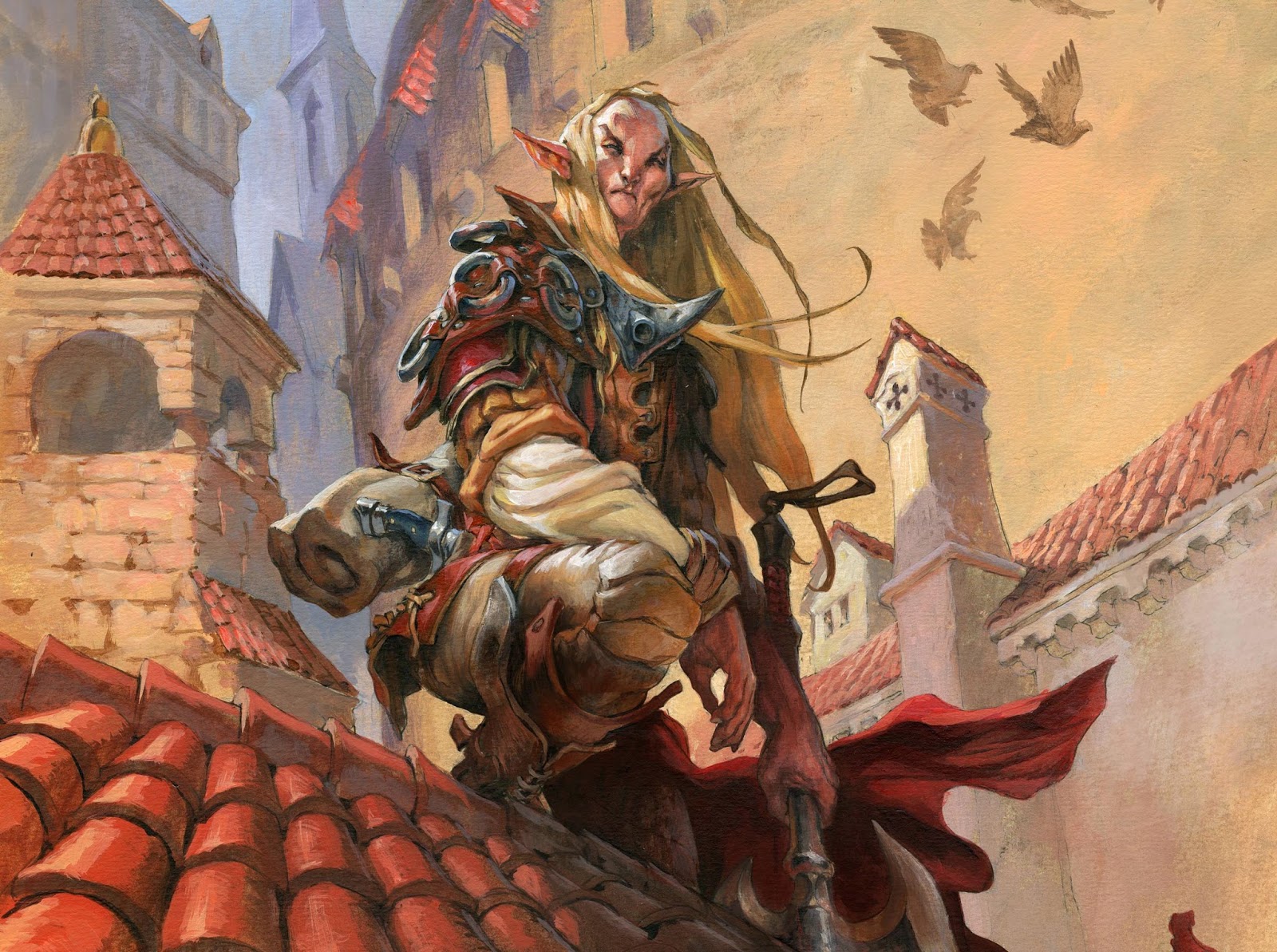
This illustration was featured in the newest DnD 5th edition. The assignment was pretty simple; a female thief pick pocketing the Innkeeper. It is a well-known scene to all of us who play role-playing games, and I had all kinds of thought involving a whole inn, lots of different role-playing characters and in the mist a hafling turning around on the bench stealing from a passing inn keeper while he had his hands full carrying beer. The more I sketched and drew thumbs of this scene the more it got away from the assignment and the less clear it became. I was loosing focus of the 2 main figures and especially the action of picking the pockets.
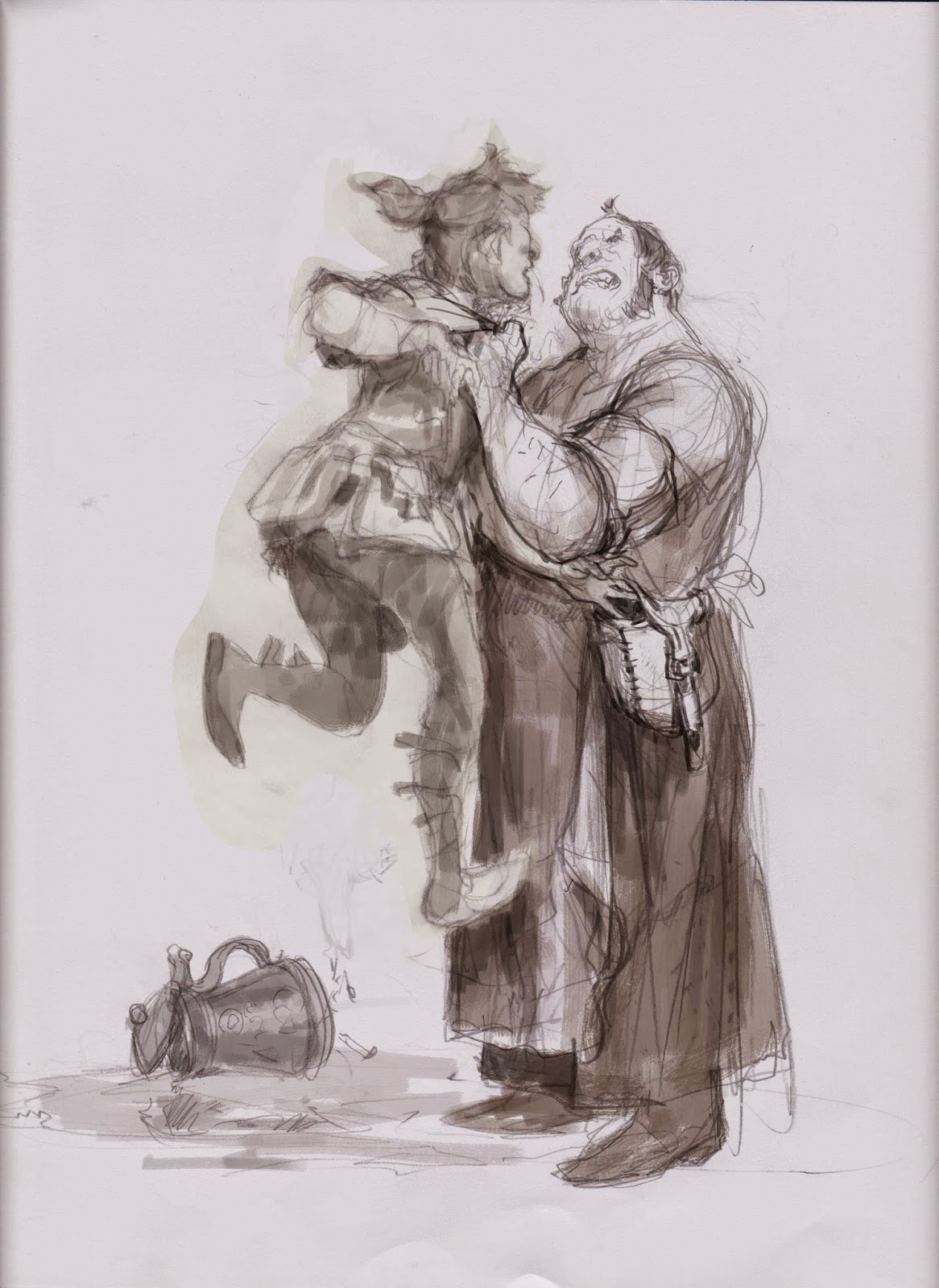
So I choose to go with a simpler version with only the hafling and the innkeeper and no background at all. First sketch I liked, had the innkeeper lifting the hafling off the ground and while doing so the haflings hands grabbed something out of the guys pouch. My art director Kate Irwin pointed out that it kind of ruined the setting a bit that the hafling had been caught already. Looking at it with critical eyes I also became aware at how weak the whole hand and pouch area was. you didn´t really noticed it; mostly; I think, because none of the attention-direction of the characters was directed towards the action of stealing.
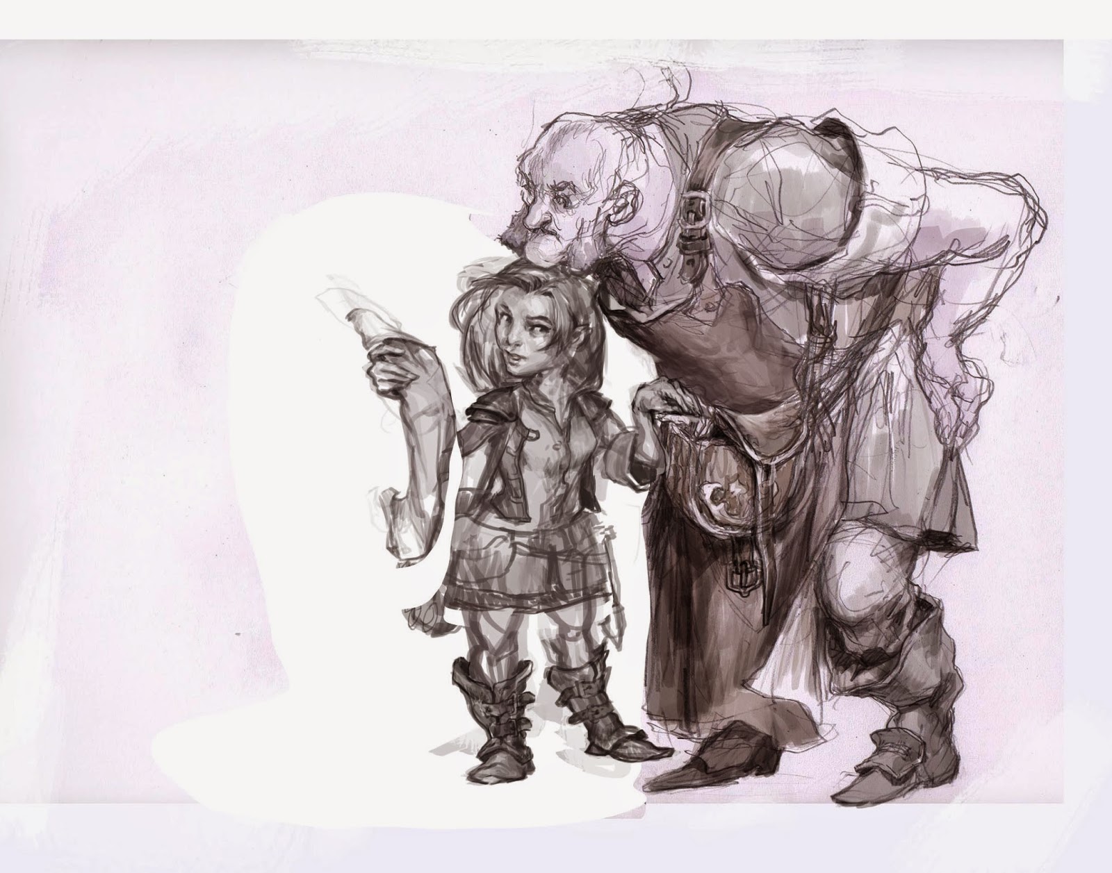
So, literally back to the drawing table. I ended up with a composition I liked. My idea was that the hafling created a diversion by asking the innkeeper for something in the menu ( or a map if you like ) . I directed her eyes to the hand that is stealing so that you would notice the action. At this point I thought the telling of this story was much more difficult than I had anticipated.
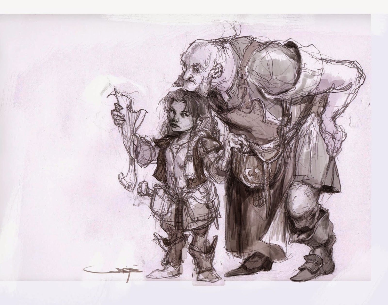
So I got this sketch approved and started grey toning it digitally, since that is what I usually do in acrylic and I haven’t really found a method to pull me out of my 20 year old acrylic habit. In grey toning I simply got disappointed with the drawing of the female figure. She was standing too much straight up and down and I did not think she was feminine enough. She looked more like a dwarf than a slender agile Hafling. So I erased the approved one and drew a new hafling. I turned her towards her stealing so that the composition closed more in on it self and so that she was turned more towards her ?
And the facial expression was a battle right up till the end. I was going for the expression of a forced smile, like she is still being polite but the eyes are eagerly watching if the hands succeeds.
Well; all of this talk has been on directing the story and the composition of the drawing. To be honest it is also the most important part and the hardest part. As soon as I begin on the painting part I relax again and turn on some loud music and start singing along, letting the brush render almost all by it self.

This was one of my first digitally colored illustrations and I was unsure if the result was all that good. I was happy with the illustration but insecure about the finish. So I passed it on to my little group of fellow artists. Chris Moeller, Steve Prescott, Steven Belledin and Randy Gallegos and I have a mailing group where we share artwork and sketches to get some blunt qualified feedback or to air out our frustrations. Randy was very precise and grabbed an older acrylic illustration of mine to put up next to this new digital one. He noticed that I was using way more dark tones and too much black in my digital illustration than my acrylics.
Damn! this is something I have learned years ago, I have avoided black and tried everything possible to get more life into the shadows and here, simply because I changed media, I somehow went backwards doing stuff I KNOW is wrong. I thanked Randy heartfelt for pointing it out, and have ever since made a big deal out of avoiding blacks and dark greys in my paintings.
I really love your style!
I love this! The expression and demeanor of the characters are absolutely perfect!
Very nice! It's great to see how you develop the piece from sketch to finished art. And speaking of finished art…any chance you might do a post on how you learned to paint digitally? That would be especially interesting for me (and other artists like me, I'm sure), since I have trouble translating traditional illustration skills to the computer.
You've really nailed the interaction!
– Jameson Gardner
buy neto
thanx for sharing this lovely post
What makes this piece are the characters and their interaction. Excellent work Jesper!
This is exactly what I hope for in an illustration. Kinda makes me want to buy the new D&D edition just to see if the rest of the illustrations are as good!
Awesome! Personally, I like the contrast in the digital version