-By Cory Godbey
Bibbidi-Bobbidi-Boo. That’s what.
One of my most enjoyable projects of last year was the opportunity to illustrate the storybook for Disney’s new, upcoming live action Cinderella film.
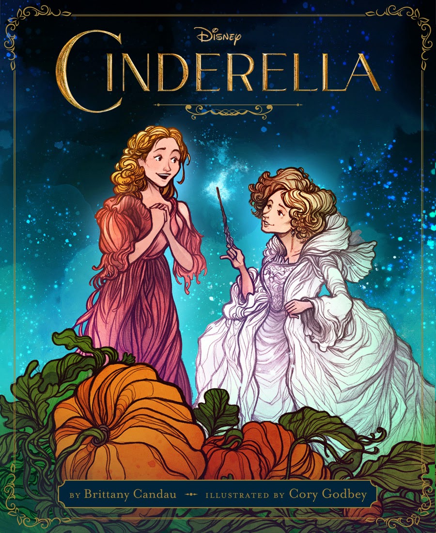
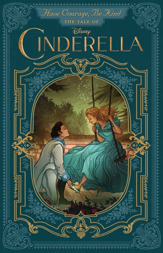
The books were just released a couple weeks ago and I’m pleased to be able to show a little of the process. For this post I decided to focus on one of the covers (the novelization has a separate cover from picture book).
In effort to keep things flexible for my clients (and easy on myself for any potential revisions) many times while working digitally I’ll work in layers. Not just layers in Photoshop, I’ll complete entire characters and elements seperately and put ’em together, you might say. I’ve come to enjoy working this way because it allows a greater degree of versatility and lets me make faster adjustments.
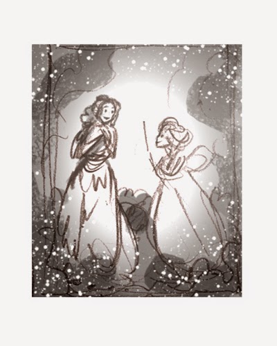 |
| Very nearly useless thumbnail. |
My preferred way to work is to begin with very loose (almost useless) thumbnail and figure out the piece as I go. This isn’t always possible for every project but for this book I had two terrific editors who were able to see exactly what I meant with just a few lines. Working this way keeps me moving fast and allows me to quickly get a feel for the book as a whole.
This thumbnail was one among many others but we settled on the direction pretty quickly.
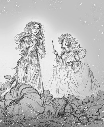
I’ll follow up with a more refined rough that gives a stronger idea where I’m heading. Once approved I’ll move on to the actual drawings of all the elements. This means figuring out the background, the characters, and just what exactly is going on with all those pumpkins.
 |
| Col-erase brown pencil rough. |
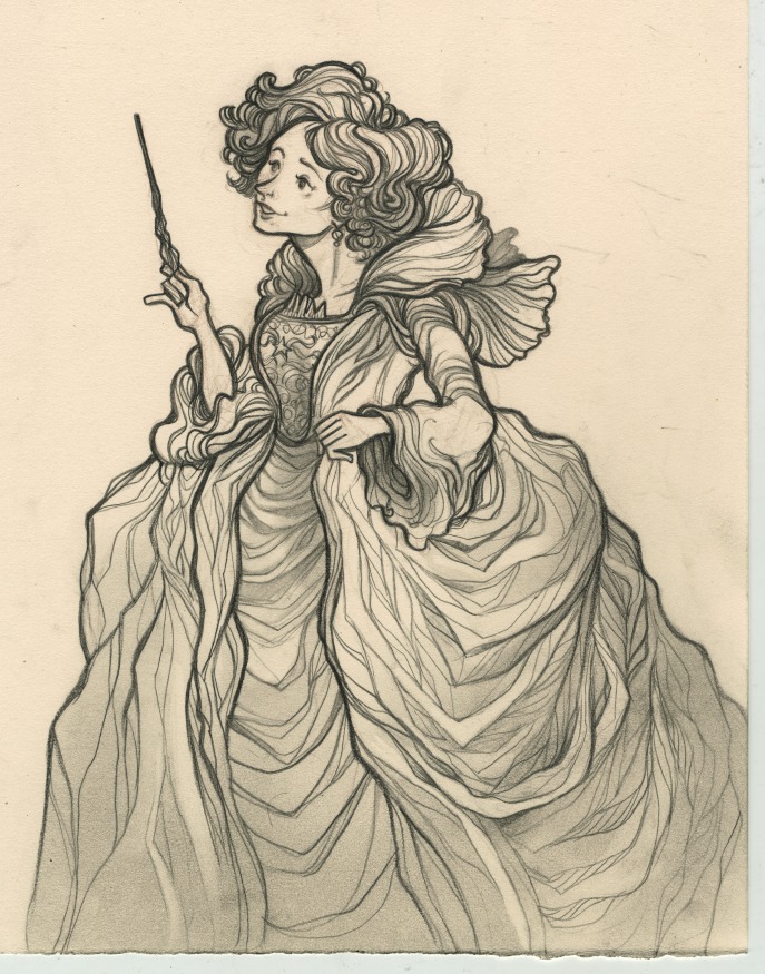 |
| Finished drawing. |
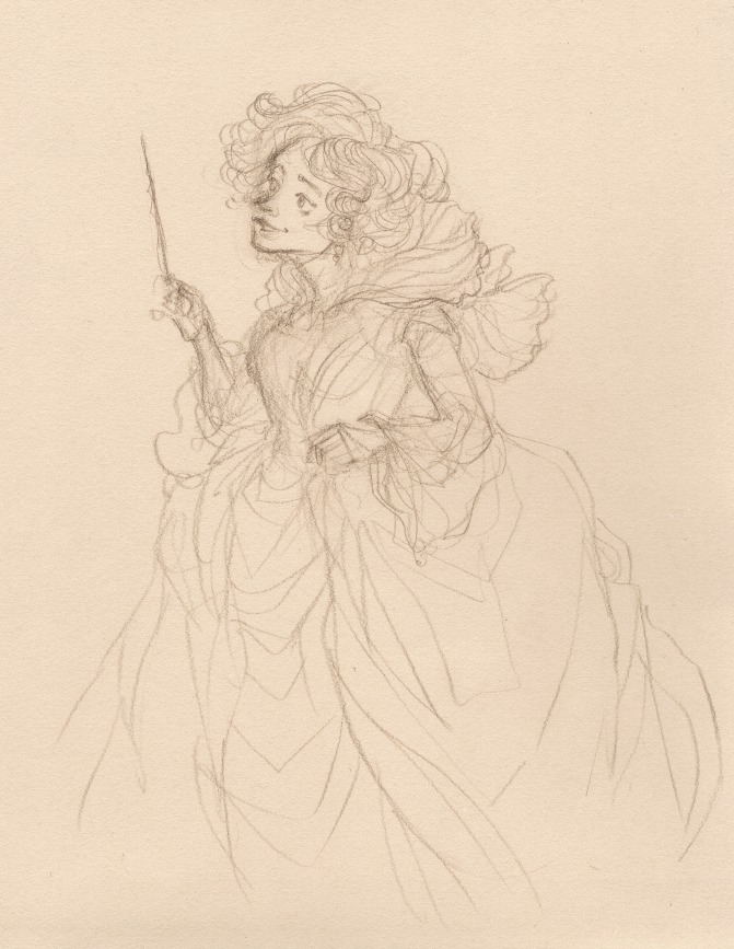
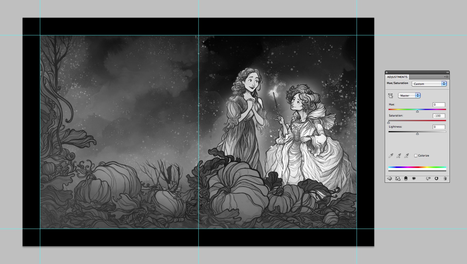
Once I’m done with the drawings, I’ll scan them and begin to work digitally. If I know I’m going to be assembling the piece in parts I’ll work the individual elements and figures up to about 75% complete. I’ll save the finishing and highlights for once I’ve got the everything in place. The three main elements of this cover to keep in mind were the Fairy Godmother, Cinderella, and the whole bunch of pumpkins.
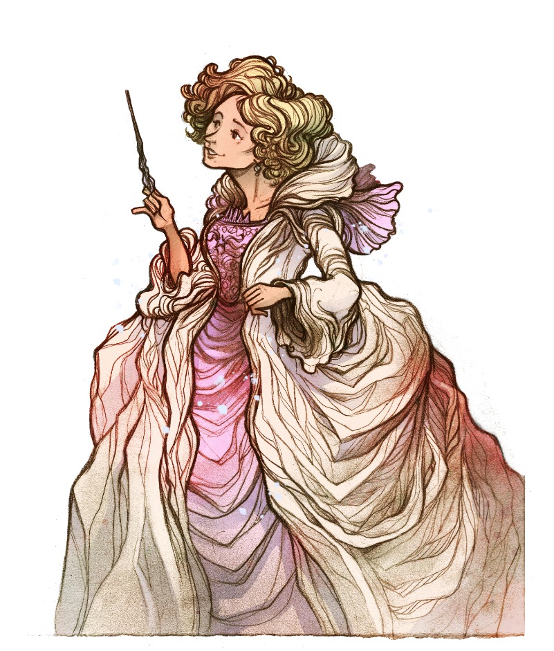 |
| Bibbidi. |
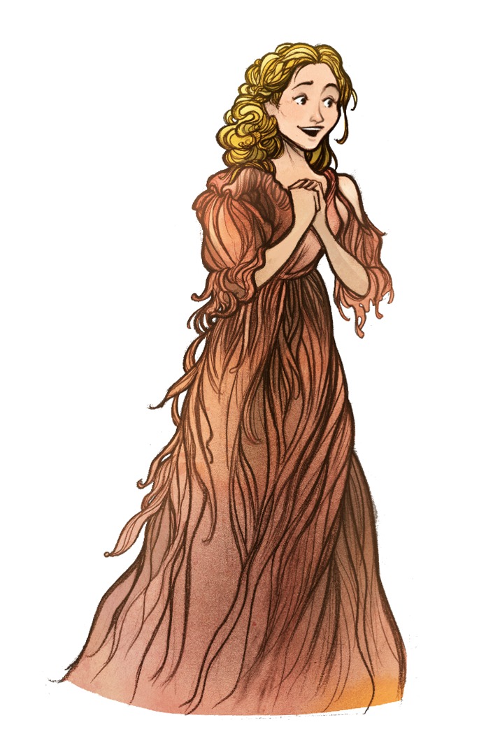 |
| Bobbidi. |
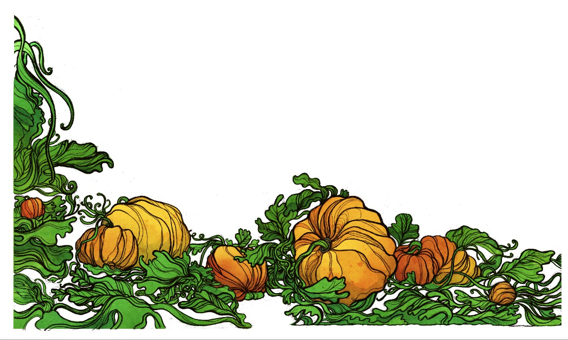 |
| Boo. |
Now that everything is mostly there, it’s time to assemble on the actual template for the cover. Generally, I’ll work foreground to background, place the figures, and finish.
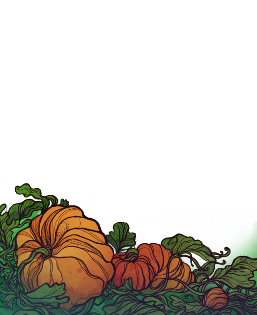 |
| Pumpkins. |
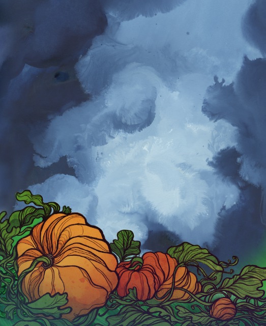 |
| A watercolor sky placed behind the pumpkins. |
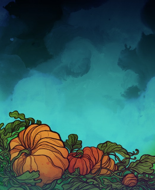 |
| A little more work to the sky. |
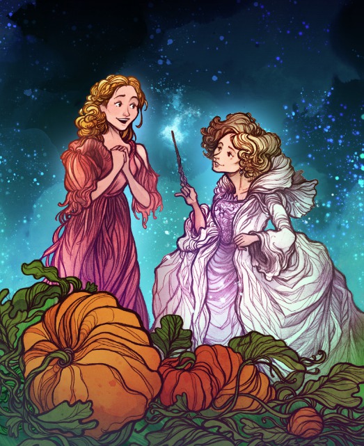 |
| Figures, highlights, finishing touches, and stars. |
And hey, while we’re here, I’ve got one hopefully useful tip: I always keep an adjustment layer with the saturation turned all the way down at the top of all my layers to keep checking my values.
There you have it! It’s not too much more complex than that.

The books themselves are a nice hard cover, they feel great, and the design work is top notch. If you spot one out in the wild be sure and let me know!
And here’s a look at the cover for the novelization!

Beautiful Covers – Thanks for sharing your process.
Great work Cory!
Wow, the process seems so simple and straightforward. Did they ask for many revisions?
Beautiful! Thank you for sharing!
Hi, I came across your blog as I was looking for Cinderella's sketches.
Nice work, I love it
thanks
Maravelle
awesome job Cory! Looks great!