Drawing From the Fishbowl
-By Todd Lockwood
Yesterday I talked about an experience that really drove home for me how different reality can be from our conventional understanding of it, in the form of a Curvilinear Brain Bender.
The human eye has a limited width of field; we tend to see only a portion of the environment at a time, and really only concentrate on the very center of what our eyes take in. And so we allow ourselves the luxury of believing that straight lines appear straight. And it is a luxury: straight lines are so much easier to deal with than curved ones! But you live at the center of a fish-eyed universe. A line is rarely so perfectly situated within your field of view that you would actually draw it as a horizontal line – even lines that we know to be level. If you turn your head slowly where you are sitting, and concentrate on the lines and angles of wall, furniture, and floor as abstract shapes, not as things, and pay attention to how they shift in your sight, you will begin to understand it. You can look straight at a thing, say the monitor you’re reading this on, and make the horizontal lines of top and bottom truly horizontal in your field of view. But turn your head just the tiniest bit, and they are no longer so.
Perspective is, literally, the view you see from wherever it is you are, depending on which way you are pointing the eyes in your head. It’s dynamic and alive. it moves and changes as you move. We have conventions that simplify applying observation to a rendered image, such as perspective grids. But they’re abstractions that only approach reality; a language that we have all learned. They aren’t reality.
The trick, then, is to use that knowledge selectively to edit reality as you render it.
Look at Barfight:
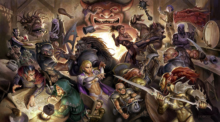
There are true verticals on either side, toward the top, in the corners of the room and along the back wall. I made them vertical because they are small and fairly insignificant, they are in the distance, and because in a horizontal painting they are not substantial anyway. Also, they are far apart, and if I were in that room looking at them, I would probably have to turn my head to look from one to the other. If I were looking straight at them, they would appear vertical, and if I’m not looking UP at them to any significant degree, lines parallel to them wouldn’t bend much. Follow me? It’s just like the example of the road and the centerline, only vertical instead of horizontal. If this were a vertical painting, and the room had a vaulted ceiling, those same lines would probably have had to start bending inward somewhat to satisfy my sense of perspective.
But if you look at the bar, on the right side, i’ve used some exaggerated perspective to make a dynamic, moving form of the bar top. It contributes to the action by not being straight and static, yet by observing the curvilinearity of the scene I can make it seem natural enough that it doesn’t jar.
The rest of the natural perspective in the scene is obscured somewhat by the fact that all the tables and chairs are overturned or bouncing. But you’ll note careful attention to the perspective of individual planks in each table and so on. Perspective is always there. There are no “tricks” or shortcuts to get around it.
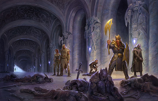
Now look at Streams of Silver:
Dan sent me the following perspective grid as I was prepping this article, and it represents more or less exactly what I did here:
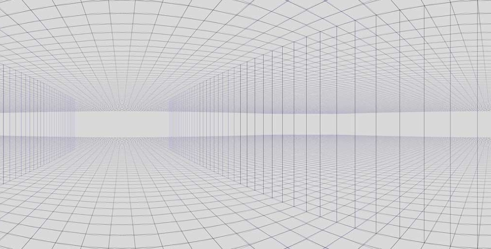
In that grid, all the verticals are actually vertical, which is that little lie again. If that grid were three times as tall, the verticals would have to converge toward upper and/or lower vanishing points or the image would start to be distorted, especially in the corners (this grid might be used in a panoramic painting that appears in an animated film, with characters traveling across it from left to right. It would never be seen in whole, but the perspective has to read as true as the camera pans across it).
Again, I’ve left the verticals vertical, because it’s a horizontal piece and to see this scene, were I there in person, I would probably have to turn my head to take it all in. In doing so, each column as I was facing it would be vertical in my line of sight, and since they’re perpendicular to the plane containing my eyes and the horizon, that’s okay. The other columns to either side, if I were to concentrate on them while still looking at the center one, would indeed be converging upward and downward. But human vision tends to be very centrally focused, and so we get away with little lies like these. However, the horizontal lines in the scene are curved. Look at the invisible line that marks the top of each arch as they recede into the distance: it’s curved, if subtly.
Now take a look at Crystal Rain:
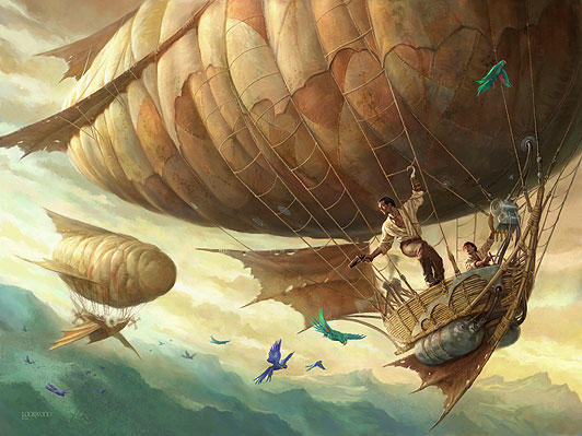
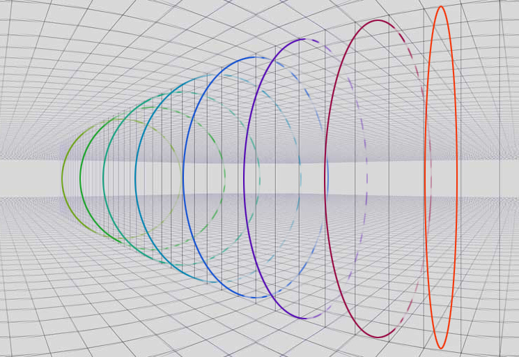
Even these amorphous gas bags have perspective. The ropes wrapped around the volume of the bags define circles or ellipses that are receding toward a vanishing point, even if they are imperfect circles.
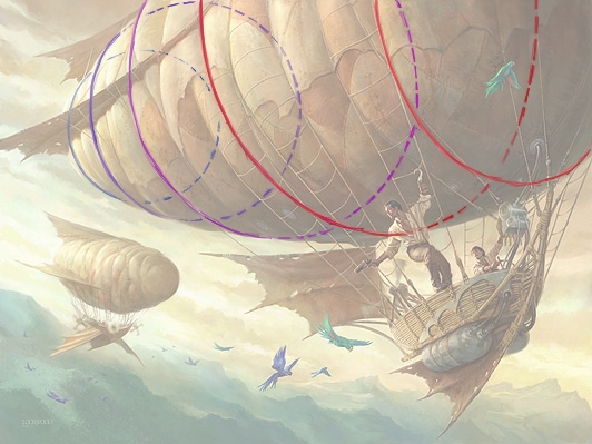
In fact, it uses the same perspective grid that Crystal Rain does; consider that each circle occupies a plane more or less parallel to the others, then note that the nearest ones are more flattened, because we’re closer to seeing them edge on. They become rounder as they march away toward a common vanishing point off the left edge of the picture. If you take care to be aware of the gentle change in definition of those circles, your drawing will convey the sense of scale more convincingly. On the more distant blimp it’s less obvious (though definitely still there). The curvilinear strategy tells the viewer that they’re close to the nearest blimp, and that it’s big.
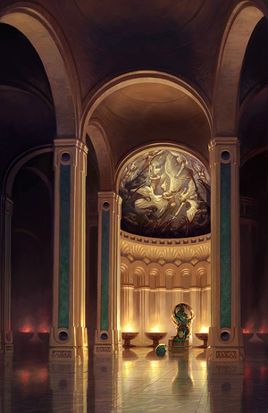
In both those images I’ve picked the horizon as my straight line, and bent the rest subordinately, because we’re translating curved reality onto a flat piece of paper. I do it pretty much always, to one degree or another. Sometimes verticals need it too, like in this picture: there’s a subtle curvilinear perspective in the vertical columns. The only truly straight vertical is in the rightmost column. The only straight horizontal is across the tops of the braziers; the rest of the horizontal lines are subtly curved to help imply the scale:
Finally, look at Pirate King:
This is the first sketch-up after I’d shot reference, spitballing the perspective:

I eyeballed a quick, one point perspective grid, with the verticals all receding to a vanishing point just below the bottom of the picture. This is the drawing at a later stage; I turned the grid to 100% for this screen grab. Most of the time it was turned down to about 10% just as a guide:
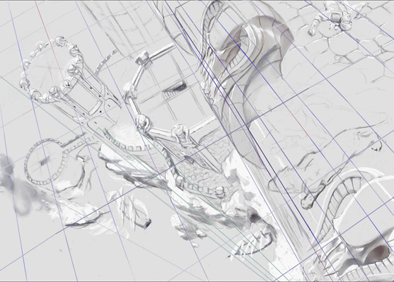
In order to give the proper sense of scale, but without untoward distortion, I used a curvilinear grid for the horizontal elements of the image. Here’s the grid alone:

Below, see the grid as it might have looked if I had expanded it beyond the borders of the image. It’s far from perfect, because I was eyeballing it, but the scene doesn’t depend on it entirely to be accurate (there’s nothing architectural below the most egregious parts of it, for example, or I’d have spent more time with it), but it still subtly informs the image with real-world cues to scale and space.
The blue lines indicate the horizontal plane, bending toward four vanishing points on the distant horizons. It’s fish-eyed! I allowed all the vertical elements to be straight lines (in green) since I was looking down. There’s a vanishing point somewhere below Drizzt and Kitty for the verticals, off the boundary of the image. In the horizontal grid, the only truly straight lines would be the two that form right angles directly above the vanishing point (the red lines) Those are the two lines that I’m “looking at.” The subtle curves help the viewers to accept the scale of the image instinctively, by telling them that they’re turning their heads (or in this case, perhaps, tilting their heads) in order to look around the image.
Note especially how the bridge leading to the left-most tower aligns with the stairwell and pavers in the next tower to its right, and finally with the pavers in the upper right. If that grid line had been straight rather than curved, there would have been distortion at either end. Instead, the horizontal elements “agree” with the verticals, both drawn and inferred, and they feel “right” as a result.

People see these things, even non-artists; few artists could draw a perfect portrait of their mother from memory – but everyone recognizes their own mother when they see her. This is similar. We all instinctively know what the real world looks like. More than that, recognizing and selectively using curvilinear perspective can help to prevent those distortions of shape that appear at the corners of an image and take the viewer out of the illusion. When you understand it, you can tell your lies more convincingly.


Todd, this was immensely helpful. Thanks so much for sharing.
Second that – I'm ashamed to say it's the first time I've encountered curvilinear perspective in anything more than an instinctive way. Thank you.
You knocked it out of the park with this two parter!
What an amazing way to take something many of us know superficially and really making us understand how it works.
Great piece, Todd!
huge thanks to todd, indeed!
This is a really great posting! I think I'm going to bookmark it for future reference to show students!
Awesome ideas, I think they fried my brain. I'm gonna have to read these posts a few times to try and get all the pieces to jiggle into understanding for me.
Thanks for the post.
Any advice on other resources for getting a better handle on perspective?
Jeez, Todd, that was terrific! Great job, man.
@Anonymous: Honestly, just writing this post increased my understanding. What really impressed me is how thoroughly my own grasp of reality was distorted by the language and conventions that had preceded my own investigations. It's true of far more than just art: politics, religion, history, and much, much more can be tainted by what you THINK you know. Art has the capacity to open your eyes in ways you did not know they could be opened. that sounds cheesy, but it's true!
My most recent comment on the previous post is worth reading and then applying: take a very long, straight stick out into the world, hold it up at about a 45° elevation, and see if it doesn't screw up your assumptions about horizons and straight lines and perspective.
Thank you! This is extremely helpful and interesting-I never work digitally-all entirely “Old School”-doing perspective by vanishing point and grid-and I can't believe I've never come across this before ( I'm looking at you, art school teachers)-so useful to keep compositions from looking too stiff.
Wow. Its amazing how much thought goes into the work. Very impressive.
From my early days of tech illustration and working to two and three point grids, I've pondered what was going on in the points outside the field of view and that freaky point where the lines unite. Your excellent post has polarized all of those thoughts and ponderings. I may not sleep for a while, but thanks.
Just got an awesome upgrade in knowledge. Thank you!
Excellent lesson, it feels so much clearer after reading this!
If I may add a suggestion I would love for stuff like this to be downloadable in a .pdf so I can keep it for future reference.
Just a thought 🙂
Awesome. Thanks a lot.