A couple years ago, I wrote a post on harmonious color and Dan posted a link to it here on Muddy Colors. Shortly after Dan invited me to start contributing regularly. It occurred to me that it might be good to have the post etched in the granite block of Muddy Color’s blog so that in a thousand years when Google robots have taken over the earth, turned us into batteries and assimilated all knowledge they can choose a decent color palette for the inevitable future.
Also, from looks of my social network feeds, just about all of you are at IMC and will be working through the wee hours of the night having a wonderful time. I am jealous of the inspiration and fun all the IMC’ers are having, but it brings back great memories too!
Harmonious Color
 |
|
|
I struggled early in my career with the application of color. That is no surprise because color can be tough, but I really struggled! In fact when I was just out of high school, my pride reared it’s ugly head and I even told one teacher that “color was overrated” and that “black and white was enough for me.” That makes me smile now, but I was serious then!
The reality was that I had no clue how to put a palette together for a painting. I knew that a complimentary palette could be good. Maybe red and green, or orange and blue… but what orange, and what blue? You only have to spend 2 minutes in an art store (or in Photoshop!) to realize that there are a LOT of different hues of blue and orange or any of the basic colors of the spectrum. It can be a bit overwhelming at first.
I do feel I have come a long way in my understanding of color, but I also know that it is something that will provide a deep and satisfying challenge for the rest of my life. Having said that, I will share my approach. I think when people ask me how I choose the colors in my paintings, what they are really asking is, “How do you create a harmonious palette?”
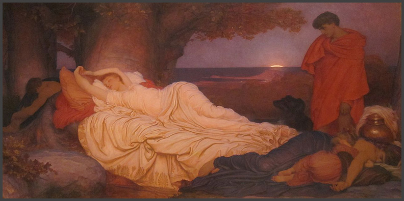 |
| Cymon and Iphigenia by Lord Frederick Leighton |
Creating Harmony
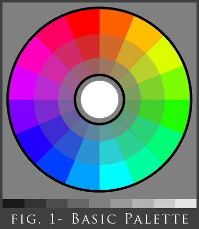
Let’s start with a color wheel. It can be any color wheel, as long as it contains the spectrum of colors in their full saturation. For this lesson, I have created a fairly large color wheel that has not only a broad selection of colors fully saturated, but also a couple different levels of saturation. In the center of the wheel is a white circle. This represents the color or temperature of the color of light that the color wheel exists in. – see fig. 1
The color of the light in your scene limits the colors in the spectrum available for you to paint with. Only under white light will all the colors of the spectrum be available. If you have a red light in your scene, you will not be able to paint with the full spectrum of colors and have your painting feel natural. Let’s see what happens to the colors if we cast them in a different temperature light. – see fig. 2
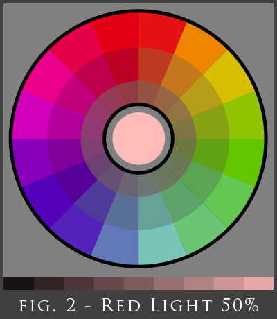
The image above is simulating a scene as if you placed a 50% red filter over your eyes, or as if your scene were lit with light the color of the circle in the middle of the color wheel.
Look at how the red light has limited the colors. The greens have lost their kick, the yellows are pushed towards orange and the blues towards grey and purple. You could no longer paint with a bright ultramarine blue in this scene and have it feel natural. The color would not feel as if it belonged in the scene. In other words it would no longer be harmonious.
Below is a more extreme version, with the red light at 90%. – see fig. 2a
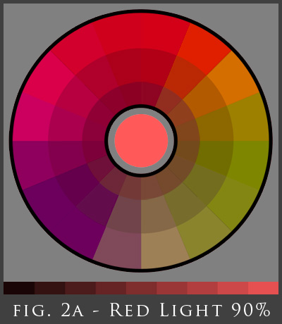
Now we are really dropping colors. You could imagine you are doing a sci-fi painting set on a planet that has a red sun. Your blue jumpsuit would be a nice grey purple and the whites of your eyes a strong carmine pink. Look at the change in the greens and yellows as well. The overall palette still represents the full spectrum, but cast under strong red light. Any of the colors within this palette will work with each other to convince the viewer that the scene you are painting has consistent color temperature in the light. It is harmonious.
Now for closer comparison, here is the color wheel with white light next to the palette with red light at 90%. – see fig. 3
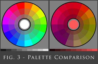
The changes in the colors are very apparent, but it is also a rather nice limited selection of colors to work with. Of course if this were your palette, you would most likely use a variety of values and different saturations. I would also simplify the palette to the most important colors I want to dominate the painting. What color would your skin be under this kind of light? What about water, or a tree? Try to imagine the colors you use in your own illustration.
Experimenting with temperature
Next, let’s take a look at a painting and see how the painting changes with the temperature of the light.
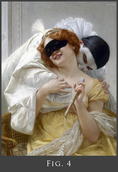
The painting above, Pierrot’s Embrace by Guillaume Seignac – fig. 4 – has what is essentially white light illuminating the painting. Now let’s take a look at the same painting cast under a 25% red light – fig 4a.

A couple obvious things stand out. The whites are pink and the whole palette has shifted a little. The skin still looks like skin and we still read the dress as yellow. What would happen if we applied other colors? – see fig 4 – 4e
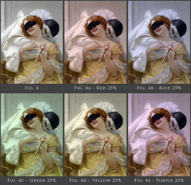
Look how the painting still works under all the different colors. The green skin in fig. 4c still reads, as does the purple skin in fig. 4e. The white fabric, while tinted in fig 4a – 4e still reads as white. Not technically, but perceptually. Our brain can tell that the light in the scene has changed and adjusts to accept the tinted cloth as white. If you were to take the shirt from 4c and put it in the original, it would no longer be perceived as white, but pale green.
It is the same in the natural world. If we are wearing a white shirt and we step outside into a beautiful Arizona sunset, we don’t wonder why our shirt just turned peach, we know that the temperature of the light changed and so the whole spectrum shifted with it. If we had a shirt that could somehow retain it’s brilliant white under different colors of light, it would stand out as unnatural. It is the same with our skin. Throughout the average day outside, our skin changes color significantly, as the color of light changes from dawn, noon and dusk. What does this tell us? Perceived color is highly relative.
I had a teacher once tell me that color doesn’t matter. It is a bit dramatic, but the point was this, there isn’t a specific flesh tone or color for spring grass that we can mix once and be done with it. Additionally, you can paint grass just about any color you want as long as it is consistent with the light and environment in your scene and it will be believable. All colors will change with the temperature of the light they are in. This is exciting to understand because even though the palette narrows, it frees us as artists to use the temperature of the light as a powerful brush. Let’s push Seignac’s painting a little further and see what happens.
The painting has a distinctly different feel to it. Besides changing the apparent time of day, it has shifted the entire palette, yet the skin is still believable as skin and the textures and surfaces still read effectively. Back to the statement that “color doesn’t matter.” Of course it matters, but what you don’t get stuck on is thinking that skin or any material has a set mixture or hue.
 |
|
|
Choosing a palette
So how does all this help you choose a palette? The very first decision that I make when determining the color in a painting is to determine the temperature of the light in the scene. Warm or cool light? Will there be a strong color to the light? Now you need to shift the entire palette based on the light in your scene. This will simplify your palette. I find this to be rather beneficial. Every painting isn’t meant to have every single color. Part of the art and craft of painting is choosing which colors to use and manipulate to create your vision. By culling your palette at the beginning this way you are simplifying the range of colors available, sometimes by a significant factor. This is a good thing!
Knowing the mood you want to convey, or maybe there are natural factors like an overcast sky or sunset, will help you determine the temperature of your light in your painting. At first, it might be useful to take a color wheel into Photoshop and shift the color wheel based on the temperature of light you have chosen. The “Photo Filter” tool found under Image>Adjustments is an easy way to experiment.
Let me shift gears for a moment. Pixar does a wonderful job of painting with color. One of my favorite things about their art books is they typically include images of the entire movie in what is called a “color script”. These are like storyboards, but their purpose is to define the color through the entire movie.

Take a moment to look at the great color at work in the images above – see fig- 7. Look at how the mood changes. Note how Nemo changes color as the lighting changes in the various scenes along with the entire palette. Also note how when two different temperature light sources are used, like in the panels in the middle right of the image, that Nemo’s coloring reflects the two palettes. This is all fairly common sense stuff, but it bears repeating, especially if you aren’t used to thinking about the temperature of the light in your painting before you choose your palette.
It may be helpful at this point to see a range of colors applied to a selection of color spectrums. I am switching from the color wheel to a grid so that we can easily see how the colors change under different light. Fig. 8
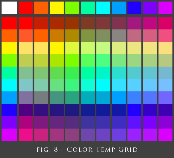
The top row represents the color of light over the swatches below. Look at the orange color and how much it changes under different light. I point that color out because it is closely related to the base for typical skin. Some colors will also appreciably darken under different temperatures of light.
This has to do with the physics of light and how atoms are able to absorb or reflect incoming wavelengths of light. Electrons will either absorb incoming energy causing them to vibrate and heat up (which is why black stays black and gets hotter) or they will absorb a the energy temporarily, jumping to a different orbit with the new energy, a quantum leap, and then jump back to their original position. When this happens the remainder of the energy absorbed is reflected as a new wavelength of light, or color. A pure red object under white light is absorbing most of the spectrum and turning it into heat, while casting off the remainder of the energy in a red wavelength. Enough of that!
Back to the color grid. I also find it useful to see the colors less saturated. See fig. 8a
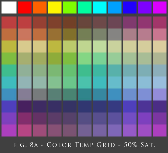
It is helpful because you don’t typically paint an image with all the colors at full saturation, so this chart shows colors in a more practical range.
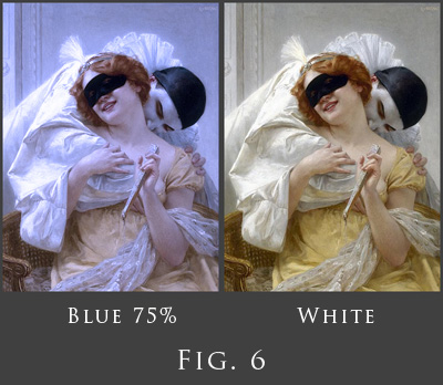
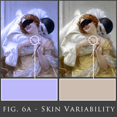
Let’s also take a look at another painting, this time Le Dejeuner Du Matin by William Bougereau. – see fig. 9
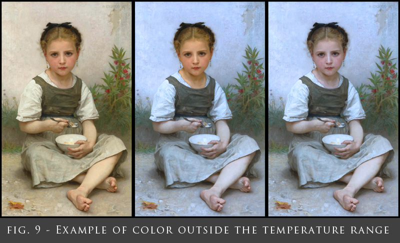
This image shows what happens if the rules are broken. The image on the left is the original scan. The image on the right has been shifted with a 50% blue light. While I prefer the original, the image on the right is still successful with its color relationships and the skin is still beautiful and full of subtleties. The image in the middle takes the head from the original and superimposes it on the image from the right. We get what might be called the “Snookie Effect”. It is clear, not just because the head doesn’t match the feet and arms, but the color of the skin is much too warm, and it contains colors that aren’t believable, or possible in the natural world with such a strong blue light illuminating the scene.
As with most rules in art, you can break this rule, and to good effect. Movies will do this all the time to make a character stand out, or draw focus to a part of the screen. Color contrast, specifically color temperature contrast is powerful stuff. Having cool blue light illuminate a magic object in a room lit by warm candles, or a figure glow with warm light in a cool winter scene instantly tells the viewer that something other worldly or unnatural is taking place.
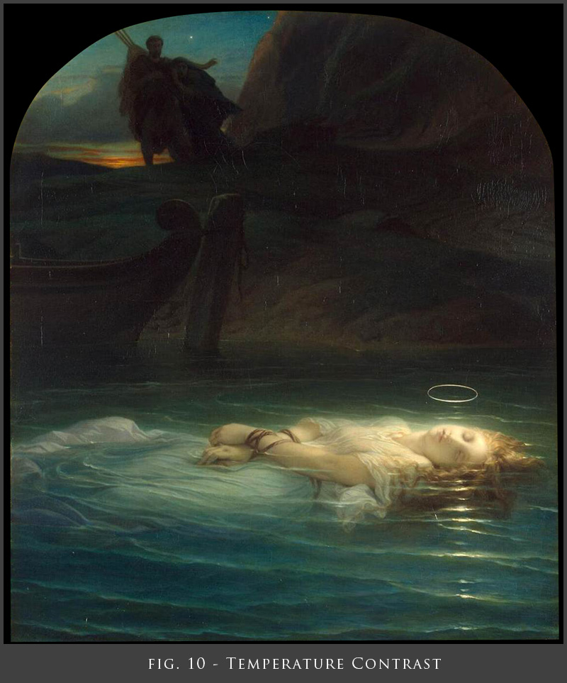
In The Young Martyr, by Paul Delaroche, – see fig 10 – temperature contrast is used to great effect. The other worldly light of the halo stand out as such because of the surrounding cooler colors and palette. The same is true of the setting sun in the background. Were she lit with a cool blue light it would not have the same pronounced effect.
Summation
Really all of the above is a long-winded way of stating something fairly simple; so let me try to do so as I conclude.
- Determine the temperature of the light before choosing your palette
- Choose your color palette from the new limited color wheel
- Don’t go outside of the range of colors except for an intended effect
I hope that helps to clarify the creation of color. Happy painting!
Thanks for giving this post a read,
Howard Lyon
howardlyon.com
Instagram
Twitter

Really helpful! One of the best things I've read about color and light. Thank you!
Excellent post – very well put.
Illuminating post;) Great examples- Thanks Howard!
Excellent post. Thanks for sharing.
Great post. This will be one of my go to Muddy favorites!
Wow! Great post. Light temperature just increased in my less saturated brain.
— steven
Great info and well said. I really enjoyed reading this and am happily reminded of these simple rules to follow.
Thank you everyone for the great response!
Posts like these are the reason I read Muddy Colors, thank you for posting.
Fantastic post! Thank you very much for this!!!
Great post! I second Shen Leidigh. I check this site more often than my email. Thank you for the insight and I can't wait to play with what I've learned.
Wow what an awesome post! Thanks for all this great advice. Color's something I've been working to refine in my paintings lately, so this post was really useful.
Fantastic very helpful tips, a new perspective for applying color, thanks!!!
These different color wheel´s are this made with some kind of tool that is available?
I found this really helpful and powerful! Thank you so much, Howard!
op zoek om online een rijbewijs te kopen, een echt rijbewijs online kopen? Je zoekopdracht heeft ervoor gezorgd dat je op de juiste pagina bent beland. Wij zijn een van de best geregistreerde aanbieders van rijbewijzen
Wij helpen u een geverifieerd rijbewijs te krijgen, beschikbaar binnen 5 tot 7 werkdagen zonder examens. Van watermerken tot het juiste lettertype. Grootte en stijl en het wordt ingevoerd in het databasesysteem
Chase Elliott’s wild win at Atlanta was pure excitement! And if you’re craving something after all that action, the chipotle menu has everything from burritos to bowls with fresh, bold flavors. Perfect fuel for race day fans!
Amazing how light changes the appearance of colors—especially skin-related tones like orange. It really shows how physics, wavelengths, and reflection affect what we see. Different lighting can completely shift the vibe of a color!
The Chipotle Menu gives clear choices for burritos, bowls, and proteins with prices and calories fresh, simple, and perfect for all Chipotle fans.
The Prime Rib Outback recipe is easy to make at home in about 2 hours. Its juicy, tender, steakhouse-style flavor makes it perfect for family dinners. Before trying it, check an Outback Ribs Review to compare taste and quality for the full experience.