By Greg Ruth

I’m sure you’ve all seen a bunch of Facebooks posts and tweets and whatever about this program that Rebecca Guay established a mere eight years ago. If not, and this is your first introduction to the program, boy howdy are you in for a treat. Simply put, it’s a week of intensive studio work and training in Amherst College led by Rebecca and a veritable gaggle of artists that would knock your socks off. When you’re in an intensive 12-14 hour day looking at, critiquing and developing the projects of fifty or so students you begin to see patterns. Certain situations start to become more common than others beyond the basic scope of anatomy. Some are so basic and yet so perpetually forgotten others are just realizations come from too much practice. Either way they began to remind me that I need to consider these each and every go myself. Sometimes simply saying these decisions aloud can revolutionize the compositional or creative process. So below are a few of those lines of thought we should all of us keep in mind on what we did and what we will be doing in the days and years to come. I must of said the top three at least a dozen times which can mean either they are common points of focus, or I honestly have nothing else to add but these three things. And yes, there will be Butters in it.
To learn more about the program, see the staff list, etc… please go here:
http://www.illustrationmasterclass.com/
HORIZON LINE BUMP!
A simple thing and one of the most basically ruinous or virtuous fundamentals to anyone’s composition. We all do this poorly by default because we tend to see the world from our own point of view about 5-6 feet off the ground. That means almost all our practical compositions run horizon lines across the middle. Even in a surrealistic piece, or an isolated figurative one, this can be a killer as it dictates how we view the thing we’re meant to see. A dead shot center horizon line is a super bummer for any kind of energy in your piece. Don’t be afraid to get jiggy with it. Push it way down, or way up, off to the side, akimbo and insane… but unless your pieces is a deck of cards or there’s some narrative theme that insists on it stay away from the middle like it’s poison, because it kind of is. Below is my favorite Wyeth’s most famous painting, Christina’s World, which I’m sure you’ve all seen.
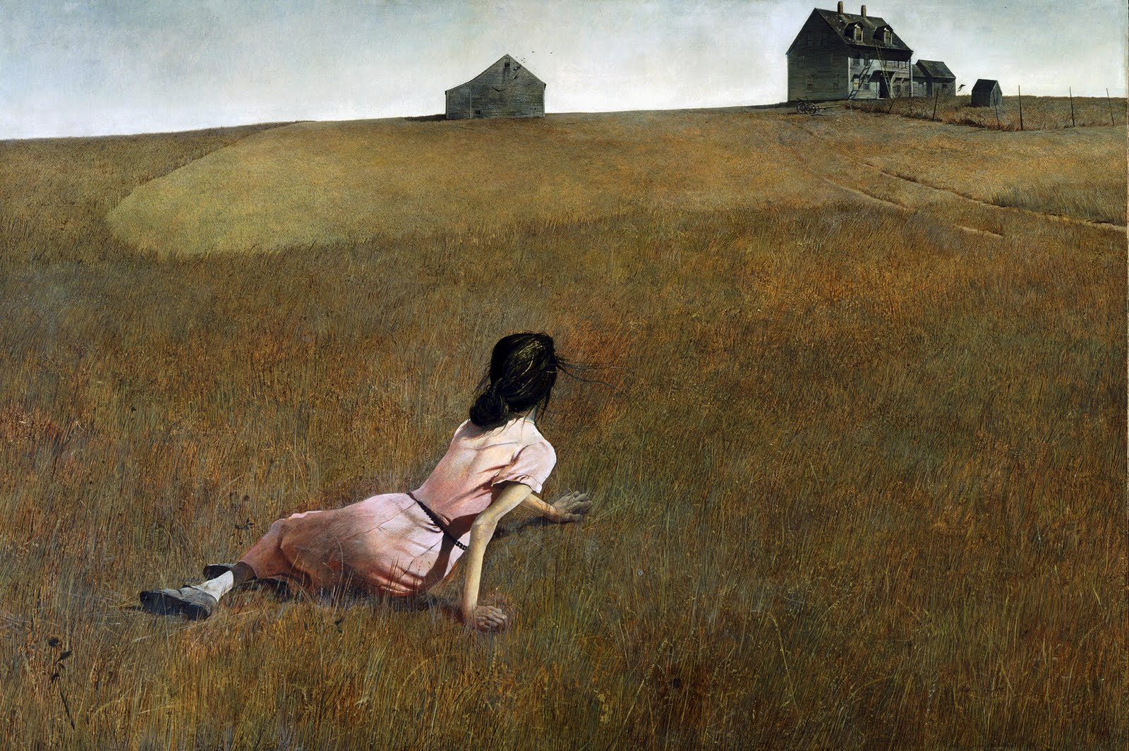 |
| Christina’s World by Andrew Wyeth |
It’s an obvious visual case to make- I mean just look at where that horizon line is. The effect is a sense of gravity and distance- a paraplegic tossed onto a vast open field, literally underwater amidst the field of wheat and grass who must crawl her away across the interminable distance to home. There is no other possible way in which to tell this story in a single image than the way Wyeth has done here. I can’t say that a lot about most paintings, but boy howdy, is it ever true here.
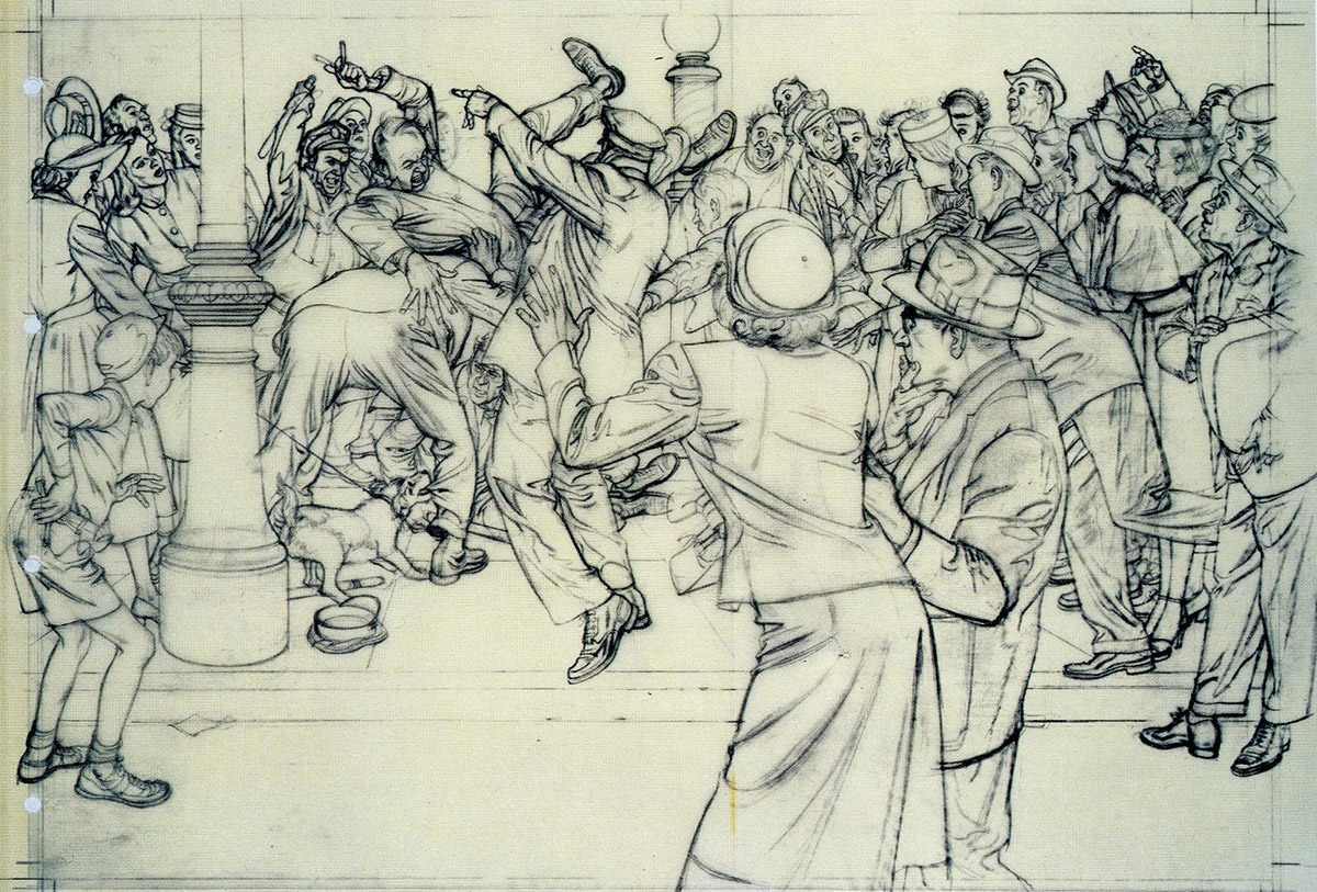
 |
| Graphite drawing from INDEH by me and Ethan Hawke |
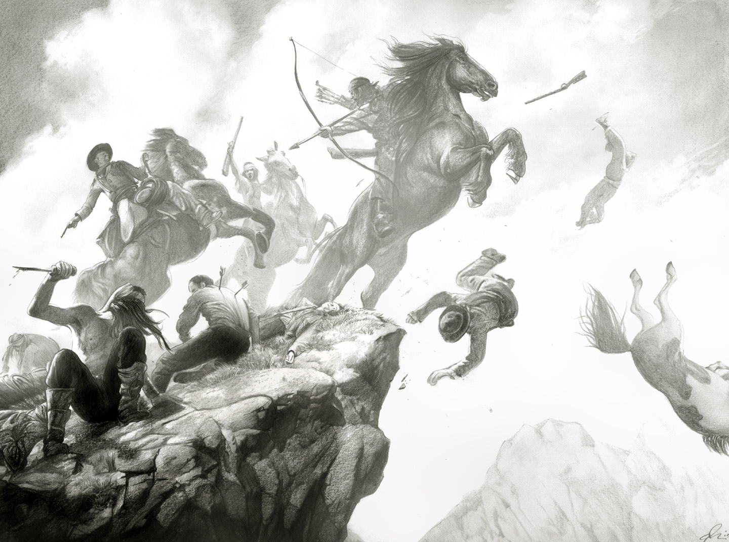
In this piece above, I do everything I warn against you taking on. While one might argue the horizon line here is way below the action given their altitude on the rocks, really it is smack dab in the middle of the action. In fact what likely saves this piece from being an utter disaster is the fact that it is SO central even to the point of celebrating a dead center axis upon which this entire piece rests- right there at the tip of the ridge where the horse is about to light from it, the falling man points to, etc… It sort of saves itself, but doesn’t do so entirely because for all the broadcasted power on display here, at least half of it is lost to the over centrality of it and that horizon line across the center. This thing tries harder to accomplish what Christina’s World does by natural inclination. Even when all of the other tenants are in evidence: the Neo Principle, The Horse and Rider thing, The God’s Law below… they can save from total crash but not wholly rescue a piece that does not submit to the primary idea of where to place your horizon. Get this right early and first. Everything else is secondary.
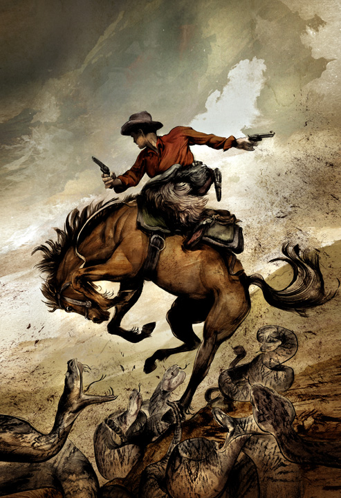
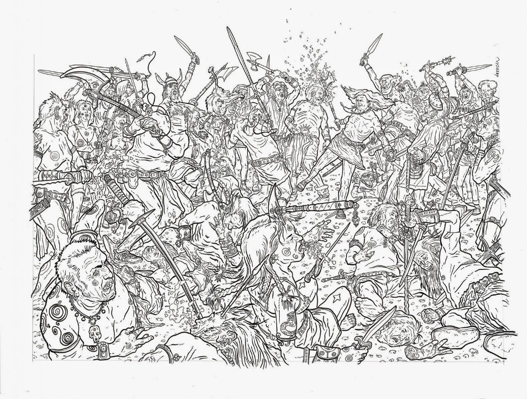
THE HORSE AND THE RIDER
 |
| Cover to OUTLAW TERRITORY Vol. 1 by me |
In comics or book covers, no matter what complexity level you’re working at or what the narrative demands, you cannot ride more than once horse at a time. Try it. Your butt simply isn’t substantial enough to pull it off, and if it did, that would be a whole other issue to discuss. The reason for this gluteous metaphor is to remind us all that in a single image we have one subject to attend to. One job to perform. Even in a comics page this is true panel to panel. Pick your subject, your singular focus and stick to it. Make the piece about that singular element. Choose what you are saying and everything else on the page that does not affirm your statement of purpose, lose and bring back later only if it submits to this point of will. This isn’t to say all comics panels or book covers should be isolated single images, though I myself adore that look and probably way too much. The focus could just as easily be thematic- rejected love, fear of bunnies, the death of one’s father… One thing has to be in charge, and it should be at your command and that of the page, not the other way around. I’m all for letting the piece tell you where it’s going to or wants to go, just as long as you remain gripping its leash and take these suggestions for what they are rather than the commands they may appear to be.
 |
| Fables cover by me |
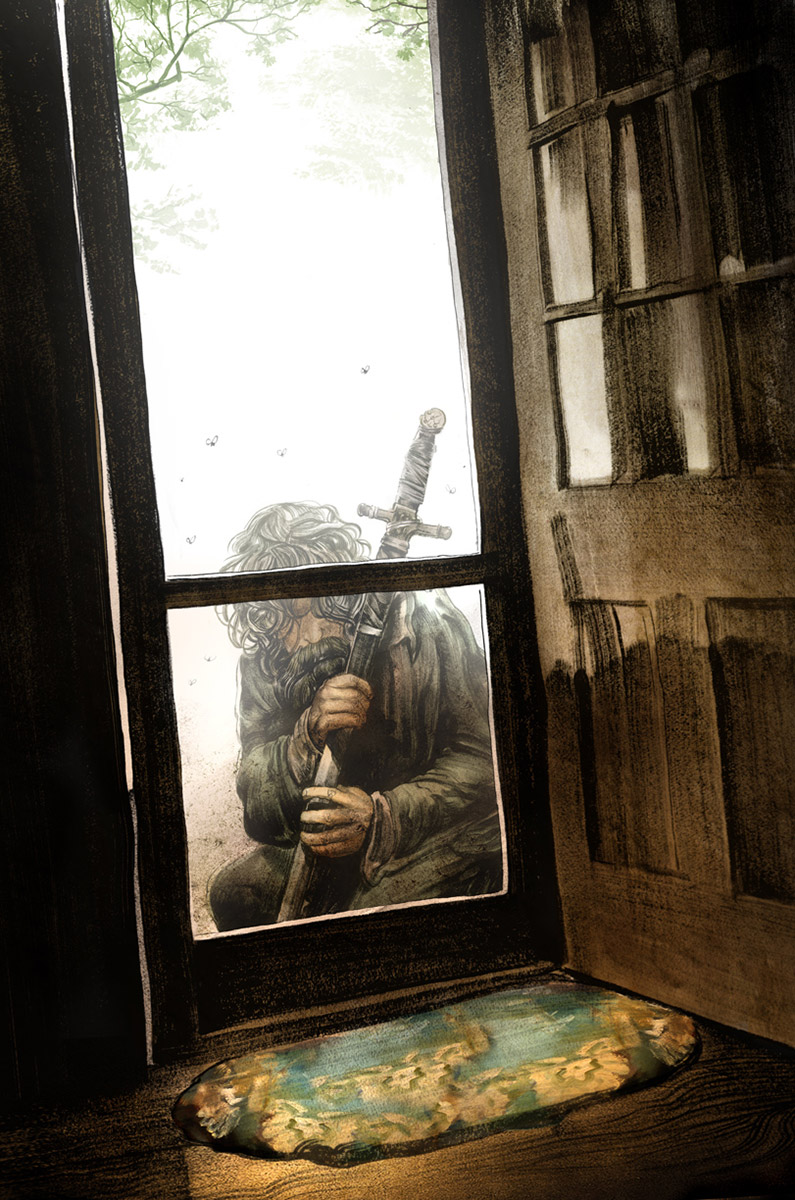
You must be the ride and it the horse. Direct it, steer it, navigate this over powerful beast towards your destination and avoid distractions, even if they seem to be simple compositional fixes or aids, or more confusingly, if elements are indeed of the same basic idea, though not of the moment your are trying to capture. Good art is about choices, and largely about what is left out rather than what is on view. Don’t be afraid to prune until the very last moment. Even if it;s perfect there’s probably always something to lose. Everything about the piece here to the right is about not just this grizzled man, but his return home. That’s the Horse. Therefore everything on hand is about achieving in the most simple and direct fashion, this idea. I had a dozen different little distractions going on in this originally from a sea of fluttering apple blossoms, too many flies buzzing about, even the form and figure of Rose Red as she receives his return. All fell away under this guiding notion and then were brought back in at the service of the point of the piece. Right down to the woolen doormat.
When the 10th anniversary of Master and Commander came about, the studio approached Peter Weir about doing a repackaged celebratory blu-ray with the final ” Director’s Cut” that we so often see. Things what they were really asking for, and what we normally get is an extended version. More movie culled from cutting room floor footage. Peter though, genius storyteller that he is, wanted to shave another 20 minutes off. The studio balked, he held strong, the project died. More is not better, bigger is not more effective- at least not on its own merits. Don’t be afraid of simplicity, it is the hardest achievement in art there is and even more tricky and difficult to pull off with aplomb in narratives.
THE NEO PRINCIPLE

As an extension of the above idea, this what I referred too way to often for all the students at IMC as “The Neo Principle”. Which is essentially the notion that once you have found and committed to your singular element, bend the world in which that element exists to it as if it were the entire source of gravity. Again this can be thematic rather than compositional, but every grand highlight in art achieves this. Look above at Christina’s World again- see how everything in that piece is bending to the notion of her crawling homeward. It’s not so much about her, or the distance, but the journey she will have to and is taking. Every part of this very simple but totally effective piece is about exactly that.
 |
| Sketch by Albert Dorne |
Every though, the tonal and value system on hand, the composition, follows this line of purpose. Remember the enemy doesn’t flee when Neo kicks the big bad’s butt, they run when they see hoe commands the world he is in utterly. Your piece needs that selfsame power, even if not literally. Everything in that composition needs to be responding to the central idea and focus. Even rejecting it is in and of itself accomplishing this. Just as long as in doing this, you do it with ferocity. Look at the piece by Dorne to the right- even minus value and tone and all the other emotional narratives color bestows, we get this upon first blush exactly because of this. If you have ever been in a room where a fight breaks out, you can literally feel the air in the room get sucked from whatever it was you were initially doing, and go to the point of conflict. This is that.
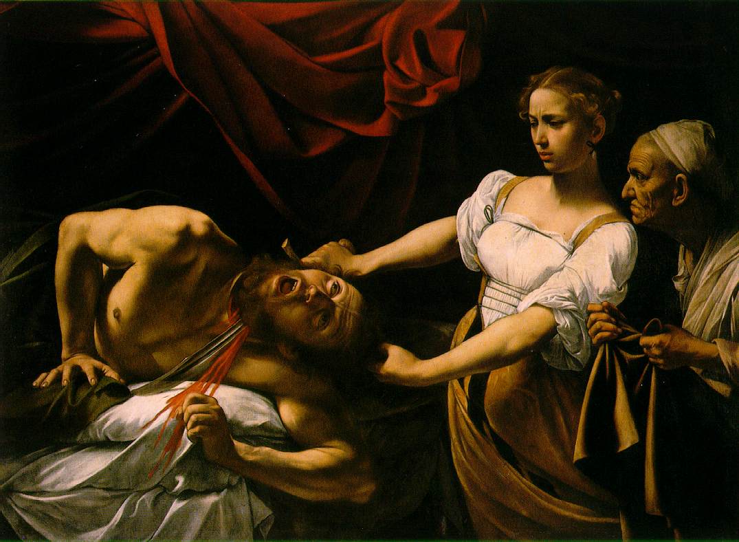 |
| Caravaggio’s Judith and Holofernes |
Its’ Caravaggio and thus it is awesome. That said, Artemesia Gentileschi showed us everything that makes this the lesser of the two versions simply by doing it. WHat Caravaggio fails to do here despite seemingly attending to this idea- the drapes bend toward Holofernes, the swoop of Judith’s tunic, the attention upon her act, the angle of the sword, the blood spurt, the look of the handmaiden… it still seems stiff and not entirely truthful to the spirit of the moment it aims to depict. Even Judith’s facial expression is more akin to one who find their mocha too cool than one in the act of sawing a giant man’s head off. Look at his arms- they are the pose of a man about to eat grapes when they should be fighting off the blade or attacking one of them brutally ins response. As a result all of it undercuts the violence here, which is the Neo of the scene. It’s more incidental as a reusult and as such the violence and blood become gratuitous as opposed to purposeful.
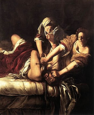 |
| Judith and Holofernes by Artemesia Gentileschi |
In what I consider to be the far superior version of the scene, Gentileschi shows us exactly how it’s done. THe entire world of this moment goes right to Holofernes twisted head. This is a big dude and made bigger by having to have both women get up on his business to make it happen. The twisting and binding of his arms, The akimbo shape of the forms and all the lines pointing to the source of the impact, even having a near perfectly centered sword lined up in a near geometrically strict up and down orientation works because it is but a leaf on the raging sea of violence on hand here. Judith responds with the determined grimace of a woman about her work, her sleeves jammed up to avoid getting soiled by his blood… everything in this speaks to the moment even as Holofernes’ head is in shadow because the point is not him, but this act.As a result it is far more powerful. The violence not at all gratuitous.
THE GOD COMPLEX
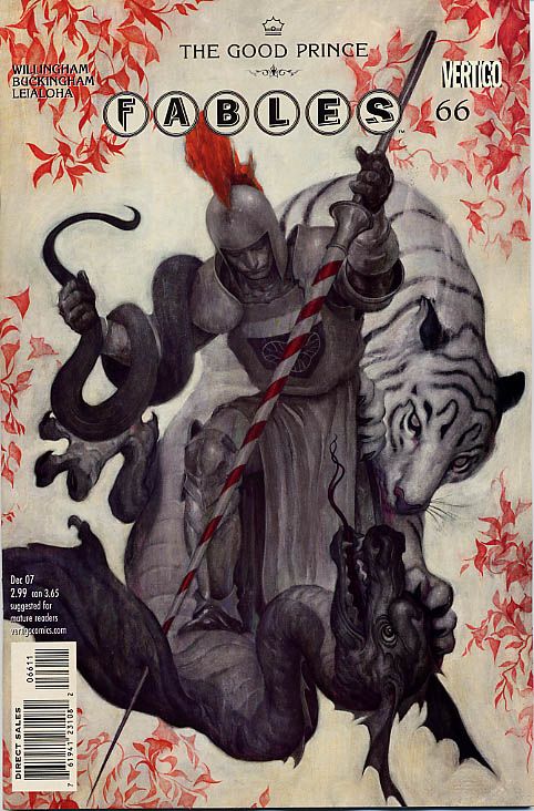 |
| James Jean’s cover to Fables #66 |
Artists get to play at being God every time we sit down to work. It is what makes us such arrogant bastards at times because being god in your studio can translate outside to the real world where we most certainly are not. However, despite these rocky shoals that sing us to shipwreck, it is still worth remembering and being. There is nothing- a complete Let-There-Be-Light moment when faced with a blank white canvas. Every potential outcome is as a result a reduction of potentiality, every mark a defining committed thing to respond to, obey or strike out. So many times I saw student focusing on the mechanical hangups of how a thing works, or whether or not this would work in the real world, doorknobs don’t look like this, etc… As intent as all were on trying, artfully to being reality to the piece all of these thoughts betray the piece in the end because they make someone else God in this world. And unless you are working alongside a partner, this is and should forever be, a monotheistic Old Testament wrathful and sometimes capricious God who will not suffer the laws of others. No sir he will NOT.
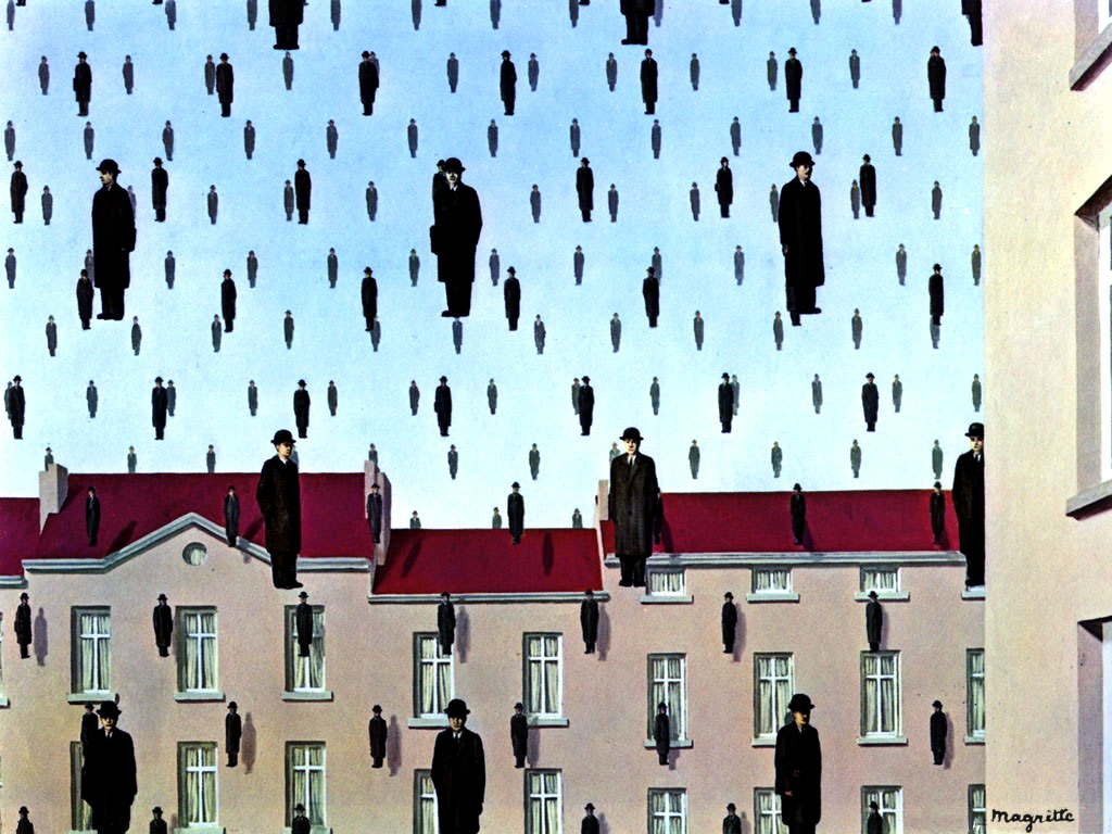 |
| Golconda by Rene Magritte |
Now that you have established your divine powers, use them and shape the world to your desires. Do cars drive upside down under a rainbow ofd fish and toupees? of course not, but in your world they can and should. (Actually I would very much like to see this piece so someone get on it, okay?). The only rule in this land of yours is that whatever laws you set forth, ALL MUST OBEY. It ain’t a true law is no one follows it, it just doesn’t have to be someone else’s law. The physics you establish in are the only ones that matter. If outside normal laws start to come in, it’s either the fault of the viewer who refuses to surrender his/her common notions to your piece, or you have failed to convince them of your laws as superior. Usually I blame the artist. If we can get millions of people to shell over hundreds of millions of dollars to fondly follow a gun toting raccoon atop a living tree-bodyguard thug in a universe of purple, green and pink people, then it can be done. If one person can do a thing, another can do that thing. If you’re explaining or apologizing, you’re losing. Look at this St. George piece above by James Jean- it makes no practical sense in a reasonable world.
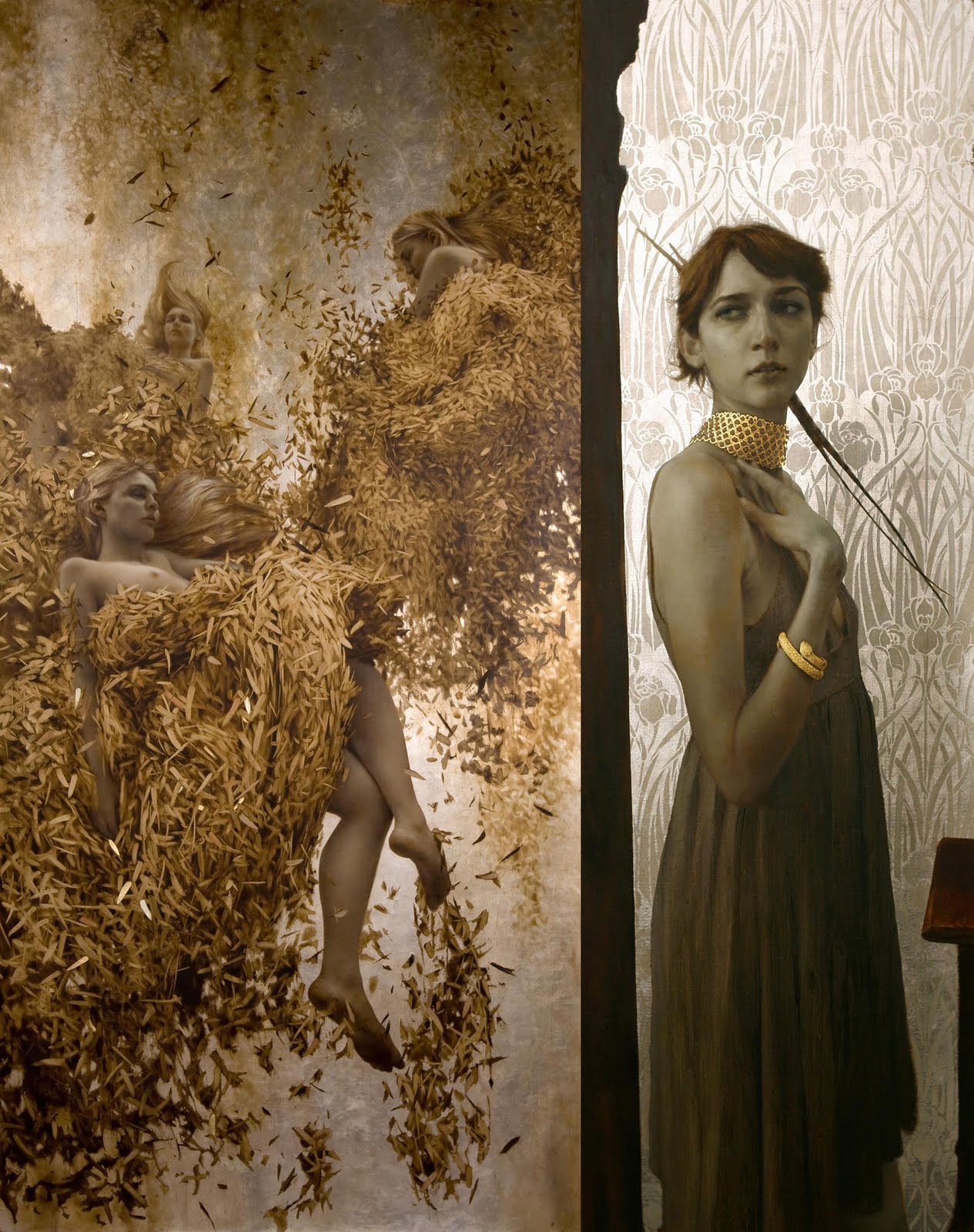 |
| Outstanding painting-as-music work by Brad Kunkle |
But we’re not in a reasonable world, we’re in his world and happy obey his commands because this thing works so damned well whatever question we may have about where the tiger goes and where the dragon comes from, etc… are those poised by them who just can’t get it. And this is a good point: No matter what you may achieve in your piece, you may still get a “But people can’t fly, right?” kind of comment. Even if you have utterly convinced everyone that in your piece people have always been able to fly and do so elegantly, or dragons exist or whatever, there’s going to be someone who just refuses to surrender to your godly powers. The best way to deal with these people? Lightening bolt to the chest, a bit of smiting perhaps? No- just ignore them. They will not now nor ever will be your friend in this. It doesn’t mean you should ignore the opportunity they provide to question your acumen in your piece. But if you find that the answer is “yes dammit, I this works”, then you may move onto the smiting. If that’s your way. Personally I’d just not pay attention to it- less jail time.
There’s about ten other things we could get into, but I’ll leave it there for now. The thing that really is fascinating to watch in such an intensive teaching moment you find in squeezing over a hundred hours of classroom into a single week, is both how clear these lessons become and how hard it is to see them ignored or unrealized as yet. We all of us as Gods of our own worlds must come to the laws of physics of designing our work in our own time, in our own manner. Sometimes we never quite get it other times we get it after years of wandering in the wilderness. The point is then not whether these dictates are obeyed, but if they are offered in a way that best suits the needs of the piece before you. All of us at IMC are artists themselves- it’s a total world, and as such it can be hard at times not to grab the pencil out of the student’s hands and take over to make the thing work in your eyes. But even when I found myself doing this, I would come back later to find much of that hubris had been tossed over as the student returned to their own work in their own way. I am after all just another interloper in their garden of delights. You know you’ve really landed the fish when they take your advice and fold it into something you hadn’t thought of, and that happened almost always to my great joy. It is an indescribable honor to be in the presence of such a faculty as the giants taking form in the human bodies of Boris Vallejo, Julie Bell, Scott Fisher, Iain McCaig, Mick Mignola, Brad Kunkle, Greg Manchess, Donato Giancola, Irene Gallo, Dan DosSantos and James Gurney, Mark Chiarello, Allen Spiegel and Matt Kalamidas under the Usen-like powers of Rebecca Leveille-Guay, whether you are a student or a visitng lecturer or simply a small child who’s wandered off from their parents. There’s always a surprise there amidst them, a laugh and serious lessons to be learned.
And sometimes if you are lucky, and quiet and have left food in your pocket… there is Butters.
 |
| Undaunted by the soul eating glare of the Butters, Boris and Julie paint onward. |


Excellent article, Greg, very good points to remind ourselves of as we work and observe.
I've always agreed about the Caravaggio versus Gentileschi paintings. After seeing both of them in person, I was convinced. Caravaggio's does look staged where Gentileschi's is dynamic.
Great stuff Greg! I will write these down and keep nearby for when things are not working. Thanks for the condensed IMC observations. I hope to get there one of these years.
And Caravaggio is no small colossus to dethrone either. Glad the post is hitting the right notes- the IMC is such a wonderland of deeply condensed art learning… I'm still unpacking it and likely will continue to do so for the rest of the month. Each year is wholly different it seems (I've only visited it thricely so far), but each one seems to be more powerful than the year before. The staff, the students.. the caliber of thought and work on hand is inspiring beyond belief. I was lucky enough to be in for a long stretch there teaching to learn.
Thanks for writing this up Greg. I'm also hoping to attend soon, but in the meantime, really appreciate your distillation of wisdom from IMC.
Thank you for this wonderful article, Greg! It's a good reminder and very helpful. The IMC sounds just amazing, I hope to get a chance to go some time.