Since this is my first posting on Muddy Colors, and my first blog post anywhere (!), I’m asking everyone please to be patient with the dismal home-made photography — at least I end up with a professional digital image of the finished painting at the end, so hang in there.
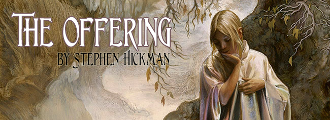
A painting starts out as an idea, or vision — a notional beginning, in whatever form. In this case, I wanted a painting that would tweak the viewer’s curiosity as to what the story behind it was. I didn’t start out with a story in mind, and I still don’t have one; this floated around the idea of the central figure, until I put down a loose sketch I thought of as ‘The Faery Ring’.
Pixies dancing didn’t seem very mysterious, and the color sketch I did was only marginally more interesting…

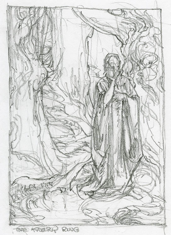
But a pixie playing a harp wasn’t weird enough… people see those all the time. So — I’m not sure where the winged serpent with the grail motif came from, but I thought the introduction of this element could get some real traction on people’s imaginations.
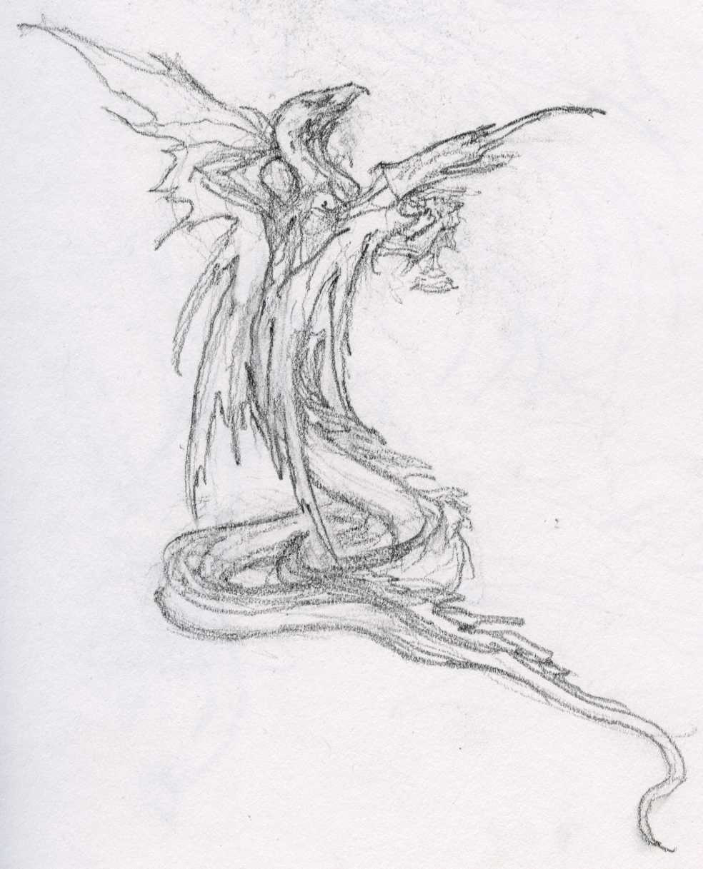
I worked it up this way — the finished version of this drawing can be seen in my new art book, EMPYREAN, The Art of Stephen Hickman (but not the finished painting, as this is my latest effort).
I projected this charcoal layout on to a pre-textured toned canvas (I slathered on Liquitex Unbleached Titanium Gesso with a large brush for this), and when the gesso was dry put down an imprimatura (a thin wash of raw umber thinned with mineral spirits), and let this dry for a half hour. Then I lined in the drawing using raw umber.
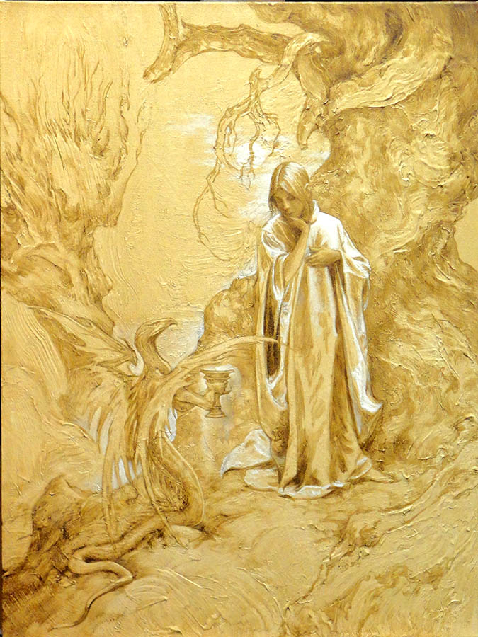
The projected drawing didn’t have a realized background, so I used the gestural textures in the gesso where it suggested a forest background. In this process the idea of a ground mist looked interesting, and I used white to define the forest floor, as well as picking out highlights on the satin garment of my mysterious figure.
I added white and raw umber to bring up contrasts, and the moon started moving around in the process — it was in three places before it settled down.
About this time I decided I didn’t like the ‘body language’ of the serpent, and mixed an opaque color the same shade as the transparent raw umber of the rest of the picture to alter the gestural quality of the serpent, while not seriously disturbing the umber tone of the underpainting. I am going to follow the traditional transparent shadows/opaque highlights principal as far as possible, laying the groundwork here.
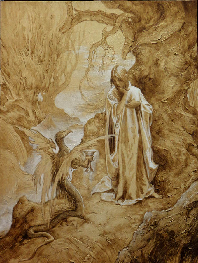
When the underpainting was dry enough, I started the color lay-in, using as a painting medium a jar of Michael Harding’s Balsam Resin Glaze Medium I had bought out of curiosity. This is a very facile light medium, with a working time of about one full day, and a nice feel to it when the solvent initially dries off. I like to keep the colors thin and transparent or translucent for this phase.
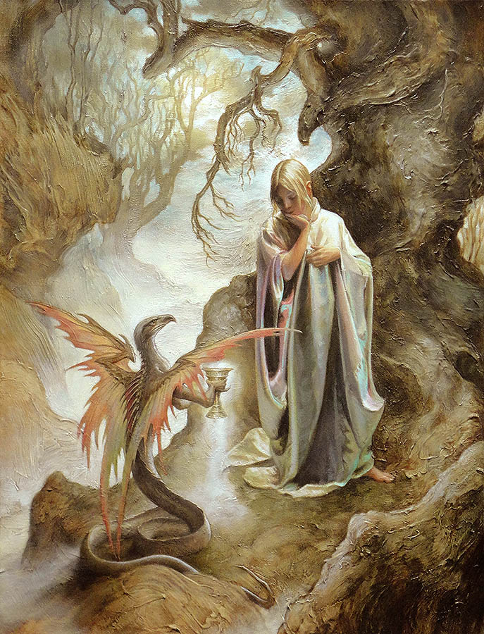
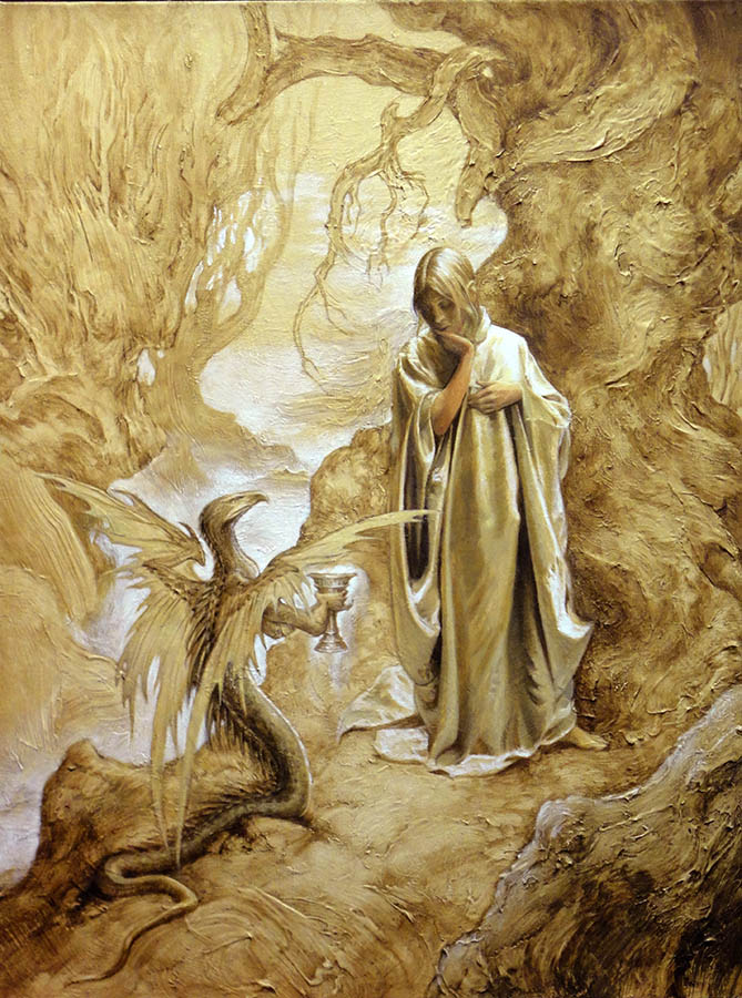
As the colors get more opaque, I use a mixture of zinc and titanium whites — this is more translucent, and takes a more pure tint than straight titanium white, which tends to look chalky. Notice in the previous step where I moved some of the tree structure on the left back, as it felt crowded. I’ve lightened the shadows, to evoke what the late Roy Krenkel used to refer to as ‘fantasy light’ (an evocative term I love because it can mean just about anything — in this case, an indeterminate misty feeling to the picture). I am looking for a liminal, poetic color mood here; the only part of my color sketch I’ve retained is the iridescent shimmer of the satin robe.

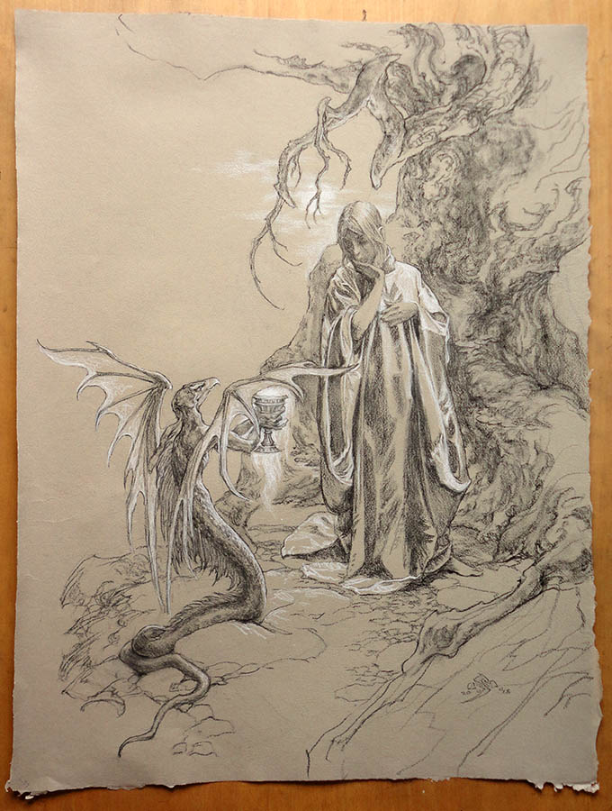
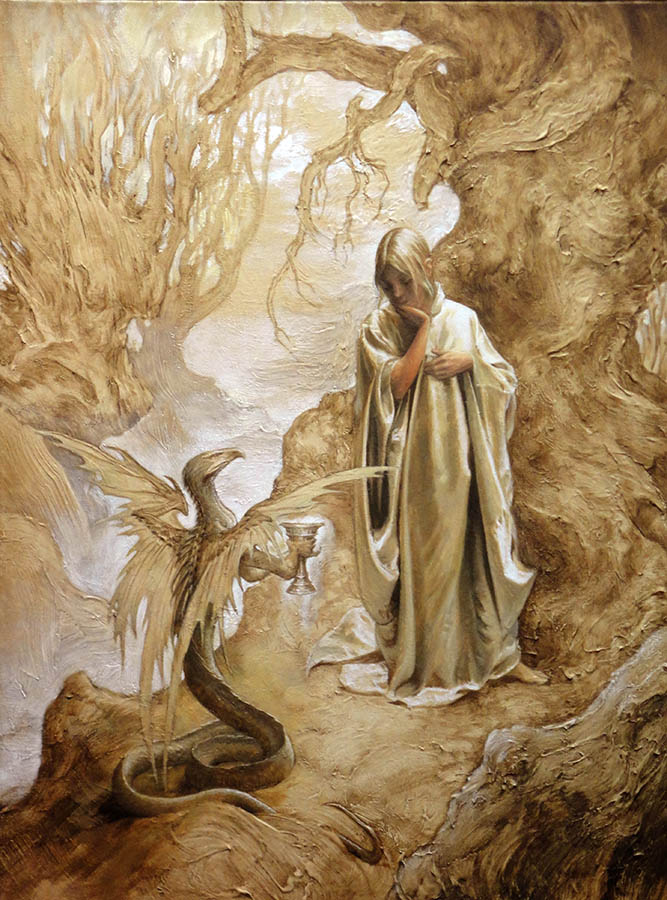
And now, the ludicrous transition from my home-made photography to a professional image, for all the world as if I had suddenly learned to paint, or that I had gotten down to the magic in the bottom of the Balsam Resin Glaze Medium. At any rate, I have ended up with a painting that is certainly more intriguing as to its backstory than what I started with — as I mentioned before, I haven’t figured out a story yet, and even the title is provisional: I am open to suggestions on this.


Cup of Moonlight?
Lovely piece!
Beautiful!
Beautiful Stephen! May I ask what size this is?
I look forwards to seeing more of these posts Stephen, thank you for joining the community here at Muddy Colors!
Temptation….or at least that's what I see when I look at it. Like the serpent is tempting the person the drink from the cup. 🙂
Wow — 'Cup of Moonlight', that's nice … !
Hi, Brian — this is on an 18 X 24 inch pre-stretched commercial canvas, not usual for me, but handy —
Thank you, Shen — and I really have to thank Dan for doing all the work on these lovely graphics … !
That's some serious moonlight! It's a gorgeous work–one of your best.
While you know I adore you and your work, you have outdone yourself with these
fantastic pieces. It is wonderful to hear some of your techniques, as well.
Great job! Thank you for sharing your magic with us. Cannot wait to get my book. 😉
Thank you so much, Susan — that is very nice of you! I'm working on another idea that I think might be interesting for a post in the foreseeable future… got to get a few things done first, though. I hope you like your book when it arrives!
Your texturing phase at the beginning is fascinating. Thanks for sharing that. The end result is phenomenal as well.
This is really lovely work. The colours are so rich are they oils or acrylic?