Recently a couple of different students have mentioned to me that “they don’t get a chance to see artists’ reference side-by-side with their finals all that often.” Hmmmmm.
Now, there is a literal shitstorm of posts and articles out there featuring this theme, but I think the root of these comments is that we can all sense a little…falseness in these posts, from time to time. I’ve seen articles where the artist is obviously sharing a picture from the same shoot, but not THE shot; not the shot they actually used to paint from – and keen students sense this as well.
Of course, it feels rather vulnerable to share one’s exact reference; I myself have shied away from it for a long time, particularly in settings (like the internet) that feel “permanent” or “public.” That said; we’re not doing each other any favors by holding this stuff back, so let’s just get over it. Photo-reference can be an astoundingly powerful part of the modern illustrator’s repertoire, and just like drawing, painting, and composing, it’s a skillset that takes time and practice to develop and integrate into one’s art, so we need good examples of how it’s done, and good dialogue around it.
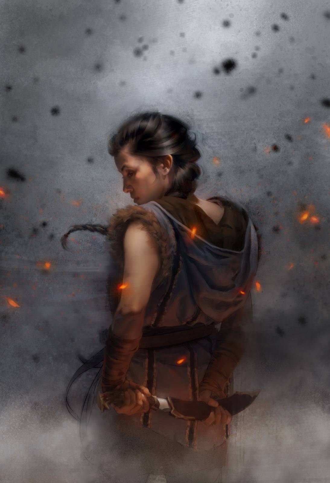
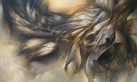
Herald of Faith, M19 – Sketch. © Wizards of the Coast.
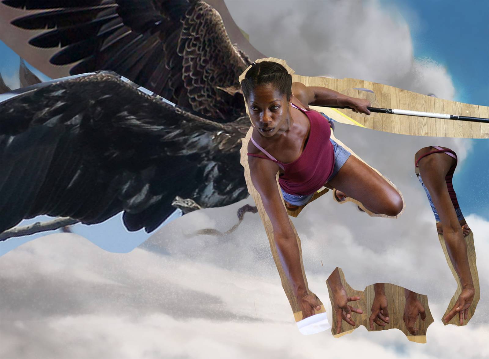
Herald of Faith, M19 – Reference © Wizards of the Coast.
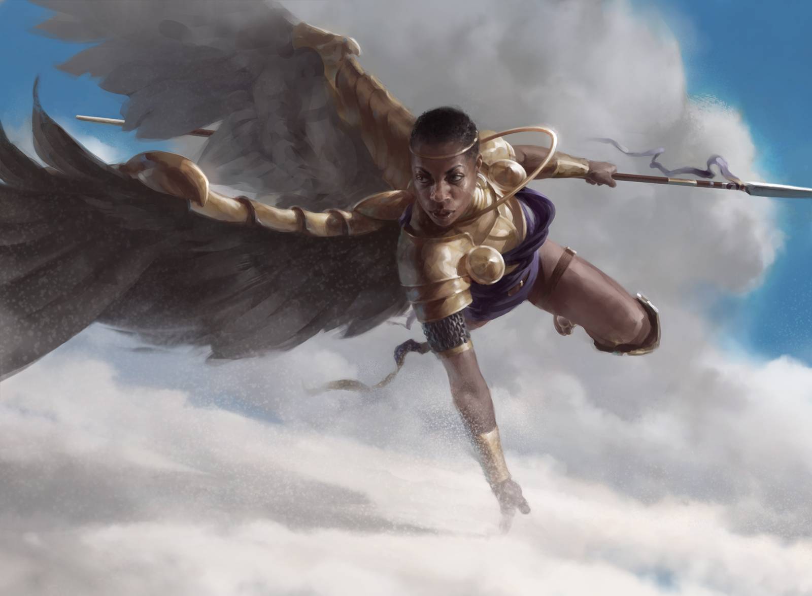
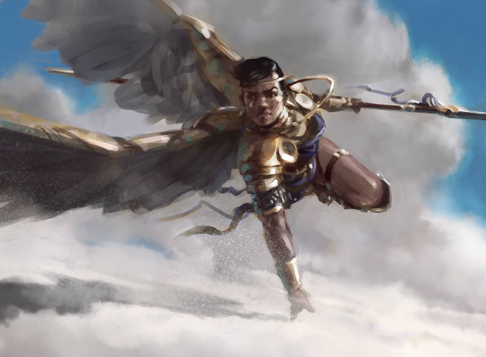
Herald of Faith, M19 – Final. © Wizards of the Coast.
Today’s post is simple: it’s an uncomfortably clear look at my reference, with nothing hidden. I’m not going to defend myself as an artist, or explain what I changed and “how it was all very complicated and technical, and not anyone could do it.” I’m sharing this stuff because I think with the right tools and knowledge anyone could do it! Welcome to the abattoir; this is how we make the meat.

Touch of Iron, 2016 – Sketch.
Touch of Iron, 2016 – Reference.
Touch of Iron, 2016 – Final.
Each reference picture is exactly what’s sitting in my PSD file. I keep my reference all in a group at the top of my file, along with other helpful things like callouts, perspective grids, and background items so I can flicker it on and off to check for accuracy. This is a lot like the “onion-skin” method of examining drawings for animation: by flickering between my reference and my painting, I create the illusion of motion anywhere there’s an inaccuracy, and can hone in on those spots for correction if they’re different in ways I haven’t chosen. This also happens to be an EXCELLENT technique for training your eye to see accurately, by the way.
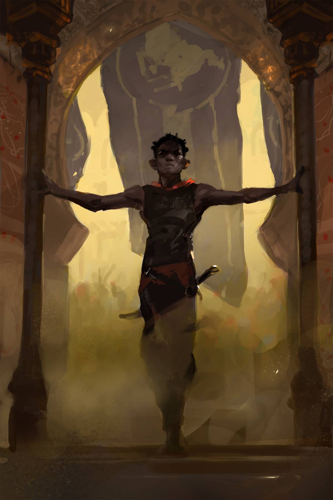
The Unbroken, 2020 – Sketch.
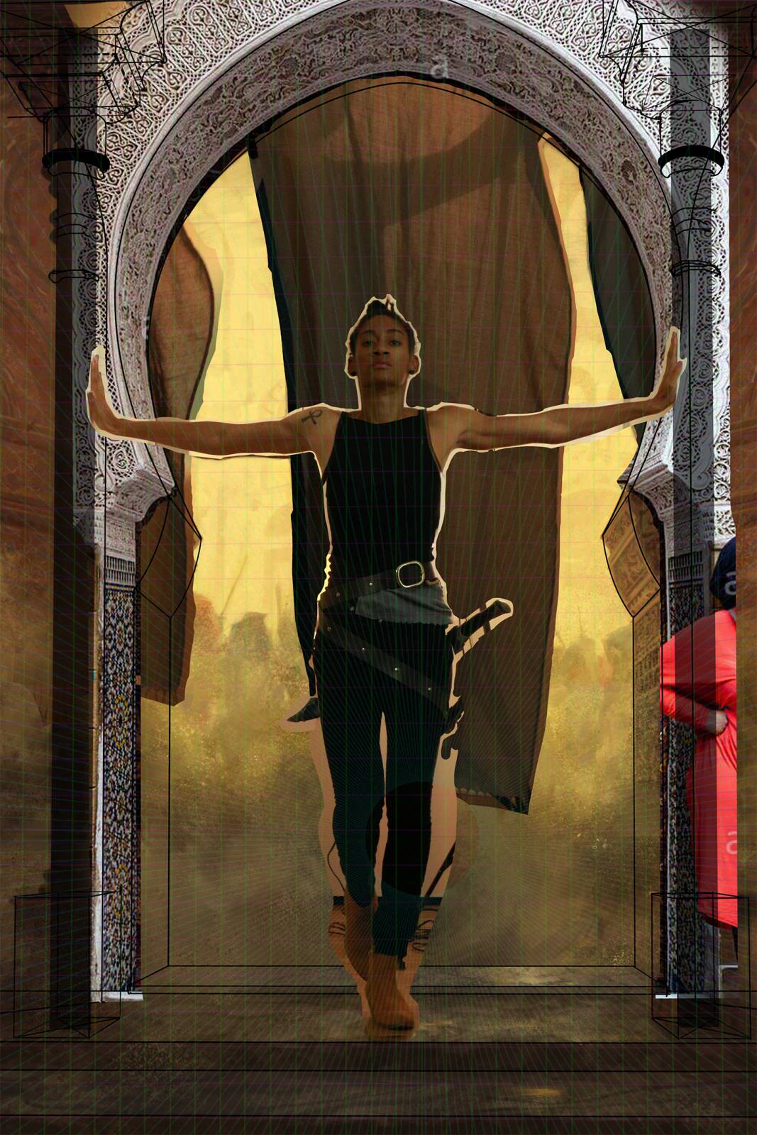
The Unbroken, 2020 – Reference.

The Unbroken, 2020 – Final.
If you want to give it a try, download these images and stack them one atop the other in Photoshop, and flicker the REF layer on and off, and you’ll see basically exactly what I see as I’m painting.
You may notice that there are seams in some of the reference; I definitely do a bit of drawing with the reference before it gets into the file. Sometimes the body is perfect but you need a different head; sometimes there isn’t a single good, holistic photo of the pose and you have to build the whole thing out of parts. I’m happy to answer any technique questions in the comments, and if you like seeing this, let me know and maybe I’ll do another post like it sometime!


Thanks for sharing this Tommy! ppl get all fussy about using pictures as a reference all the time. I work with a similar method and sometimes I get myself thinking that maybe I’m a fraud or something. It’s great to see great artists taking the veil of this subject.
Wait! What? The model did NOT have wings?
Shenanigans!
This is quite interesting. I do have a question. I have recently been digging into reference photographs and using photoshop almost as a Camera Obscura for my subjects. I feel it is helping me understand the geometry and form of my subjects, so i can focus on my painting technique more then my drawing ability. It seems here you are sketching out what you are looking to do and then taking the photograph and painting over the photo layer is that correct? Mainly using the photo as reference where your next layer is you deeper dive into technique and style.
Best
I’m not painting over the photo, although that is a perfectly valid method. Whenever I’ve tried it I find that I have to spend an awful lot of time “getting rid” on information and errant texture from the photograph, so ironically it’s faster to just paint – then I can be sure of everything gelling nicely. Good painting is always, by necessity, a simplification anyways. I use the photo as a guide for certain things, which is why I keep it in a “floating” position over my file where I can turn it on and off – sort of like a traditional painter using a projector.
What a cool glimpse “under the hood” for the rest of us. We owe you, man! Thanks!
Awesome! Love to see more artists being open about how they use references — and the amazing work that comes of it. 🙂 I have always loved the Touch of Iron illustration!
These references in these examples are so exactly on point to the visions in your sketches. I’m assuming you must have taken your own reference photos for these, right?
Yep! Historically I’ve tended to sketch first, then create reference to fit. Found reference can be good but always feels more limiting, and I don’t love introducing those types of limitations into my process as it makes me create from a place of fear. Shooting your own reference (with a clear idea in mind) before producing tight sketches works pretty well too, and is something I’m experimenting with more and more. Dave Palumbo does it this way, and wrote an article here on MC about it a good while back…
Thanks for this amazing insight into your process!
I’m planning on trying this for a while to see if it fits my own workflow.
I personally like to keep my pen on my painting and not move it around to menus so much (personal preference). So I rely heavily on shortcuts. If anyone is the same, maybe this script will be useful for you as well:
https://community.adobe.com/t5/photoshop/layer-group-visibility-toggle/td-p/6526972?page=1
(I didn’t write it, just googled it.)
It toggles the visibility of a layer or layer group by its name.
You will have to specify the name in the script, see the instructions. I just named mine ‘Ref’.
Save it to a text file named MyScriptName.jsx and do this: http://uberplugins.cc/help/how-to-install-photoshop-script/
Scripts can be assigned pretty much any shortcut in current versions of Photoshop. Just use the shortcuts menu. You will find the script shortcuts in there under File > Scripts.
Now you can use a shortcut of your choice to toggle the visibility of any layer or layer group with the name ‘Ref’.
And it takes like 2 minutes to set up. Maybe a few minutes more if it is your very first Photoshop script.
I find this kind of stuff super useful, maybe someone else here will as well. 🙂
Thank you for sharing Julia! Toggling layers on and off was an annoying hangup that was getting in the way of me trying Tommy’s workflow so I’m much keener to try it now with that script.
This is so nice to see, and has definitely made me realise I need to shoot more ref myself when i’m obviously struggling with a pose.
I do have some questions and i’d be grateful if you could answer:
How do you go about shooting the reference? Do you have your own room with props and lighting equipment or do you go somewhere else?
Do you actually hire models or use friends? And if so, does it actually cost a lot to do this? I’d assume it’s factored into your budget and comission cost.
Thanks in advance for your time!